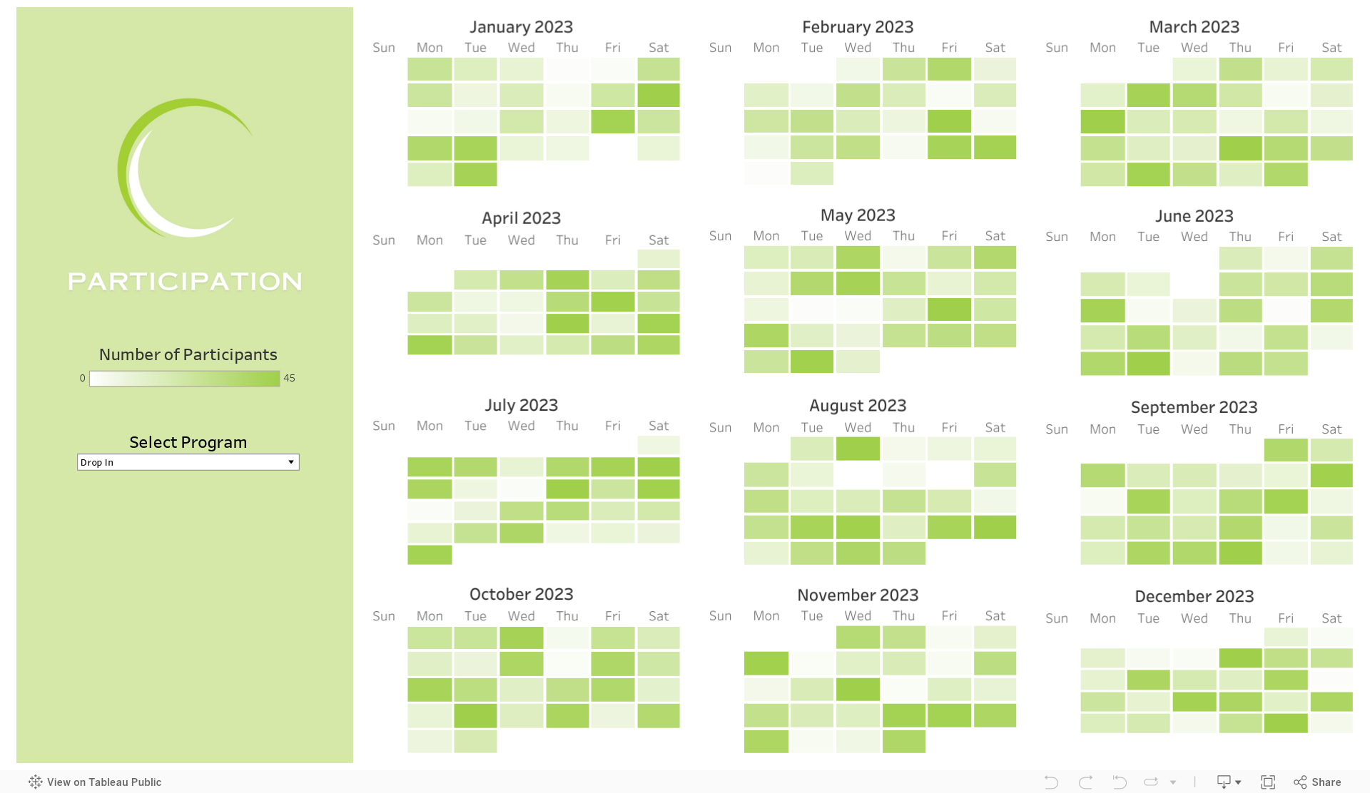
I’ve come across this useful chart a number of times and have yet to find a name for it. So I’m giving it one: the heated bar chart. If a bar chart and a heat map had a baby, it might look like this and be even more powerful than its useful parents. This heated bar chart shows months along the horizontal axis and days of the week along the vertical axis. Darker and longer bars on the two bar charts and darker cells on the heat map show when there has been the highest participation in hours. This allows us to examine patterns in participation. We can see, for example, that the relatively high participation in May is being driven by participation on Mondays during that month but that Monday was not a particularly high participation day during other months. We can also see that, overall, participation was lower during the fall months, regardless of day of the week.
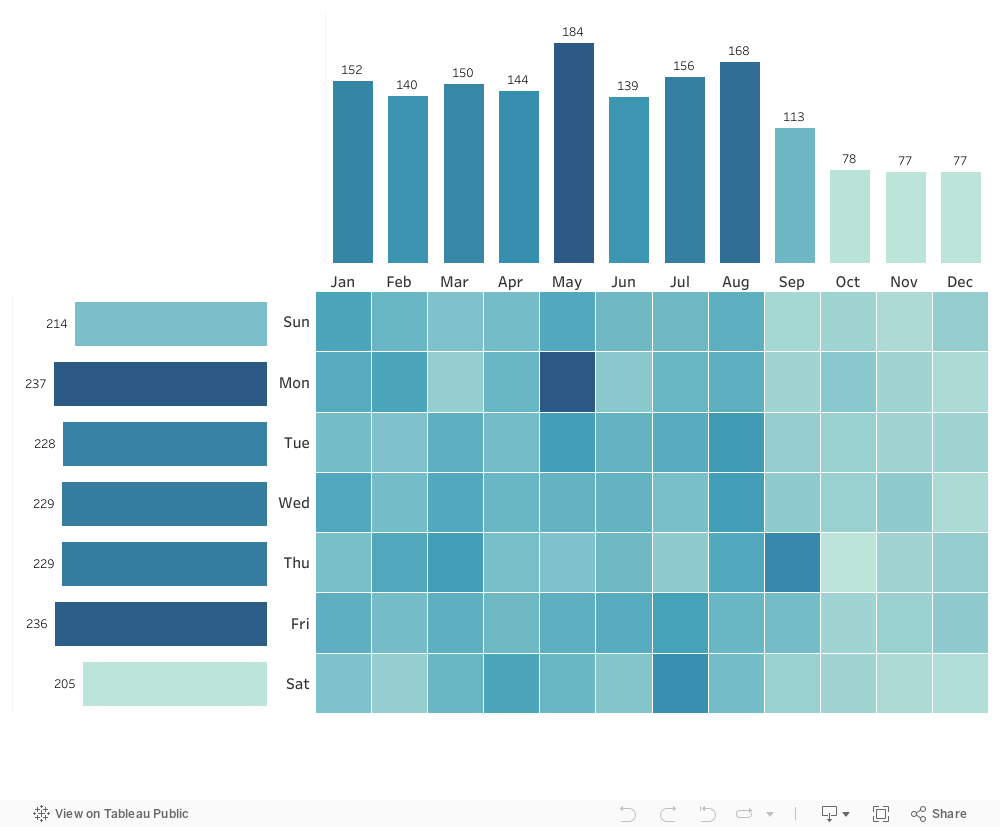
This powerful combo chart can be used with many different types of data fields. For example, you might want to create one showing the number of participants from different gender identity and age groups to see if certain gender groups within certain age brackets are not well represented among your participants.
I made this chart with Tableau Public, the free version of Tableau. But this type of chart can be created with any number of applications. For those of you with at least a little Tableau know-how, check out the steps I took in the comic strip below.

Let’s talk about YOUR data!
Got the feeling that you and your colleagues would use your data more effectively if you could see it better? Data Viz for Nonprofits (DVN) can help you get the ball rolling with an interactive data dashboard and beautiful charts, maps, and graphs for your next presentation, report, proposal, or webpage. Through a short-term consultation, we can help you to clarify the questions you want to answer and goals you want to track. DVN then visualizes your data to address those questions and track those goals.