When to (and NOT to) Use a Map

Copy of 60-SECOND DATA TIP_3.png

Reposted from December 2019

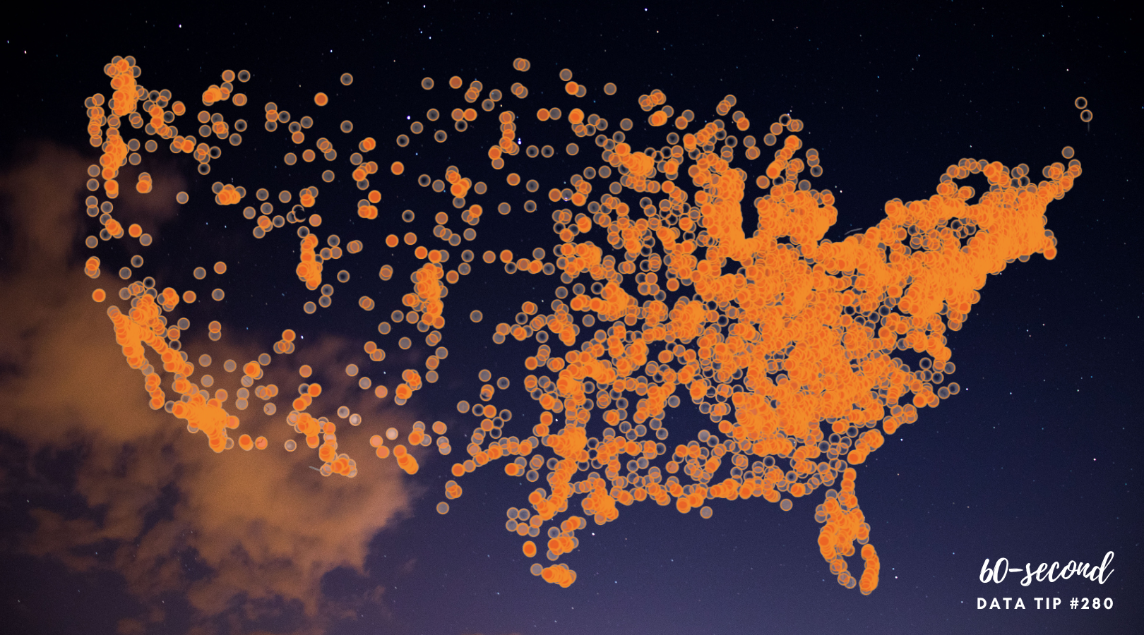
Maps can be a powerful way to show your data. But not always. Maps work best when . . .

1) Your audience already knows the geography.

Most Americans have a basic understanding of the size, demographics, land use, weather, and history of different regions of the U.S. It’s that foundational knowledge that makes maps like the following so effective. We think: wow, cows would take up all of the midwest if we put them all together, and urban housing would require only a portion of New England. Or, if only white men voted, just a few states in New England and the Northwest would go Democratic.

Source: Bloomberg

Source: Bloomberg

But when we are not familiar with the geography, maps are much less illuminating. For example, if you don’t know Ireland well, then this map does not shed much more light on the matter than the simple bar chart in the upper left hand corner. It tells us which clans are most prevalent, which is all the map also shows us unless we know more about the different regions.

Source: Brilliant Maps

2. You are showing the significance of proximity or distance.

Even if your audience is not familiar with the geography (and sometimes especially when they are not familiar with it), maps can be an effective way to show proximity or distance. This map of the Eastern Congo shows us how close armed groups (in green) are to internally displaced people (in purple). Just naming the cities or regions where these two groups are would not be effective for audience unfamiliar with the geography.

Source: Brilliant Maps

For more information on when to use a choropleth map (in which regions are filled with a color, shades or patterns to represent a value), check out this great article from Datawrapper.


Let’s talk about YOUR data!

Got the feeling that you and your colleagues would use your data more effectively if you could see it better? Data Viz for Nonprofits (DVN) can help you get the ball rolling with an interactive data dashboard and beautiful charts, maps, and graphs for your next presentation, report, proposal, or webpage. Through a short-term consultation, we can help you to clarify the questions you want to answer and goals you want to track. DVN then visualizes your data to address those questions and track those goals.


The Allure and Danger of Data Stories

Reposted from December 2018

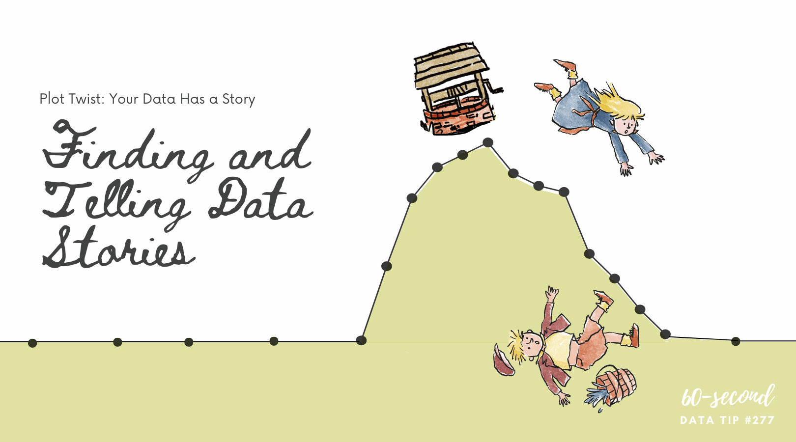
I recently read Has Data Storytelling Reached Its Peak? in which Amanda Makulec suggests that we use the term “data storytelling” cautiously. “Not every piece of data needs to be communicated as a story,” Makulec notes. “Sometimes we need to start with story-finding or just a well structured chart, rather than a full narrative arc.” I’ve had my own concerns about the term “data storytelling” which I’m sharing with you (again) today.

***

“Data” and “storytelling” are an item. You see them together all the time lately. When I first came across the term “data storytelling,” it instantly appealed to me. “Data” suggests credibility, information that has some objective basis. But data, to many of us, is boring. Its meaning is often uncertain or unclear. Or, even worse, it’s both. “Storytelling,” by contrast, suggests clarity, a plot with both excitement and resolution. So, by coupling these two words, we seem to get the best of both worlds. Data lend credibility to stories. Stories lend excitement and clarity to data.

Indeed, that’s the point of data storytelling. As Brent Dykes, a data storytelling evangelist of sorts, noted in a 2016 Forbes article, “Much of the current hiring emphasis has centered on the data preparation and analysis skills—not the ‘last mile’ skills that help convert insights into actions.” That’s where data storytelling comes in, using a combination of narrative, images, and data to make things “clear.”

But let’s step back just a minute. Why are we so drawn to stories? According to Yuval Harari, author of Sapiens: A Brief History of Humankind, the answer is:  survival. Harari maintains that humans require social cooperation to survive and reproduce. And, he suggests that to maintain large social groups (think cities and nations), humans developed stories or “shared myths” such as religions and corporations and legal systems. Shared myths have no basis in objective reality. Reality includes animals, rivers, trees, stuff you can see, hear, and touch. Rather, stories are an imagined reality that governs how we behave. The U.S. Declaration of Independence states: “We hold these truths to be self-evident: that all men are created equal . . . “ Such “truths” may have seemed obvious to the framers, but Harari notes that there is no objective evidence for them in the outside world.  Instead, they are evident based on stories we have told and retold until they have the ring of truth.

So stories (in the past and present) are not about telling the whole truth and nothing but the truth. Instead, they are often about instruction: whom to trust, how to behave, etc. And we should keep this in mind when telling and listening to “data stories.” To serve their purpose, stories leave out a lot of data — particularly data that doesn’t fit the arc of the story. For example, you might not hear about a subgroup whose storyline is quite different from the majority. Or, indeed the story might focus exclusively on a subgroup, ignoring truths about the larger group.

Bottom line: listener beware. A story, whether embellished with data or not, is still just a story. And truth can lie both within and outside of that story.


Let’s talk about YOUR data!

Got the feeling that you and your colleagues would use your data more effectively if you could see it better? Data Viz for Nonprofits (DVN) can help you get the ball rolling with an interactive data dashboard and beautiful charts, maps, and graphs for your next presentation, report, proposal, or webpage. Through a short-term consultation, we can help you to clarify the questions you want to answer and goals you want to track. DVN then visualizes your data to address those questions and track those goals.


When to (and NOT to) Use a Map

Copy of 60-SECOND DATA TIP_3.png

Maps can be a powerful way to show your data. But not always. Maps work best when . . .

1) Your audience already knows the geography.

Most Americans have a basic understanding of the size, demographics, land use, weather, and history of different regions of the U.S. It’s that foundational knowledge that makes maps like the following so effective. We think: wow, cows would take up all of the midwest if we put them all together, and urban housing would require only a portion of New England. Or, if only white men voted, just a few states in New England and the Northwest would go Democratic.

Source: Bloomberg

Source: Bloomberg

Source: Brilliant Maps

But when we are not familiar with the geography, maps are much less illuminating. For example, if you don’t know Ireland well, then this map does not shed much more light on the matter than the simple bar chart in the upper left hand corner. It tells us which clans are most prevalent, which is all the map also shows us unless we know more about the different regions.

Source: Brilliant Maps

2. You are showing the significance of proximity or distance.

Even if your audience is not familiar with the geography (and sometimes especially when they are not familiar with it), maps can be an effective way to show proximity or distance. This map of the Eastern Congo shows us how close armed groups (in green) are to internally displaced people (in purple). Just naming the cities or regions where these two groups are would not be effective for audience unfamiliar with the geography.

Source: Brilliant Maps

I found all of these maps on Grafiti.

Data Viz for Nonprofits helps organizations to effectively and beautifully present their data on websites, reports, slide decks, interactive data dashboards and more. Click HERE to learn more about our services and HERE to set up a meeting to discuss how we can meet your particular needs.

The Allure and Danger of Data Stories

60-SECOND DATA TIP (1).png

“Data” and “storytelling” are an item. You see them together all the time lately.

When I first came across the term “data storytelling,” it instantly appealed to me. “Data” suggests credibility, information that has some objective basis. But data, to many of us, is boring. Its meaning is often uncertain or unclear. Or, even worse, it’s both. “Storytelling,” by contrast, suggests clarity, a plot with both excitement and resolution. So, by coupling these two words, we seem to get the best of both worlds. Data lend credibility to stories. Stories lend excitement and clarity to data.

Indeed, that’s the point of data storytelling. As Brent Dykes, a data storytelling evangelist of sorts, noted in a 2016 Forbes article, “Much of the current hiring emphasis has centered on the data preparation and analysis skills—not the ‘last mile’ skills that help convert insights into actions.” That’s where data storytelling comes in, using a combination of narrative, images, and data to make things “clear.”

But let’s step back just a minute. Why are we so drawn to stories? According to Yuval Harari, author of Sapiens: A Brief History of Humankind, the answer is:  survival. Harari maintains that humans require social cooperation to survive and reproduce. And, he suggests that to maintain large social groups (think cities and nations), humans developed stories or “shared myths” such as religions and corporations and legal systems. Shared myths have no basis in objective reality. Reality includes animals, rivers, trees, stuff you can see, hear, and touch. Rather, stories are an imagined reality that governs how we behave. The U.S. Declaration of Independence states: “We hold these truths to be self-evident: that all men are created equal . . . “ Such “truths” may have seemed obvious to the framers, but Harari notes that there is no objective evidence for them in the outside world.  Instead, they are evident based on stories we have told and retold until they have the ring of truth.

So stories (in the past and present) are not about telling the whole truth and nothing but the truth. Instead, they are often about instruction: whom to trust, how to behave, etc. And we should keep this in mind when telling and listening to “data stories.” To serve their purpose, stories leave out a lot of data — particularly data that doesn’t fit the arc of the story. For example, you might not hear about a subgroup whose storyline is quite different from the majority. Or, indeed the story might focus exclusively on a subgroup, ignoring truths about the larger group.

Bottom line: listener beware. A story, whether embellished with data or not, is still just a story. And truth can lie both within and outside of that story.

See other data tips in this series for more information on how to effectively visualize and make good use of your organization's data.