“It’s not the mere presence of data that gives the presenter power,” notes Joel Schwartzberg in his Harvard Business Review article on presenting data, “It’s how that data is presented.” Below is my 60-second review of Schwartzberg’s helpful tips. But before you scroll down, see how much you already know. Take a look at the “Before” slide below and consider what changes you would make to it. Then advance to the “After” slide (by clicking on the right side of the image) to see a revised version that follows Schwartzberg’s guidelines.
One point per slide. Have one key takeaway for each slide and write a slide title that reinforces your point rather than something generic like “Performance by Quarter in 2023.”
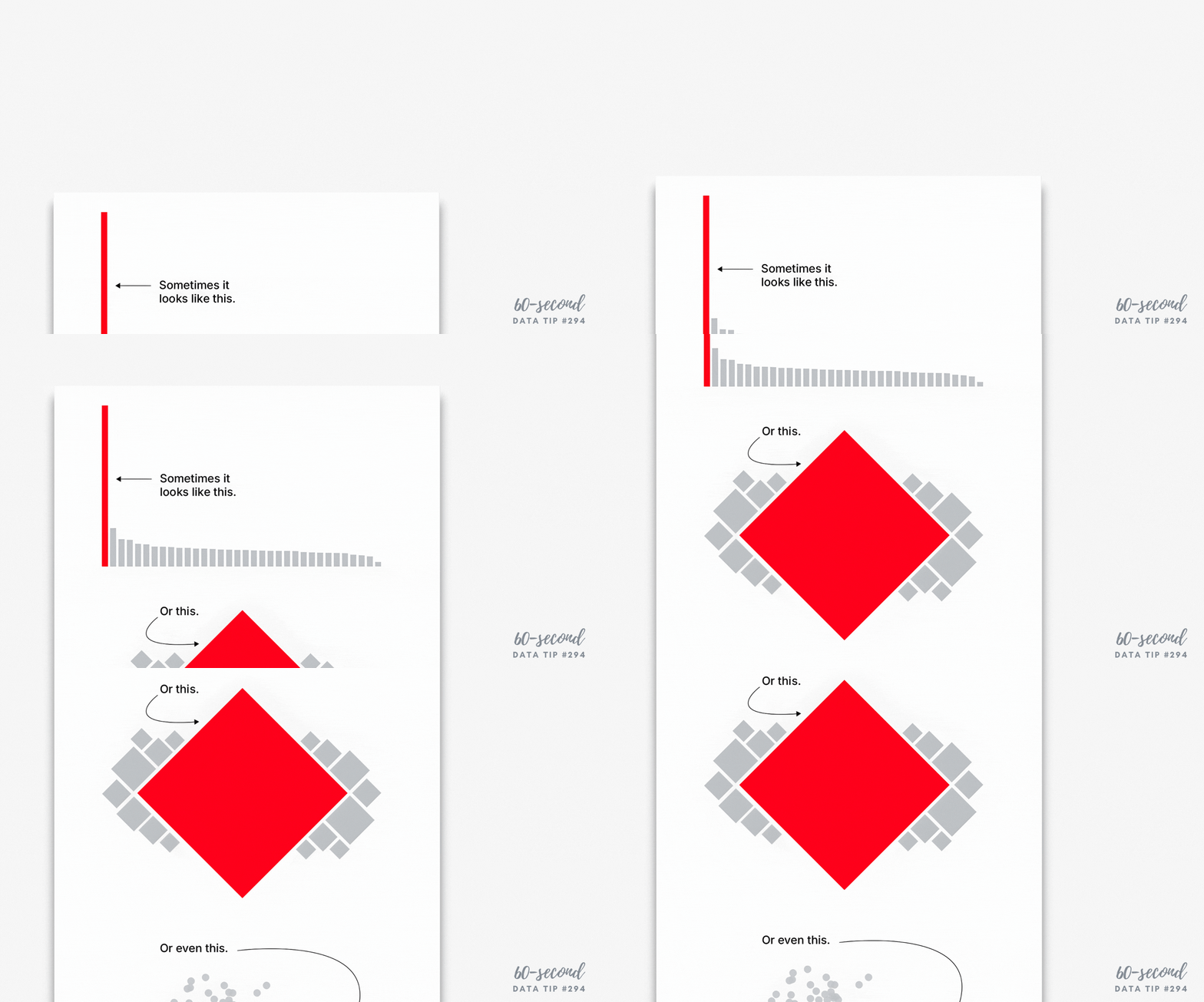
Visually highlight “Aha” zones. Use a bright color to direct attention to a key data point and gray out the rest.
Make charts readable from across the room. If you have to say “You probably can’t read this but it shows that . . . “ then it needs revision. Don’t use font sizes smaller than 18 points.
Labels are clear and intuitive. Your audience needs to decode your chart in a few seconds. Make sure axis and data labels are understandable.
To see past data tips, click HERE.
Let’s talk about YOUR data!
Got the feeling that you and your colleagues would use your data more effectively if you could see it better? Data Viz for Nonprofits (DVN) can help you get the ball rolling with an interactive data dashboard and beautiful charts, maps, and graphs for your next presentation, report, proposal, or webpage. Through a short-term consultation, we can help you to clarify the questions you want to answer and goals you want to track. DVN then visualizes your data to address those questions and track those goals.


