
Reposted from May 2022
Sometimes we approach the challenge of sharing data with others as if we were trying to con a pet into taking a pill. We think that our audience is too busy, disinterested, or distracted to focus on the data. So we wrap it in something that attracts their attention and feed it to them as quickly as possible. The problem with this approach is that it may get the data into their brains—momentarily—but it won’t stay there long. See where the pill ends up in this video.
If we want others to LEARN from the data — which involves not only retaining it but also drawing knowledge from it and applying that knowledge in the future — then we need a different approach. Daniel Kahneman’s Thinking Fast and Slow can help us.
First a little background on how the brain works, according to the evidence Kahneman presents. For learning to happen, information first must get past System 1 of our brains. This is where fast thinking happens. System 1 is the harried gate keeper, madly processing all of the information that comes in through our senses, pitching most of it, keeping only what is deemed necessary. But making it through the gate is only half the battle. Once in, information confronts System 2. This is the part of the brain that allows for conscious thought or slow thinking. The problem is that System 2 is lazy. Conscious thought is hard, and System 2 is always looking for an excuse to avoid it. However, if System 2 engages with information, the resulting knowledge can find its way to long-term memory and learning happens.
So the challenge when presenting data is to make it past System 1 AND engage System 2. Let’s consider a series of vizes from Harvard Business Review (HBR) that I think meets both parts of this challenge. Yes, it’s an example from the for-profit world, but could easily work with nonprofit data. See snapshot of the first viz in the series below .
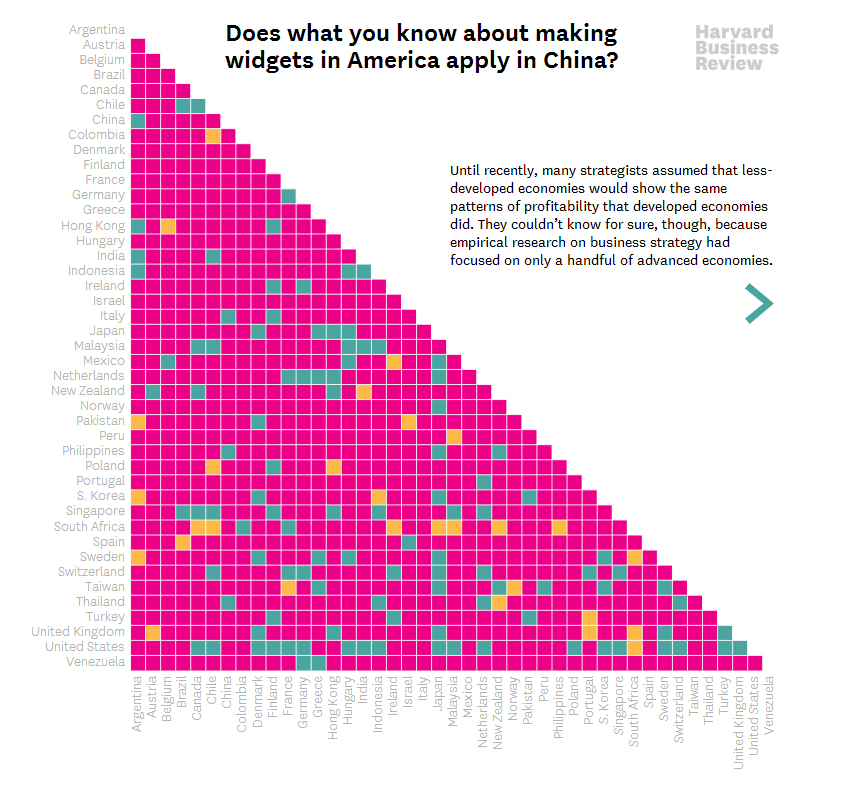
Source: Harvard Business Review
How to get data past System 1
Getting data past the System 1 fast-thinking gate keeper is all about grabbing attention. We process images much more quickly than words and numbers, so images are a great foot-in-the-door. The HBR viz does it with bright colors and a cool-looking, somewhat unusual chart. There’s plenty of information out there about how to attract attention, including the use of images with:
Stand out colors and textures
Human faces (we are wired to focus on them)
Novelty (images that are unusual in size, placement, etc.)
Data visualizations can use color as well as images to draw attention. But getting past System 1 is not nearly enough. For learning to happen, the viz also has to engage System 2.
How to engage System 2
System 2 is smart but lazy. So we need to pique its interest. The HBR viz starts with a title that poses a question. When confronted with an interesting question, we may be more likely to stick around for an answer. Then the viz leads you through the answer in a visually engaging way (see interactive version of the viz HERE). These are two great ways to slow down and engage the brain with data. Here’s a list of ways to engage System 2:
Ask a question in the title as the HBR viz does—questions beg answers.
Make it personal. We may be more likely to engage with data when we have a personal connection with it. This New York Times viz, for example, allows you to enter in your county to see what the barriers to COVID vaccination are in your area.
Highlight a surprising finding. Many of us love the counterintuitive and the creative. If you draw attention to something new that the data suggests, you may have a better chance at hooking System 2. For example, this viz from The Economist shows that China emits far less greenhouse gas per person than Western countries at the same stage of economic development. Or check out this viz by Dimiter Toshkov showing that small countries can be big players in development and good governance.
Hand draw it. There is some evidence that making information harder to consume, for example by presenting it with harder-to-read fonts, makes the brain slow down and engage in effortful and analytic processing. Although the jury is still out on this, I do find myself more likely to engage in hand-drawn vizes like two of the winners of the World Data Visualization Prize in 2019. Perhaps it’s simply the novelty of hand-drawn charts that engages me. Anyway, it’s something you might consider, and all you need is a pen and paper.
Walk them through it. A great way to slow down your viewers is to set the pace by walking them through the data as HBR does in the example. I love how HBR presents what the data might look like if our assumptions were confirmed followed by what it actually looks like.
Sources: Veritasium, Visual Content Space, MIT News, Springer Link,
Let’s talk about YOUR data!
Got the feeling that you and your colleagues would use your data more effectively if you could see it better? Data Viz for Nonprofits (DVN) can help you get the ball rolling with an interactive data dashboard and beautiful charts, maps, and graphs for your next presentation, report, proposal, or webpage. Through a short-term consultation, we can help you to clarify the questions you want to answer and goals you want to track. DVN then visualizes your data to address those questions and track those goals.


