“Perfection is achieved, not when there is nothing more to add, but when there is nothing left to take away.”
―Antoine de Saint-Exupéry, Airman's Odyssey
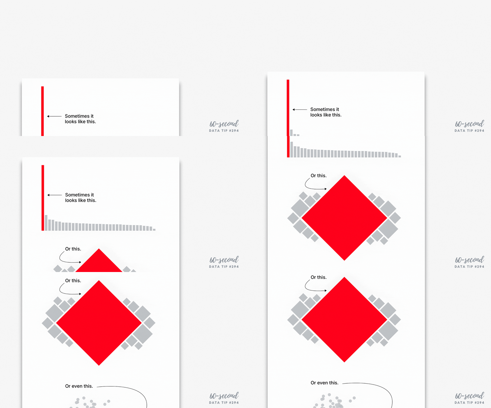
If you have heard of any data viz guru, it’s probably Edward Tufte. And if you know one thing about Tufte, it’s probably the data-to-ink ratio. The data-to-ink ratio is the amount of ink (or pixels) that convey the data divided by the total ink (or pixels) used in the entire chart. The ratio, according to Tufte, should be as close to one as possible. In other words, most of the ink/pixels should be conveying data, and you should remove as much non-data ink/pixels as possible. Click through Joey Cherdarchuk’s slides below for a great example of what Tufte is talking about.
Source: Darkhorse Analytics
To see past data tips, click HERE.
Let’s talk about YOUR data!
Got the feeling that you and your colleagues would use your data more effectively if you could see it better? Data Viz for Nonprofits (DVN) can help you get the ball rolling with an interactive data dashboard and beautiful charts, maps, and graphs for your next presentation, report, proposal, or webpage. Through a short-term consultation, we can help you to clarify the questions you want to answer and goals you want to track. DVN then visualizes your data to address those questions and track those goals.


