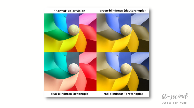
In a series of 60-second data tips, I’m taking on one basic accessiblity issue at at time. This week it’s color. About 1 in 20 people have color blindness meaning that two colors which appear distinct to a person with normal color vision may appear to be the same to a person with color blindness. There are different types of color blindness (as shown above), but the most common is red/green color blindness (aka deuteranopia). Becasuse color plays an important role in many data vizes by drawing attention to certain trends, distinguishing among categories, or illustrating relationships, we should be careful in choosing colors to make our visualizations accessible to more people.
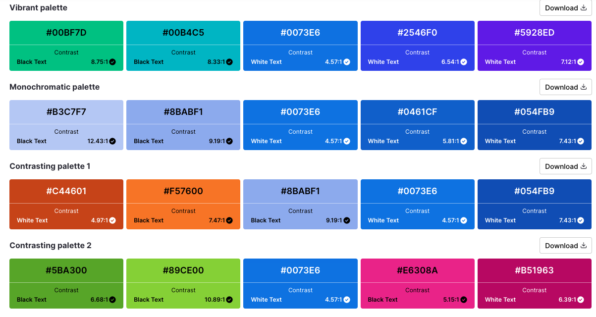
Some data viz tools, such as Tableau, have built-in colorblind palettes. You can also generate an accessible color palette using an online generator like this one from Venngage.
If you are interested in a deep dive into accessibility issues and solutions, you can find plenty of information online including Chartability.
To see past data tips, click HERE.
Sources: Coloring for Colorblindness, Build Accessible Dashboards by Tableau, Accessible color palette generator by Venngage
Let’s talk about YOUR data!
Got the feeling that you and your colleagues would use your data more effectively if you could see it better? Data Viz for Nonprofits (DVN) can help you get the ball rolling with an interactive data dashboard and beautiful charts, maps, and graphs for your next presentation, report, proposal, or webpage. Through a short-term consultation, we can help you to clarify the questions you want to answer and goals you want to track. DVN then visualizes your data to address those questions and track those goals.


