Text in charts can clarify your data or clutter it. To get it right, here are two key tips:
1. Make text slightly darker than the marks.
Marks are the visual elements that represent your data—lines, circles, bars, or shapes. Labels and annotations should be easy to read but not compete with the data itself. A good rule: make your text a bit darker than your marks.
2. Follow the “Z” pattern.
In cultures that read left to right and top to bottom, the eye naturally moves across a page in a Z shape. Position important annotations along this path—top left, across, down diagonally, and then across the bottom. This helps people notice key takeaways at just the right moment in their visual journey.
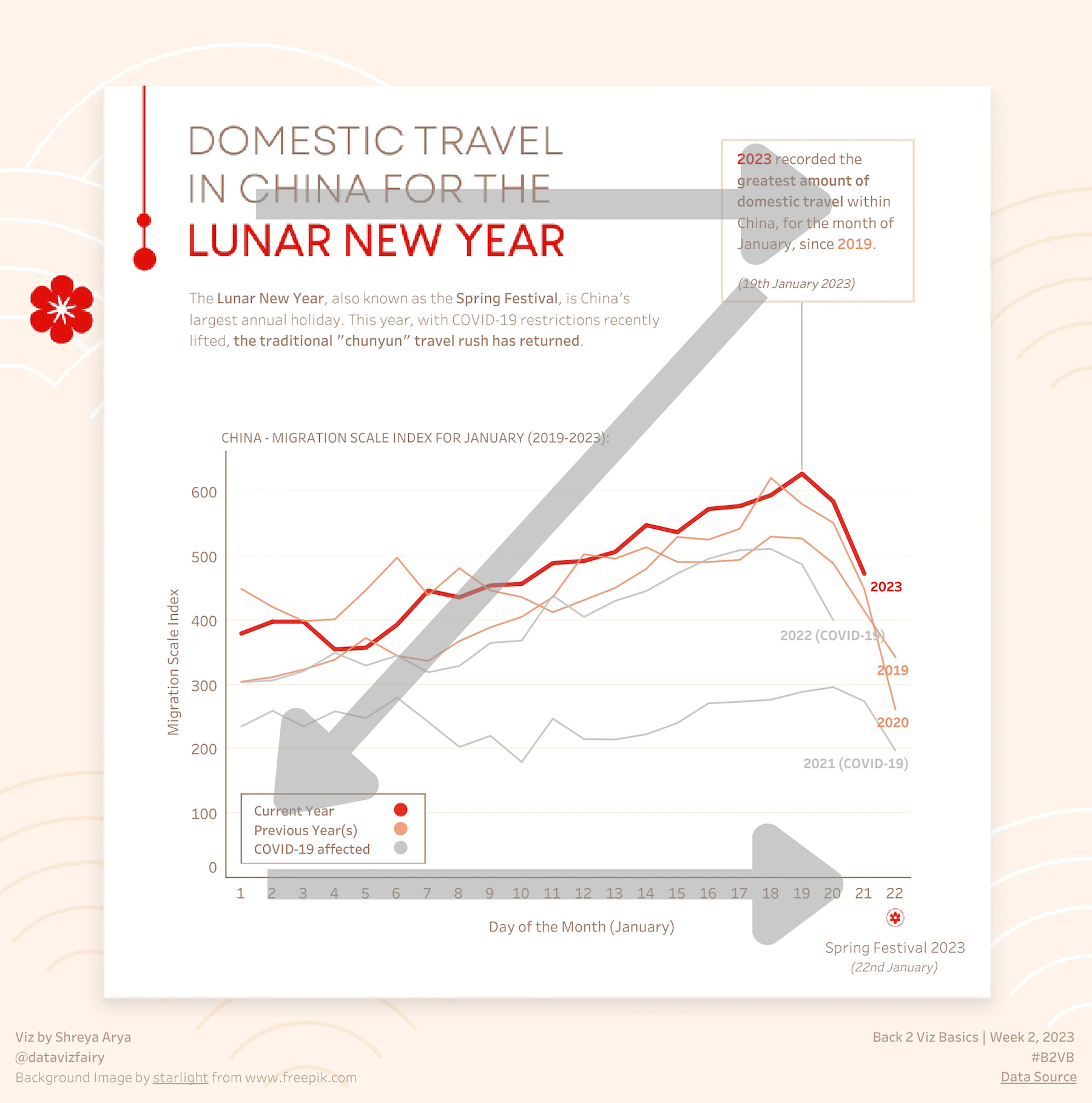
Consider this example with the “Z” pattern superimposed on it. This chart places the title, key annotation, color legend, and horizontal axis along the Z, helping us to easily pull out the key information.

Let’s talk about YOUR data!
Got the feeling that you and your colleagues would use your data more effectively if you could see it better? Data Viz for Nonprofits (DVN) can help you get the ball rolling with an interactive data dashboard and beautiful charts, maps, and graphs for your next presentation, report, proposal, or webpage. Through a short-term consultation, we can help you to clarify the questions you want to answer and goals you want to track. DVN then visualizes your data to address those questions and track those goals.


