Reposted from June 1, 2021
Data can’t take you all the way to a decision. In real life, you will never have enough data. So you’ll need to apply your own experience and your colleagues’ experiences to understand the implications of data for your work. Here’s a great way to apply experience to data. It’s from Dabbling In The Data: A Hands-On Guide to Participatory Data Analysis, a guide from Public Profit.
Dabbling in The Data describes how to do this group activity in person. I’ve adapted it to an online experience using Canva, but you can use any brainstorming app that allows for real-time collaboration. It’s simple yet powerful.

Step 1: Choose a template.
Sign up for a free Canva account. Click on “Create a design” in the upper right corner of the screen, select “whiteboard” from the dropdown list, and then select a template on the sidebar (A). I chose this template from the “Brainwriting” template group.

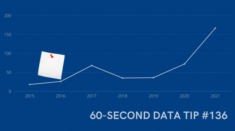
Step 2: Add a chart and customize.
Next add a chart showing change over time on some key measure you want to better understand. In this example, the key measure is the number of lessons provided to participants over a 7-year period. You can cut and paste an image of the chart from another program like Excel, or you can create the chart in Canva by click on the “Elements” tab in the sidebar (see B above), choosing a chart type, and then entering the data points (see C above.) I’ve added a chart and customized the instructions and notepads below. Note, it’s important to position the chart backward (see D above) and lock the chart in place (see E above) so that others can place notepads on top of the chart.

Step 3: Share the chart with your colleagues and invite them to add milestones.
Your colleagues will need free Canva accounts as well. To share the chart in real time, click on “Share” (see F above) and type in your colleagues' email addresses, making sure to allow them to edit the design. Ask the group to think about the key organizational milestones that occurred during the time represented in the chart and to add those milestones to the chart using the notepads at the bottom of the screen. Encourage them to also add detail to notepads added by others.

Step 4: Discuss.
Discuss how changes in the key metric over time might be related to the organizational milestones. Consider how this understanding of pivotal events can help you better show progress to stakeholders and to plan for the future. For example, if the implementation of a new program was followed by a decrease in participation, what about the new program may have caused the decrease? What else was going on at the time that may have contributed to the decline?
To see past data tips, click HERE.
Let’s talk about YOUR data!
Got the feeling that you and your colleagues would use your data more effectively if you could see it better? Data Viz for Nonprofits (DVN) can help you get the ball rolling with an interactive data dashboard and beautiful charts, maps, and graphs for your next presentation, report, proposal, or webpage. Through a short-term consultation, we can help you to clarify the questions you want to answer and goals you want to track. DVN then visualizes your data to address those questions and track those goals.


