
Have you played around with Canva? It’s a great, free online design tool. It includes lots of images and gifs and is easy to learn. Canva has a number of simple chart designs that you can adapt to your needs. After starting a design in Canva, click on “Elements” and then type in “chart” in the search window to see the chart options shown in the image below. Each allows you to customize the chart by entering in a few data points.
But I wondered how I could use other options in Canva to hack out some fun charts. Scroll down to see what I came up with.

Chart Hacks
Start a design in Canva by clicking on the “Create A Design” button (upper right corner of screen), selecting a size (such as presentation), and then try one of my hacks.
HACK 1: Use images to build bars: For this bar chart hack, I selected “Elements” and then searched for images of backpacks and then stacked them (by dragging and dropping) to create a bar chart about homework completion. You can use the “Show Rulers and Guides” option on the File menu to make the bars the right length.

HACK 2: Use icons to make a pictogram chart. Pictogram charts use icons to represent small sets of data. Each icon can represent one unit or any number of units (e.g. each icon represents 10). For this chart, I found a human graphic by selecting “Elements” and then searching for “human.” Then I colored the icons to show the number of students with failing grades and added labels using the text option on the left.

HACK 3: Use grids and photos to create a timeline of programs and events. Select “Elements” and type in “grid” in the search window. Canva will give you a bunch of frame options. Choose one and then select “uploads” to import photos of your organization’s events and programs. Then simply drag and drop photos into the grid and label bars using the text option on the left as in this example. Drag in a photo of something white for the empty cells.

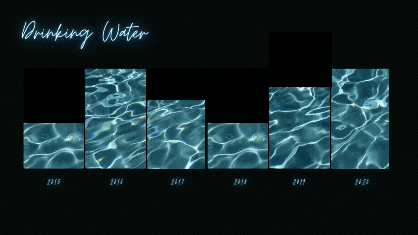
HACK 4: Use frames and videos to create moving charts. For a bar chart like the one shown below, select “Elements” and type in “frame” in the search window. Canva will give you a bunch of frame options. Choose a rectangle shaped frame and place in the design, using the “Show Rulers and Guides” option on the File menu to make your bars the right length. Then select “Elements” and type in a key word for the type of image you want. I typed in “water.” Under the search window, click on “Videos” to show only video elements. Then drag and drop videos into the frames and label using the text option on the left.
For something like the line chart shown below, select “Elements” and type in “chart.” Select a line chart option and fill in data as needed. Then type in “frame” in the Elements search window. Choose a circle shaped frame and place in design over a data point, adjusting size as desired. Then select “Elements” and type in a key word for the type of image you want. I typed in “glow.” Under the search window, click on “Videos” to show only video elements. Then drag and drop a video into the frame. Use the “Position” button in the upper right corner to place the video “backward” (i.e. behind the chart). Label using the text option on the left.

Let’s talk about YOUR data!
Got the feeling that you and your colleagues would use your data more effectively if you could see it better? Data Viz for Nonprofits (DVN) can help you get the ball rolling with an interactive data dashboard and beautiful charts, maps, and graphs for your next presentation, report, proposal, or webpage. Through a short-term consultation, we can help you to clarify the questions you want to answer and goals you want to track. DVN then visualizes your data to address those questions and track those goals.


