Small design decisions can make a huge difference. You don’t need a total redesign to improve your charts. Often, a few subtle adjustments can improve clarity, accessibility, and focus.
Here are three quick chart tweaks that deliver big results.
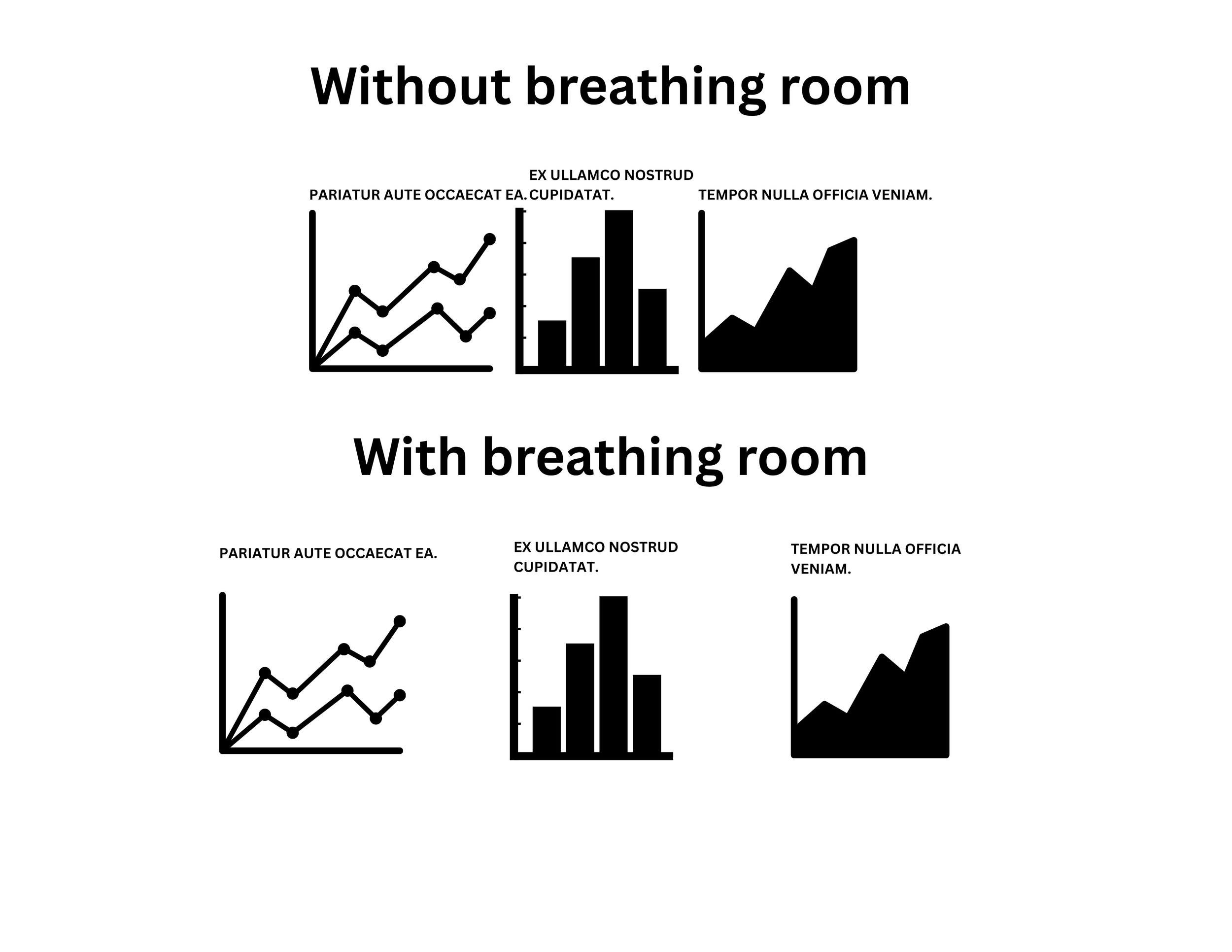
1. Add Breathing Room
Cramped visuals cause confusion. Let your chart elements breathe. Increase padding around chart components, avoid overlapping text, and keep margins generous—especially on dashboards.
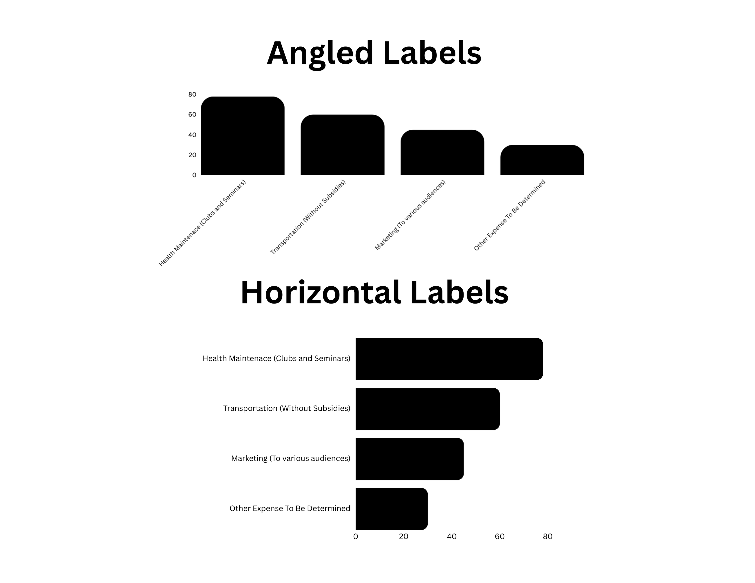
2. Use Horizontal Labels Strategically
Angled or vertical labels can slow down interpretation. Where possible, use horizontal axis labels and rotate only when space is truly limited.
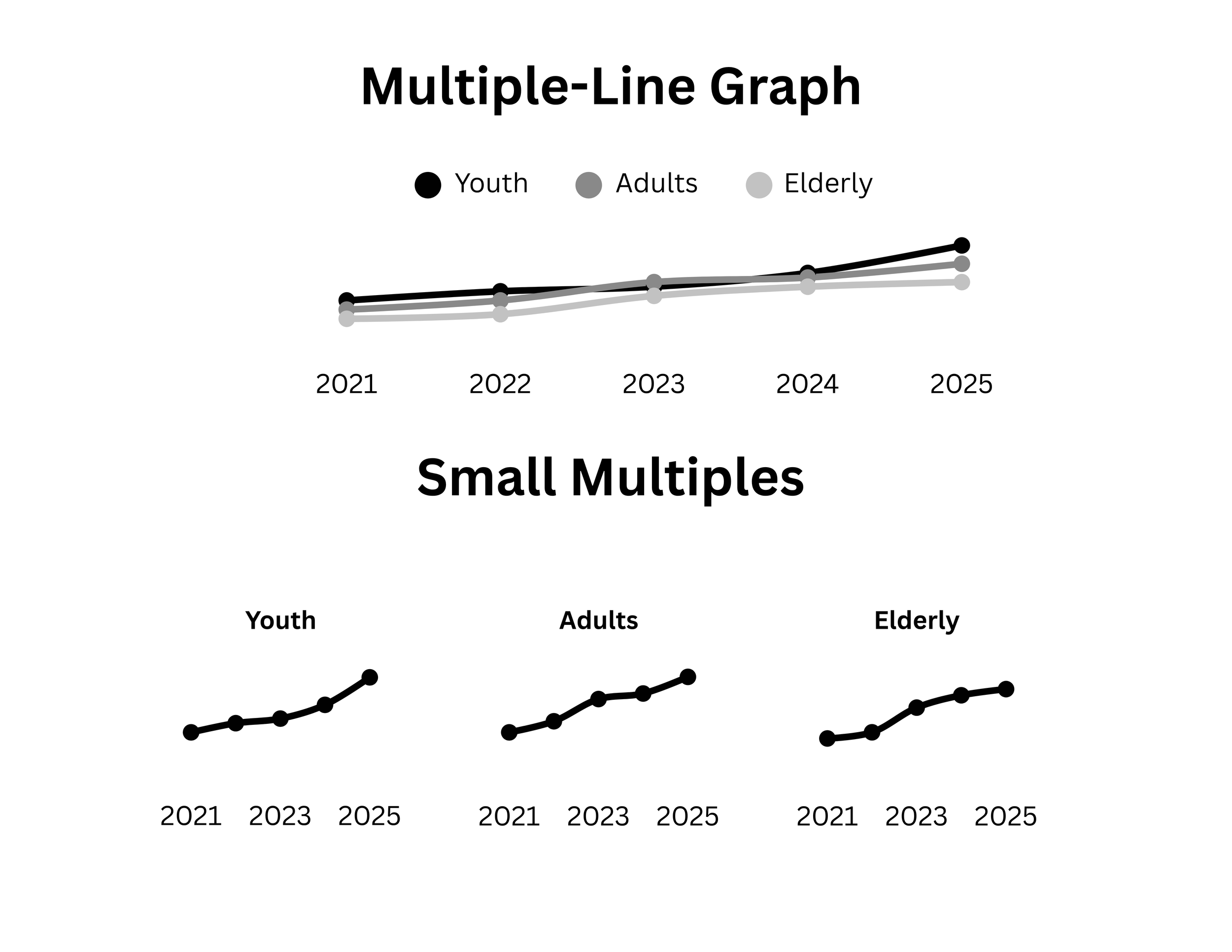
3. Try Small Multiples for Comparison
When one chart feels crowded or ambiguous, breaking it into a grid can make patterns pop. Try this: Show one mini-chart per group (e.g. per region or program) with the same scale to enable quick comparisons.
Let’s talk about YOUR data!
Got the feeling that you and your colleagues would use your data more effectively if you could see it better? Data Viz for Nonprofits (DVN) can help you get the ball rolling with an interactive data dashboard and beautiful charts, maps, and graphs for your next presentation, report, proposal, or webpage. Through a short-term consultation, we can help you to clarify the questions you want to answer and goals you want to track. DVN then visualizes your data to address those questions and track those goals.