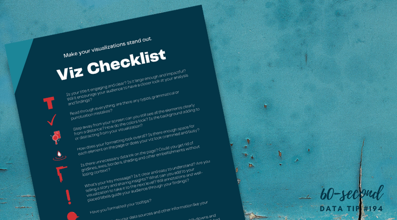
Data visualizers from around the world flex their muscles each week by creating charts, maps, and graphs using a common data set. It’s called Makeover Monday. Even if you don’t participate, it’s a great way to see the range of ways a single data set can be visualized and to consider the pros and cons of different approaches. Check out the Makeover Monday site which provides a wealth of information from past Makover Monday challenges including favorite vizes associated with each challenge. The Makeover Monday folks also shared this “Viz Checklist” with the world. And I’m offering it up as this week’s data tip. Use it next time you visualize data to ensure a polished result.

Source: https://www.makeovermonday.co.uk/
To see past data tips, click HERE.
Let’s talk about YOUR data!
Got the feeling that you and your colleagues would use your data more effectively if you could see it better? Data Viz for Nonprofits (DVN) can help you get the ball rolling with an interactive data dashboard and beautiful charts, maps, and graphs for your next presentation, report, proposal, or webpage. Through a short-term consultation, we can help you to clarify the questions you want to answer and goals you want to track. DVN then visualizes your data to address those questions and track those goals.


