
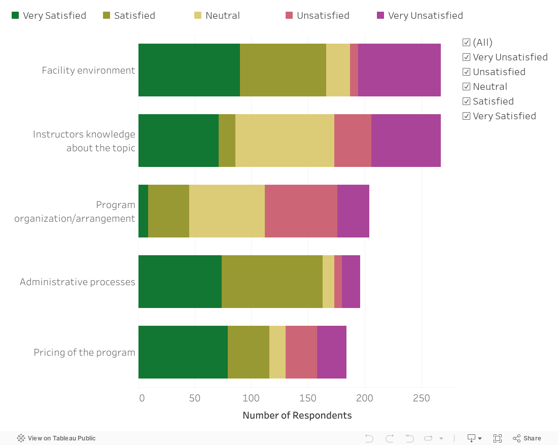
Here’s a simple solution to a problem with stacked bar charts. Yes, they allow you to compare the size of different groups as well as the subgroups within each group. But comparing the subgroups is tough because — for all but one of the subgroups — you have to compare the length of the bar segments without a common baseline.
The bar chart below, created with Tableau, solves that problem by adding a filter so that you can see the whole bars by selecting “All” but also see only one or more subgroups so you can easily make comparisons across just those subgroups. In this chart, I’ve also set the sort order so that it’s always in descending order regardless of the filter selections. See info below on how I set the sort order in Tableau.
See how this chart works by interacting with it yourself! Change the selections on the checkboxes.

To sort questions in descending order regardless of the response option chosen, click the dropdown arrow on Question in the rows shelf and select Sort . . .

. . . .Then choose to sort by Field in descending sort order and choose the name of the field that indicates number of respondents.
To see past data tips, click HERE.
Let’s talk about YOUR data!
Got the feeling that you and your colleagues would use your data more effectively if you could see it better? Data Viz for Nonprofits (DVN) can help you get the ball rolling with an interactive data dashboard and beautiful charts, maps, and graphs for your next presentation, report, proposal, or webpage. Through a short-term consultation, we can help you to clarify the questions you want to answer and goals you want to track. DVN then visualizes your data to address those questions and track those goals.


