9 Ways to Make Your Data Visualizations Stand Out

Data visualizers from around the world flex their muscles each week by creating charts, maps, and graphs using a common data set. It’s called Makeover Monday. Even if you don’t participate, it’s a great way to see the range of ways a single data set can be visualized and to consider the pros and cons of different approaches. Check out the Makeover Monday site which provides a wealth of information from past Makover Monday challenges including favorite vizes associated with each challenge. The Makeover Monday folks also shared this “Viz Checklist” with the world. And I’m offering it up as this week’s data tip. Use it next time you visualize data to ensure a polished result.

Source: https://www.makeovermonday.co.uk/

To see past data tips, click HERE.


Let’s talk about YOUR data!

Got the feeling that you and your colleagues would use your data more effectively if you could see it better? Data Viz for Nonprofits (DVN) can help you get the ball rolling with an interactive data dashboard and beautiful charts, maps, and graphs for your next presentation, report, proposal, or webpage. Through a short-term consultation, we can help you to clarify the questions you want to answer and goals you want to track. DVN then visualizes your data to address those questions and track those goals.


Why and How To Use Free Data

There’s a treasure trove of free data out there. And I know what you are thinking: “I can barely deal with my own data much less anyone else’s!” But think again. What if you could show the need for your services, your potential audiences, or other factors that affect your work without having to collect any data yourself?

Here’s an example of something you might do. I downloaded free data (in the form of an Excel spreadsheet) from the U.S. Department of Agriculture’s website on food access in 2019. I then combined this data with a list of counties that a (fictional) organization serves in Illinois to create the map below.

You can find any number of websites with lists of free data sources, such as this one. I found the USDA data by following the link from this page to Data.gov which is home to the US government’s open data.* I then clicked on “Data” on the navigation menu and searched for the topic of interest to me.

Fair warning, when searching for free data online, you are likely to find yourself in quite a few rabbit holes. So here are a few tips to make your search more fruitful:

  • Before you begin searching, know what you are looking for. Consider what geographies, time periods, or populations you need. Also, think about what data format you need. Perhaps you can only deal with Excel or CSV files. When visiting a free data site, determine if any of the data files available for download meet your needs asap. If it’s not clear, then give up and try another site.

  • If you need local data, check out your city government’s website. Many have open data available for download.*

  • Look for a data dictionary or some other type of documentation to understand what is included in the data, how the data was collected, and what each data field means. Sometimes this is included on a tab in the downloaded data file. Pay attention to what might be missing from the data and the biases that could be baked into it.

  • Link back to data sources (or attribute with text) when showing the data in charts, maps, and graphs.

  • Combine free data with your own data using zip codes, city names, census tracts or other data fields to link the two data sources.


    * Open data is data that can be freely used, re-used, and redistributed by anyone, subject only, at most, to the requirement to attribute and share-alike.


Let’s talk about YOUR data!

Got the feeling that you and your colleagues would use your data more effectively if you could see it better? Data Viz for Nonprofits (DVN) can help you get the ball rolling with an interactive data dashboard and beautiful charts, maps, and graphs for your next presentation, report, proposal, or webpage. Through a short-term consultation, we can help you to clarify the questions you want to answer and goals you want to track. DVN then visualizes your data to address those questions and track those goals.


How To Activate Board Member Fundraising With Visuals

I recently came across this excellent article by The Fundraising Authority. As promised in the title, it provides a “Simple, Step-by-Step Process for Getting Your Board to Refer New Prospects to Your Non-Profit.” In a nutshell, here are the four steps:

  1. Explain how referrals work and assure your board members that no one they refer will be asked for money until they indicate a desire to get involved.

  2. Show board members how many people they actually know through a mind mapping exercise.

  3. Ask board members for referrals usually in person.

  4. Bring referral success stories back to board meetings on a regular basis.

My tip is to enhance steps 2 and 4 with visuals.

Visuals for Step 2: For the mind map, the point is for board members to brainstorm all the people they know by considering people in different categories of their lives. You can use Canva whiteboards (or a similar tool) to create a mind map that the board member (pictured in the middle) can use to add the names of people in each category on virtual post-it notes.

Visuals for Step 4: The article claims that “this is a key step. Nothing will convince your board members to bring you more referrals than hearing from other board members that have done it successfully.” You can visualize the donors that various board members brought in using tools like Flourish to show their networks, as in this example. Scroll over the circles to interact with it and learn more. Some board members brought in donors who, in turn, brought in other donors. To make something similar, select one of the network graph templates on Flourish and fill in the data needed. (See snapshots of the data I added for the visual below.)

Links data

(used to show who is connected to whom)

Points data

(used to show groups by color, size points according to amount of donations, and add images for board members)

To see past data tips, click HERE.


Let’s talk about YOUR data!

Got the feeling that you and your colleagues would use your data more effectively if you could see it better? Data Viz for Nonprofits (DVN) can help you get the ball rolling with an interactive data dashboard and beautiful charts, maps, and graphs for your next presentation, report, proposal, or webpage. Through a short-term consultation, we can help you to clarify the questions you want to answer and goals you want to track. DVN then visualizes your data to address those questions and track those goals.


Ideas You Should Steal From This Viz (Installment 6)

Today I offer up yet another steal-worthy viz called “Flags of Inequality” created by Rita Costa and Beatriz Malveiro. Below is a partial view of the viz. But to have the whole experience and to see why I think it’s so great, click HERE.

The magic in this viz is the way the creators lead you through the meaning of each color. Color legends don’t get much attention in most vizes. But this viz guides you through the legend before showing you any data at all. It works well because, while the pride flag may be familiar to us, the various types of LGBTI equality laws and policies represented by the colors may not be. So the viz first grounds us in the meaning behind the colors so that we can fully appreciate the flags and make comparsions among countries. If you have data with complex or unfamilar categories, starting with the color legend might be a good idea.

To see past data tips, click HERE.


Let’s talk about YOUR data!

Got the feeling that you and your colleagues would use your data more effectively if you could see it better? Data Viz for Nonprofits (DVN) can help you get the ball rolling with an interactive data dashboard and beautiful charts, maps, and graphs for your next presentation, report, proposal, or webpage. Through a short-term consultation, we can help you to clarify the questions you want to answer and goals you want to track. DVN then visualizes your data to address those questions and track those goals.


Best Data Viz of 2022

Looking for a fun (if somewhat geeky) study/work break? Check out these best-of lists for 2022:

New York Times

Toward Data Science

Vox

FiveThirtyEight

FlowingData

To see past data tips, click HERE.


Let’s talk about YOUR data!

Got the feeling that you and your colleagues would use your data more effectively if you could see it better? Data Viz for Nonprofits (DVN) can help you get the ball rolling with an interactive data dashboard and beautiful charts, maps, and graphs for your next presentation, report, proposal, or webpage. Through a short-term consultation, we can help you to clarify the questions you want to answer and goals you want to track. DVN then visualizes your data to address those questions and track those goals.


Visualize 2023

May your 2023 be filled with great data viz ideas. Happy Holidays from Data Viz For Nonprofits.

To see past data tips, click HERE.


Let’s talk about YOUR data!

Got the feeling that you and your colleagues would use your data more effectively if you could see it better? Data Viz for Nonprofits (DVN) can help you get the ball rolling with an interactive data dashboard and beautiful charts, maps, and graphs for your next presentation, report, proposal, or webpage. Through a short-term consultation, we can help you to clarify the questions you want to answer and goals you want to track. DVN then visualizes your data to address those questions and track those goals.


Why You Should Know About Dot Matrix Charts

Reposted from September 2020

I’d like to introduce you to yet another chart type. The idea is to fill up your toolbox for making sense of data. This week, I give you the dot matrix chart.

Active Ingredients (What is a dot matrix chart?)

Dot matrix charts show us data units as dots (or squares). A single data unit could be a person, a group of people, a building, a program, or any other thing that you are counting. Each dot is colored to show which category or group the data unit falls into.

Uses

Dot matrix charts are simple yet mighty. They give a quick overview of the relative size of different categories and how the parts relate to the whole. I was reminded of the power of dot matrices recently when reading about the COVID-19 School Response Dashboard in an article on the National Public Radio (NPR) website. The dashboard shows data drawn from reports from K-12 schools on their confirmed and suspected coronavirus cases, along with the safety strategies they're using.

If you check out the dashboard, you see these charts showing the percent of schools reporting cases among students and staff. Take a look at the Y-axis. It ranges from 0% to 1%. This allows you to see small differences between the charts on the left (confirmed and suspected cases) and the charts on the right (only confirmed cases). But it has a big disadvantage. It doesn’t give you a visual sense of just how few students and staff have, or may have, been infected based on data that schools have. (Note: A big unknown is the number of asymptomatic/untested students or staff. Rates might be higher if more students and staff were tested.)

NPR recast this same data in a dot matrix chart (below) with each square representing 50 people.* And the first thing you comprehend is that the vast majority of staff and students at the reporting schools have not been infected (again according to information that schools have). Without much more effort, you see that there are more suspected than confirmed cases. No need to inspect the Y-axis or subtract percent of confirmed cases from the percent of confirmed and suspected cases.

Warnings

All those dots or squares require a good bit of page or screen real estate. Sure, one circle or square can represent more than one person or other data unit. But at some point, a bar chart might make more sense. Dot matrix charts work best when there are just a few categories and the aim is to communicate one or two simple messages.

Fun Fact

Dots or squares need not be displayed in rectangular form. This Policy Viz chart arrays the dots in a semi-circle to show the distribution of U.S. House members in different political parties. Gray dots represent empty seats. You can learn how to create a chart like this one using Excel HERE.

Source: PolicyViz

To see past data tips, including those about other chart types, click HERE.

*Note that the percentages displayed on the dashboard do not exactly match the numbers in the NPR dot matrix chart because the dashboard shows real-time data, and NPR used data from the dashboard on an earlier date than 9/24/20, the date when I took the image of the dashboard.


Let’s talk about YOUR data!

Got the feeling that you and your colleagues would use your data more effectively if you could see it better? Data Viz for Nonprofits (DVN) can help you get the ball rolling with an interactive data dashboard and beautiful charts, maps, and graphs for your next presentation, report, proposal, or webpage. Through a short-term consultation, we can help you to clarify the questions you want to answer and goals you want to track. DVN then visualizes your data to address those questions and track those goals.


What’s Missing From Your Social Media Posts

Reposted from May 2020

You aren’t deploying data viz. When I peruse nonprofit posts, I mostly see:

  • Bad photos,

  • Headshots,

  • Stock images (only some of which clearly relate to the text), or

  • No image at all.

Twitter, Facebook, and LinkedIn are like crowded highways packed with billboards. If we add charts, maps, and graphs to our billboards, we can both grab attention and say something meaningful. But the image and message should be simple and clear to travelers zooming by.

What types of vizes work best? Here are four to consider.

1. Maps

If the map shows a geography we know like the U.S. or our own city, we have a lot of prior knowledge that we can apply. This makes maps easy to digest on the fly. We look for our own location. We compare east to west or cities to rural areas. Consider showing the distribution of the need you are addressing, the location of your clientele, or where you are providing services using a map.

Source: tennessean.com, image: feedingamerica.org

2. BANs (Big Ass Numbers)

Just one large number can capture attention. The BANs shown here are from Women Will, a Google initiative focused on economic empowerment for women. They won a Shorty Award, which honors the best content creators on social media. Think about what single number you might share that could spark interest in your work. Add a link from your BAN post to a chart that provides more context and detail for that number.

Source: shortyawards.com

3. Line graph showing a clear trend

Line graphs are familiar. Many show change over time. So if we make it clear what is changing (here it’s number of deaths) and over what period of time, we can tell a quick and powerful story without much more than an angled line. But keep it simple with only one line or multiple lines but only one highlighted in color and the rest grayed out. Consider showing how the need for your services or your impact has changed over time.

source: informationisbeautiful.net

4. Bar chart showing a clear comparison

Bar charts also are trusted friends. We get them. When deploying bar charts, use color strategically to encourage a comparison of a target group to the others. This post from the World Wildlife Fund is a follow-up to an earlier post which asked followers a question. This post gives them the answer in a simple bar chart and shows them what percent of followers guessed each answer (see numbers on the right.)

Source: shortyawards.com                                 i.    

To see past data tips, including those about other chart types, click HERE.


Let’s talk about YOUR data!

Got the feeling that you and your colleagues would use your data more effectively if you could see it better? Data Viz for Nonprofits (DVN) can help you get the ball rolling with an interactive data dashboard and beautiful charts, maps, and graphs for your next presentation, report, proposal, or webpage. Through a short-term consultation, we can help you to clarify the questions you want to answer and goals you want to track. DVN then visualizes your data to address those questions and track those goals.


How To Make More "Fragrant" Data Visualizations

Whether we are trying to find a certain address as we walk down a street, to purchase clothes online, or to extract meaning from a chart, map, or graph, we foraging for information. I recently came across the idea of “information foraging” and following “an information scent” in this article on web user behavior. It got me thinking about how to boost the information scent in a data visualization. “A strong information scent is found,” according to the article, “when an element within the design suggests the user is moving nearer to their goal.” On an e-commerce website, a button that takes you to your shopping cart has a strong information scent. Below are a couple of data dashboards that I came across on the Tableau Public site that I think give off a strong information scent. See if you agree and consider using these strategies in your own data presentations.

The Potential of Female Wealth

In this dashboard, Jennifer Dawes provides a strong information scent using color, starting at the title. If you simply follow the color purple — which always means female — through the title, subtitles, and chart marks, you get a high-level understanding of where, when, and how females have accumulated wealth. I also like how the dots along the right border pique your curiosity and draw you through the dashboard to explore the wealthiest individuals in the world. Scroll around on the dashboard to learn more.

Source: Jennifer Dawes on Tableau Public

Is India Nearing A Water Crisis?

This dashboard begins with a “fragrant” table of contents. It’s visually engaging. It provides a summary of all the information included in the dashboard. And clicking on a number on the table of contents brings you to a page with more charts and maps on the topic noted. Additionally, the detail pages each include a prominent conclusion that can be drawn from the data on that page such as “Groundwater across India is at critical levels due to excessive usage.” These conclusions provide a scent or clue about what to explore in the adjacent charts.

Source: Varun Jain on Tableau Public

To see past data tips, click HERE.


Let’s talk about YOUR data!

Got the feeling that you and your colleagues would use your data more effectively if you could see it better? Data Viz for Nonprofits (DVN) can help you get the ball rolling with an interactive data dashboard and beautiful charts, maps, and graphs for your next presentation, report, proposal, or webpage. Through a short-term consultation, we can help you to clarify the questions you want to answer and goals you want to track. DVN then visualizes your data to address those questions and track those goals.


The Pies That Bind

Rather than provide you with a tip, I thought I’d start this holiday week by offering you a little hope instead. It’s pie season, and folks are searching for pie recipes on Pinterest. According to this Food & Wine article, Pinterest analyzed recent internal search data to discover the most common pie recipe search terms in each state. I took that data and mapped it. As you can see below, pie preferences do not appear to fall along regional, ideological, or even agricultural lines. Minnesotans love lemon pies, and Floridians love pumpkin pie, although I’m guessing that more lemons are grown in Florida and pumpkins in Minnesota. Some states were idiosyncratic in their searches. Hello West Virginians who love no-bake peanut butter pies and Kentuckians who love pies made with cushaws, a type of squash I’d never heard of. But most states shared pie interests with other states. So this Thanksgiving, let’s be thankful for our shared love of pie. Scroll around on the vizes below and Happy Thanksgiving!


Let’s talk about YOUR data!

Got the feeling that you and your colleagues would use your data more effectively if you could see it better? Data Viz for Nonprofits (DVN) can help you get the ball rolling with an interactive data dashboard and beautiful charts, maps, and graphs for your next presentation, report, proposal, or webpage. Through a short-term consultation, we can help you to clarify the questions you want to answer and goals you want to track. DVN then visualizes your data to address those questions and track those goals.


Ideas You Should Steal From This Viz (Installment 5)

Today I offer up yet another steal-worthy viz that I came across in the Tableau Public Gallery. Take a look:

Source: Vignesh Suresh on Tableau Public

Source: Vignesh Suresh on Tableau Public

The goal is to highlight the mismatch between the percentage of websites using a language and the share of the world’s population speaking that language. As we can see, there’s a mismatch for all languages except Polish. Using partial shapes for each of the two metrics works so well. It’s easy to see where there is more or less of a mismatch.

Creating such a chart in Tableau involves some varsity-level skills including the trigonometric functions of sine and cosine. But if you are just as happy with diamonds as circles, you can easily steal the basic idea for this chart and create a much simpler chart in Tableau. The example below compares the percent of residents in a community in need of a particular service and the percent of program slots providing that service. Want to know how I did it? Check out these instructions which assume basic knowledge of Tableau.


To see past data tips, click HERE.


Let’s talk about YOUR data!

Got the feeling that you and your colleagues would use your data more effectively if you could see it better? Data Viz for Nonprofits (DVN) can help you get the ball rolling with an interactive data dashboard and beautiful charts, maps, and graphs for your next presentation, report, proposal, or webpage. Through a short-term consultation, we can help you to clarify the questions you want to answer and goals you want to track. DVN then visualizes your data to address those questions and track those goals.


Ideas You Should Steal From This Viz (Installment 4)

“Every artist gets asked the question: ‘Where do you get your ideas?’ The honest artist answers, ‘I steal them.’ . . . What a good artist understands is that nothing comes from nowhere. All creative work builds on what came before.” —Austin Kleon in Steal Like An Artist.

Today I offer up another steal-worthy interactive viz that I came across in the Tableau Public Gallery. Scroll down for ideas to steal from this viz.


Source: Ethan Lang on Tableau Public


Here’s what I suggest you steal from this viz:

  • Side-by-side comparisons. It’s simple to compare states to one another since they are arrayed alongside each other.

  • Good news/bad news colors. The red/blue color coding makes it easy to discern states with decreased rates of homelessness from those with increased rates both in the national map and in the individual state charts.

  • Easy look up. If you want to dig into one state’s data, you can select it on the map and get more detail on the charts in the upper left hand panel.

To see past data tips, click HERE.


Let’s talk about YOUR data!

Got the feeling that you and your colleagues would use your data more effectively if you could see it better? Data Viz for Nonprofits (DVN) can help you get the ball rolling with an interactive data dashboard and beautiful charts, maps, and graphs for your next presentation, report, proposal, or webpage. Through a short-term consultation, we can help you to clarify the questions you want to answer and goals you want to track. DVN then visualizes your data to address those questions and track those goals.


How To Easily Visualize Where Your Funds Are Coming From and Going

Here’s a helpful, easy, and even fun way to show where your organization’s money is coming from and where it’s going. It’s called a Sankey diagram. Creating a Sankey diagram with data viz tools that don’t have an express Sankey option (like Tableau) can be daunting. However, there are various websites that allow you to create them quite easily, including Flourish, which is where I created the diagram below for free. Give it a go by scrolling over the chart and using the filter.

I started by selecting a Sankey diagram template. Then I simply replaced the data in the template with my own data, which included three columns: funding source, program, and value. Flourish provides various options to customize the look of the diagram (font, color, etc.) And it gives you an embed code so that you can share it on your website.

To see past data tips, click HERE.


Let’s talk about YOUR data!

Got the feeling that you and your colleagues would use your data more effectively if you could see it better? Data Viz for Nonprofits (DVN) can help you get the ball rolling with an interactive data dashboard and beautiful charts, maps, and graphs for your next presentation, report, proposal, or webpage. Through a short-term consultation, we can help you to clarify the questions you want to answer and goals you want to track. DVN then visualizes your data to address those questions and track those goals.


More Fun Chart Hacks in Canva

I bring you more chart hacks in Canva!

Canva has a number of simple chart designs that you can adapt to your needs. After starting a design in Canva, click on “Elements” and then type in “chart” in the search window to see the chart options shown in the image to the right. Each allows you to customize the chart by entering in a few data points.

HERE are some ways that I have shared in the past to use other options in Canva to hack out some fun charts. And below, you’ll find a few more ideas.

Chart Hacks

Start a design in Canva by clicking on the “Create A Design” button (upper right corner of screen), selecting a size (such as presentation), and then try one of my hacks.

HACK 1: Place a chart in a landscape: For this bar chart hack, find a landscape by searching in “Elements” (on left side of screen). Landscapes with large, cloudless skies work best. Drag the image onto a page and size it as you like. With the image selected, click on “Edit Image” in the upper left corner of the design area and then use the Background Remover tool to remove the sky. Now create a chart using the chart tools (see above). With the chart selected, click on “Position” in the the upper right corner of the design area and select “Backward” to put the chart sligtly behind the landscape image. (See how the bottoms of the bars in the image below are behind the hills?) Finally, find a sky image by searching in “Background” (on left side of screen) and add it to the design.

HACK 2: Show change over time in a chart “notebook.” For this chart, I created a series of donut charts using the chart tools (see above). Then I found a notebook graphic in “Elements.” I made several copies of the graphic and added the charts and labels to each page of the notebook.

HACK 3: Use number frames to label a key data point. For this chart, I created a line graph using the chart tools (see above). Then I searched for “number frames” in “Elements.” I added the relevant numbers to label the key data point on the graph and then dragged and dropped photos into the the number frames. Note that you can upload your own photos to Canva or use photos from their vast library of free photos in “Elements.”

HACK 4: Use videos to label a key data point. For something like the chart shown below, create a line graph using the chart tools (see above). Then type in “speech bubble” in the “Elements” search window. Limit the results to only photos by selecting the “Photos” option below the search window. Drag a speech bubble onto the design (and pointing to the key data point) and, with the speech bubble selected, click on “Edit Image” in the upper left corner of the design area and then use the “Shadows” tool to add a shadow to the speech bubble image. Now drag a video to the design and size it to fit inside the speech bubble. Note that you can upload your own videos to Canva or use videos from their vast library in “Elements.”


Let’s talk about YOUR data!

Got the feeling that you and your colleagues would use your data more effectively if you could see it better? Data Viz for Nonprofits (DVN) can help you get the ball rolling with an interactive data dashboard and beautiful charts, maps, and graphs for your next presentation, report, proposal, or webpage. Through a short-term consultation, we can help you to clarify the questions you want to answer and goals you want to track. DVN then visualizes your data to address those questions and track those goals.


Mock Up Your Dashboards (Easily)

When I’m starting a new dashboard, I usually make some sketches to help me think about what charts to include, how I’m going to lay it out, how the pages are going to relate to each other, etc. The problem is that my sketches aren’t so good. I end up scratching out a lot and then not being able to interpret it later. Recently, I started using Canva whiteboards for my mock-ups. This free tool has a bunch of features that I like:

  • Large virtual “canvases” with the ability to zoom in on particular items or zoom way out to see the whole thing.

  • Various whiteboard templates which can easily be adapted to data dashboard design or just start with a blank board.

  • Virtual post-it notes, lines, arrows, circles and other elements to annotate the design.

  • Lots of free chart images to use as placeholders.

  • The upload feature which allows you to bring in images of dashboards you might want to riff on.

  • The ability to share and collaborate with others on a design.

Check out this mock-up I created which includes design ideas for various pages of a data dashboard.

CYDI Mock Up by Amelia Kohm World!


Let’s talk about YOUR data!

Got the feeling that you and your colleagues would use your data more effectively if you could see it better? Data Viz for Nonprofits (DVN) can help you get the ball rolling with an interactive data dashboard and beautiful charts, maps, and graphs for your next presentation, report, proposal, or webpage. Through a short-term consultation, we can help you to clarify the questions you want to answer and goals you want to track. DVN then visualizes your data to address those questions and track those goals.


Viz Makeover: The Clustered Bar Chart

I rarely find clustered bar charts to be enlightening. Take this one I recently came across in an article about Chicago’s Auburn Gresham neighborhood. Take about 5 seconds and see what you extract from it. Then scroll down.

My guess is that you didn’t extract much. By the time you’ve read the title and figured out which colors relate to which geographic areas, your 5 seconds are up. Below is my makeover. Take another 5 seconds to review it and then scroll down.

I hope you at least got this from your 5-second review: Auburn-Gresham’s residents were much less likely to have a college degree than residents of the city/metro area in general. Here’s what I did:

  • Aggregated the groups into just two larger groups: those with and without college degrees. And I distinguished the groups with labels and colors. What makes a clustered bar chart confusing is the requirement to review multiple groups and compare the bars within each one of them.

  • Retained the subgroups but de-emphasized them so that they do not distract the viewer from the larger story. Each subgroup is represented by a shade of orange or blue and the exact percent of residents in each group is available on demand by scrolling over the bar segments.

  • Converted to a diverging bar chart to allow the viewer to more easily compare the size of the college and no-college groups.

  • Changed the title to a question to clarify what the viewer can learn from the chart.


To see past data tips, click HERE.


Let’s talk about YOUR data!

Got the feeling that you and your colleagues would use your data more effectively if you could see it better? Data Viz for Nonprofits (DVN) can help you get the ball rolling with an interactive data dashboard and beautiful charts, maps, and graphs for your next presentation, report, proposal, or webpage. Through a short-term consultation, we can help you to clarify the questions you want to answer and goals you want to track. DVN then visualizes your data to address those questions and track those goals.


Pop Quiz: Guess What This Chart Shows

Go ahead and make a guess from the options below. Then scroll down to see how your response compares with others’ and what the answer is!

Keep scrolling!

The answer: The decline in child poverty in the U.S.


As recently reported in The New York Times, “the sharp retreat of child poverty represents major progress and has drawn surprisingly little notice, even among policy experts.” Read the article (and view the detailed line chart) to learn more about the role of government aid in lifting children and families out of poverty.

I share this chart with you—in this way—for a couple of reasons:

1) It’s an engagement strategy you can use. Rather than present a list of stats to your audience, you can engage them in your data by first quizzing them on an interesting, fun, or counterintuitive finding from your data.

2) Bad new bias. Bad news is more likely to be reported than good news, possibly because bad news sells, according to this article citing various research. Perhaps because of that bias, we may be more likely to assume a chart is telling a negative story. This chart is a reminder of the importance of taking a broader view to gain a more balanced understanding of an issue.

To see past data tips, click HERE.


Let’s talk about YOUR data!

Got the feeling that you and your colleagues would use your data more effectively if you could see it better? Data Viz for Nonprofits (DVN) can help you get the ball rolling with an interactive data dashboard and beautiful charts, maps, and graphs for your next presentation, report, proposal, or webpage. Through a short-term consultation, we can help you to clarify the questions you want to answer and goals you want to track. DVN then visualizes your data to address those questions and track those goals.


Don't Measure Impact . . . Wait, What?

Ghost of Christmas Yet To Come in The Chrismas Carol by Charles Dickens, Illustration by J. Leech, Source: Flickr

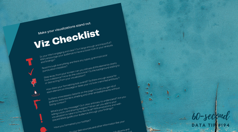
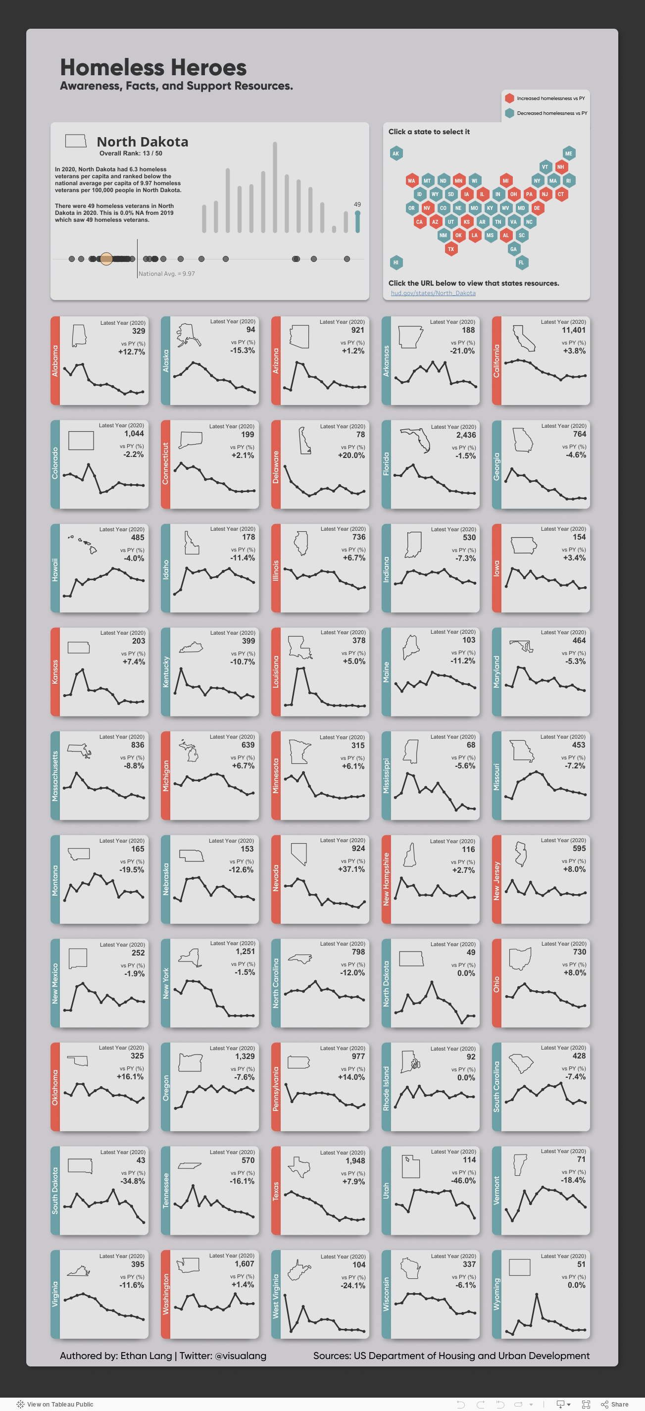
Most organizations should not waste time and money on impact evaluations. Measuring impact is difficult and expensive. It’s difficult because you need a good counterfactual. A counterfactual is what Dickens’s Ghost of Christmas Yet to Come shows Ebenezer Scrooge: what would happen if you did not change anything. The impact of an intervention or program is the difference between what happened and what would have happened without the intervention. Since, in the real world, you can’t observe the same group of beneficiaries with and without the intervention (as we do when we watch The Christmas Carol), you need a good proxy for the would-have-been condition. The best proxy is a group of potential beneficiaries that were randomly selected from a larger group of potential beneficiaries. These folks do not get the intervention. Then you can compare those who did and did not receive the intervention over time to estimate the impact of the intervention. This is called a randomized control trial or RCT.

Of course, withholding an intervention from potential beneficiaries can be a difficult and morally-questionable pursuit. And tracking a large group of beneficiaries and non-beneficiaries over time is expensive. This usually requires a team of skilled data collectors and analysts. Non-randomly-selected comparison groups are not nearly as good because they may differ from the intervention group in known or unknown ways. So it’s difficult to determine if the outcomes observed are due to the intervention itself or to pre-existing biases or characteristics. This costly and challenging process is further complicated by the need to start with a well-established intervention, one that has already worked out the kinks.

Due to the many challenges of measuring impact, most organizations should not waste time and money on impact evaluations. Instead, they should consider interventions that already have a strong research base, ideally because they have been rigorously tested with RCTs. (Check out: Where to Search for Evidence of Effective Programs.)

In a Stanford Social Innovation Review article, Mary Kay Gugerty and Dean Karlan suggest that, before beginning a new program, organizations ask: “What do other evaluations say about it? How applicable is the context under which those studies were done, and how similar is the intervention? Study the literature to see if there is anything that suggests your approach might be effective.”

Rather than assessing impact, your limited resources are better spent assessing implementation. You can do this by collecting data that shows whether what you planned is actually happening. If you can pinpoint where the problems are, you are in a better position to make fixes, alter plans, refine processes.  Many organizations make their plans using a logic model (aka theory of change). A logic model is a flow chart with inputs and outputs. The best logic models draw on past impact evaluations to determine what inputs are most likely to lead to what outputs. And organizations can easily assess progress to date by plugging their logic models into real time data. Interested? Read more about “living logic models” HERE.

To see past data tips, click HERE.


Let’s talk about YOUR data!

Got the feeling that you and your colleagues would use your data more effectively if you could see it better? Data Viz for Nonprofits (DVN) can help you get the ball rolling with an interactive data dashboard and beautiful charts, maps, and graphs for your next presentation, report, proposal, or webpage. Through a short-term consultation, we can help you to clarify the questions you want to answer and goals you want to track. DVN then visualizes your data to address those questions and track those goals.


Data + Experience = Insight

Reposted from June 1, 2021

Data can’t take you all the way to a decision. In real life, you will never have enough data. So you’ll need to apply your own experience and your colleagues’ experiences to understand the implications of data for your work. Here’s a great way to apply experience to data. It’s from Dabbling In The Data: A Hands-On Guide to Participatory Data Analysis, a guide from Public Profit.

Dabbling in The Data describes how to do this group activity in person. I’ve adapted it to an online experience using Canva, but you can use any brainstorming app that allows for real-time collaboration. It’s simple yet powerful.

Step 1: Choose a template.

Sign up for a free Canva account. Click on “Create a design” in the upper right corner of the screen, select “whiteboard” from the dropdown list, and then select a template on the sidebar (A). I chose this template from the “Brainwriting” template group.

Step 2: Add a chart and customize.

Next add a chart showing change over time on some key measure you want to better understand. In this example, the key measure is the number of lessons provided to participants over a 7-year period. You can cut and paste an image of the chart from another program like Excel, or you can create the chart in Canva by click on the “Elements” tab in the sidebar (see B above), choosing a chart type, and then entering the data points (see C above.) I’ve added a chart and customized the instructions and notepads below. Note, it’s important to position the chart backward (see D above) and lock the chart in place (see E above) so that others can place notepads on top of the chart.

Step 3: Share the chart with your colleagues and invite them to add milestones.

Your colleagues will need free Canva accounts as well. To share the chart in real time, click on “Share” (see F above) and type in your colleagues' email addresses, making sure to allow them to edit the design. Ask the group to think about the key organizational milestones that occurred during the time represented in the chart and to add those milestones to the chart using the notepads at the bottom of the screen. Encourage them to also add detail to notepads added by others.

Step 4: Discuss.

Discuss how changes in the key metric over time might be related to the organizational milestones. Consider how this understanding of pivotal events can help you better show progress to stakeholders and to plan for the future. For example, if the implementation of a new program was followed by a decrease in participation, what about the new program may have caused the decrease? What else was going on at the time that may have contributed to the decline?

To see past data tips, click HERE.


Let’s talk about YOUR data!

Got the feeling that you and your colleagues would use your data more effectively if you could see it better? Data Viz for Nonprofits (DVN) can help you get the ball rolling with an interactive data dashboard and beautiful charts, maps, and graphs for your next presentation, report, proposal, or webpage. Through a short-term consultation, we can help you to clarify the questions you want to answer and goals you want to track. DVN then visualizes your data to address those questions and track those goals.


Four Fun Chart Hacks

Have you played around with Canva? It’s a great, free online design tool. It includes lots of images and gifs and is easy to learn. Canva has a number of simple chart designs that you can adapt to your needs. After starting a design in Canva, click on “Elements” and then type in “chart” in the search window to see the chart options shown in the image below. Each allows you to customize the chart by entering in a few data points.

But I wondered how I could use other options in Canva to hack out some fun charts. Scroll down to see what I came up with.


Chart Hacks

Start a design in Canva by clicking on the “Create A Design” button (upper right corner of screen), selecting a size (such as presentation), and then try one of my hacks.

HACK 1: Use images to build bars: For this bar chart hack, I selected “Elements” and then searched for images of backpacks and then stacked them (by dragging and dropping) to create a bar chart about homework completion. You can use the “Show Rulers and Guides” option on the File menu to make the bars the right length.

HACK 2: Use icons to make a pictogram chart. Pictogram charts use icons to represent small sets of data. Each icon can represent one unit or any number of units (e.g. each icon represents 10). For this chart, I found a human graphic by selecting “Elements” and then searching for “human.” Then I colored the icons to show the number of students with failing grades and added labels using the text option on the left.

HACK 3: Use grids and photos to create a timeline of programs and events. Select “Elements” and type in “grid” in the search window. Canva will give you a bunch of frame options. Choose one and then select “uploads” to import photos of your organization’s events and programs. Then simply drag and drop photos into the grid and label bars using the text option on the left as in this example. Drag in a photo of something white for the empty cells.

HACK 4: Use frames and videos to create moving charts. For a bar chart like the one shown below, select “Elements” and type in “frame” in the search window. Canva will give you a bunch of frame options. Choose a rectangle shaped frame and place in the design, using the “Show Rulers and Guides” option on the File menu to make your bars the right length. Then select “Elements” and type in a key word for the type of image you want. I typed in “water.” Under the search window, click on “Videos” to show only video elements. Then drag and drop videos into the frames and label using the text option on the left.

For something like the line chart shown below, select “Elements” and type in “chart.” Select a line chart option and fill in data as needed. Then type in “frame” in the Elements search window. Choose a circle shaped frame and place in design over a data point, adjusting size as desired. Then select “Elements” and type in a key word for the type of image you want. I typed in “glow.” Under the search window, click on “Videos” to show only video elements. Then drag and drop a video into the frame. Use the “Position” button in the upper right corner to place the video “backward” (i.e. behind the chart). Label using the text option on the left.


Let’s talk about YOUR data!

Got the feeling that you and your colleagues would use your data more effectively if you could see it better? Data Viz for Nonprofits (DVN) can help you get the ball rolling with an interactive data dashboard and beautiful charts, maps, and graphs for your next presentation, report, proposal, or webpage. Through a short-term consultation, we can help you to clarify the questions you want to answer and goals you want to track. DVN then visualizes your data to address those questions and track those goals.