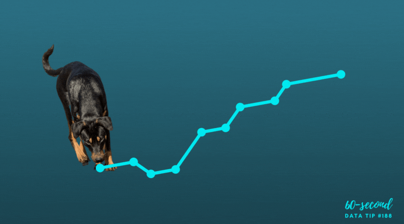
Whether we are trying to find a certain address as we walk down a street, to purchase clothes online, or to extract meaning from a chart, map, or graph, we foraging for information. I recently came across the idea of “information foraging” and following “an information scent” in this article on web user behavior. It got me thinking about how to boost the information scent in a data visualization. “A strong information scent is found,” according to the article, “when an element within the design suggests the user is moving nearer to their goal.” On an e-commerce website, a button that takes you to your shopping cart has a strong information scent. Below are a couple of data dashboards that I came across on the Tableau Public site that I think give off a strong information scent. See if you agree and consider using these strategies in your own data presentations.
The Potential of Female Wealth
In this dashboard, Jennifer Dawes provides a strong information scent using color, starting at the title. If you simply follow the color purple — which always means female — through the title, subtitles, and chart marks, you get a high-level understanding of where, when, and how females have accumulated wealth. I also like how the dots along the right border pique your curiosity and draw you through the dashboard to explore the wealthiest individuals in the world. Scroll around on the dashboard to learn more.
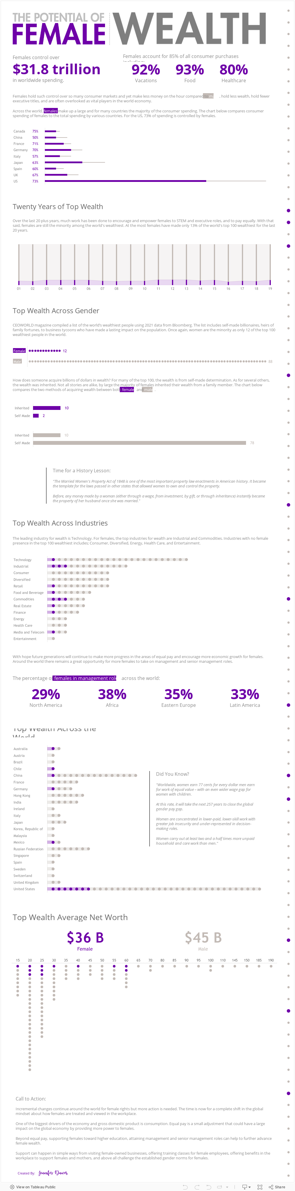
Source: Jennifer Dawes on Tableau Public
Is India Nearing A Water Crisis?
This dashboard begins with a “fragrant” table of contents. It’s visually engaging. It provides a summary of all the information included in the dashboard. And clicking on a number on the table of contents brings you to a page with more charts and maps on the topic noted. Additionally, the detail pages each include a prominent conclusion that can be drawn from the data on that page such as “Groundwater across India is at critical levels due to excessive usage.” These conclusions provide a scent or clue about what to explore in the adjacent charts.
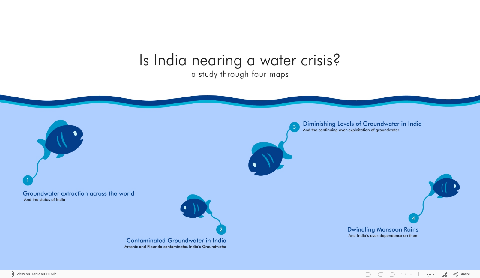
Source: Varun Jain on Tableau Public
To see past data tips, click HERE.
Let’s talk about YOUR data!
Got the feeling that you and your colleagues would use your data more effectively if you could see it better? Data Viz for Nonprofits (DVN) can help you get the ball rolling with an interactive data dashboard and beautiful charts, maps, and graphs for your next presentation, report, proposal, or webpage. Through a short-term consultation, we can help you to clarify the questions you want to answer and goals you want to track. DVN then visualizes your data to address those questions and track those goals.


