The Problem with Large Numbers (And What To Do About it)

Reposted from April 2021

BANs (Big Ass Numbers) — aka “vanity metrics” — are gaining prominent positions in data dashboards, websites, social media, email marketing, and annual reports these days. They are meant to impress. Wow! 359,234 meals served! Cool! $6 million raised!

But there is a problem with big numbers. Our brains can’t fully digest them. As noted in a 2017 Wall Street Journal article, “Big numbers befuddle us, and our lack of comprehension compromises our ability to judge information about government budgets, scientific findings, the economy and other topics that convey meaning with abstract figures, like millions, billions, and trillions.”

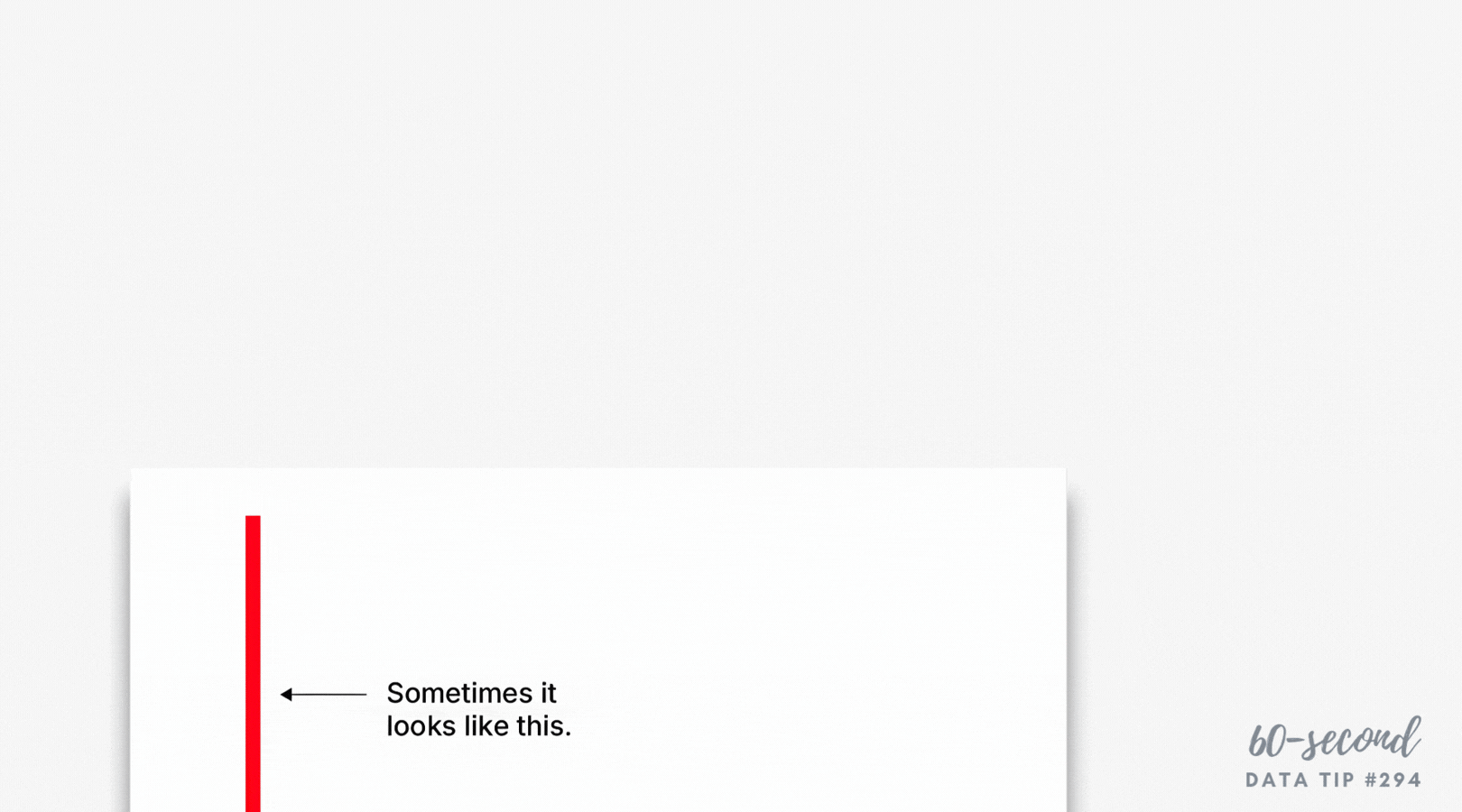
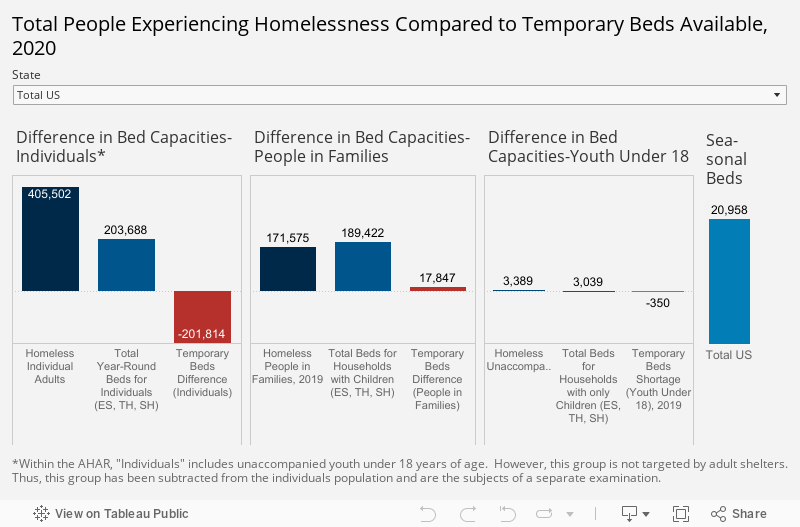
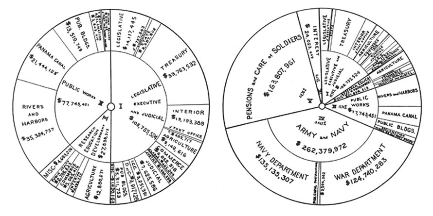
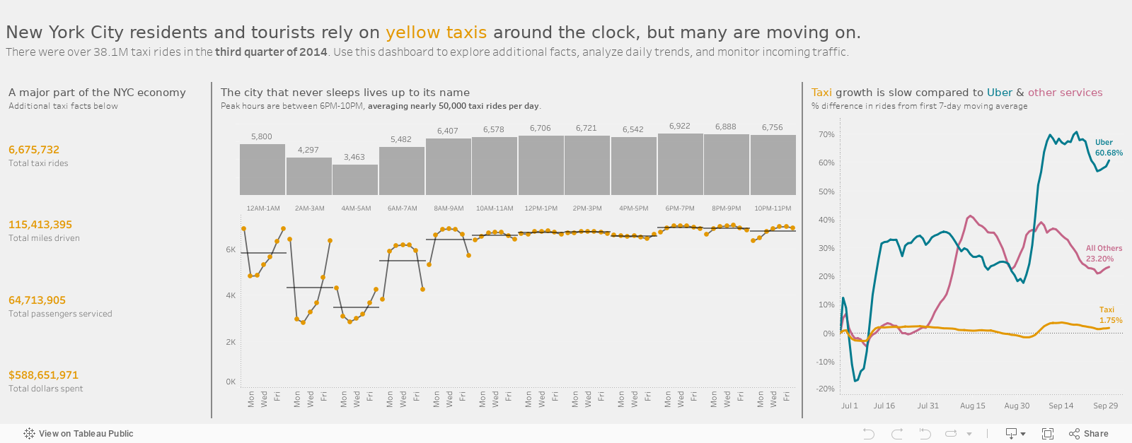
When quantifying the breadth of a problem or solution, nonprofits may toss out lots of giant figures, as in the bewildering graphic below. But without context, even numbers in the hundreds or thousands can bewilder.

So what can we do to make BANs more meaningful? Researchers at Columbia University and Microsoft found that they could improve numerical comprehension by using “perspectives,” which are simple sentences that relate a large number to something more familiar to us.

They found, for example, that when told that the number of registered firearms in the U.S. is about 300 million, study participants not only had trouble comprehending this number but also recalling it and assessing its likely accuracy. However, when told that there is about one firearm per person in the U.S., significantly more people could comprehend, assess, and recall the quantity. Makes sense to me. We can imagine a group of people, each holding a firearm, but we are hard pressed to imagine a pile of 300 million firearms.

So before you present a large number, consider a perspective that will make it relatable for your audience. Below are some formulas used in the Columbia/Microsoft study for developing perspectives.


Let’s talk about YOUR data!

Got the feeling that you and your colleagues would use your data more effectively if you could see it better? Data Viz for Nonprofits (DVN) can help you get the ball rolling with an interactive data dashboard and beautiful charts, maps, and graphs for your next presentation, report, proposal, or webpage. Through a short-term consultation, we can help you to clarify the questions you want to answer and goals you want to track. DVN then visualizes your data to address those questions and track those goals.


How To Make Your Data Riveting

Reposted from September 2019

Attention is like a bouncer at the entrance to our brains. For anything to get inside and make a difference in how we think and act, it first has to win our attention. And I don’t have to tell you (although here I go anyway) that we each have limited attention and lots of things are competing for it. So if you aim to influence others’ thoughts and actions with data, give some consideration to the nature of attention.

What wins people’s attention? 1) Stuff that stands out and 2) Stuff related to our desires or goals. The former wins our “exogenous” attention. The latter wins our “endogenous” attention.

Say you are at a crowded cocktail party. You are going to notice stuff that stands out like loud noises or bright lights. But you will also notice stuff that does not stand out but is of particular interest to you such as that woman standing in far corner whom you were hoping to see. You may also notice if one of your favorite songs is playing softly in the background.

We can make use of this understanding of attention when we visualize data by:

  • Making the most important aspects stand out.  Vary the size, color, and space around text and data points. For example, make the title much larger than the rest of the text or color all of the data points gray except for the ones you want to call attention to.

  • Pointing to aspects that may interest your intended viewers. Use titles, subtitles, data labels and captions to highlight and explain aspects of the data that may be particularly engaging for your intended audience.

Check out the before-and-after vizes below to see how I’ve applied these techniques to focus my audience’s attention.

BEFORE

AFTER


Let’s talk about YOUR data!

Got the feeling that you and your colleagues would use your data more effectively if you could see it better? Data Viz for Nonprofits (DVN) can help you get the ball rolling with an interactive data dashboard and beautiful charts, maps, and graphs for your next presentation, report, proposal, or webpage. Through a short-term consultation, we can help you to clarify the questions you want to answer and goals you want to track. DVN then visualizes your data to address those questions and track those goals.


Sure Data Confuses You. You Are An Early Human.

I recently read this article which suggests that, if we avoid a large catastrophe, we may be living at the early beginnings of human history. That is sort of mind-boggling. But even if we are not early humans, we are certainly at the beginning of our journey with data.

We aren’t so good at processing words and numbers and making sense of them. Think about the last time you looked at a spreadsheet and got the gist of it in a few seconds. By contrast, we can all get the gist of a photo in less than a few seconds. That’s because our brains have evolved over millions of years to process visual information — color, shape, size, placement — at lightening speed. Indeed, our survival depended on it. Think about detecting predators in the tall grass at a distance.

Processing words and numbers is a quite recent activity for humans, as the timeline below shows. Perhaps, as our brains evolve, we will be able to discern a spreadsheet at a glance. But, until then, we should consider visualizing our data by translating words and numbers into color, shape, size, and placement in the form of charts, maps, and graphs.

To see past data tips, click HERE.


Let’s talk about YOUR data!

Got the feeling that you and your colleagues would use your data more effectively if you could see it better? Data Viz for Nonprofits (DVN) can help you get the ball rolling with an interactive data dashboard and beautiful charts, maps, and graphs for your next presentation, report, proposal, or webpage. Through a short-term consultation, we can help you to clarify the questions you want to answer and goals you want to track. DVN then visualizes your data to address those questions and track those goals.


5 Megatrends Fueling the Rise of Data Storytelling

Happy to share with you this great infographic from Visual Capitalist. You can find the full article here.

To see past data tips, click HERE.


Let’s talk about YOUR data!

Got the feeling that you and your colleagues would use your data more effectively if you could see it better? Data Viz for Nonprofits (DVN) can help you get the ball rolling with an interactive data dashboard and beautiful charts, maps, and graphs for your next presentation, report, proposal, or webpage. Through a short-term consultation, we can help you to clarify the questions you want to answer and goals you want to track. DVN then visualizes your data to address those questions and track those goals.


How To Reveal The People In The Data

Charts, maps, and graphs are, by nature, abstractions. And it can be easy to forget about the folks that the bars, circles, and lines represent. Plus sharing information on your clientele presents not only a visualization challenge, but also a privacy challenge since we rarely have permission to share information on all of our participants. Here’s my answer to that challenge. First, get permission from a handful of participants to share their stories. The visualization below provides an example of what we could do with that information. Each chart represents individuals with distinct shapes within groups. And scrolling over shapes colored in yellow reveals a photo and profile of an individual participant in select groups. Thus the charts convey both the aggregate story and individual stories. Try interacting with it yourself. I built this example using Tableau Public, the free version of Tableau.

And here is some more information on how to show the real people behind the data.


Let’s talk about YOUR data!

Got the feeling that you and your colleagues would use your data more effectively if you could see it better? Data Viz for Nonprofits (DVN) can help you get the ball rolling with an interactive data dashboard and beautiful charts, maps, and graphs for your next presentation, report, proposal, or webpage. Through a short-term consultation, we can help you to clarify the questions you want to answer and goals you want to track. DVN then visualizes your data to address those questions and track those goals.


Upcoming Free Data Viz Webinars

webinars by Amelia Kohm

To see past data tips, click HERE.


Let’s talk about YOUR data!

Got the feeling that you and your colleagues would use your data more effectively if you could see it better? Data Viz for Nonprofits (DVN) can help you get the ball rolling with an interactive data dashboard and beautiful charts, maps, and graphs for your next presentation, report, proposal, or webpage. Through a short-term consultation, we can help you to clarify the questions you want to answer and goals you want to track. DVN then visualizes your data to address those questions and track those goals.


Ideas You Should Steal From This Viz (Installment 4)

“Every artist gets asked the question: ‘Where do you get your ideas?’ The honest artist answers, ‘I steal them.’ . . . What a good artist understands is that nothing comes from nowhere. All creative work builds on what came before.” —Austin Kleon in Steal Like An Artist.

Today I offer up another steal-worthy interactive viz that I came across in the Tableau Public Gallery.


Source: Eugenio Gallastegui on Tableau Public


Here’s what I suggest you steal from this scatterplot:

  • Use color and labels to distinguish clusters. “Donor Score” appears to be a measure of engagement. By distinguishing groups based on their income and level of engagement, this scatterplot chart effectively shows the need for various strategies moving forward.

  • Use icons instead of dots. The chart reminds us that we are considering individual people by using human icons rather than dots on the scatterplot.

  • Provide detail on demand about individuals. The chart also lets us see the forest and the trees. If you scroll over icons, you learn more about the individuals in each group.

What I don’t think works so well on this chart is the size legend showing the age of donors and volunteers. It’s quite hard to discern the various sizes of the icons and form any ideas on the possible relationship between age and group membership.

To see past data tips, click HERE.


Let’s talk about YOUR data!

Got the feeling that you and your colleagues would use your data more effectively if you could see it better? Data Viz for Nonprofits (DVN) can help you get the ball rolling with an interactive data dashboard and beautiful charts, maps, and graphs for your next presentation, report, proposal, or webpage. Through a short-term consultation, we can help you to clarify the questions you want to answer and goals you want to track. DVN then visualizes your data to address those questions and track those goals.


How To Motivate Action With Data

Data can either motivate or shut down action, depending on how it’s presented and to whom. Charts, maps, and graphs that convey good news can increase the commitment to an endeavor while those that broadcast bad news can either spur action among the already committed or quash action among the uncommitted.

Think about one of the most common data visualizations in the nonprofit world: the fundraising thermometer. When it shows minimal progress, only those most committed to the cause will likely donate. The thermometer may put off the less committed because it suggests that others do not feel the cause is important or because they feel that their small donation will not make much difference. However, when the thermometer shows considerable progress, the less committed are more likely to jump on the bandwagon. This is why, according to Eli Holder, many organizations don’t officially launch a campaign — and show a thermometer — until they are at least a third of the way to their goal.

Holder also offers up some advice on how to visualize data to maintain motivation in Dashboard Psychology: Effective Feedback in Data Design. Here’s my 60-second version of Holder’s recommendations:

Emphasize Progress Thus Far

You can make change over time appear more dramatic or more gradual depending on the the space between tick marks on your Y (or vertical) axis. Check out these two charts which show the same data, but the one on the right suggests a more dramatic increase and may be more motivating to the less committed. Of course it’s important to use this strategy to emphasize rather than deceive. Thus labeling the tick marks is essential.

Another way to emphasize progress is to give more visual weight to the good news. In this chart, the 7-day moving average trend is generally positive and is emphasized by the thick orange line. The daily changes are played down by using a thinner gray line. Moving averages, in general, iron out outliers and provides a sense of the overall trend.

Emphasize The Need For Progress

Those already committed may find the visualization of the gap between actual data and the goal quite motivating. Similarly, you can show them an expected range for a measure. As long as the data show that the measure is within range, they can feel reassured. However, a chart showing that the measure is above or below the expected range can motivate action. Note that the expected range can change over time with a lower range at the beginning of an endeavor and a higher one later on. Indeed, a changing expected range may reassure the less committed during early stages of an endeavor.


Let’s talk about YOUR data!

Got the feeling that you and your colleagues would use your data more effectively if you could see it better? Data Viz for Nonprofits (DVN) can help you get the ball rolling with an interactive data dashboard and beautiful charts, maps, and graphs for your next presentation, report, proposal, or webpage. Through a short-term consultation, we can help you to clarify the questions you want to answer and goals you want to track. DVN then visualizes your data to address those questions and track those goals.


Head Versus Gut

Reposted from December 2018

Data is head food. But we often make decisions with our gut. And the gut is fueled by emotions.

It’s hard to defy our gut feelings when deciding. That’s because emotions often drive behavior. Evolutionary psychologists believe that emotions evolved to get us to do what has to be done to survive: to avoid predators, secure nutrients, resist infection, mate . . . you get the idea. So when your head says A, but your gut says B, you might feel an urgent need to do B because your survival button has been pushed.

I’m going to venture to guess that most of your decisions, like mine, are not directly related to survival. And when that’s the case, our emotions can lead us astray. In a 2016 article in the Atlantic, Olga Khazan summarizes research which suggests just how far astray. For example, anger may cause us to be trigger-happy and simplify our thinking. Happiness may lead us to make shallow assessments based on looks and likability. And depression may induce dwelling on particular issues.

It’s important to recognize our emotions and what they are telling us, rather than blindly following them. Sure, we can form hypotheses about gut feelings and see if the data support them. But when faced with a pressing decision in the real world, we often have a strong emotion and little data at hand. In these situations, we can ask ourselves: Is there a way to bring some more data to the problem quickly?

  • Perhaps it’s data collected by other people for other purposes. We can look for statistics about organizations similar to ours or about issues that our organization addresses.

  • Perhaps it's a quick and dirty anonymous survey of our staff, asking for their knowledge and opinions relevant to the decision.

The idea is to feed the head with some data and, in the process, temper the pleadings of the gut.

See other data tips in this series for more information on how to effectively visualize and make good use of your organization's data.

Upcoming Free Webinars

Jun 22, 2022, 8:00 am PT/11:00 am ET

Data visualization is like one of those unlikely couples. One partner is outgoing and a great storyteller. The other is introverted and sticks to the facts. To make great charts, maps, and graphs, you need to channel both partners in this odd couple: the artist and the analyst. In this workshop, I will offer up 10 key rules about composition that artists know and that analysts (and the rest of us) can apply when presenting data.

Presenter: Amelia Kohm | Data Viz for Nonprofits. Sponsor: Nonprofit Learning Lab

REGISTER for this free event.


July 20, 2022, 1:00 pm PT/4:00 pm ET

Almost every organization has two superpowers. The first is the data that they have packed away in databases and spreadsheets, often collecting virtual dust on their servers. The second is the visual faculties of their donors, clients, board members and staff members. While most of us glaze over at the sight of a spreadsheet, humans are wired to process visual information at lightning speed. By visualizing our data, we make it more accessible and usable.

You will leave this webinar with a clear understanding of:

  • The two superpowers organizations have and how to wield them more often and more effectively;

  • How you can use data visualization (aka data viz) to address key problems you face showing and evaluating your impact;

  • The types of visualizations that work best for different purposes; and

  • How to turn a good viz into a great one.

Presenter: Amelia Kohm | Data Viz for Nonprofits. Sponsor: techsoup

REGISTER for this free event.


Let’s talk about YOUR data!

Got the feeling that you and your colleagues would use your data more effectively if you could see it better? Data Viz for Nonprofits (DVN) can help you get the ball rolling with an interactive data dashboard and beautiful charts, maps, and graphs for your next presentation, report, proposal, or webpage. Through a short-term consultation, we can help you to clarify the questions you want to answer and goals you want to track. DVN then visualizes your data to address those questions and track those goals.


What We've Learned From All Those COVID Charts

COVID has taught us a lot about a lot of things, including data viz. Early in the pandemic, I asked: Which are worse: COVID haircuts or COVID charts? We all needed ways to understand what was happening, how bad it was, and what we should do. And many public and private entities turned to data viz to convey this information. But not all of them did a great job, particularly at the beginning. With time, those visualizing this data have learned a great deal, and we can apply this learning to charts showing all types of data.

The digital magazine, Sapiens, recently reviewed the “emerging consensus” around how to display COVID data. In this tip, I give you the 60-second version of these rules and how they might apply to the work of any nonprofit organization.

1. Cases should be reported on a population-adjusted basis. Whether you are counting cases of COVID, school drop outs, or food insecurity, raw numbers don’t mean much. One hundred drop outs in a small school district should raise more alarms than the same number in a large district. Per-capita numbers are better. They allow us to compare populations of different sizes.

2. Cases should be reported on a rolling weekly basis. Numbers of cases can fluctuate on a daily basis for a variety of reasons. And these spikes and dips can make it difficult to discern overall trends. Regardless of the type of cases you are reporting, presenting rolling averages (aka moving averages) often works better than showing daily cases.

3. Certain thresholds are meaningful and remain so over time. Per capita numbers may give us a better sense of the magnitude of a problem, but they don’t tell us what to do. The color-coded COVID risks levels serve that purpose. We can show similar thresholds in charts showing other issues. For example, the dashboard below indicates when the number of people experiencing homelessness exceeds temporary beds available and thus when further action is needed.

Source: National Alliance to End Homelessness

4. Heat maps are useful. Heat maps use color to convey meaning. And among COVID maps, as noted in the Sapiens article, “colors and threshold values vary, but everyone is speaking the same general language. Green, blue, and white tend to mean things are under control while yellow, orange, and red suggest increasing danger.” Thus heat maps show us not only when action is needed but also where it’s needed. For example, in the maps below, states with high ranks and colored in blue shades are healthier, and states with low ranks and colored in orange shades are less healthy according to the Overall Health Index and the Chronic Illness Index. Gray states are in the middle of the range. This map helps us to discern corridors of good and poor health.


Let’s talk about YOUR data!

Got the feeling that you and your colleagues would use your data more effectively if you could see it better? Data Viz for Nonprofits (DVN) can help you get the ball rolling with an interactive data dashboard and beautiful charts, maps, and graphs for your next presentation, report, proposal, or webpage. Through a short-term consultation, we can help you to clarify the questions you want to answer and goals you want to track. DVN then visualizes your data to address those questions and track those goals.


Ideas You Should Steal From This Viz (Installment 3)

“Every artist gets asked the question: ‘Where do you get your ideas?’ The honest artist answers, ‘I steal them.’ . . . What a good artist understands is that nothing comes from nowhere. All creative work builds on what came before.” —Austin Kleon in Steal Like An Artist.

Today I offer up another steal-worthy viz. Take a look:

Source: Nicole Mark on Tableau Public

Here’s what I suggest you steal from this viz:

  • Use a quote for the title. As noted in another data tip, titles are among the most important elements of a viz but often little effort goes into them. Nicole Mark, who created this viz, could easily have slapped on this title: “Number of People Who Fled Ukraine, February to March 2022.” Instead, Nicole humanized the crisis with a quote from Volodymyr Zelenskyy.

  • Show just the trajectory. To focus attention on the dramatic increase in the number of people fleeing Ukraine, the axes and gridlines have been removed.

  • Connect key information with color. The quote, the key statistic in the lower right corner, and the line on the chart are the only elements in red and thus appear more important than the other information and are visually related to each other.

To see past data tips, click HERE.


Let’s talk about YOUR data!

Got the feeling that you and your colleagues would use your data more effectively if you could see it better? Data Viz for Nonprofits (DVN) can help you get the ball rolling with an interactive data dashboard and beautiful charts, maps, and graphs for your next presentation, report, proposal, or webpage. Through a short-term consultation, we can help you to clarify the questions you want to answer and goals you want to track. DVN then visualizes your data to address those questions and track those goals.


Presenting Data Fast and Slow

Sometimes we approach the challenge of sharing data with others as if we were trying to con a pet into taking a pill. We think that our audience is too busy, disinterested, or distracted to focus on the data. So we wrap it in something that attracts their attention and feed it to them as quickly as possible. The problem with this approach is that it may get the data into their brains—momentarily—but it won’t stay there long. See where the pill ends up in this video.

If we want others to LEARN from the data — which involves not only retaining it but also drawing knowledge from it and applying that knowledge in the future — then we need a different approach. Daniel Kahneman’s Thinking Fast and Slow can help us.

First a little background on how the brain works, according to the evidence Kahneman presents. For learning to happen, information first must get past System 1 of our brains. This is where fast thinking happens. System 1 is the harried gate keeper, madly processing all of the information that comes in through our senses, pitching most of it, keeping only what is deemed necessary. But getting through the gate is only half the battle. Once in, information confronts System 2. This is the part of the brain that allows for conscious thought or slow thinking. The problem is that System 2 is lazy. Conscious thought is hard, and System 2 is always looking for an excuse to avoid it. But if System 2 engages with information, the resulting knowledge can find its way to long-term memory and learning happens.

So the challenge when presenting data is to get past System 1 AND engage System 2. Let’s consider a viz from Harvard Business Review (HBR) that I think meets both parts of this challenge. Yes, it’s an example from the for-profit world, but could easily work with nonprofit data. Take a look.

How to get data past System 1

Getting data past the System 1 fast-thinking gate keeper is all about grabbing attention. We process images much more quickly than words and numbers, so images are a great foot-in-the-door. The HBR viz does it with bright colors and a cool-looking, somewhat unusual chart. There’s plenty of information out there about how to attract attention, including the use of images with:

  • Stand out colors and textures

  • Human faces (we are wired to focus on them)

  • Novelty (images that are unusual in size, placement, etc.)

Data visualizations can use color as well as images to draw attention. But getting past System 1 is not nearly enough. For learning to happen, the viz also has to engage System 2.

How to engage System 2

System 2 is smart but lazy. So we need to pique its interest. The HBR viz starts with a title that poses a question. When confronted with an interesting question, we may be more likely to stick around for an answer. Then the viz leads you through the answer in a visually engaging way (see interactive version of the viz HERE). These are two great ways to slow down and engage the brain with data. Here’s a list of ways to engage System 2:

  • Ask a question in the title as the HBR viz does—questions beg answers.

  • Make it personal. We may be more likely to engage with data when we have a personal connection with it. This New York Times viz, for example, allows you to enter in your county to see what the barriers to COVID vaccination are in your area.

  • Highlight a surprising finding. Many of us love the counterintuitive and the creative. If you draw attention to something new that the data suggests, you may have a better chance at hooking System 2. For example, this viz from The Economist shows that China emits far less greenhouse gas per person than Western countries at the same stage of economic development. Or check out this viz by Dimiter Toshkov showing that small countries can be big players in development and good governance.

  • Hand draw it. There is some evidence that making information harder to consume, for example by presenting it with harder-to-read fonts, makes the brain slow down and engage in effortful and analytic processing. Although the jury is still out on this, I do find myself more likely to engage in hand-drawn vizes like two of the winners of the World Data Visualization Prize in 2019. Perhaps it’s simply the novelty of hand-drawn charts that engages me. Anyway, it’s something you might consider, and all you need is a pen and paper.

  • Walk them through it. A great way to slow down your viewers is to set the pace by walking them through the data as HBR does in the example. I love how HBR presents what the data might look like if our assumptions were confirmed followed by what it actually looks like.

Sources: Veritasium, Visual Content Space, MIT News, Springer Link,


Let’s talk about YOUR data!

Got the feeling that you and your colleagues would use your data more effectively if you could see it better? Data Viz for Nonprofits (DVN) can help you get the ball rolling with an interactive data dashboard and beautiful charts, maps, and graphs for your next presentation, report, proposal, or webpage. Through a short-term consultation, we can help you to clarify the questions you want to answer and goals you want to track. DVN then visualizes your data to address those questions and track those goals.


Let’s Talk!

Thanks for subscribing to 60-Second Data Tips. I hope you are finding the tips useful. I’m writing to offer you some more of my time. Click below to schedule a free consultation about your data. Let’s talk about how you can extract meaning from your data with great charts, maps, and graphs, share them with others, and use them to improve your work.

-Amelia (pictured above drowning in data . . . I feel your pain)


Why You Should Know About Connected Dot Plots

This week, I give you the connected dot plot. The name might not ring a bell, but I think you’ll recognize the face. It’s a pretty intuitive and useful chart for nonprofits. This is a continuation of a series of tips which introduce you to different chart types which are good for making sense of the type of data nonprofits collect.

Active Ingredients (What is a connected dot plot?)

A connected dot plot, aka “dumbbell plot,” shows the differences between two categories or two points in time. Usually circles indicate the values of each category or time period. For example, this segment of a larger chart from Pew Research Center gives us an intuitive way of comparing two age groups on their social media use. We can easily see where the gap is larger (Germany) and smaller (India). The stats to the right help to distinguish lines that are close in length such as the ones for Germany and France. Here are instructions for creating a connected dot plot with Tableau and Excel.

Uses

Connected dot plots can be much more effective in showing differences or changes over time than their more popular cousin: the grouped bar chart. Check out the two examples below which show the average score (on a five point scale) among respondents to a survey in 2018 and 2019. See which gives you a better sense of the change over time.

Grouped Bar Chart

Screen Shot 2021-08-16 at 11.35.55 AM.png

Connected Dot Plot

Warnings

In the examples above, the relative positions of the two categories or time points are the same in all cases: social media use was always greater in the younger group of users than in the older group, and the average score was always higher in 2019 than in 2018. What should you do when the positions flip flop? A good strategy is to call out these direction changes using arrows, colors, and/or legends as in this chart:


Fun Facts

Connected dot plots are sometimes called “Cleveland dot plots,” named for William Cleveland who, along with Robert McGill, studied different types of “encodings” in charts such as the length of a line, the area of a “slice” of a circle, and the position of a point along a common scale. They looked at what types of encodings humans decode most easily and, based on their findings, they designed a chart well-suited for human perception: the connected or “Cleveland” dot plot.

To see past data tips, including those about other chart types, click HERE.

Sources: Storytelling With Data and UC Business Analytics R Programming Guide


Let’s talk about YOUR data!

Got the feeling that you and your colleagues would use your data more effectively if you could see it better? Data Viz for Nonprofits (DVN) can help you get the ball rolling with an interactive data dashboard and beautiful charts, maps, and graphs for your next presentation, report, proposal, or webpage. Through a short-term consultation, we can help you to clarify the questions you want to answer and goals you want to track. DVN then visualizes your data to address those questions and track those goals.


What You Should Know About Sunburst Charts

This is a new addition to a series of tips on different chart types. In each tip, l give you need-to-know information in a format akin to the “Drug Facts” on the back of medication boxes: active ingredients (what the chart is), uses (when to use it), and warnings (what to look out for when creating the chart). The idea is to fill up your toolbox with a variety of tools for making sense of data. This time I give you the sunburst chart.

Active Ingredients (What is a sunburst chart?)

A sunburst chart is a multi-level pie chart. Each ring corresponds to a level in a hierarchy, with the highest level as the inner circle or ring. Each ring slice is either divided equally under its parent slice or is proportional to a value. Color is often used to highlight hierarchal categories. Check out the example below. The inner ring segments show the number of participants in three program areas of a community center. The outer ring segments shows the number of participants in specific programs within the three areas. Scroll over segments to learn more.

Uses

Although the pie chart gets a bad rap in the data viz world, this pie chart cousin shines in certain circumstances. It works best (in my opinion) when you want to show not only a hierarchy but also how each component of the hierarchy differs according to some measure. For example, you want to show which components have the most participants or funding, or the highest survey ratings.

Here are instructions for creating a sunburst chart with Tableau and Excel.

Warnings

Sunburst charts with a large number of ring slices are difficult to read. A good rule of thumb is to abandon your dreams of a sunburst chart if any of the segment slices are too small to label. Once you need a color legend, as in the example below, use another type of chart such as a tree diagram or treemap. Also, I think a tree diagram works better when you are just showing a hierarchy and not how the components differ according to a measure.

Source: Oracle

Fun Fact

Here’s an early example of a sunburst chart, published in Mechanical Engineering in 1921 according to Think Design. It shows the average annual net expenditure of the US federal government from 1910 to 1919.

Source: Think Design


Let’s talk about YOUR data!

Got the feeling that you and your colleagues would use your data more effectively if you could see it better? Data Viz for Nonprofits (DVN) can help you get the ball rolling with an interactive data dashboard and beautiful charts, maps, and graphs for your next presentation, report, proposal, or webpage. Through a short-term consultation, we can help you to clarify the questions you want to answer and goals you want to track. DVN then visualizes your data to address those questions and track those goals.


How To Nail Your Next Presentation (And Every One After That)

Hey Everyone: This week’s quick tip is to check out Ann Emery’s upcoming course on creating powerful presentations. This course includes both live and recorded lessons, so it only opens once a year for registration, and the deadline is Friday, April 29.

This course will transform you into the powerful presenter that your organization needs. Here's what's included to make that happen.

  • 80+ video lessons that you can watch anytime (the equivalent of my two-day Powerful Presentations workshop)

  • Step-by-step process to deliver data-driven presentations that engage audiences

  • Your Turn activities after every lesson to post your own work and get the instructor's feedback

  • 12 additional Live Trainings just for participants in this cohort

  • Office Hours sessions (almost) every week in 2022

  • Powerful Presentations ebook with our checklists and case studies

  • Private Data Vizards community of fellow participants

  • Weekly emails to cheer you on

  • Lifetime access so you don't feel rushed

  • Examples from a variety of industries (public health, juvenile justice, museums, and more)

  • Behind-the-scenes PowerPoint magic tricks guaranteed to make your jaw drop

LEARN MORE AND ENROLL HERE!


Let’s talk about YOUR data!

Got the feeling that you and your colleagues would use your data more effectively if you could see it better? Data Viz for Nonprofits (DVN) can help you get the ball rolling with an interactive data dashboard and beautiful charts, maps, and graphs for your next presentation, report, proposal, or webpage. Through a short-term consultation, we can help you to clarify the questions you want to answer and goals you want to track. DVN then visualizes your data to address those questions and track those goals.


A Better Alternative to Surveys?

When organizations want to understand the concerns, opinions, beliefs, or needs of their communities, clientele, or participants, they often turn to surveys. But I probably don’t have to tell you that surveys have many downsides. To name just a few:

  • The difficulty of asking the right questions in the right ways to really understand issues accurately and fully.

  • The difficulty of getting a decent response rate so that you can feel at least somewhat confident that responders’ viewpoints reflect those of the larger group.

  • The difficulty of extracting actionable knowledge from survey responses without a degree in data analysis.

I recently read about a tool that addresses some of the downsides of surveys. Polis is an open-source, real-time system for gathering, analyzing and understanding what large groups of people think in their own words.

Surveys present people with questions like this:

Source: https://www.examples.com/business/assessment/community-needs-assessment.html

By contrast, Polis allows participants to submit their own short comments on a topic specified by the “conversation” creator. Comments are then sent out semi-randomly to other participants to vote on by clicking agree, disagree or pass.

Most interesting to me are the visualizations that Polis generates in a report, which can be shared with all participants. The report includes, a viz like this:

Source: Polis

Each dot represents a comment or statement and is placed along a continuum to show the degree of agreement with the statement. In this conversation, you can see that there were many more consensus statements than divisive statements. And Polis says that’s usually the case. Polis can make consensus visible and thus may be a powerful tool when division so dominates our attention that we may be skeptical that any consensus among diverse groups exists.

When you scroll over a dot, the related statement appears below with stacked bar charts showing the amount of agreement (green), disagreement (red) and passes (gray) among participants overall and by opinion groups. An opinion group is made up of participants who tended to vote similarly on multiple statements and also have voted distinctly differently from other groups. Because the statement shown above (represented by the red dot in the chart) is toward the consensus end of the spectrum, the majority of participants in both opinion groups A and B agreed with the statement. That wasn’t the case for the statement shown below. Participants in opinion group A were much more likely to agree with this statement than those in opinion group B.

Source: Polis

The report also includes a summary of all of the consensus statements. (See example below.)

I can’t vouch for Polis — never used it myself — but I find its basic idea intriguing. If your organization is looking for a better way to understand a large group of people and is particularly interested in finding consensus hidden among all the noisy division, you may want to look into it.

Source: Polis


Let’s talk about YOUR data!

Got the feeling that you and your colleagues would use your data more effectively if you could see it better? Data Viz for Nonprofits (DVN) can help you get the ball rolling with an interactive data dashboard and beautiful charts, maps, and graphs for your next presentation, report, proposal, or webpage. Through a short-term consultation, we can help you to clarify the questions you want to answer and goals you want to track. DVN then visualizes your data to address those questions and track those goals.


What To Do With Incomplete Data

Reposted from March 29, 2021

Here’s the super short version of this data tip: when designing data viz, don’t mix complete and incomplete data. Below is the somewhat-longer-but-still-60-seconds version of this data tip.

The graphs below were on the Chicago Public Schools (CPS) website and show the number of confirmed COVID-19 cases associated with CPS buildings. I’ve added the pink lines and captions to direct your attention to the last two data points. The first image shows what the graph looked like on Monday, January 18, 2021 and the second image shows what the graph looked like 5 days later on Saturday, January 23rd.

If you went to this website on January 18th and looked that this graph, you might very well have concluded that cases had recently plummeted. But you’d be wrong. To understand what was really going on, you’d have to notice that the last data point (1/23) was in the future and put that information together with a caption saying “Case counts are updated Monday through Friday (excluding holidays) after impacted individuals are notified.” So the graph shows complete data for past weeks but incomplete data for the current week. The last data point shows week-to-date data.

Unless your aim is to confuse or deceive, why present data in this way? Instead, when you have complete data for various time periods or groups and incomplete data for other time periods or groups, consider the following:

  • If you are updating data on a daily basis, then show day intervals (rather than week intervals as in the graphs above) on the X-axis.

  • Create a separate chart showing a running total for the incomplete time period or group and place it alongside the graph showing complete data.

  • If neither of the solutions above work for you, at least color the dots, lines, or other marks representing the incomplete data in a color different from the complete data to alert the viewer to the difference and include a color legend to explain the difference.

Thanks to Carol White of CBWhite marketing research and strategy consulting for pointing out this graph to me! To see past data tips, click HERE.


Let’s talk about YOUR data!

Got the feeling that you and your colleagues would use your data more effectively if you could see it better? Data Viz for Nonprofits (DVN) can help you get the ball rolling with an interactive data dashboard and beautiful charts, maps, and graphs for your next presentation, report, proposal, or webpage. Through a short-term consultation, we can help you to clarify the questions you want to answer and goals you want to track. DVN then visualizes your data to address those questions and track those goals.


How To Visualize Cycles

Every organization experiences cyclical or seasonal patterns. Understanding how funding, participation, volunteering, and other factors change in predictable ways over time can help us to plan for the future. The problem is that we don’t always see these patterns. We get caught up in currents issues and crises, and it’s hard to step back and see what’s coming next. Visualizing your data can reveal cyclical or seasonal patterns in helpful ways. This often involves aggregating data from multiple years by specific time periods such as season, quarter, or day of the week. Here are some examples.

Working with a statistician named William Farr in the 1800s, Florence Nightingale analyzed mortality rates during the Crimean War. She and Farr discovered that most of the soldiers who died in the conflict perished not in combat but as a result of “preventable diseases” caused by bad hygiene. Nightingale invented the polar area chart (shown below), a variant of the pie chart, meant “to affect thro’ the Eyes what we fail to convey to the public through their word-proof ears.” Each pie represented a twelve-month period of the war, with each slice showing the number of deaths per month, growing outward if the number increased, and color-coded to show the causes of death (blue: preventable, red: wounds, black: other). The New York Times showed the seasonal pattern of COVID cases using a somewhat similar chart.

Source: Wikipedia

In the dashboard below, Curtis Harris reveals not only patterns in taxi rides by time of day but also by day of the week. We can see, for example, that few people are using taxis between 2 and 3 am, particularly at the beginning of the week.

Source: Curtis Harris on Tableau Public

This varsity-level viz (below) by Lindsay Betzendahl shows the seasonality of the flu. Each dot represents one week in a particular year. Each “ray” consists of dots for the same week of different years. So the ray at the 12:00 position represents the first week in January for each year between 2007 to 2018. The size of the dots show the number of influenza cases. So we can see that cases surge during the winter weeks, in general, but we also can see outbreaks during other seasons in particular years. Betzendahl explains how to create such a chart in Tableau here.

Source: Lindsay Betzendahl on Tableau Public


Let’s talk about YOUR data!

Got the feeling that you and your colleagues would use your data more effectively if you could see it better? Data Viz for Nonprofits (DVN) can help you get the ball rolling with an interactive data dashboard and beautiful charts, maps, and graphs for your next presentation, report, proposal, or webpage. Through a short-term consultation, we can help you to clarify the questions you want to answer and goals you want to track. DVN then visualizes your data to address those questions and track those goals.