
This week, I give you the connected dot plot. The name might not ring a bell, but I think you’ll recognize the face. It’s a pretty intuitive and useful chart for nonprofits. This is a continuation of a series of tips which introduce you to different chart types which are good for making sense of the type of data nonprofits collect.
Active Ingredients (What is a connected dot plot?)
A connected dot plot, aka “dumbbell plot,” shows the differences between two categories or two points in time. Usually circles indicate the values of each category or time period. For example, this segment of a larger chart from Pew Research Center gives us an intuitive way of comparing two age groups on their social media use. We can easily see where the gap is larger (Germany) and smaller (India). The stats to the right help to distinguish lines that are close in length such as the ones for Germany and France. Here are instructions for creating a connected dot plot with Tableau and Excel.

Source: Pew Research Center
Uses
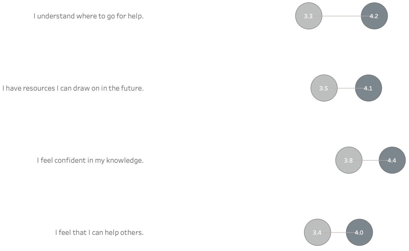
Connected dot plots can be much more effective in showing differences or changes over time than their more popular cousin: the grouped bar chart. Check out the two examples below which show the average score (on a five point scale) among respondents to a survey in 2018 and 2019. See which gives you a better sense of the change over time.
Grouped Bar Chart

Connected Dot Plot
Warnings
In the examples above, the relative positions of the two categories or time points are the same in all cases: social media use was always greater in the younger group of users than in the older group, and the average score was always higher in 2019 than in 2018. What should you do when the positions flip flop? A good strategy is to call out these direction changes using arrows, colors, and/or legends as in this chart:

Fun Facts
Connected dot plots are sometimes called “Cleveland dot plots,” named for William Cleveland who, along with Robert McGill, studied different types of “encodings” in charts such as the length of a line, the area of a “slice” of a circle, and the position of a point along a common scale. They looked at what types of encodings humans decode most easily and, based on their findings, they designed a chart well-suited for human perception: the connected or “Cleveland” dot plot.
To see past data tips, including those about other chart types, click HERE.
Sources: Storytelling With Data and UC Business Analytics R Programming Guide
Let’s talk about YOUR data!
Got the feeling that you and your colleagues would use your data more effectively if you could see it better? Data Viz for Nonprofits (DVN) can help you get the ball rolling with an interactive data dashboard and beautiful charts, maps, and graphs for your next presentation, report, proposal, or webpage. Through a short-term consultation, we can help you to clarify the questions you want to answer and goals you want to track. DVN then visualizes your data to address those questions and track those goals.


