
Data can either motivate or shut down action, depending on how it’s presented and to whom. Charts, maps, and graphs that convey good news can increase the commitment to an endeavor while those that broadcast bad news can either spur action among the already committed or quash action among the uncommitted.

Think about one of the most common data visualizations in the nonprofit world: the fundraising thermometer. When it shows minimal progress, only those most committed to the cause will likely donate. The thermometer may put off the less committed because it suggests that others do not feel the cause is important or because they feel that their small donation will not make much difference. However, when the thermometer shows considerable progress, the less committed are more likely to jump on the bandwagon. This is why, according to Eli Holder, many organizations don’t officially launch a campaign — and show a thermometer — until they are at least a third of the way to their goal.
Holder also offers up some advice on how to visualize data to maintain motivation in Dashboard Psychology: Effective Feedback in Data Design. Here’s my 60-second version of Holder’s recommendations:
Emphasize Progress Thus Far
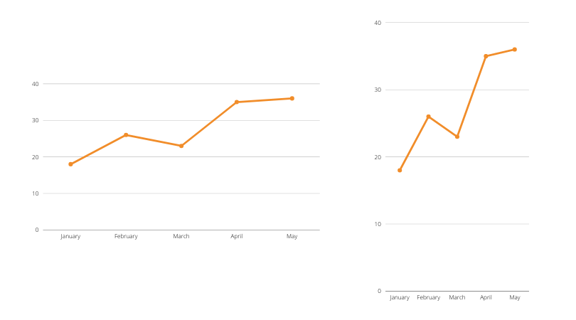
You can make change over time appear more dramatic or more gradual depending on the the space between tick marks on your Y (or vertical) axis. Check out these two charts which show the same data, but the one on the right suggests a more dramatic increase and may be more motivating to the less committed. Of course it’s important to use this strategy to emphasize rather than deceive. Thus labeling the tick marks is essential.
Another way to emphasize progress is to give more visual weight to the good news. In this chart, the 7-day moving average trend is generally positive and is emphasized by the thick orange line. The daily changes are played down by using a thinner gray line. Moving averages, in general, iron out outliers and provides a sense of the overall trend.

Emphasize The Need For Progress
Those already committed may find the visualization of the gap between actual data and the goal quite motivating. Similarly, you can show them an expected range for a measure. As long as the data show that the measure is within range, they can feel reassured. However, a chart showing that the measure is above or below the expected range can motivate action. Note that the expected range can change over time with a lower range at the beginning of an endeavor and a higher one later on. Indeed, a changing expected range may reassure the less committed during early stages of an endeavor.

Let’s talk about YOUR data!
Got the feeling that you and your colleagues would use your data more effectively if you could see it better? Data Viz for Nonprofits (DVN) can help you get the ball rolling with an interactive data dashboard and beautiful charts, maps, and graphs for your next presentation, report, proposal, or webpage. Through a short-term consultation, we can help you to clarify the questions you want to answer and goals you want to track. DVN then visualizes your data to address those questions and track those goals.


