
“Every artist gets asked the question: ‘Where do you get your ideas?’ The honest artist answers, ‘I steal them.’ . . . What a good artist understands is that nothing comes from nowhere. All creative work builds on what came before.” —Austin Kleon in Steal Like An Artist.
Today I offer up another steal-worthy interactive viz that I came across in the Tableau Public Gallery.
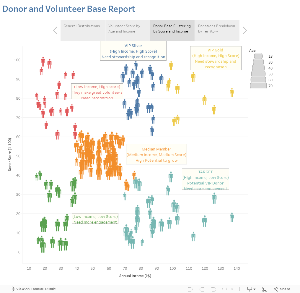
Source: Eugenio Gallastegui on Tableau Public
Here’s what I suggest you steal from this scatterplot:
Use color and labels to distinguish clusters. “Donor Score” appears to be a measure of engagement. By distinguishing groups based on their income and level of engagement, this scatterplot chart effectively shows the need for various strategies moving forward.
Use icons instead of dots. The chart reminds us that we are considering individual people by using human icons rather than dots on the scatterplot.
Provide detail on demand about individuals. The chart also lets us see the forest and the trees. If you scroll over icons, you learn more about the individuals in each group.
What I don’t think works so well on this chart is the size legend showing the age of donors and volunteers. It’s quite hard to discern the various sizes of the icons and form any ideas on the possible relationship between age and group membership.
To see past data tips, click HERE.
Let’s talk about YOUR data!
Got the feeling that you and your colleagues would use your data more effectively if you could see it better? Data Viz for Nonprofits (DVN) can help you get the ball rolling with an interactive data dashboard and beautiful charts, maps, and graphs for your next presentation, report, proposal, or webpage. Through a short-term consultation, we can help you to clarify the questions you want to answer and goals you want to track. DVN then visualizes your data to address those questions and track those goals.


