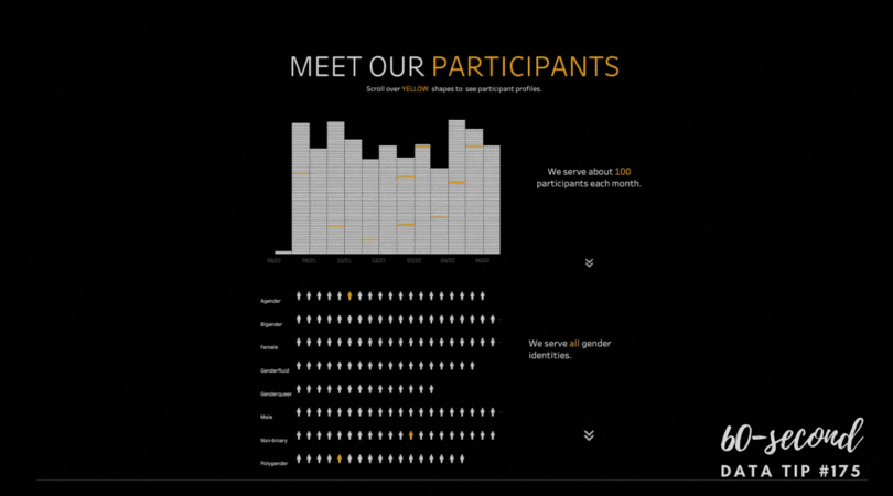
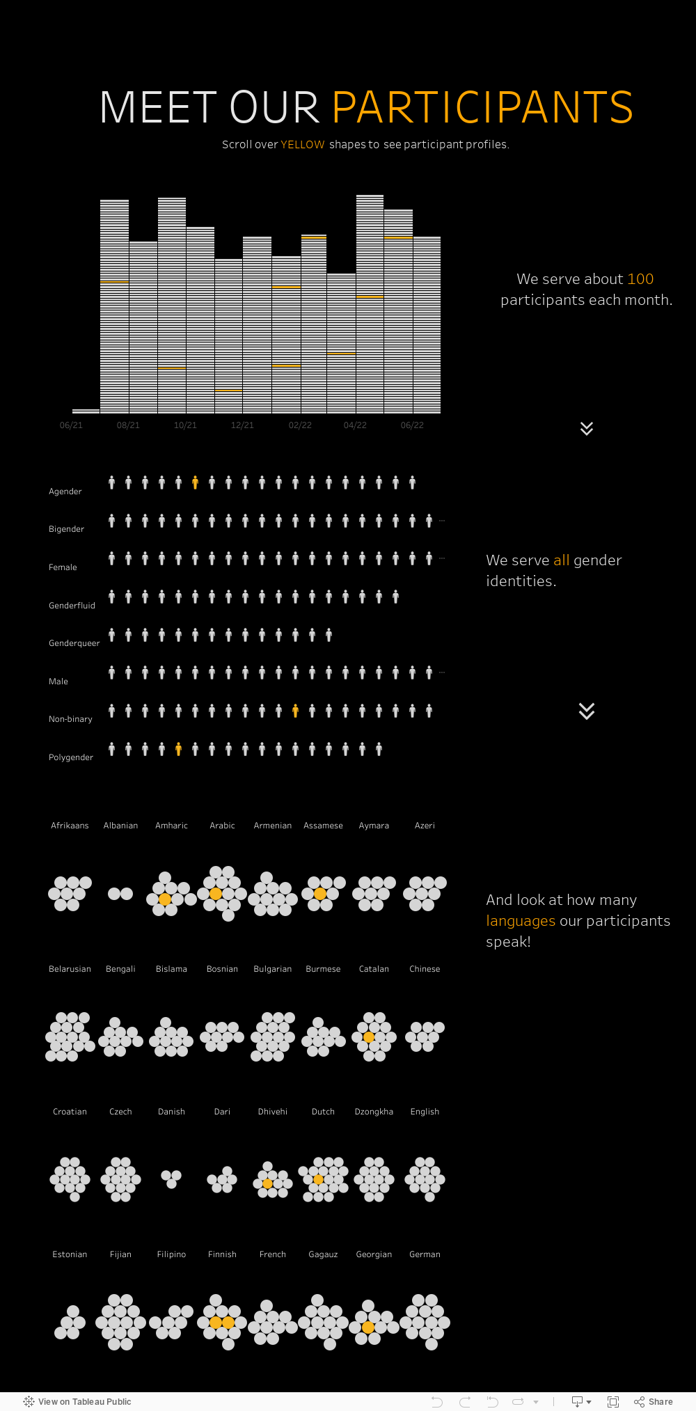
Charts, maps, and graphs are, by nature, abstractions. And it can be easy to forget about the folks that the bars, circles, and lines represent. Plus sharing information on your clientele presents not only a visualization challenge, but also a privacy challenge since we rarely have permission to share information on all of our participants. Here’s my answer to that challenge. First, get permission from a handful of participants to share their stories. The visualization below provides an example of what we could do with that information. Each chart represents individuals with distinct shapes within groups. And scrolling over shapes colored in yellow reveals a photo and profile of an individual participant in select groups. Thus the charts convey both the aggregate story and individual stories. Try interacting with it yourself. I built this example using Tableau Public, the free version of Tableau.
And here is some more information on how to show the real people behind the data.
Let’s talk about YOUR data!
Got the feeling that you and your colleagues would use your data more effectively if you could see it better? Data Viz for Nonprofits (DVN) can help you get the ball rolling with an interactive data dashboard and beautiful charts, maps, and graphs for your next presentation, report, proposal, or webpage. Through a short-term consultation, we can help you to clarify the questions you want to answer and goals you want to track. DVN then visualizes your data to address those questions and track those goals.


