What We've Learned From All Those COVID Charts

COVID has taught us a lot about a lot of things, including data viz. Early in the pandemic, I asked: Which are worse: COVID haircuts or COVID charts? We all needed ways to understand what was happening, how bad it was, and what we should do. And many public and private entities turned to data viz to convey this information. But not all of them did a great job, particularly at the beginning. With time, those visualizing this data have learned a great deal, and we can apply this learning to charts showing all types of data.

The digital magazine, Sapiens, recently reviewed the “emerging consensus” around how to display COVID data. In this tip, I give you the 60-second version of these rules and how they might apply to the work of any nonprofit organization.

1. Cases should be reported on a population-adjusted basis. Whether you are counting cases of COVID, school drop outs, or food insecurity, raw numbers don’t mean much. One hundred drop outs in a small school district should raise more alarms than the same number in a large district. Per-capita numbers are better. They allow us to compare populations of different sizes.

2. Cases should be reported on a rolling weekly basis. Numbers of cases can fluctuate on a daily basis for a variety of reasons. And these spikes and dips can make it difficult to discern overall trends. Regardless of the type of cases you are reporting, presenting rolling averages (aka moving averages) often works better than showing daily cases.

3. Certain thresholds are meaningful and remain so over time. Per capita numbers may give us a better sense of the magnitude of a problem, but they don’t tell us what to do. The color-coded COVID risks levels serve that purpose. We can show similar thresholds in charts showing other issues. For example, the dashboard below indicates when the number of people experiencing homelessness exceeds temporary beds available and thus when further action is needed.

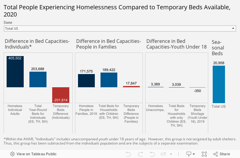
Source: National Alliance to End Homelessness

4. Heat maps are useful. Heat maps use color to convey meaning. And among COVID maps, as noted in the Sapiens article, “colors and threshold values vary, but everyone is speaking the same general language. Green, blue, and white tend to mean things are under control while yellow, orange, and red suggest increasing danger.” Thus heat maps show us not only when action is needed but also where it’s needed. For example, in the maps below, states with high ranks and colored in blue shades are healthier, and states with low ranks and colored in orange shades are less healthy according to the Overall Health Index and the Chronic Illness Index. Gray states are in the middle of the range. This map helps us to discern corridors of good and poor health.


Let’s talk about YOUR data!

Got the feeling that you and your colleagues would use your data more effectively if you could see it better? Data Viz for Nonprofits (DVN) can help you get the ball rolling with an interactive data dashboard and beautiful charts, maps, and graphs for your next presentation, report, proposal, or webpage. Through a short-term consultation, we can help you to clarify the questions you want to answer and goals you want to track. DVN then visualizes your data to address those questions and track those goals.


How to Show Problems and Solutions in One Chart

Reposted from September 16,  2020

Reposted from September 16, 2020

Data visualizations are kind of like beards or kale. They used to be decidedly uncool, but are now hip, at least in certain circles. Yet, even with the rising popularity of charts, maps, and graphs, I think many of us have a faint feeling of aversion when encountering them. For one, they may be hard to decipher. But there’s another problem too. They often are the bearers of bad news. They show us how widespread a problem is or how it’s increasing. Worse, they rarely give us any hope of improvement.

Wouldn’t charts, maps, and graphs be more engaging and helpful if they showed both problems AND solutions? Let’s talk about how to get that done.

Show Two Scenarios

Show the difference between how things play out with and without an intervention or program. The now-famous flatten the curve graph (shown below) did this without any real data. The point was just to show how the number of cases would likely differ with and without public health measures to slow the spread of COVID.

Here’s a graph that shows two scenarios with real data. The data point labels are particularly helpful in this example. By comparing two different cities, the graph suggests that a delay in the start of social distancing interventions may have a huge effect on the severity of an outbreak.

Show A Change In The Trend

Another way to present a problem along with a solution is to show how a trend alters following an intervention. This graph shows projected data for several types of interventions: the current policy, alternative policies, and the absence of policies. In the absence of policies, global warming is expected to reach 4.1°C – 4.8°C above pre-industrial levels by the end of the century. Current policies are projected to result in about a 3.0° rise over pre-industrial levels. Other pledges and targets that governments have made would limit warming to even lower amounts.

This one effectively uses bubble size and color to show a trend alteration following the introduction of the measles vaccine.

On the uncool-to-very-cool spectrum, data visualizations that show both problems and solutions are very cool. To see what other things are cool/uncool check out CoolnessGraphed.com.

To see past data tips, including those about other chart types, click HERE.


Let’s talk about YOUR data!

Got the feeling that you and your colleagues would use your data more effectively if you could see it better? Data Viz for Nonprofits (DVN) can help you get the ball rolling with an interactive data dashboard and beautiful charts, maps, and graphs for your next presentation, report, proposal, or webpage. Through a short-term consultation, we can help you to clarify the questions you want to answer and goals you want to track. DVN then visualizes your data to address those questions and track those goals.


How to Show Problems and Solutions in One Chart

Data Tips.png

Data visualizations are kind of like beards or kale. They used to be decidedly uncool, but are now hip, at least in certain circles. Yet, even with the rising popularity of charts, maps, and graphs, I think many of us have a faint feeling of aversion when encountering them. For one, they may be hard to decipher. But there’s another problem too. They often are the bearers of bad news. They show us how widespread a problem is or how it’s increasing. Worse, they rarely give us any hope of improvement.

Wouldn’t charts, maps, and graphs be more engaging and helpful if they showed both problems AND solutions? Let’s talk about how to get that done.

Show Two Scenarios

Show the difference between how things play out with and without an intervention or program. The now-famous flatten the curve graph (shown below) did this without any real data. The point was just to show how the number of cases would likely differ with and without public health measures to slow the spread of COVID.

Source: C.T. Bergstrom

Here’s a graph that shows two scenarios with real data. The data point labels are particularly helpful in this example. By comparing two different cities, the graph suggests that a delay in the start of social distancing interventions may have a huge effect on the severity of an outbreak.

Show A Change In The Trend

Another way to present a problem along with a solution is to show how a trend alters following an intervention. This graph shows projected data for several types of interventions: the current policy, alternative policies, and the absence of policies. In the absence of policies, global warming is expected to reach 4.1°C – 4.8°C above pre-industrial levels by the end of the century. Current policies are projected to result in about a 3.0° rise over pre-industrial levels. Other pledges and targets that governments have made would limit warming to even lower amounts.

This one effectively uses bubble size and color to show a trend alteration following the introduction of the measles vaccine.

Source: Sciencemag.org

On the uncool-to-very-cool spectrum, data visualizations that show both problems and solutions are very cool. To see what other things are cool/uncool check out CoolnessGraphed.com.

To see past data tips, including those about other chart types, click HERE.


Let’s talk about YOUR data!

Got the feeling that you and your colleagues would use your data more effectively if you could see it better? Data Viz for Nonprofits (DVN) can help you get the ball rolling with an interactive data dashboard and beautiful charts, maps, and graphs for your next presentation, report, proposal, or webpage. Through a short-term consultation, we can help you to clarify the questions you want to answer and goals you want to track. DVN then visualizes your data to address those questions and track those goals.


The Ingredient Missing From Your Website

Copy of Add a heading (1).gif

If the internet is a street, and websites are storefronts, then homepages are the window displays. Effective displays give you the gist of the organization and lure you in. When I stroll down nonprofit lane, I rarely see displays featuring data visualizations (aka data viz) like charts, maps, and graphs. That makes sense, right? Data viz lacks the visceral appeal of photos. Images of a child receiving medical care, a homeless adult eating a meal, or a home being rebuilt after a hurricane are more compelling than a chart.

I get that. But there’s a missed opportunity here. Prominently-displayed, well-designed data viz provides something that photos cannot. Context. Charts, maps, and graphs can quickly show website visitors the critical context that they cannot see in a photo, such as how prevalent a problem is, where it is occurring, or the impact of a program over time.

Recently, I did a little review of the 12 sites that won a Web Award in 2019 for best in industry or outstanding website in the nonprofit category. I expected that these sites would be better than most when it came to featuring data viz. I gave myself three minutes to review each site. And I awarded 2 points for data viz on their homepage, 2 points for data viz on their work/impact page,* and 1 point for data viz on any other page that I could visit in the balance of my three-minute tour. My definition of data viz was not strict. I counted any display of data not described in text or presented in a table. BANs (Big Ass Numbers), timelines, and flowcharts counted. (See the results in the chart below.)

The data viz situation in these sites was even worse than I expected. I found:

  • Only two of the twelve sites had data viz on their homepages.

  • Five of the sites had no data viz that could be found in three minutes.

  • The vizes I found were: 3 BANs, 2 maps, 1 timeline, and 1 flowchart, none of which provided a wealth of insight.

website review.png

To make your website stand out, even among award-winning sites, consider prominently displaying a variety of data visualizations (not just BANs). Visualizations can provide the necessary context to bring both problems and solutions into greater focus.

One last thing before we go. I give the best-content-not-related-to-data-viz award to the website called “Get In Touch With Your Testes With Nad & Tad.” See Grab Your Balls And Check Out These Videos on the homepage. It’s a must-see.

To see past data tips, including those about other chart types, click HERE.

*Work/impact page: any page on menu bar describing their work and/or impact


Let’s talk about YOUR data!

Got the feeling that you and your colleagues would use your data more effectively if you could see it better? Data Viz for Nonprofits (DVN) can help you get the ball rolling with an interactive data dashboard and beautiful charts, maps, and graphs for your next presentation, report, proposal, or webpage. Through a short-term consultation, we can help you to clarify the questions you want to answer and goals you want to track. DVN then visualizes your data to address those questions and track those goals.


Why Our Brains Glitch On COVID Data And Why Nonprofits Should Take Notice

Copy of Add a heading (1).gif

I’ve said it before. It’s not enough to present data clearly and beautifully. If we want the brains of our staff members, board members, policymakers, donors, and clients to absorb data AND use it for decision-making, we have to present it in brain-friendly ways. And brain-friendly means avoiding common brain glitches. I’ve talked about how our brains glitch when dealing with small numbers.

The pandemic has brought to the fore another known issue with our brains. They glitch when confronted with exponential growth. And, as a result, we make the wrong decisions. The good news is that we can learn from this problem. And this learning can benefit our causes and organizations well past the pandemic. Let me walk you through this in the remaining 50 seconds.

We default to LINEAR not EXPONENTIAL growth. Linear growth means that something is growing by the same amount at each time step. Your hair, for example, grows about a half inch each month. Exponential growth is different. It means that something is growing in proportion to its current value, such as doubling at each time step.

Here’s a common example that reveals the glitch: Would you prefer to receive:

  1. $1,000 a day for the next 30 days or

  2. 1 cent on the first day, 2 cents on the second day, 4 cents on the third day, 8 cents on the fourth day and so on for 30 days?

Given a short time to consider, most folks choose option 1 in which the linear growth results in $30,000. But in option 2, the exponential growth results in over $5 million!

Most of us have heard that COVID grows at an exponential rate. And we probably understand what that means: if one person infects two others and then each of those people infect two others, the number of infections is doubling at each time step. But we fail to appreciate the impact of exponential growth and thus fail to choose the wisest actions when faced with an exponential growth problem or opportunity. For example, there is evidence that those who underestimate the effect of exponential growth on the spread of the virus are less likely to take precautions like social distancing and wearing masks.

We can (sometimes) overcome the glitch with a nudge. There is also evidence that simple nudges can help people to better estimate the impact of exponential growth. Nudges can include showing raw numbers instead of graphs or reminding people that the number of cases doubles at each step rather than grows at a constant rate or asking people to do the math to more clearly see the effect of doubling. It’s important to note, however, that there is also research suggesting that our brains can be pretty resistant corrections.

What does this mean for your organization? Exponential growth crops up in regular, non-pandemic life more often than you’d think. If your organization is dealing with issues as diverse as food spoilage, human population growth, invasive species, forest fires, or cancer, then you need a way to effectively communicate exponential growth. To deal with this glitch you can:

  • Turn to the research. Look for studies that tested ways to correct glitches and then apply the effective ones to your work.

  • Test your data presentations before they go live. It may sound simple, but it’s a step few of us take. Identify a few people with a similar level of expertise in the subject matter and data as those in your target audience. Then ask them what they think the data in your presentation shows. Perhaps show them a few versions of the same data in different types of charts or tables and see which ones are easiest to process quickly and accurately. But don’t stop there. Ask what actions they might consider based on their interpretations. Then use their responses to revise and test again.

  • Ask rather than tell. You can engage your stakeholders while also nudging them toward greater understanding. Ask them how soon they think a particular problem will grow to a particular size if left unchecked. If their answer is off the mark, you’ve got their attention. Now explain how the problem is growing exponentially.

To see past data tips, click HERE.


Let’s talk about YOUR data!

Got the feeling that you and your colleagues would use your data more effectively if you could see it better? Data Viz for Nonprofits (DVN) can help you get the ball rolling with an interactive data dashboard and beautiful charts, maps, and graphs for your next presentation, report, proposal, or webpage. Through a short-term consultation, we can help you to clarify the questions you want to answer and goals you want to track. DVN then visualizes your data to address those questions and track those goals.


How To Show Your Organization's Pre- and Post-COVID Data

60-SECOND DATA TIP_3 (1).gif

It’s time to reconsider your plans for showing progress in 2020. The chart, map, or graph you planned to use on your website, in your annual report, or at the quarterly board meeting may no longer apply or may tell the wrong story. The lives of those you serve and the way you serve them probably have changed. The question is: how can you show progress and provide enough context so that viewers get it right and get it quickly. Below are some ideas. If your organization has come up with other solutions, please let me know, and I’ll share them in a future data tip.

1.png

1. Distinguish pre- and post-COVID periods

This is the simplest solution. Make sure to distinguish the COVID period in your charts using color, shading, borders, and captions. Viewers will expect to see differences between pre- and post-COVID periods. So show them where to apply these different expectations.

Copy of Add a heading.png

2. Emphasize COVID period

You might consider emphasizing the COVID period by enlarging it and showing an adjusted goal for this time. Even if your service capacity has decreased, you could be doing well compared to adjusted goals.

3.png

3. Discourage pre/post comparisons

In some cases, you may want to discourage pre- and post-COVID comparisons given how much circumstances have changed. You might show only the COVID period, perhaps along with an adjusted goal reference line.

Copy of Add a heading (1).png

4. Focus on adaptation over time

Although some programs and services may have come to a screeching halt, others may have ramped up speedily. There are plenty of ways to show these changes in charts that clearly distinguish both periods.


To see past data tips, including those about other chart types, click HERE.


Let’s talk about YOUR data!

Got the feeling that you and your colleagues would use your data more effectively if you could see it better? Data Viz for Nonprofits (DVN) can help you get the ball rolling with an interactive data dashboard and beautiful charts, maps, and graphs for your next presentation, report, proposal, or webpage. Through a short-term consultation, we can help you to clarify the questions you want to answer and goals you want to track. DVN then visualizes your data to address those questions and track those goals.


Covid Haircuts vs. Covid Charts, Which Are Worse? (And What Can We Learn From Them?)

Remember the old TV warning: Don’t try this at home? Well, many of us are home right now. And we are trying lots of new stuff. Like cutting our own hair or visualizing data. Both can be dangerous.

We’ve already talked about the limitations of COVID data and the importance of both broadcasting limitations when presenting data and seeking out such disclaimers when consuming data in any format. Charts, maps, and graphs attempting to show the severity of the pandemic across time and location run into many difficulties including differences in population sizes and densities, testing rates, and reporting policies of various states and countries. The result is a likely misrepresentation of reality. (For more on this, see The Covid Tracking Project at the Atlantic’s Visualization Guide.)

The misrepresentation can be even more severe when visualizations distort the data. Much of the distortion, intentional or otherwise, occurs along the X and Y axes.* So when designing or reading charts, pay attention to:

  1. The order of values along the axes

This graph, from the Georgia Department of Public Health's website, is now infamous. The original chart (see “Before” image) did not present the dates along the X-axis in chronological order. Moreover, the bars, which each represent a different county, were presented in different orders on different dates. The result “seemed to bend both time and place to achieve a clean descending-staircase effect,” wrote Morgan McFall-Johnsen at The Business Insider on May 17, 2020. The corrected version was later posted and, as you can see, told a different story. When presenting values that have an inherent order, such as dates, we should present them in that order such as earlier to later or lower to higher.

2. The span of values along the axes

Wrong (1).png

It’s easy enough to choose the part of a chart that tells the story you want to tell and just omit the rest. So when you see a trend over time, always check the X-axis to see the span of time covered. If relevant time periods are not included, find out why.

3. The range of values along the axes

Zero+Origins.png

The lowest point on an axis is called the “origin.” It’s where the Y and X axes intersect. Much has been written about the importance of starting the Y-axis at zero because, when you don’t, you can make a small difference look like a big one. See the two bar charts here for a case in point.

4. The aggregation of values along the axes

When you combine values by computing sums, averages, counts, etc., it's called aggregating. The way values are aggregated along the axes can significantly affect the way the data look. For example, when using date values, consider how detailed of a story you want to tell. Do you want to show general trends or is it important to show the volatility over shorter intervals of time? The charts below show the same data at different levels of aggregation: week totals, month totals, and quarter totals.

intervals.png

To see past data tips, click HERE.


*What is an axis (plural: axes)?

Dashboard+1.png

Data visualizations, like charts, maps, and graphs, often use position to show the value of something. They usually do this using an intersecting X-axis (a horizontal line) and a Y-axis (a vertical line). Each axis shows a particular type of measurement such as dates, dollars, or miles or particular categories or groups. Lines, bars, or other shapes are positioned according to these measures and categories.


Let’s talk about YOUR data!

Got the feeling that you and your colleagues would use your data more effectively if you could see it better? Data Viz for Nonprofits (DVN) can help you get the ball rolling with an interactive data dashboard and beautiful charts, maps, and graphs for your next presentation, report, proposal, or webpage. Through a short-term consultation, we can help you to clarify the questions you want to answer and goals you want to track. DVN then visualizes your data to address those questions and track those goals.


Managing Amid Uncertainty: What You Can Know and Show

60-SECOND DATA TIP_3 (1).png

Does your organization feel like the guy in the picture above? Heretofore, you and your colleagues have been climbing a challenging mountain. The journey has been daunting at times but despite occasional setbacks, your trend has been upward. And just as you were ready to take on the next steep incline, you encounter a cliff — or at least what feels like a cliff. The path ahead is foggy and uncertain.

How to deal with the uncertainty that the pandemic had brought into most aspects of life, including our work? One response is to try to bring the present and possible future into focus through charts, maps, and graphs. “In many ways, data visualization has been instrumental to how we’re processing COVID-19,” writes Stephen Gossett at Built In. “The Washington Post’s animated-dots simulation became the paper’s most-viewed article ever.” But Gossett goes on to describe the dangers of visualizing uncertain data. As I wrote in an earlier data tip on “Low-CAL” data, data visualizations can make situations appear more certain than they actually are. We should look for the fine print that describes Context, Assumptions, and Limitations and be wary of visualizations that lack this information.

So what can you confidently know and show about your organization now?

  • Your past efficacy or impact. It’s a good time to dust off old charts. Or better yet, revive past data with new and improved visualizations that show your staff, board, and current and prospective supporters how well you have done in the past and thus how worthy of investment your organization is.

  • Your ability to adapt. For extra credit, show your stakeholders how well you have adapted to changes in the past, particularly unexpected ones. Show in charts how you resurged after a cut in public funding or how you built new programs to address unexpected needs in your community.

  • Your current efforts. Show how much money and person hours you have invested, how many people you have served, how many funds you have raised, or how you have redirected resources to new programs.

Even amid all of the uncertainty, there are some “known knowns” (in the words of former US Secretary of Defense, Donald Rumsfeld). While we are waiting for the “known unknowns” and the “unknown unknowns” to come into focus, we can move forward by showing what we do know.

 To see past data tips, including those about other chart types, click HERE.


Let’s talk about YOUR data!

Got the feeling that you and your colleagues would use your data more effectively if you could see it better? Data Viz for Nonprofits (DVN) can help you get the ball rolling with an interactive data dashboard and beautiful charts, maps, and graphs for your next presentation, report, proposal, or webpage. Through a short-term consultation, we can help you to clarify the questions you want to answer and goals you want to track. DVN then visualizes your data to address those questions and track those goals.