
Reposted from September 2020
I’d like to introduce you to yet another chart type. The idea is to fill up your toolbox for making sense of data. This week, I give you the dot matrix chart.
Active Ingredients (What is a dot matrix chart?)
Dot matrix charts show us data units as dots (or squares). A single data unit could be a person, a group of people, a building, a program, or any other thing that you are counting. Each dot is colored to show which category or group the data unit falls into.
Uses
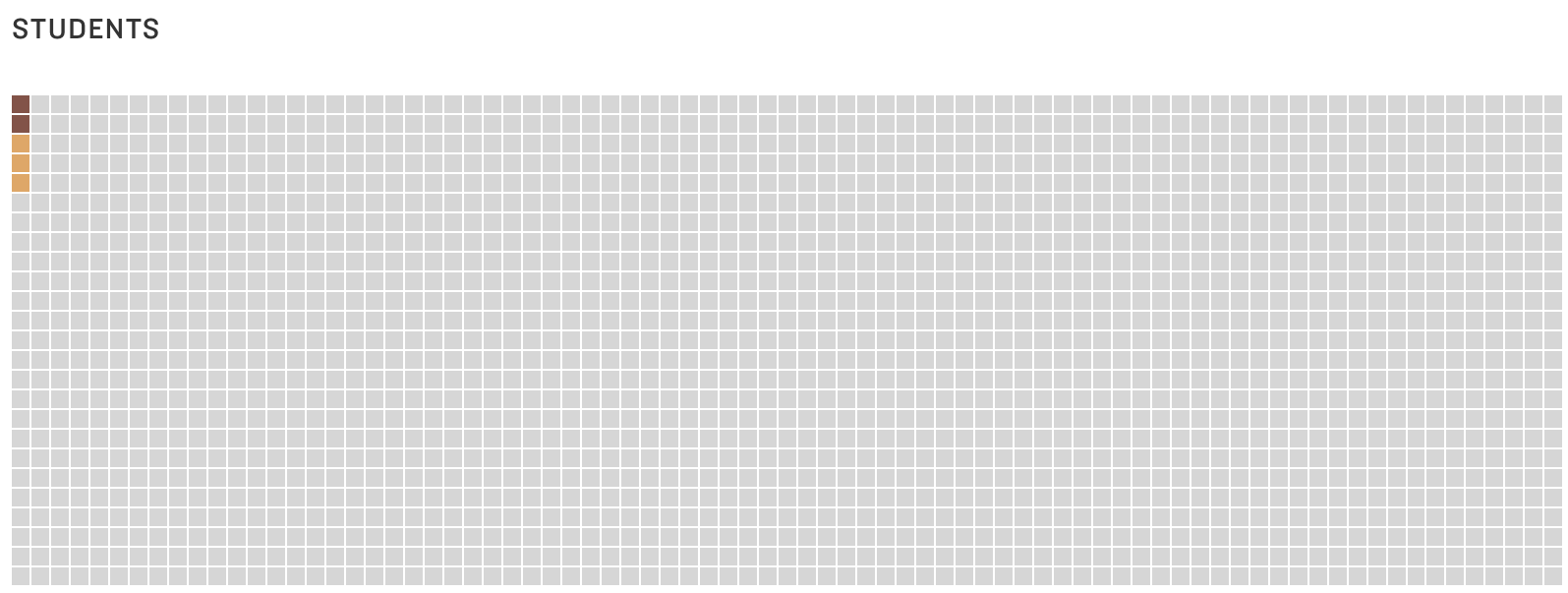
Dot matrix charts are simple yet mighty. They give a quick overview of the relative size of different categories and how the parts relate to the whole. I was reminded of the power of dot matrices recently when reading about the COVID-19 School Response Dashboard in an article on the National Public Radio (NPR) website. The dashboard shows data drawn from reports from K-12 schools on their confirmed and suspected coronavirus cases, along with the safety strategies they're using.
If you check out the dashboard, you see these charts showing the percent of schools reporting cases among students and staff. Take a look at the Y-axis. It ranges from 0% to 1%. This allows you to see small differences between the charts on the left (confirmed and suspected cases) and the charts on the right (only confirmed cases). But it has a big disadvantage. It doesn’t give you a visual sense of just how few students and staff have, or may have, been infected based on data that schools have. (Note: A big unknown is the number of asymptomatic/untested students or staff. Rates might be higher if more students and staff were tested.)


NPR recast this same data in a dot matrix chart (below) with each square representing 50 people.* And the first thing you comprehend is that the vast majority of staff and students at the reporting schools have not been infected (again according to information that schools have). Without much more effort, you see that there are more suspected than confirmed cases. No need to inspect the Y-axis or subtract percent of confirmed cases from the percent of confirmed and suspected cases.


Source: National Public Radio
Warnings
All those dots or squares require a good bit of page or screen real estate. Sure, one circle or square can represent more than one person or other data unit. But at some point, a bar chart might make more sense. Dot matrix charts work best when there are just a few categories and the aim is to communicate one or two simple messages.
Fun Fact
Dots or squares need not be displayed in rectangular form. This Policy Viz chart arrays the dots in a semi-circle to show the distribution of U.S. House members in different political parties. Gray dots represent empty seats. You can learn how to create a chart like this one using Excel HERE.

Source: PolicyViz
To see past data tips, including those about other chart types, click HERE.
*Note that the percentages displayed on the dashboard do not exactly match the numbers in the NPR dot matrix chart because the dashboard shows real-time data, and NPR used data from the dashboard on an earlier date than 9/24/20, the date when I took the image of the dashboard.
Let’s talk about YOUR data!
Got the feeling that you and your colleagues would use your data more effectively if you could see it better? Data Viz for Nonprofits (DVN) can help you get the ball rolling with an interactive data dashboard and beautiful charts, maps, and graphs for your next presentation, report, proposal, or webpage. Through a short-term consultation, we can help you to clarify the questions you want to answer and goals you want to track. DVN then visualizes your data to address those questions and track those goals.


