Reposted from May 2020
You aren’t deploying data viz. When I peruse nonprofit posts, I mostly see:
Bad photos,
Headshots,
Stock images (only some of which clearly relate to the text), or
No image at all.
Twitter, Facebook, and LinkedIn are like crowded highways packed with billboards. If we add charts, maps, and graphs to our billboards, we can both grab attention and say something meaningful. But the image and message should be simple and clear to travelers zooming by.
What types of vizes work best? Here are four to consider.
1. Maps
If the map shows a geography we know like the U.S. or our own city, we have a lot of prior knowledge that we can apply. This makes maps easy to digest on the fly. We look for our own location. We compare east to west or cities to rural areas. Consider showing the distribution of the need you are addressing, the location of your clientele, or where you are providing services using a map.
Source: tennessean.com, image: feedingamerica.org
2. BANs (Big Ass Numbers)
Just one large number can capture attention. The BANs shown here are from Women Will, a Google initiative focused on economic empowerment for women. They won a Shorty Award, which honors the best content creators on social media. Think about what single number you might share that could spark interest in your work. Add a link from your BAN post to a chart that provides more context and detail for that number.
Source: shortyawards.com
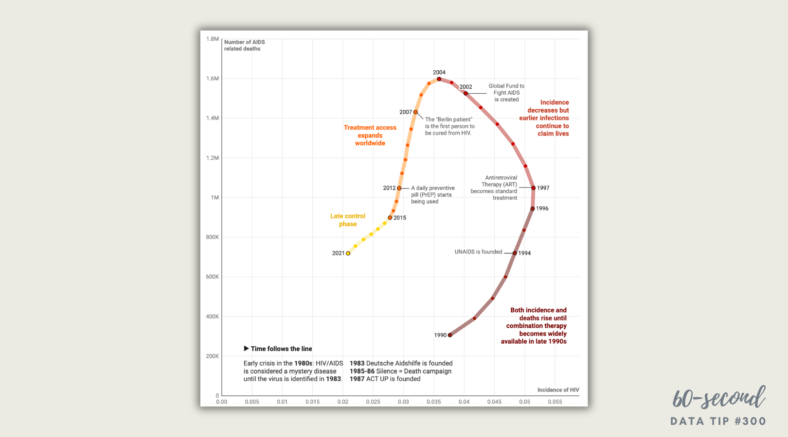
3. Line graph showing a clear trend
Line graphs are familiar. Many show change over time. So if we make it clear what is changing (here it’s number of deaths) and over what period of time, we can tell a quick and powerful story without much more than an angled line. But keep it simple with only one line or multiple lines but only one highlighted in color and the rest grayed out. Consider showing how the need for your services or your impact has changed over time.
source: informationisbeautiful.net
4. Bar chart showing a clear comparison
Bar charts also are trusted friends. We get them. When deploying bar charts, use color strategically to encourage a comparison of a target group to the others. This post from the World Wildlife Fund is a follow-up to an earlier post which asked followers a question. This post gives them the answer in a simple bar chart and shows them what percent of followers guessed each answer (see numbers on the right.)
Source: shortyawards.com i.
To see past data tips, including those about other chart types, click HERE.
Let’s talk about YOUR data!
Got the feeling that you and your colleagues would use your data more effectively if you could see it better? Data Viz for Nonprofits (DVN) can help you get the ball rolling with an interactive data dashboard and beautiful charts, maps, and graphs for your next presentation, report, proposal, or webpage. Through a short-term consultation, we can help you to clarify the questions you want to answer and goals you want to track. DVN then visualizes your data to address those questions and track those goals.
