The Pies That Bind

Reposted from November 2022

Rather than provide you with a tip, I thought I’d start this holiday week by offering you a little hope instead. It’s pie season, and folks are searching for pie recipes on Pinterest. According to this Food & Wine article, Pinterest analyzed internal search data to discover the most common pie recipe search terms in each state. I took that data and mapped it. As you can see below, pie preferences do not appear to fall along regional, ideological, or even agricultural lines. Minnesotans love lemon pie, and Floridians love pumpkin pie, although I’m guessing that more lemons are grown in Florida and pumpkins in Minnesota. Some states were idiosyncratic in their searches. Hello West Virginians who love no-bake peanut butter pies and Kentuckians who love pies made with cushaws, a type of squash I’d never heard of. But most states shared pie interests with other states. So this Thanksgiving, let’s be thankful for our shared love of pie. Scroll around on the vizes below and Happy Thanksgiving!


Let’s talk about YOUR data!

Got the feeling that you and your colleagues would use your data more effectively if you could see it better? Data Viz for Nonprofits (DVN) can help you get the ball rolling with an interactive data dashboard and beautiful charts, maps, and graphs for your next presentation, report, proposal, or webpage. Through a short-term consultation, we can help you to clarify the questions you want to answer and goals you want to track. DVN then visualizes your data to address those questions and track those goals.


Not Your Grandmother's Icons

We have all seen icon charts that look like this (even if our grandmother didn’t create them):

Want to make an icon chart that actually looks like real people as in the example below? Well, of course, you can just find some cool silhouette icons and use any graphic design program — such as Canva or Adobe Illustrator —  to layout and color icons as you wish. However, if you want the chart to be interactive, you will need to use a program like Tableau or Power BI. I created the chart below in Tableau. It provides more information when you scroll over the icons. Scroll down for Tableau instructions.

Here’s how I did it:

(Note: These directions assume basic knowledge of Tableau. If you don’t have that knowledge, here’s a good video on Tableau basics.)

  1. I selected 10 head silhouettes to use as icons. You can find great (free) icons on sites like flaticon , The Noun Project, or Canva. Be sure to save each icon as a separate PNG file with a transparent background.

  2. I added the icons to the shapes folder in my Tableau Repository. Here’s a short video on how to do that.

  3. I connected a data file (such as an Excel or CSV file) to Tableau Public (the free version of Tableau). The file included 40 rows, one for each applicant, and columns for:  a unique identifier for applicants (such as an ID number), selection status (whether applicants was or wasn’t selected to be a participant, and 3) the silhouette image assigned to the applicant.

  4. In Tableau, I started a new worksheet, changed the marks type to shape, and dragged:

    1. The ID number to the columns shelf (note that ID number should be a dimension not a measure);

    2. The selection status dimension to color on the marks card; and

    3. The silhouette dimension to shape on the marks card.

  5. I clicked on shape on the marks card, clicked on “Reload Shapes,” selected the shape palette that I added to my Tableau Repository in Step 2,  assigned head shapes to the various values for the silhouette dimension., and then clicked “OK.”

  6. I clicked on color on the marks card and adjusted the colors for the “selected” and “not selected” values.

  7. I dragged ID number to the filters shelf and selected ten ID numbers to show.

  8. I changed the view from standard to entire view and clicked on size on the marks card and adjusted the size of the heads as I preferred.

  9. I hid the header and title, duplicated the worksheet, and selected different IDs using the filter. I then repeated this step to create two more worksheets.

  10. I created a dashboard, added a vertical container, dragged the four worksheets into the container, clicked on the drop down menu for the container (in the upper right corner of the container) and selected to distribute contents evenly. I then adjusted the layout by adding outer padding and added in a text box.

To see past data tips, click HERE.


Let’s talk about YOUR data!

Got the feeling that you and your colleagues would use your data more effectively if you could see it better? Data Viz for Nonprofits (DVN) can help you get the ball rolling with an interactive data dashboard and beautiful charts, maps, and graphs for your next presentation, report, proposal, or webpage. Through a short-term consultation, we can help you to clarify the questions you want to answer and goals you want to track. DVN then visualizes your data to address those questions and track those goals.


Ideas You Should Steal From This Viz (Installment 10)

Here’s another steal-worthy viz to inspire you. There’s so much I like about this data dashboard created by Alessia Musìo on Tableau Public. In the Information is Beautiful Awards submission for this dashboard, Musìo notes: “Simplicity, coherence, and clarity are the words that have guided me in the development of the project.”

Here’s what I especially like and suggest you apply to your own dashboards:

  • User friendly: There’s no need for a user guide for this dashboard. The simple left-hand panel tells you all you need to know: how to navigate to other pages, how to filter the data, and how to interpret the color coding.

  • Limited views of data: There are only two ways of looking at the data contained in the dashboard: in a map which allows you to make comparisons across regions and countries or in a chart showing change over time. And there are limited ways to filter the data. This simplicity makes the dashboard more approachable and instantly usable.

  • Methodology and sources page: For those interested, the methods and sources are presented in an organized way with links.

Take the dashboard out for a spin. Be sure to hover over the circular elements on the single country charts to see comparisons with countries of the same continent.


Let’s talk about YOUR data!

Got the feeling that you and your colleagues would use your data more effectively if you could see it better? Data Viz for Nonprofits (DVN) can help you get the ball rolling with an interactive data dashboard and beautiful charts, maps, and graphs for your next presentation, report, proposal, or webpage. Through a short-term consultation, we can help you to clarify the questions you want to answer and goals you want to track. DVN then visualizes your data to address those questions and track those goals.


Data Dashboard Treasure Hunt

Looking for a way to engage your staff, board members, and others in your data dashboard? Want them to understand how to use it and how it can inform their work? Here’s a great idea from MiraCosta College: a dashboard treasure hunt! Each page features one page of the dashboard along with questions that require the user to interact with the dashboard. Correct answers lead the user toward a hidden treasure. Try it for yourself:


Source: Treasure Hunt by MiraCosta College on Tableau Public

To see past data tips, click HERE.


Let’s talk about YOUR data!

Got the feeling that you and your colleagues would use your data more effectively if you could see it better? Data Viz for Nonprofits (DVN) can help you get the ball rolling with an interactive data dashboard and beautiful charts, maps, and graphs for your next presentation, report, proposal, or webpage. Through a short-term consultation, we can help you to clarify the questions you want to answer and goals you want to track. DVN then visualizes your data to address those questions and track those goals.


How to Extract Meaning from Survey Data

You just conducted a survey of your clients. participants, board members, visitors, or community members, and chances are you used some Likert Scales in that survey. In other words, you asked respondents to state their level of agreement or disagreement on a symmetric agree-disagree scale. A typical 5-level Likert scale is:

Strongly Disagree - Disagree - Neither Agree nor Disagree - Agree - Strongly Agree

Here’s a FAQ (which is more like a QYSA: Questions You Should Ask) on visualizing Likert Scale data to extract useful information.

Have you collected data just once or multiple times with this survey?

If this is a one-time deal, then I would suggest that you visualize the data using a stacked bar chart. Exactly which type of stacked bar chart depends on what you are trying to understand and show. Check out this Daydreamming With Numbers blog post: 4 ways to visualize Likert Scales. It walks you through various options. If you have collected the data two or more times, read on.

Should I calculate average scores and compare them?

A common way to look at change over time with Likert Scale data is to assign numerical values to each response (e.g. Strongly Disagree: 1, Disagree: 2, Neither Agree nor Disagree: 3, Agree: 4, Strongly Agree: 5) then calculate the average across respondents at two or more points in time and compare them. Some may even use a statistical test (such as a paired sample t-test) to assess whether the averages are “significantly” different. This may seem like an obvious way to deal with the data, but there are problems with it:

  • The distance between 4 and 5 is always the same as the distance between 2 and 3. However, the distance between Agree and Strongly Agree is not necessarily the same as the distance between Disagree and Neither Agree nor Disagree. So we may be distorting respondents’ opinions and emotions by assigning numbers to these response options.

  • Respondents are often reluctant to express strong opinions and thus gravitate to the middle options. Averaging a bunch of middle options (2, 3, and 4) only amplifies the impression that respondents are on the fence.

  • Averages do not give us a sense of the range of responses. The average of these 4 responses (5,1,1,1) is the same as the average of these 4 responses (2,3,2,1). Also averages result in fractional results which can be hard to interpret. Does an increase from 4.32 to 4.71, even if it’s statistically significant, really mean anything in the real world? At best, we can say that the aggregated results changed from somewhere between Agree and Strongly Agree to another place that is a little closer to Strongly Agree.

What are alternatives to calculating averages?

Visualize the spread of responses. If you don’t have too many questions (or can group questions together) some simple side-by-side stacked bar charts might do the trick. See sketch 1 below.

Use the mode or median rather than average.The mode is the number that occurs most often in a data set and may be a good way to describe the data if one response dominated. The median is the middle value when a data set is ordered from least to greatest. If responses tend toward one end of the scale (i.e. are skewed), it may be more reasonable to use the median rather than the average. If you feel that the assumption of equal spacing between response options is legit, then you might stick with the average.

Visualize average, mode, or median using one of the following chart types (see sketches 2-4) to understand and show change over time.

To see past data tips, click HERE.


Let’s talk about YOUR data!

Got the feeling that you and your colleagues would use your data more effectively if you could see it better? Data Viz for Nonprofits (DVN) can help you get the ball rolling with an interactive data dashboard and beautiful charts, maps, and graphs for your next presentation, report, proposal, or webpage. Through a short-term consultation, we can help you to clarify the questions you want to answer and goals you want to track. DVN then visualizes your data to address those questions and track those goals.


Data Viz Resources You Should Know: Our World In Data

Our World in Data is a new addition to my highly-curated resources list. I occasionally write a 60-second data tip describing a particular resource, including why I think it’s cool. And I link each of these tips to a resources list on my website.

What is it?

Our World in Data is a collection of charts and articles on “the world’s largest problems”. They believe making knowledge, which “is often stored in inaccessible databases, locked away behind paywalls and buried under jargon in academic papers” more accessible to foster progress.

Who’s it for?

Anyone trying to better understand the world and how it’s changing including individuals, journalists, researchers, and policymakers. Our World in Data’s charts and data can be freely downloaded and embedded in others’ work.

Who’s behind it?

Our World in Data is a collaborative effort between researchers at the University of Oxford, who are the scientific editors of the website content, and the non-profit organization Global Change Data Lab (GCDL) which publishes and maintains the website. Max Roser is the founder and director of Our World in Data. He began the project in 2011 and for several years was the sole author until receiving funding for the formation of a team.

Why I think it’s cool

Their charts and articles help to correct our misperceptions that all global living conditions are getting worse. In their words, “historical data and research shows that it is possible to change the world. Historical research shows that until a few generations ago around half of all newborns died as children. Since then the health of children has rapidly improved around the world and life expectancy has doubled in all regions. . . . Progress is possible, but it is not a given. If we want to know how to reduce suffering and tackle the world’s problems we should learn from what was successful in the past.”


Let’s talk about YOUR data!

Got the feeling that you and your colleagues would use your data more effectively if you could see it better? Data Viz for Nonprofits (DVN) can help you get the ball rolling with an interactive data dashboard and beautiful charts, maps, and graphs for your next presentation, report, proposal, or webpage. Through a short-term consultation, we can help you to clarify the questions you want to answer and goals you want to track. DVN then visualizes your data to address those questions and track those goals.


Without Data Viz, You Can Get It All Wrong

The aim of today’s tip is to remind you of the importance of visualizing data. Without charts, maps, and graphs, we can get it all wrong. We base our understanding on a few stories in the media, on the experience of someone we know, or on what we hear most often about the topic rather than on what is actually happening. More on this in a moment. First, please take this short pop quiz and then scroll down.


“Stories about individual people are much more engaging – our minds like these stories – but they cannot be representative for how the world has changed,” writes Max Roser. “To achieve a representation of how the world has changed at large you have to tell many, many stories all at once. . . .“

Roser made the series of charts below to tell all of those stories in a way that we can understand. It shows the number of people out of 100 with various experiences over the course of 200 years. It’s worth checking out Roser’s whole article entitled “The short history of global living conditions and why it matters that we know it.

I’ll leave you with one more quote from Roser: “The result of a media – and education system – that fails to present quantitative information on long-run developments is that the huge majority of people is very ignorant about global development and has little hope that progress against serious problems is even possible. Even the decline of global extreme poverty – by any standard one of the most important developments in our lifetime – is only known by a small fraction of the population of the UK (10%) or the US (5%). “


Let’s talk about YOUR data!

Got the feeling that you and your colleagues would use your data more effectively if you could see it better? Data Viz for Nonprofits (DVN) can help you get the ball rolling with an interactive data dashboard and beautiful charts, maps, and graphs for your next presentation, report, proposal, or webpage. Through a short-term consultation, we can help you to clarify the questions you want to answer and goals you want to track. DVN then visualizes your data to address those questions and track those goals.


The Allure and Danger of Data Stories

Reposted from December 2018

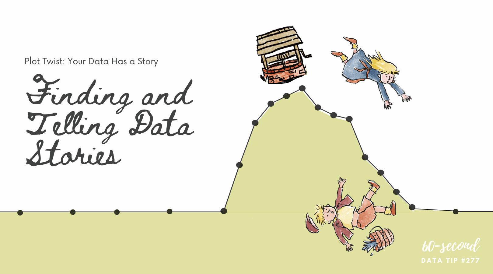
I recently read Has Data Storytelling Reached Its Peak? in which Amanda Makulec suggests that we use the term “data storytelling” cautiously. “Not every piece of data needs to be communicated as a story,” Makulec notes. “Sometimes we need to start with story-finding or just a well structured chart, rather than a full narrative arc.” I’ve had my own concerns about the term “data storytelling” which I’m sharing with you (again) today.

***

“Data” and “storytelling” are an item. You see them together all the time lately. When I first came across the term “data storytelling,” it instantly appealed to me. “Data” suggests credibility, information that has some objective basis. But data, to many of us, is boring. Its meaning is often uncertain or unclear. Or, even worse, it’s both. “Storytelling,” by contrast, suggests clarity, a plot with both excitement and resolution. So, by coupling these two words, we seem to get the best of both worlds. Data lend credibility to stories. Stories lend excitement and clarity to data.

Indeed, that’s the point of data storytelling. As Brent Dykes, a data storytelling evangelist of sorts, noted in a 2016 Forbes article, “Much of the current hiring emphasis has centered on the data preparation and analysis skills—not the ‘last mile’ skills that help convert insights into actions.” That’s where data storytelling comes in, using a combination of narrative, images, and data to make things “clear.”

But let’s step back just a minute. Why are we so drawn to stories? According to Yuval Harari, author of Sapiens: A Brief History of Humankind, the answer is:  survival. Harari maintains that humans require social cooperation to survive and reproduce. And, he suggests that to maintain large social groups (think cities and nations), humans developed stories or “shared myths” such as religions and corporations and legal systems. Shared myths have no basis in objective reality. Reality includes animals, rivers, trees, stuff you can see, hear, and touch. Rather, stories are an imagined reality that governs how we behave. The U.S. Declaration of Independence states: “We hold these truths to be self-evident: that all men are created equal . . . “ Such “truths” may have seemed obvious to the framers, but Harari notes that there is no objective evidence for them in the outside world.  Instead, they are evident based on stories we have told and retold until they have the ring of truth.

So stories (in the past and present) are not about telling the whole truth and nothing but the truth. Instead, they are often about instruction: whom to trust, how to behave, etc. And we should keep this in mind when telling and listening to “data stories.” To serve their purpose, stories leave out a lot of data — particularly data that doesn’t fit the arc of the story. For example, you might not hear about a subgroup whose storyline is quite different from the majority. Or, indeed the story might focus exclusively on a subgroup, ignoring truths about the larger group.

Bottom line: listener beware. A story, whether embellished with data or not, is still just a story. And truth can lie both within and outside of that story.


Let’s talk about YOUR data!

Got the feeling that you and your colleagues would use your data more effectively if you could see it better? Data Viz for Nonprofits (DVN) can help you get the ball rolling with an interactive data dashboard and beautiful charts, maps, and graphs for your next presentation, report, proposal, or webpage. Through a short-term consultation, we can help you to clarify the questions you want to answer and goals you want to track. DVN then visualizes your data to address those questions and track those goals.


New and Improved Stacked Bar Chart

Here’s a simple solution to a problem with stacked bar charts. Yes, they allow you to compare the size of different groups as well as the subgroups within each group. But comparing the subgroups is tough because — for all but one of the subgroups — you have to compare the length of the bar segments without a common baseline.

The bar chart below, created with Tableau, solves that problem by adding a filter so that you can see the whole bars by selecting “All” but also see only one or more subgroups so you can easily make comparisons across just those subgroups. In this chart, I’ve also set the sort order so that it’s always in descending order regardless of the filter selections. See info below on how I set the sort order in Tableau.

See how this chart works by interacting with it yourself! Change the selections on the checkboxes.

To sort questions in descending order regardless of the response option chosen, click the dropdown arrow on Question in the rows shelf and select Sort . . .

. . . .Then choose to sort by Field in descending sort order and choose the name of the field that indicates number of respondents.

To see past data tips, click HERE.


Let’s talk about YOUR data!

Got the feeling that you and your colleagues would use your data more effectively if you could see it better? Data Viz for Nonprofits (DVN) can help you get the ball rolling with an interactive data dashboard and beautiful charts, maps, and graphs for your next presentation, report, proposal, or webpage. Through a short-term consultation, we can help you to clarify the questions you want to answer and goals you want to track. DVN then visualizes your data to address those questions and track those goals.


Ideas You Should Steal From This Viz (Installment 9)

Source: Source: Yusuke Nakanishi on Tableau Public

Here’s another steal-worthy viz to inspire you. This one is from Yusuke Nakanishi on Tableau Public. Filling the numbers to show the percent is cool, particularly because the chart is about drinking and the numbers appear to be filled like a glass. Nakanishi created the chart in Tableau by making a simple bar chart and then placing a virtual stencil (i.e. numbers with a transparent fill) over the chart. The best place to make this type of stencil is probably Adobe Illustrator. But if you don’t have an Adobe subscription, you can do it for free in Canva. I created this image in Canva as indicated below.

  1. Open Canva and click on “Create a design” in upper right corner of the screen. Select a size (I chose presentation).

  2. Select “Background” on left side of screen and then choose a background.

  3. Select “Elements” on left side of screen and enter' “number frames” in the search window. Number frames look like numbers filled with an illustration of grass and sky. Click on the numbers you want and place and size them on the slide as you wish.

  4. Select “Elements” on left side of screen and enter search terms in the search window to find a photo with one color on the bottom and another color on the top. I entered “oil” and used a photo with oil on the bottom and white on the top.

  5. Drag that image over each number frame until it fills the frame.

  6. Double click on the filled number and resize and move the image until the bottom color fills the number frame to the right height. To determine the height, you can use Canva’s rulers and guides.


Let’s talk about YOUR data!

Got the feeling that you and your colleagues would use your data more effectively if you could see it better? Data Viz for Nonprofits (DVN) can help you get the ball rolling with an interactive data dashboard and beautiful charts, maps, and graphs for your next presentation, report, proposal, or webpage. Through a short-term consultation, we can help you to clarify the questions you want to answer and goals you want to track. DVN then visualizes your data to address those questions and track those goals.


Do nonprofits have the necessary data to make good use of AI?

This is a question that I’ve been wondering about. Maybe you have too? So I used AI (artificial intelligence) to find an answer! Here is what ChatGPT spit out in a few seconds with my commentary on the side.


Let’s talk about YOUR data!

Got the feeling that you and your colleagues would use your data more effectively if you could see it better? Data Viz for Nonprofits (DVN) can help you get the ball rolling with an interactive data dashboard and beautiful charts, maps, and graphs for your next presentation, report, proposal, or webpage. Through a short-term consultation, we can help you to clarify the questions you want to answer and goals you want to track. DVN then visualizes your data to address those questions and track those goals.


Jitter Your Charts

A jittered bar chart shows the individuals that make up the bar. In this example, each circle represents an employee within a given city department. Larger circles represent higher salaries and smaller circles lower salaries. You can scroll over each circle to learn more. It’s another great way to show the individuals within an aggregate. And it’s easy to create in Tableau (just watch this four-minute video) or in Excel (here are instructions).


Let’s talk about YOUR data!

Got the feeling that you and your colleagues would use your data more effectively if you could see it better? Data Viz for Nonprofits (DVN) can help you get the ball rolling with an interactive data dashboard and beautiful charts, maps, and graphs for your next presentation, report, proposal, or webpage. Through a short-term consultation, we can help you to clarify the questions you want to answer and goals you want to track. DVN then visualizes your data to address those questions and track those goals.


Is The Chihuahua Syndrome Infecting Your Data?

This “sketchplanation” gives a name to a familiar problem.* Chihuahua is challenging to spell. If humans are entering dog breeds into a database or spreadsheet, chances are there are going to be spelling errors unless they can select from a list of breeds or there is another sort of data validation. It’s hard to extract meaning from data that is inaccurate. “Capitals, spaces, misspellings, hyphens, numbers stored as text, numbers entered as letters (I, O), accents, straight/curly apostrophes, dates out of order, languages, dialects, abbreviations, and more are all routes for misleading your analysis.” So make a plan to clean your dirty data and to keep it clean over time. Also, when visualizing data in programs like Tableau, you can group common misspellings into one new field. In this way, the misspelled entry will be automatically corrected in visualizations that use the new field. Also, Tableau Prep Builder comes with most subscriptions to Tableau and allows for easier data preparation including combining, shaping, and cleaning data for analysis within Tableau.

To see past data tips, click HERE.

*Chihuahua Syndrome” was coined by Edward Tufte.


Let’s talk about YOUR data!

Got the feeling that you and your colleagues would use your data more effectively if you could see it better? Data Viz for Nonprofits (DVN) can help you get the ball rolling with an interactive data dashboard and beautiful charts, maps, and graphs for your next presentation, report, proposal, or webpage. Through a short-term consultation, we can help you to clarify the questions you want to answer and goals you want to track. DVN then visualizes your data to address those questions and track those goals.


Two Ways to Offer The "Just Right" Data Portion

60-SECOND DATA TIP #8 (3).png

Reposted from June 2018

Pretend that you are Goldilocks and your porridge is data. How much data is just right? Just enough to engage your funders, staff, or board members, but not so much as to be overwhelming?

To answer this question, we might consider Miller’s Law. George A. Miller was a psychology professor at Princeton University and wrote one of the most frequently cited papers in psychology: "The Magical Number Seven, Plus or Minus Two: Some Limits on Our Capacity for Processing Information."

Miller conducted experiments on human memory and concluded that the number of objects that an average human can remember in the short-term is 7 ± 2.  Objects can include symbols like numbers or abstract concepts. We also can hold several groups of related objects in mind.

Armed with this knowledge, we can make visualizations of data (charts, maps, graphs) easier to digest by:

1) Grouping data into categories. Whenever you have a graph or chart with more than 5 data categories, the individual units start to lose their individuality and are perceived by our eyes as a single whole. In the “before” and “after” examples below, the after chart is easier to process because it combines data on donors into just two groups: those in Chicago and those in other cities.

2) Highlight one or two single categories and gray out the rest. The second chart below (called a parallel coordinates chart) includes a line for each of the 50 states showing the prevalence of various diseases in each state. But only one state (Hawaii) is highlighted and the rest are grayed out. Thus there are really only two data categories to compare: 1) Hawaii and 2) the rest of the states.

BEFORE: TOO MANY GROUPS

many groups.jpg

AFTER: JUST TWO GROUPS

two groups.jpg

HIGHLIGHT ONE GROUP

hawaii.jpg

Let’s talk about YOUR data!

Got the feeling that you and your colleagues would use your data more effectively if you could see it better? Data Viz for Nonprofits (DVN) can help you get the ball rolling with an interactive data dashboard and beautiful charts, maps, and graphs for your next presentation, report, proposal, or webpage. Through a short-term consultation, we can help you to clarify the questions you want to answer and goals you want to track. DVN then visualizes your data to address those questions and track those goals.


10 Tips for Presenting Data Like An Artist

Resposted from March 2021

To make great charts, maps, and graphs, you need to channel both your inner analyst and your inner artist. Here are 10 rules about composition that artists know and that analysts (and the rest of us) can apply when presenting data. Bookmark it! Print it out and pin it to your bulletin board!


Let’s talk about YOUR data!

Got the feeling that you and your colleagues would use your data more effectively if you could see it better? Data Viz for Nonprofits (DVN) can help you get the ball rolling with an interactive data dashboard and beautiful charts, maps, and graphs for your next presentation, report, proposal, or webpage. Through a short-term consultation, we can help you to clarify the questions you want to answer and goals you want to track. DVN then visualizes your data to address those questions and track those goals.


Context is King

This “sketchplanation” elegantly demonstrates the importance of context in understanding anything. Since data visualizations are supposed to help people understand something, we should pay close attention to context when creating them, adding as much context as is needed for others to appreciate what’s going on and act on it. Considering the following charts . . .

Low-context chart

This is your garden variety chart. I see them all the time. Sure, it provides some context by comparing clients served in different zip code areas. But it doesn’t give me enough context to understand if these numbers are high, low, or somewhere in between. This chart needs more context.

xx

Moderate-context chart

This chart is better than the one above. By providing the previous year’s numbers, we can see where there has been increases and decreases and how large and small they were as well as compare the number increases (3) to the number of decreases (1).

xx

Moderate-context chart

This chart, too, allows for better assessment of the numbers than the first chart did. By simply adding a reference line for the goal, we have a better understanding of what’s going on and where we might need to take action. A reference line showing the average number of clients per zip code might also be helpful.

xx

High-context chart

This “small multiples chart”* gives us much more context by showing how the current numbers compare to past years. Consider, for example, the trend for 60601. Just knowing the current and past years’ numbers would not give you an appreciation of the overall upward trend.

*Small multiples chart: a series of similar graphs or charts using the same scale and axes, allowing them to be easily compared


Let’s talk about YOUR data!

Got the feeling that you and your colleagues would use your data more effectively if you could see it better? Data Viz for Nonprofits (DVN) can help you get the ball rolling with an interactive data dashboard and beautiful charts, maps, and graphs for your next presentation, report, proposal, or webpage. Through a short-term consultation, we can help you to clarify the questions you want to answer and goals you want to track. DVN then visualizes your data to address those questions and track those goals.


Interesting Versus Actionable Data

60-SECOND DATA TIP_4 (3).gif

Reposted from October 2021

It’s easy to get lost in a sea of interesting data when what you really need is actionable data. As Oracle’s Nate Mayfield points out, you know when you’ve presented only interesting data when you get this type of response: “Oh, cool. Yeah, that's great to know.” On the other hand, if you hear “Oh, okay. I can definitely decide what to do now,” then you’ve presented actionable data.

The key to presenting actionable data is to ask specific—rather than broad—questions. And then design your charts, maps, and graphs to answer those narrower questions. Mayfield’s article focuses on the types of questions a business might ask. Let’s consider the types of questions a nonprofit might ask:

Interesting Questions.png

Mayfield notes that data dashboards that are designed for a wide range of users tend to address only interesting questions. “Because they are intended for a broad set of users, with a lot of filters, you can in theory answer a lot of questions with these sprawling dashboards,” says Mayfield. “The problem is people quickly get lost in them and don’t spend the time required to answer their questions.” Instead, Mayfield advises us to create simple dashboards that answer quite specific questions such as the actionable questions above. So consider a series of simple dashboards, each designed to provide answers that prompt action for a particular type of user.

To see past data tips, including tips on other types of pantry staple data, click HERE.


Let’s talk about YOUR data!

Got the feeling that you and your colleagues would use your data more effectively if you could see it better? Data Viz for Nonprofits (DVN) can help you get the ball rolling with an interactive data dashboard and beautiful charts, maps, and graphs for your next presentation, report, proposal, or webpage. Through a short-term consultation, we can help you to clarify the questions you want to answer and goals you want to track. DVN then visualizes your data to address those questions and track those goals.


Ideas You Should Steal From This Viz (Installment 8)

Today I offer up yet another steal-worthy viz. The Racial Wealth Gap viz uses data from the U.S. Federal Reserve’s Survey of Consumer Finances to show the proportion of households that own different kinds of assets by racial group. Here’s what I like about this chart (and what you should steal from it):

  1. The use 100 families in addition to percentages. We can wrap our brains around 100 families. We can imagine it.

  2. The use of icons that help tell the story and also remind us of Monopoly pieces.

  3. Highlighting the gaps between the White group and other racial groups. The pink squares help us to appreciate how large the gaps are and how they compare across different asset groups.

To see past data tips, click HERE.


Let’s talk about YOUR data!

Got the feeling that you and your colleagues would use your data more effectively if you could see it better? Data Viz for Nonprofits (DVN) can help you get the ball rolling with an interactive data dashboard and beautiful charts, maps, and graphs for your next presentation, report, proposal, or webpage. Through a short-term consultation, we can help you to clarify the questions you want to answer and goals you want to track. DVN then visualizes your data to address those questions and track those goals.


What Averages Obscure

Copy of 60-SECOND DATA TIP #8.png

Reposted from January 2018

Nonprofits (and everyone else) are addicted to averages. We like to talk about how participants do on average. We might describe how many visitors we have in an average week. But how much are we missing when we focus solely on averages? Short answer: it depends, but it could be a lot. If I only showed you the average sized person in the picture above, would you appreciate the full range of sizes?

To figure out what and how much we are missing, we need to calculate—or better yet show—how spread out our data points are. Understanding the spread gives us an idea of how well the average represents the data. When the spread of values in the data set is large, the average obscures the real picture more than when the spread is small.

Spread measures include range, quartiles, absolute deviation, variance and standard deviation. For more on these measures, check this out. 

A great way to quickly grasp the spread of your data is to make a box plot. A box plot (aka. box and whisker diagram) shows the distribution of data including the minimum, first quartile, median, third quartile, and maximum. The box plots below show the affordability of neighborhoods in five cities. Each red circle represents a zip code area. The gray boxes show where 50 percent of the zip code areas fall on the affordability scale. And the median (the middle point in a dataset) is where the dark gray meets the light gray. You can see that, in general (i.e according to the median), New York is more affordable than Los Angeles. However, New York has some zip code areas that are much less affordable than the median seems to suggest.

So when looking at your data, don’t just look at averages, also consider the spread.

boxplot2.jpg

Image created by Moxilla for Noun Project.


Let’s talk about YOUR data!

Got the feeling that you and your colleagues would use your data more effectively if you could see it better? Data Viz for Nonprofits (DVN) can help you get the ball rolling with an interactive data dashboard and beautiful charts, maps, and graphs for your next presentation, report, proposal, or webpage. Through a short-term consultation, we can help you to clarify the questions you want to answer and goals you want to track. DVN then visualizes your data to address those questions and track those goals.


And Here's A Bonus: A Bar Chart Catalogue

I thought I had wrapped up my miniseries on bar charts when I came across this excellent bar chart catalogue by Rosa Mariana de Leon-E. It includes 27 variations on the bar chart with links to instructions for creating them with Tableau. Enjoy!


Let’s talk about YOUR data!

Got the feeling that you and your colleagues would use your data more effectively if you could see it better? Data Viz for Nonprofits (DVN) can help you get the ball rolling with an interactive data dashboard and beautiful charts, maps, and graphs for your next presentation, report, proposal, or webpage. Through a short-term consultation, we can help you to clarify the questions you want to answer and goals you want to track. DVN then visualizes your data to address those questions and track those goals.