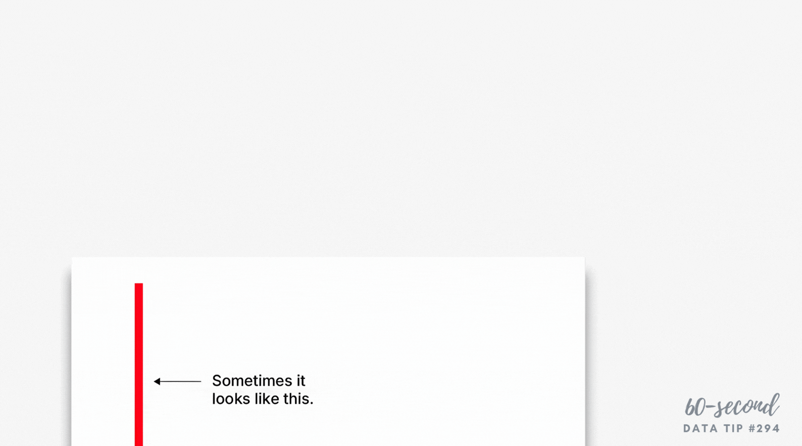
This week I offer up my last bar chart hack. I came across this hack just recently in Philip Bump’s excellent Washington Post newsletter, How To Read This Chart. In the newsletter, he shares a chart from his book: The Aftermath: The Last Days of The Baby Boom and The Future of Power in America. The chart, shown below, is a sort of double-duty stacked bar chart. It not only makes use of the length of the bar segments to convey meaning, it also makes use of the width of the bars.
Here’s how Bump describes the chart: “The width of each column reflects the total percentage of the population for that generational group. The colored sections are the percentage that is each racial group. Black, Asian and Hispanic Americans of every age vote more heavily Democratic than Republican. It’s not just White young people who are more Democratic (though, among women, that is the case.) It’s that young people are less likely to be White and also more likely to vote against Republicans. The thesis of my book is that the baby boom (which backed Donald Trump by 3 points in 2020) is seeing its political and economic power fade, contributing to a number of the tensions we see in the moment. Between 2016 and 2020, the percentage of the presidential electorate that was baby-boom-aged or older went from 52 to 44 percent; the percent that was millennial or Gen Z went from 23 to 30 percent.”
Had Bump shown the percent of the population in different racial groups in one chart and the percent of the population in different generations in another chart, he would have provided fewer insights.
I encourage you to explore your data with this type of chart, showing the percent of your participants, donors, locations, etc. according to two different dimensions such as age group and zip code or giving level and giving history (recurring, one-time, major gift). It might yield important insights and help you to communicate them to others.

Source: The Aftermath by Philip Bump
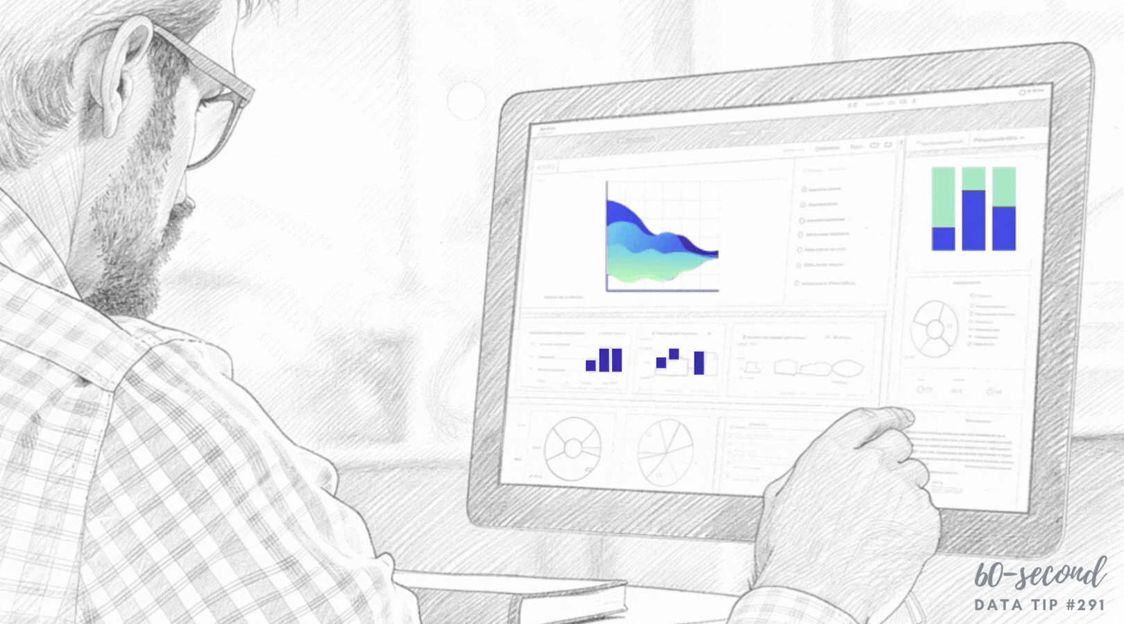
Let’s talk about YOUR data!
Got the feeling that you and your colleagues would use your data more effectively if you could see it better? Data Viz for Nonprofits (DVN) can help you get the ball rolling with an interactive data dashboard and beautiful charts, maps, and graphs for your next presentation, report, proposal, or webpage. Through a short-term consultation, we can help you to clarify the questions you want to answer and goals you want to track. DVN then visualizes your data to address those questions and track those goals.