The Pies That Bind

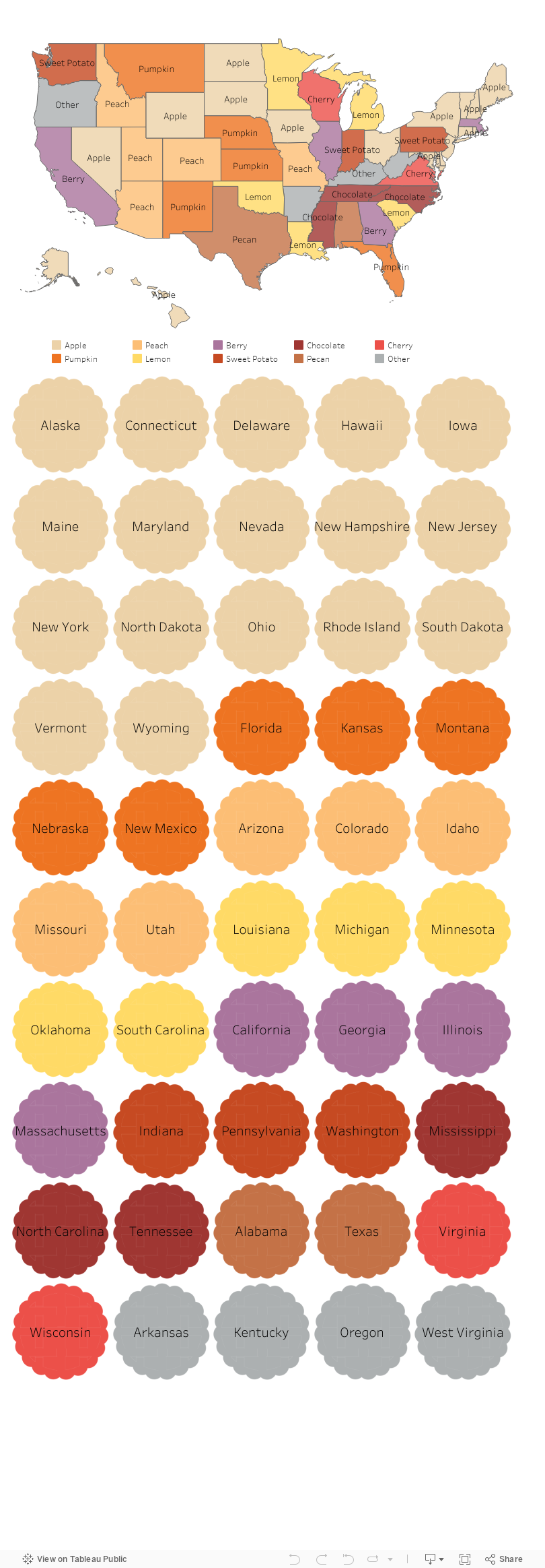
Rather than provide you with a tip, I thought I’d start this holiday week by offering you a little hope instead. It’s pie season, and folks are searching for pie recipes on Pinterest. According to this Food & Wine article, Pinterest analyzed recent internal search data to discover the most common pie recipe search terms in each state. I took that data and mapped it. As you can see below, pie preferences do not appear to fall along regional, ideological, or even agricultural lines. Minnesotans love lemon pies, and Floridians love pumpkin pie, although I’m guessing that more lemons are grown in Florida and pumpkins in Minnesota. Some states were idiosyncratic in their searches. Hello West Virginians who love no-bake peanut butter pies and Kentuckians who love pies made with cushaws, a type of squash I’d never heard of. But most states shared pie interests with other states. So this Thanksgiving, let’s be thankful for our shared love of pie. Scroll around on the vizes below and Happy Thanksgiving!


Let’s talk about YOUR data!

Got the feeling that you and your colleagues would use your data more effectively if you could see it better? Data Viz for Nonprofits (DVN) can help you get the ball rolling with an interactive data dashboard and beautiful charts, maps, and graphs for your next presentation, report, proposal, or webpage. Through a short-term consultation, we can help you to clarify the questions you want to answer and goals you want to track. DVN then visualizes your data to address those questions and track those goals.


Pop Quiz: Guess What This Chart Shows

Go ahead and make a guess from the options below. Then scroll down to see how your response compares with others’ and what the answer is!

Keep scrolling!

The answer: The decline in child poverty in the U.S.


As recently reported in The New York Times, “the sharp retreat of child poverty represents major progress and has drawn surprisingly little notice, even among policy experts.” Read the article (and view the detailed line chart) to learn more about the role of government aid in lifting children and families out of poverty.

I share this chart with you—in this way—for a couple of reasons:

1) It’s an engagement strategy you can use. Rather than present a list of stats to your audience, you can engage them in your data by first quizzing them on an interesting, fun, or counterintuitive finding from your data.

2) Bad new bias. Bad news is more likely to be reported than good news, possibly because bad news sells, according to this article citing various research. Perhaps because of that bias, we may be more likely to assume a chart is telling a negative story. This chart is a reminder of the importance of taking a broader view to gain a more balanced understanding of an issue.

To see past data tips, click HERE.


Let’s talk about YOUR data!

Got the feeling that you and your colleagues would use your data more effectively if you could see it better? Data Viz for Nonprofits (DVN) can help you get the ball rolling with an interactive data dashboard and beautiful charts, maps, and graphs for your next presentation, report, proposal, or webpage. Through a short-term consultation, we can help you to clarify the questions you want to answer and goals you want to track. DVN then visualizes your data to address those questions and track those goals.


The Problem with Large Numbers (And What To Do About it)

Reposted from April 2021

BANs (Big Ass Numbers) — aka “vanity metrics” — are gaining prominent positions in data dashboards, websites, social media, email marketing, and annual reports these days. They are meant to impress. Wow! 359,234 meals served! Cool! $6 million raised!

But there is a problem with big numbers. Our brains can’t fully digest them. As noted in a 2017 Wall Street Journal article, “Big numbers befuddle us, and our lack of comprehension compromises our ability to judge information about government budgets, scientific findings, the economy and other topics that convey meaning with abstract figures, like millions, billions, and trillions.”

When quantifying the breadth of a problem or solution, nonprofits may toss out lots of giant figures, as in the bewildering graphic below. But without context, even numbers in the hundreds or thousands can bewilder.

So what can we do to make BANs more meaningful? Researchers at Columbia University and Microsoft found that they could improve numerical comprehension by using “perspectives,” which are simple sentences that relate a large number to something more familiar to us.

They found, for example, that when told that the number of registered firearms in the U.S. is about 300 million, study participants not only had trouble comprehending this number but also recalling it and assessing its likely accuracy. However, when told that there is about one firearm per person in the U.S., significantly more people could comprehend, assess, and recall the quantity. Makes sense to me. We can imagine a group of people, each holding a firearm, but we are hard pressed to imagine a pile of 300 million firearms.

So before you present a large number, consider a perspective that will make it relatable for your audience. Below are some formulas used in the Columbia/Microsoft study for developing perspectives.


Let’s talk about YOUR data!

Got the feeling that you and your colleagues would use your data more effectively if you could see it better? Data Viz for Nonprofits (DVN) can help you get the ball rolling with an interactive data dashboard and beautiful charts, maps, and graphs for your next presentation, report, proposal, or webpage. Through a short-term consultation, we can help you to clarify the questions you want to answer and goals you want to track. DVN then visualizes your data to address those questions and track those goals.


5 Megatrends Fueling the Rise of Data Storytelling

Happy to share with you this great infographic from Visual Capitalist. You can find the full article here.

To see past data tips, click HERE.


Let’s talk about YOUR data!

Got the feeling that you and your colleagues would use your data more effectively if you could see it better? Data Viz for Nonprofits (DVN) can help you get the ball rolling with an interactive data dashboard and beautiful charts, maps, and graphs for your next presentation, report, proposal, or webpage. Through a short-term consultation, we can help you to clarify the questions you want to answer and goals you want to track. DVN then visualizes your data to address those questions and track those goals.


How To Visualize Cycles

Every organization experiences cyclical or seasonal patterns. Understanding how funding, participation, volunteering, and other factors change in predictable ways over time can help us to plan for the future. The problem is that we don’t always see these patterns. We get caught up in currents issues and crises, and it’s hard to step back and see what’s coming next. Visualizing your data can reveal cyclical or seasonal patterns in helpful ways. This often involves aggregating data from multiple years by specific time periods such as season, quarter, or day of the week. Here are some examples.

Working with a statistician named William Farr in the 1800s, Florence Nightingale analyzed mortality rates during the Crimean War. She and Farr discovered that most of the soldiers who died in the conflict perished not in combat but as a result of “preventable diseases” caused by bad hygiene. Nightingale invented the polar area chart (shown below), a variant of the pie chart, meant “to affect thro’ the Eyes what we fail to convey to the public through their word-proof ears.” Each pie represented a twelve-month period of the war, with each slice showing the number of deaths per month, growing outward if the number increased, and color-coded to show the causes of death (blue: preventable, red: wounds, black: other). The New York Times showed the seasonal pattern of COVID cases using a somewhat similar chart.

Source: Wikipedia

In the dashboard below, Curtis Harris reveals not only patterns in taxi rides by time of day but also by day of the week. We can see, for example, that few people are using taxis between 2 and 3 am, particularly at the beginning of the week.

Source: Curtis Harris on Tableau Public

This varsity-level viz (below) by Lindsay Betzendahl shows the seasonality of the flu. Each dot represents one week in a particular year. Each “ray” consists of dots for the same week of different years. So the ray at the 12:00 position represents the first week in January for each year between 2007 to 2018. The size of the dots show the number of influenza cases. So we can see that cases surge during the winter weeks, in general, but we also can see outbreaks during other seasons in particular years. Betzendahl explains how to create such a chart in Tableau here.

Source: Lindsay Betzendahl on Tableau Public


Let’s talk about YOUR data!

Got the feeling that you and your colleagues would use your data more effectively if you could see it better? Data Viz for Nonprofits (DVN) can help you get the ball rolling with an interactive data dashboard and beautiful charts, maps, and graphs for your next presentation, report, proposal, or webpage. Through a short-term consultation, we can help you to clarify the questions you want to answer and goals you want to track. DVN then visualizes your data to address those questions and track those goals.


How To Make Big Numbers Tangible

We’ve talked about the problem with big numbers before. Most recently, we considered the difficulty humans have digesting large numbers and how “perspectives” — simple sentences that relate a large number to something more familiar to us — can help us to understand, assess, and recall numbers. (For more on this, check out the data tip.)

I’m returning to the big number problem today and offering up some new tips for dealing with them. The inspiration for these tips came from the data-driven documentaries of Neil Halloran, specifically his first documentary called The Fallen of World War II. If you have a few more minutes to spare after reading this 60-second tip (and are not among the 10 million + who have viewed it already), I highly recommend that you check it out. It’s 18 minutes long, but the techniques listed below all appear in the first 7 minutes.

Halloran uses the following techniques to make larger numbers understandable. And you don’t need to be a filmmaker to use them. You can apply them to simple data presentations on websites, reports, and PowerPoints.

  1. Use shapes or icons (rather than bars) to represent one or more people, programs, etc. Halloran uses a human figure shape to represent 1,000 people.

  2. Show an aggregate and then break it down by subgroups and time periods. Halloran shows aggregates, such as the total number of U.S. soldiers who died and then, using animation, redistributes the human figures to show how many soldiers died in the European and Pacific theaters and then how many died over time. The animation is cool but not necessary. You can do the same thing with a series of static images. See example below.

  3. Juxtapose photos and charts. To keep the discussion from becoming too abstract, Halloran reminds the audience what actual soldiers (rather than icons) look like by incorporating photos into his presentation. Again, animation is not necessary. Static photos can be placed along side charts.

  4. Walk audience through the data. To give the audience a sense of scale, the video progresses from smaller to larger numbers. Halloran first walks us through casualty stats for the U.S. and European countries. These numbers seem quite high so by the time Russian stats are shown, we are blown away.


Let’s talk about YOUR data!

Got the feeling that you and your colleagues would use your data more effectively if you could see it better? Data Viz for Nonprofits (DVN) can help you get the ball rolling with an interactive data dashboard and beautiful charts, maps, and graphs for your next presentation, report, proposal, or webpage. Through a short-term consultation, we can help you to clarify the questions you want to answer and goals you want to track. DVN then visualizes your data to address those questions and track those goals.


How To Make Data Dashboards More Comfortable

I’m always looking for ways to make data more comfortable, particularly for non-data people. Sometimes that means creating simple charts that everyone can understand. Sometimes that means limiting the number of charts presented. And today, I offer up another tip: show your data in a familiar environment. For many of us, paper, file folders, paper clips, and post-it notes are familiar and, dare I say, even comforting.

Give this old-school-meets-new-school data dashboard a spin and see what you think. It shows real-time data in an interactive format. And if you’d like some help creating a similar dashboard for your organization, feel free to contact me.


Let’s talk about YOUR data!

Got the feeling that you and your colleagues would use your data more effectively if you could see it better? Data Viz for Nonprofits (DVN) can help you get the ball rolling with an interactive data dashboard and beautiful charts, maps, and graphs for your next presentation, report, proposal, or webpage. Through a short-term consultation, we can help you to clarify the questions you want to answer and goals you want to track. DVN then visualizes your data to address those questions and track those goals.


How To Create More Diverse, Equitable, and Inclusive Data Visualizations

When we visualize information, we make a series of decisions which affect the way that viewers process the information in our charts, maps, and graphs. Sometimes they don’t feel like decisions at all. We go with the default settings in the application we are using. Or we just do something the way it’s usually done. But a more diverse, equitable, and inclusive approach to presenting and visualizing data requires us to make those decisions more consciously and deliberately. Jonathan Schwabish and Alice Feng of the Urban Institute provide some helpful tips, based on the Urban Institute’s own style guide, which you can apply the next time you present data.

Here is a summarized version of Schwabish and Feng’s article.* And here is my 60-second version of their recommendations:

  • Use people-first language in titles, text, and labels associated with charts, maps, and graphs. For example, use “people with disabilities” rather than “disabled people.” Also Urban does not refer strictly to skin color. For example, they refer to “Black people” not “Blacks.”

  • Order and present groups purposefully. The first group shown in a table or the first bar in a graph can affect how readers perceive the relationship or hierarchy among groups. For example, if the first group is “Men,” then it may appear that men are the default group against which other groups should be compared. One way to prevent viewers from making certain comparisons is to display groups in side-by-side charts (aka “small multiples” charts) rather than on a single chart. In general, make ordering and grouping decisions to promote certain comparisons and prevent others.

  • Point to missing groups. If certain groups are missing from the data, explain why in text boxes or footnotes. Also add information on groups included in “Other” categories and consider providing a more specific label than “Other” which can have an exclusionary connotation.

  • Do not use color palettes that reinforce gender or racial stereotypes. This one may seem obvious, but it bears repeating. Also, Urban’s color palette is accessible to people with certain color vision deficiencies, and the contrast between those colors and white and black text meet basic accessibility guidelines.

  • Depict a variety of races and genders when using icons and avoid icons that make inappropriate depictions of people or communities or reinforce stereotypes such as showing traditionally feminine icons to depict nurses or traditionally masculine icons to depict bosses.

  • Find ways to show the people behind the data. Data visualizations are, by definition, abstractions of larger realities. But in the process of abstracting, we may obscure the lived experiences of the real people whom the data represent. Visualizations can remind viewers about the individuals behind the data by, for example, depicting them as individual circles rather than aggregating them in a single bar.

* The full paper has been published as an OSF Preprint and can be accessed here.


Let’s talk about YOUR data!

Got the feeling that you and your colleagues would use your data more effectively if you could see it better? Data Viz for Nonprofits (DVN) can help you get the ball rolling with an interactive data dashboard and beautiful charts, maps, and graphs for your next presentation, report, proposal, or webpage. Through a short-term consultation, we can help you to clarify the questions you want to answer and goals you want to track. DVN then visualizes your data to address those questions and track those goals.


How To Present Diversity Data (or What To Steal From This Diversity Scorecard)

Today’s tip is to take inspiration from Chantilly Jaggernauth’s excellent diversity scoreboard displayed below. It shows diversity among employees in a company but can easily be applied to staff or participants in a nonprofit organization.

I suggest you steal the following ideas from Chantilly:

  • Metric Definitions. In a Tableau Conference session, Chantilly shares the pros and cons of the four metrics in the dashboard. See image of the slide below. None of the metrics are perfect. But together they provide an understanding of where an organization is in its diversity efforts. These definitions are not incorporated in the dashboard itself but could be added through a link or in a tooltip (scroll over) feature.*

  • Views of Diversity. The dashboard provides three views of diversity: overall, gender, and people of color (POC). By providing side-by-side charts with these three views, the dashboard allows users to see variations that overall diversity charts obscure.

  • Color Coding. Each type of diversity has its own color, which makes the comparison among overall, gender, and POC easy, even when you scroll down and can no longer see the column headers. Also the comparison groups (non-diversity, male, and non-POC) are represented by the same colors in lighter shades. This approach makes the dashboard easier to understand. Assigning three additional colors for the comparison groups could be confusing and require a color legend.

  • Simple Charts. These are all charts we all know how to read. So the scorecard is accessible immediately to anyone, even if they are not familiar with the data or the organization.

  • Also, note that the dashboard and the slide use different terms for two of the metrics.

Source: HR Diversity Scorecard on Tableau Public by Lovelytics

Image above from Tableau Conference session called “Next Gen Analytics for Your New Normal” on 11/10/21.


Let’s talk about YOUR data!

Got the feeling that you and your colleagues would use your data more effectively if you could see it better? Data Viz for Nonprofits (DVN) can help you get the ball rolling with an interactive data dashboard and beautiful charts, maps, and graphs for your next presentation, report, proposal, or webpage. Through a short-term consultation, we can help you to clarify the questions you want to answer and goals you want to track. DVN then visualizes your data to address those questions and track those goals.


Interesting Versus Actionable Data

60-SECOND DATA TIP_4 (3).gif

It’s easy to get lost in a sea of interesting data when what you really need is actionable data. As Oracle’s Nate Mayfield points out, you know when you’ve presented only interesting data when you get this type of response: “Oh, cool. Yeah, that's great to know.” On the other hand, if you hear “Oh, okay. I can definitely decide what to do now,” then you’ve presented actionable data.

The key to presenting actionable data is to ask specific—rather than broad—questions. And then design your charts, maps, and graphs to answer those narrower questions. Mayfield’s article focuses on the types of questions a business might ask. Let’s consider the types of questions a nonprofit might ask:

Interesting Questions.png

Mayfield notes that data dashboards that are designed for a wide range of users tend to address only interesting questions. “Because they are intended for a broad set of users, with a lot of filters, you can in theory answer a lot of questions with these sprawling dashboards,” says Mayfield. “The problem is people quickly get lost in them and don’t spend the time required to answer their questions.” Instead, Mayfield advises us to create simple dashboards that answer quite specific questions such as the actionable questions above. So consider a series of simple dashboards, each designed to provide answers that prompt action for a particular type of user.

To see past data tips, including tips on other types of pantry staple data, click HERE.


Let’s talk about YOUR data!

Got the feeling that you and your colleagues would use your data more effectively if you could see it better? Data Viz for Nonprofits (DVN) can help you get the ball rolling with an interactive data dashboard and beautiful charts, maps, and graphs for your next presentation, report, proposal, or webpage. Through a short-term consultation, we can help you to clarify the questions you want to answer and goals you want to track. DVN then visualizes your data to address those questions and track those goals.


Before Showing A Percentage, Read This

60-SECOND DATA TIP_4 (1).png

Here’s what I’m going to do in 60 seconds today:

  • Give you three percentages. They might be the type of percentages that you share in proposals, reports, your website, or in social media posts.

  • Give you the backstory on these percentages.

  • Convince you to think carefully next time you want to present a percentage.

Here goes.

#1: Two percent of clients in Program A dropped out in the first three days of the program.

#2: 60% of first time donors in March made a second gift.

#3: 25% of people who attended our XYZ event said that they were unlikely or very unlikely to recommend the event to others.

And here is the backstory on each of the percentages:

#1: Two percent of clients in Program A dropped out in the first three days of the program. Backstory: There were 50 participants in Program A. That means only one person dropped out.

#2: 60% of first time donors in March made a second gift. Backstory: There were 5 new donors in March. That means that 3 made second gifts.

#3: 25% of people who attended our XYZ event said that they were unlikely or very unlikely to recommend the event to others. Backstory: Eight people attended XYZ event. That means two people provided the low rating.

Did the backstories cast a different light on the percentages for you? Perhaps you were imagining more people were involved? When the numerator or the denominator is fairly small, it’s usually best to present both in raw numbers rather than give a percentage. The raw numbers present a clearer understanding of the situation that you’re trying to describe. In fact, when numbers are small, percentages can be downright misleading.


Let’s talk about YOUR data!

Got the feeling that you and your colleagues would use your data more effectively if you could see it better? Data Viz for Nonprofits (DVN) can help you get the ball rolling with an interactive data dashboard and beautiful charts, maps, and graphs for your next presentation, report, proposal, or webpage. Through a short-term consultation, we can help you to clarify the questions you want to answer and goals you want to track. DVN then visualizes your data to address those questions and track those goals.


Understand Social Media Impact Using "Pantry Staple" Data

60-SECOND DATA TIP_3.gif

Social media data is another staple in our data pantries. Your organization probably has it. But you might not make good use of it. Why? Well, social media analytics come in many flavors and can bewilder. Posts are like bait. The better the bait, the more nibbles and bites leading to website traffic and eventually to more donations, volunteers, participation, and other types of engagement. But we need a way to easily decipher which types of bait are working best. And drawing this information out of the data can be a challenge.

Need some inspiration? Check out Alice McKnight’s dashboard below. It provides a broad array of social media data in an appealing and accessible format. We can see how effective social media posts are at various times. The charts along the top give us the basic trends over the last several months. It also shows us what topics are drawing attention. Give it a try. Check out the “View By” options which filter the two charts at the bottom. Then consider how you might visualize your own social media data using similar charts.

Source: Alice McKnight on Tableau Public

To see past data tips, including tips on other types of pantry staple data, click HERE.


Let’s talk about YOUR data!

Got the feeling that you and your colleagues would use your data more effectively if you could see it better? Data Viz for Nonprofits (DVN) can help you get the ball rolling with an interactive data dashboard and beautiful charts, maps, and graphs for your next presentation, report, proposal, or webpage. Through a short-term consultation, we can help you to clarify the questions you want to answer and goals you want to track. DVN then visualizes your data to address those questions and track those goals.


Understand Your Budget Using "Pantry Staple" Data

60-SECOND DATA TIP_3.png

Budget data is another staple in our data pantries. We need our staff, board members, funders, clients, and other stakeholders to understand this data. But many of them are not comfortable with financial spreadsheets. Here are some ways to present budget data that allow others to gain quick insight and, perhaps, dig deeper. These examples all come from the public sector but are easily applied to a nonprofit organization’s budget.

2016 U.S. Budget

The Obama administration made the Byzantine federal budget accessible to the world through this simple treemap. We can see where the lion's share of the money goes and which areas receive relatively little funding. Click HERE to see the interactive version which provides more information when you scroll over or click on a rectangle. Treemaps are easy to make in Tableau, Excel, and other apps.

School District of Philadelphia Budget

I find this sunburst chart daunting in static form. But check out the interactive version HERE. If you scroll over the inner ring, you can see that 96 percent of funds went to school budgets. Then move to successive outer rings to see how school and administrative budgets break down into smaller categories. You can build sunburst charts in Excel and other apps.

Oak Park, Illinois Budget

This interactive area chart showing the Oak Park, IL budget emphasizes change over time in the area chart at the top. But you can click on any year to see how the budget broke down by funds in the bar chart below. If you click on the downward arrow next to a given fund, you get even more detailed information on that fund. You can build this type of interactive viz in Tableau.

To see past data tips, including tips on other types of pantry staple data, click HERE.


Let’s talk about YOUR data!

Got the feeling that you and your colleagues would use your data more effectively if you could see it better? Data Viz for Nonprofits (DVN) can help you get the ball rolling with an interactive data dashboard and beautiful charts, maps, and graphs for your next presentation, report, proposal, or webpage. Through a short-term consultation, we can help you to clarify the questions you want to answer and goals you want to track. DVN then visualizes your data to address those questions and track those goals.


Understand Donations Using "Pantry Staple" Data

60-SECOND DATA TIP_3.gif

The vast majority of nonprofits have some type of list of donors and donations. Tell me that you don’t have a database or spreadsheet that looks something like this.

Screen Shot 2021-04-19 at 11.10.23 AM.png

Use Case: Tracking Progress to Goal

Now tell me that this data would not be way more useable in this interactive dashboard. Give it a try. You can see both how you are doing overall in relation to your goal and how different types of donors and donations are contributing to your progress. This dashboard can be created using Tableau Public, the free version of Tableau.

To see past data tips, including tips on other types of pantry staple data, click HERE.


Let’s talk about YOUR data!

Got the feeling that you and your colleagues would use your data more effectively if you could see it better? Data Viz for Nonprofits (DVN) can help you get the ball rolling with an interactive data dashboard and beautiful charts, maps, and graphs for your next presentation, report, proposal, or webpage. Through a short-term consultation, we can help you to clarify the questions you want to answer and goals you want to track. DVN then visualizes your data to address those questions and track those goals.


How to Put The Viewer In The Viz

60-SECOND DATA TIP_3 (2).gif

Here’s a surefire way to engage your donors, staff, board members, and others in your data: put them in it. I’ve talked about how to place the “viewer in the viz” before. And The New York Times recently reminded me just how powerful this strategy can be.

This series of interactive visualizations from The New York Times shows you, right out of the gates, whether you live in a Democratic or Republican bubble. Then it zooms out to zip code areas near you and finally focuses on the segregated political landscape in the U.S. more generally.

I recommend you interact with the NYT viz and let it inspire you. Think about how you can engage various stakeholders in your data by using a similar technique. For example, show viewers . . .

  • How close they are to a problem. Rather than present statistics on food insecurity in your region, ask viewers to enter their zip code to see how many families near them don’t have consistent access to healthy food.

  • How accurate their understanding of an issues is. Ask them how many women experience domestic abuse or how many children experience poverty, and then show them how far off the mark they are. Check out this example!

  • How their habits or lifestyle contribute to—or help to reduce—a problem. Check out this Carbon Footprint Calculator for a great example.

  • What category they fall into. We all love to discover groups we belong to. Think of Harry Potter’s sorting hat. Consider elucidating an issue by showing viewers where they fall in relation to that issue. That’s what I did with this data personality viz.

And no, you don’t need to be a tech wiz to make these types of interactive visualizations. You can make them using Tableau Public, the free version of Tableau (or a similar data viz application) and embed them in your website. I’m also happy to create something like this for you.


Let’s talk about YOUR data!

Got the feeling that you and your colleagues would use your data more effectively if you could see it better? Data Viz for Nonprofits (DVN) can help you get the ball rolling with an interactive data dashboard and beautiful charts, maps, and graphs for your next presentation, report, proposal, or webpage. Through a short-term consultation, we can help you to clarify the questions you want to answer and goals you want to track. DVN then visualizes your data to address those questions and track those goals.


Understand Your Volunteers Using "Pantry Staple" Data

60-SECOND DATA TIP_3 (1).gif

If your organization is like most nonprofits, you rely on volunteers to get the job done. And you probably have at least some basic “pantry staple” data on volunteers.

Pantry Staple Data: Volunteer Data

The volunteer data you already have can be leveraged to:

  • Impress funders, donors, and other stakeholders. Show them how you are using this free resource to move the needle.

  • Recruit new volunteers. As we have discussed in this blog before, we are all influenced by peers. So show how many volunteers you have to attract even more.

  • Manage volunteers more effectively. Seeing clearly what’s going on with your volunteers will help you to retain them, make better use of them, and recruit new ones. This is the subject of today’s tip.

Use Case: Maximizing Volunteer Time and Value

This volunteer data dashboard uses a variety of charts to answer the who, what, where, and when questions that you may have about your volunteers. With this detailed view of volunteers, an organization can start thinking about how to activate inactive volunteers, what types of new volunteers to target, and when during the year to deploy volunteers.

Source: Jin Tat on Tableau Public

Source: Jin Tat on Tableau Public

This simple map dashboard provides insight into the distribution of volunteers—and volunteer hours—among sites. This understanding can help you decide if and how to redistribute volunteers. Both this dashboard and the one above can be created using Tableau Public, the free version of Tableau.

Source:CCE on Tableau Public

Source:CCE on Tableau Public

To see past data tips, click HERE.


Let’s talk about YOUR data!

Got the feeling that you and your colleagues would use your data more effectively if you could see it better? Data Viz for Nonprofits (DVN) can help you get the ball rolling with an interactive data dashboard and beautiful charts, maps, and graphs for your next presentation, report, proposal, or webpage. Through a short-term consultation, we can help you to clarify the questions you want to answer and goals you want to track. DVN then visualizes your data to address those questions and track those goals.


The Problem with Large Numbers (And What To Do About it)

60-SECOND DATA TIP_3.gif

BANs (Big Ass Numbers) are gaining prominent positions in data dashboards, websites, social media, email marketing, and annual reports these days. They are meant to impress. Wow! 359,234 meals served! Cool! $6 million raised!

But there is a problem with big numbers. Our brains can’t fully digest them. As noted in a 2017 Wall Street Journal article, “Big numbers befuddle us, and our lack of comprehension compromises our ability to judge information about government budgets, scientific findings, the economy and other topics that convey meaning with abstract figures, like millions, billions, and trillions.”

When quantifying the breadth of a problem or solution, nonprofits may toss out lots of giant figures, as in the bewildering graphic below. But without context, even numbers in the hundreds or thousands can bewilder.

So what can we do to make BANs more meaningful? Researchers at Columbia University and Microsoft found that they could improve numerical comprehension by using “perspectives,” which are simple sentences that relate a large number to something more familiar to us.

They found, for example, that when told that the number of registered firearms in the U.S. is about 300 million, study participants not only had trouble comprehending this number but also recalling it and assessing its likely accuracy. However, when told that there is about one firearm per person in the U.S., significantly more people could comprehend, assess, and recall the quantity. Makes sense to me. We can imagine a group of people, each holding a firearm, but we are hard pressed to imagine a pile of 300 million firearms.

So before you present a large number, consider a perspective that will make it relatable for your audience. Below are some formulas used in the Columbia/Microsoft study for developing perspectives.


Let’s talk about YOUR data!

Got the feeling that you and your colleagues would use your data more effectively if you could see it better? Data Viz for Nonprofits (DVN) can help you get the ball rolling with an interactive data dashboard and beautiful charts, maps, and graphs for your next presentation, report, proposal, or webpage. Through a short-term consultation, we can help you to clarify the questions you want to answer and goals you want to track. DVN then visualizes your data to address those questions and track those goals.


What's Your Data Personality?

Re-posted from July 2019

Re-posted from July 2019

Some of us might be resistant to data but who can resist an over-simplistic personality quiz? I’ve developed a tool to determine your data personality. Just answer two questions and BOOM you fall into (or on the border of) one of four personality types. But wait! That’s not all. You also get a “data prescription” tailored to your personality type.

Sure, the tool is highly unscientific. But it’s fun and throws some light on how we can help ourselves and those with other data personalities (living in the next cubicle, board room, or across the world wide web) to better understand and use data.

What are the four data personality types? Well, there’s . . .

The Wonky

These are the unabashed number lovers with a deep belief that, with enough data, we can make much better decisions. They yearn for equations and algorithms. They find meaning in all those Greek statistical symbols that baffle the rest of us. Data Prescription: Feed the Wonky a steady and ample diet of data in almost any form. But also help them to communicate data to the not-so-wonky through charts, maps, and graphs so that the message behind the data is as clear to others as it is to them.

The Intimidated

The intimidated long for the objectivity that data and the scientific method offer. They want something besides their gut or conventional wisdom as a compass. But they glaze over at the sight of a spreadsheet and worry that they cannot confidently assess the quality or implications of their data. Data Prescription: Relax the Intimidated with well-designed charts, maps, and graphs.

The Cautious

These folks are comfortable with numbers. They took stats in high school or college and aced it. But they worry about the accuracy of data, particularly data they did not collect themselves. Data Prescription: Like the Intimidated, the Cautious do well with charts, maps, and graphs but also need assurances regarding data sources. While you should be upfront about the sources and limitations of your data with all data personality types, provide more detailed information to the Cautious.

The Averse

In the Averse, we find the perfect storm: both a distaste for and a distrust of data. Data Prescription: They need to be eased along in their engagement with data. Try starting with data that’s familiar to them. And what’s more familiar and fascinating than data about ourselves? So try putting-the-viewer-in-the-viz. Show The Averse how their height, salary, diet, or opinions compare to that of others. Ask them to guess a statistic before showing them the answer. (For a great example of this, see this article in the Guardian.) As you move them into more complex data, make your charts as simple and user-friendly as possible. This often includes sign posts directing them through the viz.

Yes, visualized data (in the form of charts, maps, and graphs) are prescribed for all data personality types. They either clarify data for you or for others who need to understand it. Data viz is no cure-all but it often helps, particularly in nonprofits which are often staffed by the Intimidated and the Averse.

I hope this personality quiz — like so many overly-simplistic quizes — makes you feel less alone and gets you thinking about upping your data game.

For many tips on why and how to visualize data, take a stroll through past 60-Second Data Tips.


Create A Map Dashboard To Show Your Organization's Reach

60-SECOND DATA TIP_3.gif

An interactive map is a great way to show donors, board members, prospective funders and other stakeholders whom you serve, including their age, location, income, and other characteristics. I’m doing a webinar on December 10, 2020 where I will teach you how to create an interactive map dashboard, like the one below, in less than an hour using Tableau Public, the free version of Tableau, a powerful data visualization tool. You can create a map dashboard with a simple Excel file, as long as it includes geographic data, such as zip codes. And you can embed the dashboard on your website, as I’ve done here. Play around with the dashboard below to explore the possibilities. And click HERE to register for the webinar.


Let’s talk about YOUR data!

Got the feeling that you and your colleagues would use your data more effectively if you could see it better? Data Viz for Nonprofits (DVN) can help you get the ball rolling with an interactive data dashboard and beautiful charts, maps, and graphs for your next presentation, report, proposal, or webpage. Through a short-term consultation, we can help you to clarify the questions you want to answer and goals you want to track. DVN then visualizes your data to address those questions and track those goals.


How To Show The Real People Behind The Data

60-SECOND DATA TIP_3 (1).png

Data visualizations can provide something that photos and case studies—for all of their visceral appeal—cannot. Context. Charts, maps, and graphs give us the critical context that we cannot see in a photo or in a story about one person, such as how prevalent a problem is, where it is occurring, or the impact of a program over time.

Data visualizations, of course, also have a downside. A chart, map, or graph is an abstraction that aggregates the stories of many individuals. And, as Joshua Smith points out: “It’s really hard to tell a powerful story in aggregate when all of the humans and all of their lives and moments and emotions are plotted under a single data point, often represented through a behavioral variable, e.g. “sales”, or “likes”. In aggregate, we lose all the parts and pieces that make characters relatable and memorable.”

So can we have the best of both worlds? Can we put photos and other information about real people into data visualizations? Yes! Consider one of these strategies.

Follow Individuals Through The Data

The idea is to explain an issue, a problem, or a situation through the stories of select individuals. Ludovic Tavernier explains the the situation of Somali refugees through the stories of two Somali women. Ayaan and Shamshi, in a series of visualizations entitled Two Years Late. Tavernier labels particular data points to show where Ayaan and Shamshi fit into the larger picture.

Source: Ludovic Tavernier (on Tablea Public)

Source: Ludovic Tavernier (on Tablea Public)

Dot = Person

Another approach is to make each mark (e.g. dot, square, bar) represent an actual person and allow the viewer to scroll over marks to learn more about these individuals. This is Eve Thomas’ strategy in Stop and Search which shows the disproportionate rate at which Black people are stopped and searched in London.

Source: Eve Thomas (on Tableau Public)

Source: Eve Thomas (on Tableau Public)

Here’s another example from JR Copreros in which each dot represents a real person who was convicted of a crime and later exonerated.

Source: JR Copreros (on Tableau Public)

Source: JR Copreros (on Tableau Public)

Show Both The Forest and The Trees

Perhaps the simplest strategy is to include both aggregated data (the forest) and disaggregated data (the trees) in the same visualization. The chart below shows the number of absences for both individual students and the average number of absences across all students.

revamp.png

Filter Charts By Individuals

Another way to zoom in on particular trees is to include a filter that allows you to show results for just one person. This visualization by David Borczuk allows you to choose just one woman in Madagascar who suffered from obstetric fistula, a medical condition in which a hole develops in the birth canal as a result of childbirth.

Source: David Borczuk (on Tableau Public)

Source: David Borczuk (on Tableau Public)

On the lighter side, you can click on any character in Glee to learn more about that character in various charts in this data dashboard by Jennifer Dawes.

To see past data tips, click HERE.


Let’s talk about YOUR data!

Got the feeling that you and your colleagues would use your data more effectively if you could see it better? Data Viz for Nonprofits (DVN) can help you get the ball rolling with an interactive data dashboard and beautiful charts, maps, and graphs for your next presentation, report, proposal, or webpage. Through a short-term consultation, we can help you to clarify the questions you want to answer and goals you want to track. DVN then visualizes your data to address those questions and track those goals.