How To Improve Your Organization’s Time Line

Reposted from March 2022

Here’s a simple data viz idea. Next time you make a time line showing your organization’s milestones, size those milestone markers (usually circles) according to some key measure. Voila! You are not only showing what happened but also your progress along the way.

The data for such a viz is super simple. Something like this:

Screen Shot 2021-08-24 at 9.01.48 AM.png

I connected the data shown above to Tableau Public (the free version of Tableau) to create the time line below. Vertical time lines not only suggest an upward progression but also work better on phone screens.

Dashboard 1 (3) (1).png

Let’s talk about YOUR data!

Got the feeling that you and your colleagues would use your data more effectively if you could see it better? Data Viz for Nonprofits (DVN) can help you get the ball rolling with an interactive data dashboard and beautiful charts, maps, and graphs for your next presentation, report, proposal, or webpage. Through a short-term consultation, we can help you to clarify the questions you want to answer and goals you want to track. DVN then visualizes your data to address those questions and track those goals.


How To Make Big Numbers Tangible

Reposted from March 2022

We’ve talked about the problem with big numbers before. Most recently, we considered the difficulty humans have digesting large numbers and how “perspectives” — simple sentences that relate a large number to something more familiar to us — can help us to understand, assess, and recall numbers. (For more on this, check out the data tip.)

I’m returning to the big number problem today and offering up some new tips for dealing with them. The inspiration for these tips came from the data-driven documentaries of Neil Halloran, specifically his first documentary called The Fallen of World War II. If you have a few more minutes to spare after reading this 60-second tip (and are not among the 13 million + who have viewed it already), I highly recommend that you check it out. It’s 18 minutes long, but the techniques listed below all appear in the first 7 minutes.

Halloran uses the following techniques to make large numbers understandable. And you don’t need to be a filmmaker to use them. You can apply them to simple data presentations on websites, reports, and PowerPoints.

  1. Use shapes or icons (rather than bars) to represent one or more people, programs, etc. Halloran uses a human figure shape to represent 1,000 people.

  2. Show an aggregate and then break it down by subgroups and time periods. Halloran shows aggregates, such as the total number of U.S. soldiers who died and then, using animation, redistributes the human figures to show how many soldiers died in the European and Pacific theaters and then how many died over time. The animation is cool but not necessary. You can do the same thing with a series of static images. See example below.

  3. Juxtapose photos and charts. To keep the discussion from becoming too abstract, Halloran reminds the audience what actual soldiers (rather than icons) look like by incorporating photos into his presentation. Again, animation is not necessary. Static photos can be placed alongside charts.

  4. Walk your audience through the data. To give the audience a sense of scale, the video progresses from smaller to larger numbers. Halloran first walks us through casualty stats for the U.S. and European countries. These numbers seem quite high so by the time Russian stats are shown, we are blown away.


Let’s talk about YOUR data!

Got the feeling that you and your colleagues would use your data more effectively if you could see it better? Data Viz for Nonprofits (DVN) can help you get the ball rolling with an interactive data dashboard and beautiful charts, maps, and graphs for your next presentation, report, proposal, or webpage. Through a short-term consultation, we can help you to clarify the questions you want to answer and goals you want to track. DVN then visualizes your data to address those questions and track those goals.


Sure Data Confuses You. You Are An Early Human.

Reposted from August 2022

I recently read this article which suggests that, if we avoid a large catastrophe, we may be living at the early beginnings of human history. That is sort of mind-boggling. But even if we are not early humans, we are certainly at the beginning of our journey with data.

We aren’t so good at processing words and numbers and making sense of them. Think about the last time you looked at a spreadsheet and got the gist of it in a few seconds. By contrast, we can get the gist of a photo in less than a few seconds. That’s because our brains have evolved over millions of years to process visual information — color, shape, size, placement — at lightening speed. Indeed, our survival depended on it. Think about detecting predators in the tall grass at a distance.

Processing words and numbers is a quite recent activity for humans, as the timeline below shows. Perhaps, as our brains evolve, we will be able to discern a spreadsheet at a glance. But, until then, we should consider visualizing our data by translating words and numbers into color, shape, size, and placement in the form of charts, maps, and graphs.

To see past data tips, click HERE.


Let’s talk about YOUR data!

Got the feeling that you and your colleagues would use your data more effectively if you could see it better? Data Viz for Nonprofits (DVN) can help you get the ball rolling with an interactive data dashboard and beautiful charts, maps, and graphs for your next presentation, report, proposal, or webpage. Through a short-term consultation, we can help you to clarify the questions you want to answer and goals you want to track. DVN then visualizes your data to address those questions and track those goals.


Data Viz Pitfalls and Landmines: Polarization

Charts, maps, and graphs can be great tools for illuminating trends and patterns in data. But data visualization has its pitfalls and landmines. Sometimes charts, graphs, and maps can have harmful consequences, intended or not. So I’m starting a series of 60-Second Data Tips that point out pitfalls and landmines to avoid. This time it’s about polarization.

When visualizing data, we should consider how humans think including heuristics (i.e. mental shortcuts) and biases. That’s a tall order given how many shortcuts and biases affect our thinking. See Diagram B below. Some of them have particular relevance to data visualization such as conformity bias, which is the tendency to change one's beliefs or behavior to fit in with others. Can data visualization exacerbate this bias?

You are likely familiar with charts showing U.S. attitudes toward public policies which highlight the gap between Democrats and Republicans. Researchers conducted experiments to explore whether such charts invoke viewers’ social-normative conformity bias, influencing them to match the divided opinions shown in the visualization. In three experiments described in Polarizing Political Polls: How Visualization Design Choices Can Shape Public Opinion and Increase Political Polarization, researchers either aggregated data as non-partisan "All US Adults," or partisan "Democrat" / "Republican." (See Diagram A) They found that the partisan charts tended to increase viewers’ polarization while the non-partisan charts did not, leading the researchers to conclude that visualizing partisan divisions can further divide us.

So when showing differences of opinions across various groups, we should take this finding into consideration. Is our ultimate aim to divide or unite?

Diagram A

Diagram B

Source: https://upload.wikimedia.org/wikipedia/commons/c/ce/Cognitive_Bias_Codex_With_Definitions%2C_an_Extension_of_the_work_of_John_Manoogian_by_Brian_Morrissette.jpg

To see past data tips, click HERE.


Let’s talk about YOUR data!

Got the feeling that you and your colleagues would use your data more effectively if you could see it better? Data Viz for Nonprofits (DVN) can help you get the ball rolling with an interactive data dashboard and beautiful charts, maps, and graphs for your next presentation, report, proposal, or webpage. Through a short-term consultation, we can help you to clarify the questions you want to answer and goals you want to track. DVN then visualizes your data to address those questions and track those goals.


How To Visualize Cycles

Reposted from April 2022

Every organization experiences cyclical or seasonal patterns. Understanding how funding, participation, volunteering, and other factors change in predictable ways over time can help us to plan for the future. The problem is that we don’t always see these patterns. We get caught up in current issues and crises, and it’s hard to step back and see what’s coming next. Visualizing your data can reveal cyclical or seasonal patterns in helpful ways. This often involves aggregating data from multiple years by specific time periods such as season, quarter, or day of the week. Here are some examples.

Working with a statistician named William Farr in the 1800s, Florence Nightingale analyzed mortality rates during the Crimean War. She and Farr discovered that most of the soldiers who died in the conflict perished not in combat but as a result of “preventable diseases” caused by bad hygiene. Nightingale invented the polar area chart (shown below), a variant of the pie chart, meant “to affect thro’ the Eyes what we fail to convey to the public through their word-proof ears.” Each pie represented a twelve-month period of the war, with each slice showing the number of deaths per month, growing outward if the number increased, and color-coded to show the causes of death (blue: preventable, red: wounds, black: other). The New York Times showed the seasonal pattern of COVID cases using a somewhat similar chart.

Source: Wikipedia

In the dashboard below, Curtis Harris reveals not only patterns in taxi rides by time of day but also by day of the week. We can see, for example, that few people are using taxis between 2 and 3 am, particularly at the beginning of the week. (Click on this viz to see interactive version.)

Source: Curtis Harris on Tableau Public

This varsity-level viz (below) by Lindsay Betzendahl shows the seasonality of the flu. Each dot represents one week in a particular year. Each “ray” consists of dots for the same week of different years. So the ray at the 12:00 position represents the first week in January for each year between 2007 to 2018. The size of the dots show the number of influenza cases. So we can see that cases surge during the winter weeks, in general, but we also can see outbreaks during other seasons in particular years. Betzendahl explains how to create such a chart in Tableau here.

Source: Lindsay Betzendahl on Tableau Public


Let’s talk about YOUR data!

Got the feeling that you and your colleagues would use your data more effectively if you could see it better? Data Viz for Nonprofits (DVN) can help you get the ball rolling with an interactive data dashboard and beautiful charts, maps, and graphs for your next presentation, report, proposal, or webpage. Through a short-term consultation, we can help you to clarify the questions you want to answer and goals you want to track. DVN then visualizes your data to address those questions and track those goals.


Ideas You Should Steal From This Viz (Installment 12)

“All creative work builds on what came before.” —Austin Kleon in Steal Like An Artist.

Today I offer up another steal-worthy interactive viz that I came across in the Tableau Public Gallery.

Here’s what I suggest you steal from this viz:

  • Dot Matrix Chart Type. Each dot in a dot matrix chart is colored to represent a category and sized to represent the magnitude of the category. Thus the chart provides an overview of the distribution and proportions of each category in the data set. By clicking through the ban categories at the top (classrooms, libraries, etc,), we get a quick sense of the magnitude and origin of book ban challenges.

  • Explanation/Directions. The text on the left tells us everything we need to know to extract meaning from the visualization without loading us down with unnecessary details.

  • Details on Demand. For those who want more information, details are available on demand by scrolling over the individual circles and the info button.

Source: Gbolahan Adebayo on Tableau Public

To see past data tips, click HERE.


Let’s talk about YOUR data!

Got the feeling that you and your colleagues would use your data more effectively if you could see it better? Data Viz for Nonprofits (DVN) can help you get the ball rolling with an interactive data dashboard and beautiful charts, maps, and graphs for your next presentation, report, proposal, or webpage. Through a short-term consultation, we can help you to clarify the questions you want to answer and goals you want to track. DVN then visualizes your data to address those questions and track those goals.


How To Recognize and Reform Vanity Metrics

Reposted from March 2022

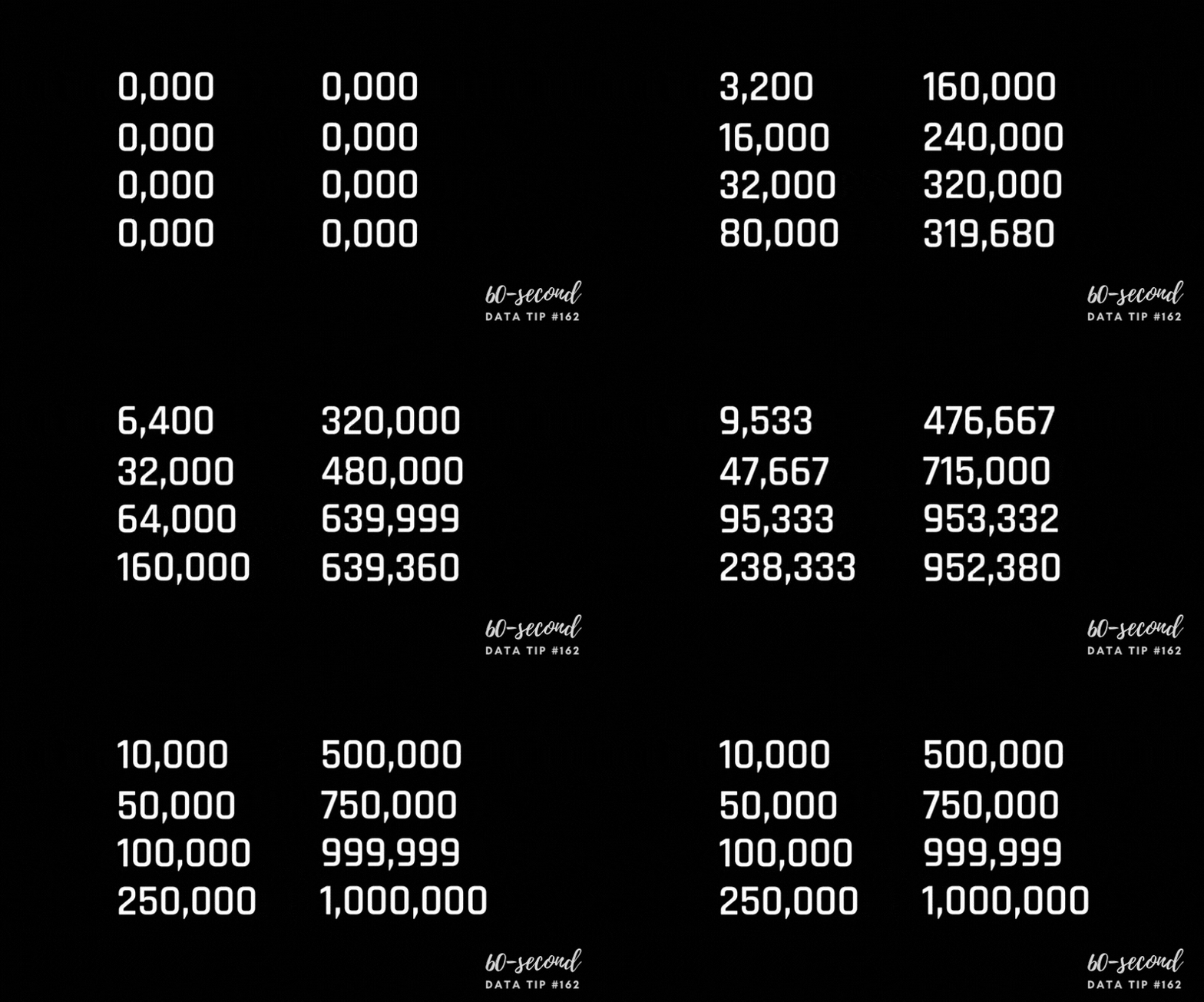
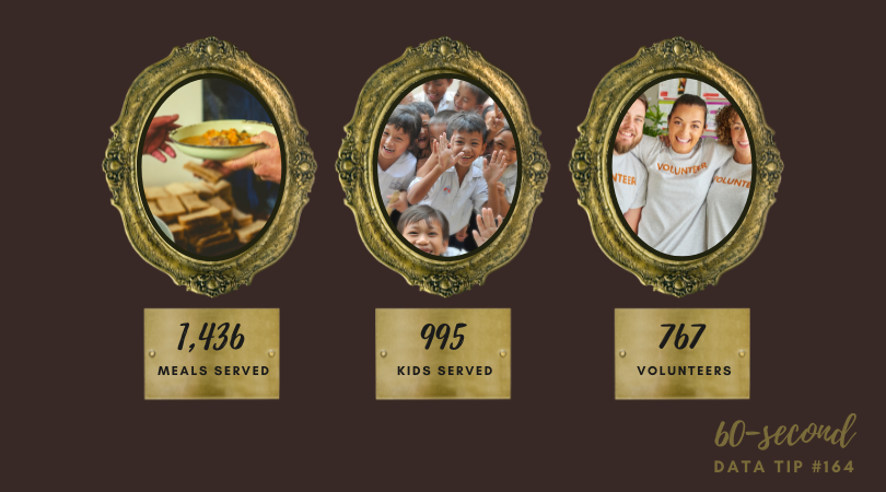
Vanity metrics are like cheap, trendy sunglasses. They may help you to look cool, briefly, but they don’t last long and do little to improve your eyesight. You’ve seen vanity metrics, even if you haven’t used this term to describe them. They are those flashy statistics (sometimes called “big ass numbers”) and charts showing how many services an organization has provided or people they’ve served or some other seemingly impressive stat. The problem is that these metrics don’t help you to better understand your current work and improve it. In this tip, I’ll give you some quick advice on recognizing and reforming vanity metrics.

How To Recognize A Vanity Metric

This Tableau article suggests three questions to ask to identify a vanity metric. I’ve put a nonprofit spin on each:

  • What decision can we make with the metric? If the metric can’t help you to make a decision, it’s probably a vanity metric. For example, does knowing how many meals you delivered help you to decide who, what, where, when, or how to deliver meals in the future? Or do you need a more specific metric such as the gap between need and service provision for various subgroups of clients?

  • What can we do to intentionally reproduce the result? Did some random event produce the big number? For example, did you see a bump in the number of participants last year because another organization, providing a similar service, closed down? If you cannot consistently reproduce the same result next year, this isn’t a helpful metric.

  • Is the data a real reflection of the truth? Let’s face it. There are always ways to misrepresent the truth. You can tell the world that attendance at all of your programs last year totaled 3,237. Sounds good, but that’s probably a “duplicated number” and can be misleading depending on what you want to understand or broadcast to the world. Some people likely attended more than one program. So the total number of individuals who participated in any program could be much lower. The central question to ask yourself when considering a metric is whether or not it will help your organization achieve its goals. If your goal is to reach more folks, this metric is not helpful.

How To Reform A Vanity Metric

  • Provide context. The metrics that are worthy of your attention and your stakeholders’ attention are those that are directly related to your goals. You may have overall goals for all of your participants, clients, audiences, services, programs, etc. But you also might have specific goals for subsets of those groups and for specific time periods. Present your metrics in relation to the goals. And compare metrics for subgroups to each other to see where you are making progress and where you are not.

  • Use more than one statistic. Sometimes what you want to improve cannot be measured with just one metric. For example, if you aim to improve the diversity of your staff, you may want to look at a set of metrics together including number, tenure, and seniority of staff by race/ethnicity, gender identification, age, etc.

Sources: Moving Beyond Vanity Metrics, Stanford Social Innovation Review and Vanity Metrics: Definition, How To Identify Them, And Examples, Tableau.


Let’s talk about YOUR data!

Got the feeling that you and your colleagues would use your data more effectively if you could see it better? Data Viz for Nonprofits (DVN) can help you get the ball rolling with an interactive data dashboard and beautiful charts, maps, and graphs for your next presentation, report, proposal, or webpage. Through a short-term consultation, we can help you to clarify the questions you want to answer and goals you want to track. DVN then visualizes your data to address those questions and track those goals.


How To Visualize What Could Have Been or Might Be

In English, there are three verbal moods:

  • The indicative used to express factual statements or positive beliefs;

  • The imperative used to express direct commands, requests, and prohibitions; and

  • The subjunctive used to express hypothetical situations or conditions which are contrary to fact or uncertain.

When we are visualizing data, we often settle into the indicative, the realm of facts. But what if we want to show what might happen if action is not taken or what might have been had action not been taken? In other words, how can we visualize the subjunctive? I’d like to offer up four examples to inspire you. The Flattening The Curve chart shows the impact of COVID mitigation (social distancing, masking, etc.) on the healthcare system and should bring back memories of 2020. The other charts may be new to you.


To see past data tips, click HERE.


Let’s talk about YOUR data!

Got the feeling that you and your colleagues would use your data more effectively if you could see it better? Data Viz for Nonprofits (DVN) can help you get the ball rolling with an interactive data dashboard and beautiful charts, maps, and graphs for your next presentation, report, proposal, or webpage. Through a short-term consultation, we can help you to clarify the questions you want to answer and goals you want to track. DVN then visualizes your data to address those questions and track those goals.


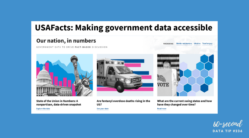
Another Data Viz Resource You Should Know: USAFacts

Here’s a new addition to my highly-curated resources list: USAFacts. I occasionally write a 60-second data tip describing a particular resource, including why I think it’s cool. And I link each of these tips to a resources list on my website.

What is it?

USAFacts is dedicated to making government data more accessible. The idea is to help people understand where their tax dollars are going and to help those working on issues of concern in the philanthropic, nonprofit, and public sectors to easily access information to inform their decisions.

Who’s it for?

The general public, policymakers, philanthropists, nonprofit managers, and researchers, among others.

Who’s behind it?

After he retired from tech and began to focus on philanthropy, former Microsoft CEO Steve Ballmer wanted to understand what the government spends on programs to help people and the outcomes of those programs. However, unlike businesses, US governments are not mandated to compile reports on their expenditures. He then hired data analysts to compile this data, and this was the origin of USAFacts, a not-for-profit, nonpartisan civic initiative which is solely funded by Ballmer.

Why I think it’s cool

It’s free and the data is shared under a Creative Commons license. They only ask that you credit USAFacts when using their curated material. Most of their data is visualized and all of it is well-documented. Charts can be easily downloaded in an image format or embedded into your website using an embed code like the chart below.


Let’s talk about YOUR data!

Got the feeling that you and your colleagues would use your data more effectively if you could see it better? Data Viz for Nonprofits (DVN) can help you get the ball rolling with an interactive data dashboard and beautiful charts, maps, and graphs for your next presentation, report, proposal, or webpage. Through a short-term consultation, we can help you to clarify the questions you want to answer and goals you want to track. DVN then visualizes your data to address those questions and track those goals.


Emphasize The Shape of Your Data

“There is a magic in graphs. The profile of a curve reveals in a flash a whole situation — the life history of an epidemic, a panic, or an era of prosperity. The curve informs the mind, awakens the imagination, convinces.” – Henry D. Hubbard in the preface to William C. Brinton’s Graphic Presentation, 1939.

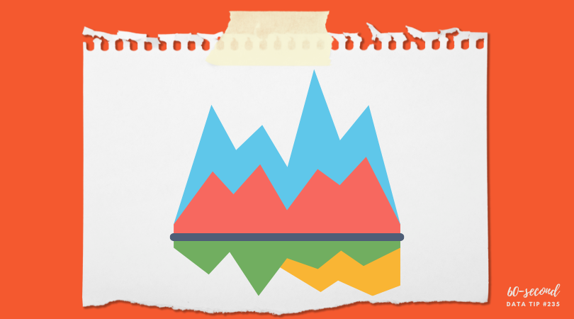
Data visualization translates words and numbers into visual cues such as color, size, position, and shape. Humans can process such visual cues much more easily and quickly than words and numbers. Today, I’m here to talk about shape because I don’t think we turn to shape often enough to engage and educate with data. The three area charts below provide a great example of the power of shape. The charts show estimates of the distribution of annual income among all world citizens over the last two centuries. By considering the change in the shape of the data across the three time periods and in relation to the poverty line, we learn a lot. Most significantly, we learn that, over the 215 year time period, the majority of people went from living below the poverty line to living above it. We learn even more by considering the shape of the distribution for each color-coded region.

So consider taking a page from this playbook. Rather than showing change over time in one chart. Consider using shape to tell the story by showing the distribution of something (e.g. income, course grades, number of clients) at different time periods in adjacent area charts.


Let’s talk about YOUR data!

Got the feeling that you and your colleagues would use your data more effectively if you could see it better? Data Viz for Nonprofits (DVN) can help you get the ball rolling with an interactive data dashboard and beautiful charts, maps, and graphs for your next presentation, report, proposal, or webpage. Through a short-term consultation, we can help you to clarify the questions you want to answer and goals you want to track. DVN then visualizes your data to address those questions and track those goals.


This Is A Teenager: Showing The People Behind The Data

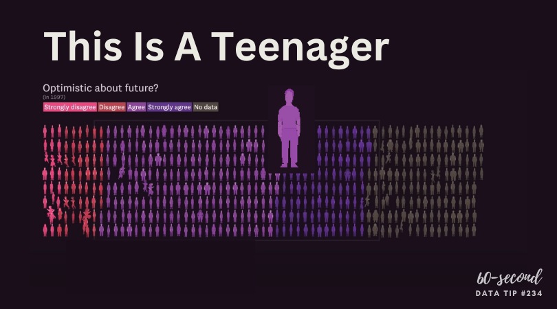
My tip this week is to check out This Is A Teenager by Alvin Chang at The Pudding. It’s a visual essay that traces the paths of hundreds of teenagers, starting in 1997, to see how their childhood experiences relate to their life outcomes. You can view it in video form (see below) or as a scrolling visualization HERE. The actual teenagers behind the data* don’t get lost in aggregates represented by bars, lines, and circles. Instead, we see them as individuals whose lives tend to follow the paths of other individuals with similar childhood experiences.

* The data is from the National Longitudinal Survey of Youth.

Source: The Pudding

To see past data tips, click HERE.


Let’s talk about YOUR data!

Got the feeling that you and your colleagues would use your data more effectively if you could see it better? Data Viz for Nonprofits (DVN) can help you get the ball rolling with an interactive data dashboard and beautiful charts, maps, and graphs for your next presentation, report, proposal, or webpage. Through a short-term consultation, we can help you to clarify the questions you want to answer and goals you want to track. DVN then visualizes your data to address those questions and track those goals.


How To Create More Diverse, Equitable, and Inclusive Data Visualizations

Reposted from February 2022

When we visualize information, we make a series of decisions which affect the way that viewers process the information in our charts, maps, and graphs. Sometimes they don’t feel like decisions at all. We go with the default settings in the application we are using. Or we just do something the way it’s usually done. But a more diverse, equitable, and inclusive approach to presenting and visualizing data requires us to make those decisions more consciously and deliberately. Jonathan Schwabish and Alice Feng of the Urban Institute provide some helpful tips, based on the Urban Institute’s own style guide, which you can apply the next time you present data.

Here is a summarized version of Schwabish and Feng’s article.* And here is my 60-second version of their recommendations:

  • Use people-first language in titles, text, and labels associated with charts, maps, and graphs. For example, use “people with disabilities” rather than “disabled people.” Also the Urban Institute does not refer strictly to skin color. For example, they refer to “Black people” not “Blacks.”

  • Order and present groups purposefully. The first group shown in a table or the first bar in a chart can affect how readers perceive the relationship or hierarchy among groups. For example, if the first group is “Men,” then it may appear that men are the default group against which other groups should be compared. One way to prevent viewers from making certain comparisons is to display groups in side-by-side charts (aka “small multiples” charts) rather than on a single chart. In general, make ordering and grouping decisions to promote certain comparisons and prevent others.

  • Point to missing groups. If certain groups are missing from the data, explain why in text boxes or footnotes. Also add information on groups included in “Other” categories and consider providing a more specific label than “Other” which can have an exclusionary connotation.

  • Do not use color palettes that reinforce gender or racial stereotypes. This one may seem obvious, but it bears repeating. Also, the Urban Institute’s color palette is accessible to people with certain color vision deficiencies, and the contrast between those colors and white and black text meet basic accessibility guidelines.

  • Depict a variety of races and genders when using icons and avoid icons that make inappropriate depictions of people or communities or reinforce stereotypes such as showing traditionally feminine icons to depict nurses or traditionally masculine icons to depict bosses.

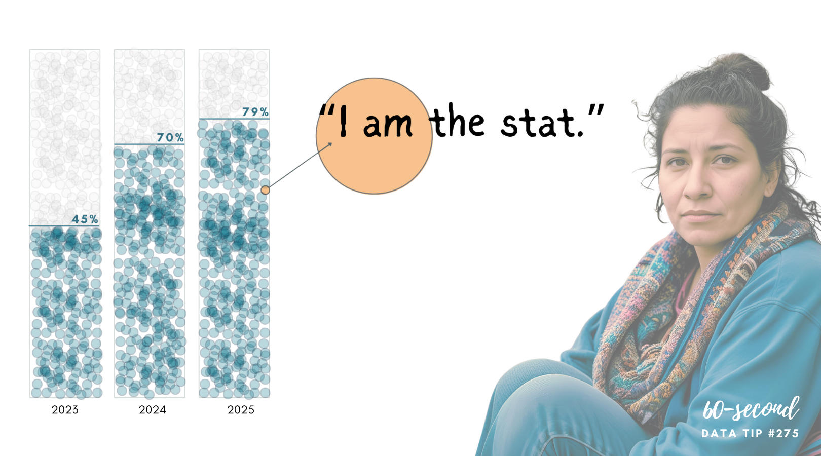
  • Find ways to show the people behind the data. Data visualizations are, by definition, abstractions of larger realities. But in the process of abstracting, we may obscure the lived experiences of the real people whom the data represent. Visualizations can remind viewers about the individuals behind the data by, for example, depicting them as individual circles rather than aggregating them in a single bar.

* The full paper has been published as an OSF Preprint and can be accessed here.


Let’s talk about YOUR data!

Got the feeling that you and your colleagues would use your data more effectively if you could see it better? Data Viz for Nonprofits (DVN) can help you get the ball rolling with an interactive data dashboard and beautiful charts, maps, and graphs for your next presentation, report, proposal, or webpage. Through a short-term consultation, we can help you to clarify the questions you want to answer and goals you want to track. DVN then visualizes your data to address those questions and track those goals.


Data Viz Resources You Should Know: Data.gov

Here’s a new addition to my highly-curated resources list: Data.gov. I occasionally write a 60-second data tip describing a particular resource, including why I think it’s cool. And I link each of these tips to a resources list on my website.

What is it?

Data.gov is the United States government’s open data site. Open data is data that can be freely used, re-used, and redistributed by anyone - subject only, at most, to the requirement to attribute and sharealike. Data.gov is designed to “unleash the power of government open data to inform decisions by the public and policymakers, drive innovation and economic activity, achieve agency missions, and strengthen the foundation of an open and transparent government.”

Who’s it for?

It’s for the general public.

Who’s behind it?

The U.S. government. More specifically, The U.S. General Services Administration, working with the Office of Management and Budget and other agency partners, launched Data.gov in 2009. Government agencies compile metadata such as title, description, keywords, and links for accessing their datasets, and the Data.gov catalog automatically “harvests” that metadata to populate a continually updated catalog.

Why I think it’s cool

Unlike many other open data catalogs, you can find and download data quickly and visualize it. You can begin by searching for keywords in the search box. And there are helpful filters to narrow the results by, for example, topic categories, location, and agency. This is a great place to find data to show the need for your organization’s services and the problems you and your colleagues are working to address.


Let’s talk about YOUR data!

Got the feeling that you and your colleagues would use your data more effectively if you could see it better? Data Viz for Nonprofits (DVN) can help you get the ball rolling with an interactive data dashboard and beautiful charts, maps, and graphs for your next presentation, report, proposal, or webpage. Through a short-term consultation, we can help you to clarify the questions you want to answer and goals you want to track. DVN then visualizes your data to address those questions and track those goals.


Why You Should Know About Cycle Plots

If you are looking to explore patterns in participation or giving, a cycle plot can get you there.

This is a new addition to a series of tips on different chart types. In each tip, l give you need-to-know information in a format akin to the “Drug Facts” on the back of medication boxes: active ingredients (what the chart is), uses (when to use it), and warnings (what to look out for when creating the chart). The idea is to fill up your toolbox with a variety of tools for making sense of data. To learn about other chart types, check out this index of data tips.

Active Ingredients (What is a cycle plot?)

A cycle plot shows how a trend or cycle changes over time. We can use them to see seasonal patterns. Typically, a cycle plot shows a measure on the Y-axis and then shows a time period (such as months or seasons) along the X-axis. For each time period, there is a trend line across a number of years. In the example below, we see that, on average (black lines show averages across years), there were the most travelers from Greece in August between 2001 and 2011, but we can also see that the number of travelers varied greatly from year to year. Use the filter to see trends for travelers from other countries.

Source: Travellers by Month Cycle Plot by Tai Shi Ling on Tableau Public

Uses

Cycle plots can help identify periods of time when the best or worst results are recorded. For example, you want to see trends in participation in your summer programs or patterns in year-end giving over the years. Cycle plots can be created in a number of data viz applications including Excel and Tableau.

Warnings

The range of years shown in each trendline can be shown on the X-axis or in the subtitle to the the chart, but the range should be clear and consistent across trendlines.

Fun Fact

William S. Cleveland and Irma J. Terpenning introduced the cycle plot in Graphical Methods for Seasonal Adjustment (1982) In their example below, we see that number of telephone installations are highest in late summer/early fall.

To see past data tips, including those about other chart types, scroll down or click HERE.

Title Image Source: Seasonality with Cycle Plots by Vladimir Trkulja on Tableau Public


Let’s talk about YOUR data!

Got the feeling that you and your colleagues would use your data more effectively if you could see it better? Data Viz for Nonprofits (DVN) can help you get the ball rolling with an interactive data dashboard and beautiful charts, maps, and graphs for your next presentation, report, proposal, or webpage. Through a short-term consultation, we can help you to clarify the questions you want to answer and goals you want to track. DVN then visualizes your data to address those questions and track those goals.


10 Essential Data Facts For Non-Data People: The Cheat Sheet

Reposted from January 2022

Here are ten data facts for non-data people who, nevertheless, have to deal with data sometimes (i.e. most of us). This is the cheat sheet. Click on the “Learn More” buttons for additional information served up in comic strip format!


Let’s talk about YOUR data!

Got the feeling that you and your colleagues would use your data more effectively if you could see it better? Data Viz for Nonprofits (DVN) can help you get the ball rolling with an interactive data dashboard and beautiful charts, maps, and graphs for your next presentation, report, proposal, or webpage. Through a short-term consultation, we can help you to clarify the questions you want to answer and goals you want to track. DVN then visualizes your data to address those questions and track those goals.


The Power of Substraction

“Perfection is achieved, not when there is nothing more to add, but when there is nothing left to take away.”

―Antoine de Saint-Exupéry, Airman's Odyssey

If you have heard of any data viz guru, it’s probably Edward Tufte. And if you know one thing about Tufte, it’s probably the data-to-ink ratio. The data-to-ink ratio is the amount of ink (or pixels) that convey the data divided by the total ink (or pixels) used in the entire chart. The ratio, according to Tufte, should be as close to one as possible. In other words, most of the ink/pixels should be conveying data, and you should remove as much non-data ink/pixels as possible. Click through Joey Cherdarchuk’s slides below for a great example of what Tufte is talking about.

Source: Darkhorse Analytics

To see past data tips, click HERE.


Let’s talk about YOUR data!

Got the feeling that you and your colleagues would use your data more effectively if you could see it better? Data Viz for Nonprofits (DVN) can help you get the ball rolling with an interactive data dashboard and beautiful charts, maps, and graphs for your next presentation, report, proposal, or webpage. Through a short-term consultation, we can help you to clarify the questions you want to answer and goals you want to track. DVN then visualizes your data to address those questions and track those goals.


Presenting Data Fast and Slow

Reposted from May 2022

Sometimes we approach the challenge of sharing data with others as if we were trying to con a pet into taking a pill. We think that our audience is too busy, disinterested, or distracted to focus on the data. So we wrap it in something that attracts their attention and feed it to them as quickly as possible. The problem with this approach is that it may get the data into their brains—momentarily—but it won’t stay there long. See where the pill ends up in this video.

If we want others to LEARN from the data — which involves not only retaining it but also drawing knowledge from it and applying that knowledge in the future — then we need a different approach. Daniel Kahneman’s Thinking Fast and Slow can help us.

First a little background on how the brain works, according to the evidence Kahneman presents. For learning to happen, information first must get past System 1 of our brains. This is where fast thinking happens. System 1 is the harried gate keeper, madly processing all of the information that comes in through our senses, pitching most of it, keeping only what is deemed necessary. But making it through the gate is only half the battle. Once in, information confronts System 2. This is the part of the brain that allows for conscious thought or slow thinking. The problem is that System 2 is lazy. Conscious thought is hard, and System 2 is always looking for an excuse to avoid it. However, if System 2 engages with information, the resulting knowledge can find its way to long-term memory and learning happens.

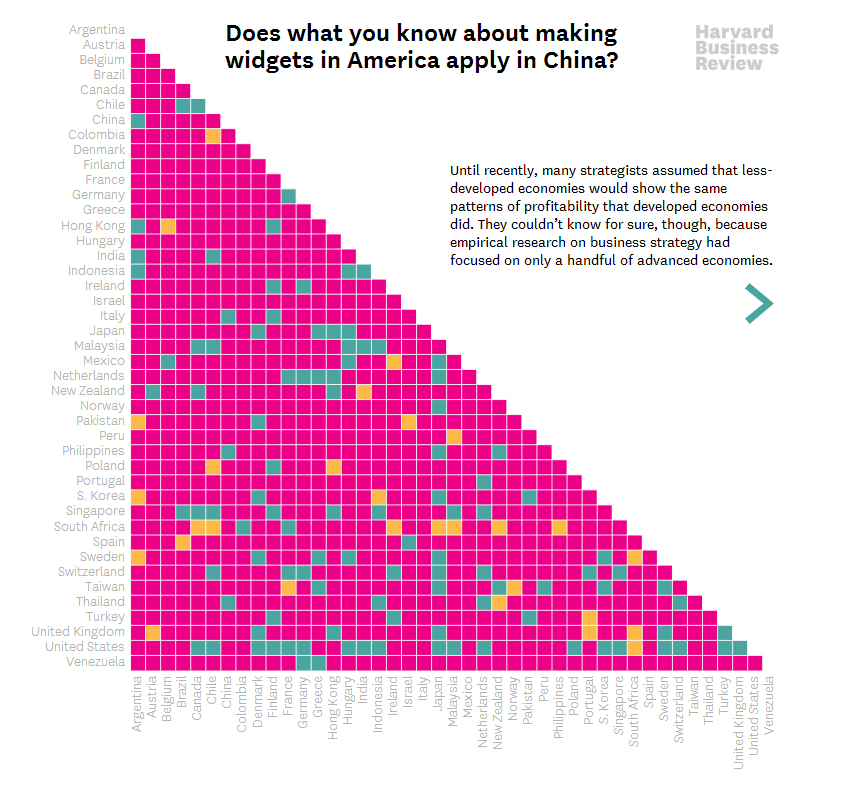
So the challenge when presenting data is to make it past System 1 AND engage System 2. Let’s consider a series of vizes from Harvard Business Review (HBR) that I think meets both parts of this challenge. Yes, it’s an example from the for-profit world, but could easily work with nonprofit data. See snapshot of the first viz in the series below .

How to get data past System 1

Getting data past the System 1 fast-thinking gate keeper is all about grabbing attention. We process images much more quickly than words and numbers, so images are a great foot-in-the-door. The HBR viz does it with bright colors and a cool-looking, somewhat unusual chart. There’s plenty of information out there about how to attract attention, including the use of images with:

  • Stand out colors and textures

  • Human faces (we are wired to focus on them)

  • Novelty (images that are unusual in size, placement, etc.)

Data visualizations can use color as well as images to draw attention. But getting past System 1 is not nearly enough. For learning to happen, the viz also has to engage System 2.

How to engage System 2

System 2 is smart but lazy. So we need to pique its interest. The HBR viz starts with a title that poses a question. When confronted with an interesting question, we may be more likely to stick around for an answer. Then the viz leads you through the answer in a visually engaging way (see interactive version of the viz HERE). These are two great ways to slow down and engage the brain with data. Here’s a list of ways to engage System 2:

  • Ask a question in the title as the HBR viz does—questions beg answers.

  • Make it personal. We may be more likely to engage with data when we have a personal connection with it. This New York Times viz, for example, allows you to enter in your county to see what the barriers to COVID vaccination are in your area.

  • Highlight a surprising finding. Many of us love the counterintuitive and the creative. If you draw attention to something new that the data suggests, you may have a better chance at hooking System 2. For example, this viz from The Economist shows that China emits far less greenhouse gas per person than Western countries at the same stage of economic development. Or check out this viz by Dimiter Toshkov showing that small countries can be big players in development and good governance.

  • Hand draw it. There is some evidence that making information harder to consume, for example by presenting it with harder-to-read fonts, makes the brain slow down and engage in effortful and analytic processing. Although the jury is still out on this, I do find myself more likely to engage in hand-drawn vizes like two of the winners of the World Data Visualization Prize in 2019. Perhaps it’s simply the novelty of hand-drawn charts that engages me. Anyway, it’s something you might consider, and all you need is a pen and paper.

  • Walk them through it. A great way to slow down your viewers is to set the pace by walking them through the data as HBR does in the example. I love how HBR presents what the data might look like if our assumptions were confirmed followed by what it actually looks like.

Sources: Veritasium, Visual Content Space, MIT News, Springer Link,


Let’s talk about YOUR data!

Got the feeling that you and your colleagues would use your data more effectively if you could see it better? Data Viz for Nonprofits (DVN) can help you get the ball rolling with an interactive data dashboard and beautiful charts, maps, and graphs for your next presentation, report, proposal, or webpage. Through a short-term consultation, we can help you to clarify the questions you want to answer and goals you want to track. DVN then visualizes your data to address those questions and track those goals.


How To Present Data on Slides

“It’s not the mere presence of data that gives the presenter power,” notes Joel Schwartzberg in his Harvard Business Review article on presenting data, “It’s how that data is presented.” Below is my 60-second review of Schwartzberg’s helpful tips. But before you scroll down, see how much you already know. Take a look at the “Before” slide below and consider what changes you would make to it. Then advance to the “After” slide (by clicking on the right side of the image) to see a revised version that follows Schwartzberg’s guidelines.

  • One point per slide. Have one key takeaway for each slide and write a slide title that reinforces your point rather than something generic like “Performance by Quarter in 2023.”

  • Visually highlight “Aha” zones. Use a bright color to direct attention to a key data point and gray out the rest.

  • Make charts readable from across the room. If you have to say “You probably can’t read this but it shows that . . . “ then it needs revision. Don’t use font sizes smaller than 18 points.

  • Labels are clear and intuitive. Your audience needs to decode your chart in a few seconds. Make sure axis and data labels are understandable.

To see past data tips, click HERE.


Let’s talk about YOUR data!

Got the feeling that you and your colleagues would use your data more effectively if you could see it better? Data Viz for Nonprofits (DVN) can help you get the ball rolling with an interactive data dashboard and beautiful charts, maps, and graphs for your next presentation, report, proposal, or webpage. Through a short-term consultation, we can help you to clarify the questions you want to answer and goals you want to track. DVN then visualizes your data to address those questions and track those goals.


Ideas You Should Steal From This Viz (Installment 11)

“Every artist gets asked the question: ‘Where do you get your ideas?’ The honest artist answers, ‘I steal them.’ . . . What a good artist understands is that nothing comes from nowhere. All creative work builds on what came before.” —Austin Kleon in Steal Like An Artist.

Today I offer up another steal-worthy interactive viz that I came across in the Tableau Public Gallery.

Source: Kizley Benedict on Tableau Public

Here’s what I suggest you steal from this viz:

  • Beeswarm Chart. The beeswarm chart at the top allows you to easily compare several countries and to see the overall distribution along the Gender Inequality Index among large and small countries. For more on beeswarm charts, see this tip.

  • Highlight a Country. For users who want to know about a particular country, the dashboard provides a search tool which highlights the selected country.

  • Overall Then Zoom In. After getting a sense of the overall distribution from the beeswarm chart, the user can zoom in and make comparisons among and within regions with the maps along the bottom of the dashboard.

To see past data tips, click HERE.


Let’s talk about YOUR data!

Got the feeling that you and your colleagues would use your data more effectively if you could see it better? Data Viz for Nonprofits (DVN) can help you get the ball rolling with an interactive data dashboard and beautiful charts, maps, and graphs for your next presentation, report, proposal, or webpage. Through a short-term consultation, we can help you to clarify the questions you want to answer and goals you want to track. DVN then visualizes your data to address those questions and track those goals.


Don't Measure Impact . . . Wait, What?

Reposted from September 2022

Ghost of Christmas Yet To Come in The Chrismas Carol by Charles Dickens, Illustration by J. Leech, Source: Flickr

Most organizations should not waste time and money on impact evaluations. Measuring impact is difficult and expensive. It’s difficult because you need a good counterfactual. A counterfactual is what Dickens’s Ghost of Christmas Yet to Come shows Ebenezer Scrooge: what would happen if you did not change anything. The impact of an intervention or program is the difference between what happened and what would have happened without the intervention. Since, in the real world, you can’t observe the same group of beneficiaries with and without the intervention (as we do when we watch The Christmas Carol), you need a good proxy for the would-have-been condition. The best proxy is a group of potential beneficiaries that were randomly selected from a larger group of potential beneficiaries. These folks do not get the intervention. Then you can compare those who did and did not receive the intervention over time to estimate the impact of the intervention. This is called a randomized control trial or RCT.

Of course, withholding an intervention from potential beneficiaries can be a difficult and morally-questionable pursuit. And tracking a large group of beneficiaries and non-beneficiaries over time is expensive. This usually requires a team of skilled data collectors and analysts. Non-randomly-selected comparison groups are not nearly as good because they may differ from the intervention group in known or unknown ways. So it’s difficult to determine if the outcomes observed are due to the intervention itself or to pre-existing biases or characteristics. This costly and challenging process is further complicated by the need to start with a well-established intervention, one that has already worked out the kinks.

Due to the many challenges of measuring impact, most organizations should not waste time and money on impact evaluations. Instead, they should consider interventions that already have a strong research base, ideally because they have been rigorously tested with RCTs. (Check out: Where to Search for Evidence of Effective Programs.)

In a Stanford Social Innovation Review article, Mary Kay Gugerty and Dean Karlan suggest that, before beginning a new program, organizations ask: “What do other evaluations say about it? How applicable is the context under which those studies were done, and how similar is the intervention? Study the literature to see if there is anything that suggests your approach might be effective.”

Rather than assessing impact, your limited resources are better spent assessing implementation. You can do this by collecting data that shows whether what you planned is actually happening. If you can pinpoint where the problems are, you are in a better position to make fixes, alter plans, refine processes.  Many organizations make their plans using a logic model (aka theory of change). A logic model is a flow chart with inputs and outputs. The best logic models draw on past impact evaluations to determine what inputs are most likely to lead to what outputs. And organizations can easily assess progress to date by plugging their logic models into real time data. Interested? Read more about “living logic models” HERE.

To see past data tips, click HERE.


Let’s talk about YOUR data!

Got the feeling that you and your colleagues would use your data more effectively if you could see it better? Data Viz for Nonprofits (DVN) can help you get the ball rolling with an interactive data dashboard and beautiful charts, maps, and graphs for your next presentation, report, proposal, or webpage. Through a short-term consultation, we can help you to clarify the questions you want to answer and goals you want to track. DVN then visualizes your data to address those questions and track those goals.