Data Viz Dangers: Hiding Variability

Data visualization has its pitfalls and landmines. Sometimes charts, graphs, and maps can have harmful consequences, intended or not.  So I’m offering up another tip in a series of 60-Second Data Tips that point out pitfalls and landmines to avoid. This time, it’s about hiding variability.

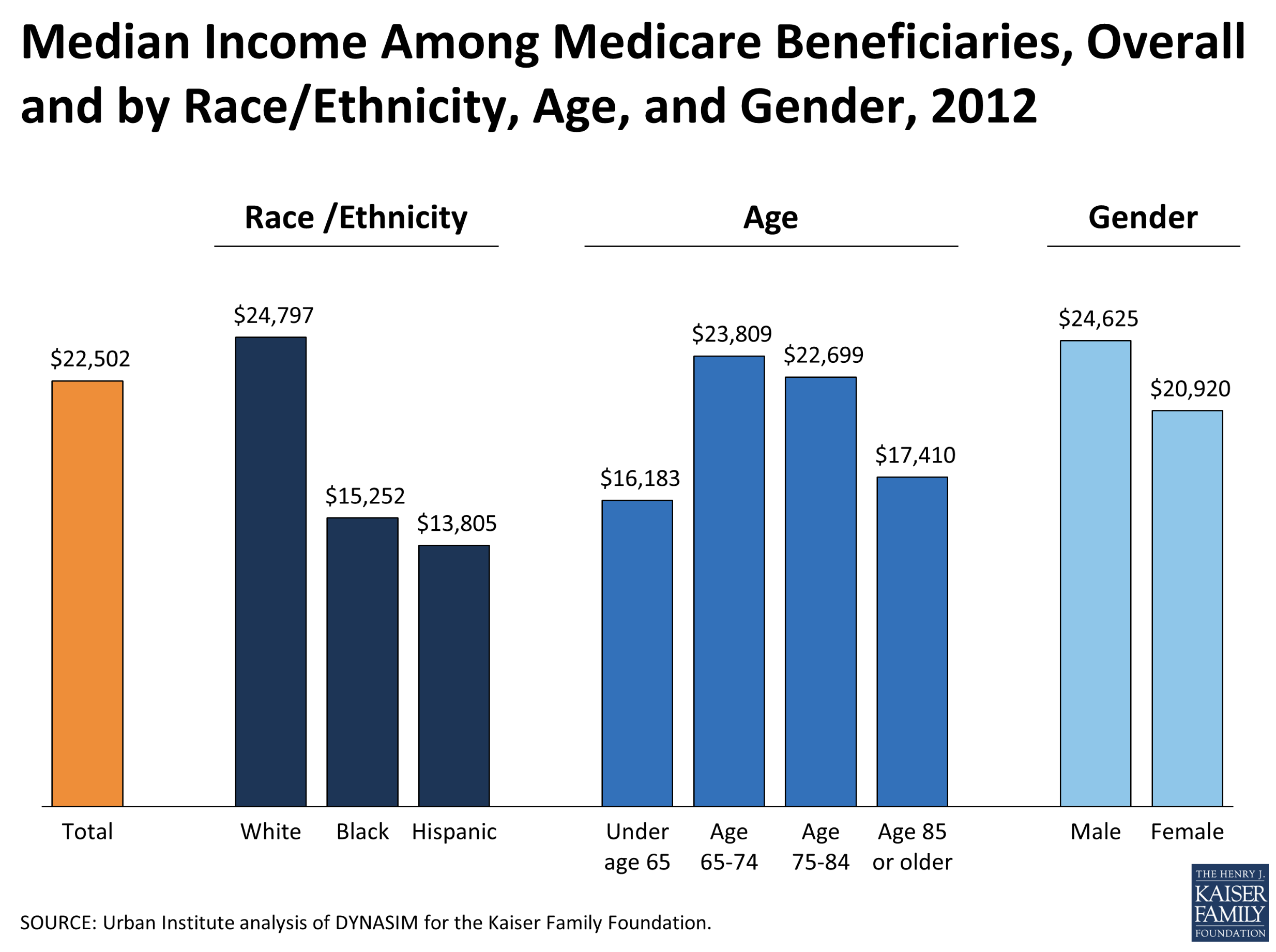
If we see a bar chart like the one below showing median income of Medicare beneficiaries by demographic group, we may make the following mistakes in interpreting it:

  • Assume that all or most of those in the higher income groups are earning more than all or most of those in lower income groups rather than assume that there may be more variation in income within groups than between groups.

  • Assume that the higher median income of a given group suggests that those in that group are more capable, smarter, skilled, etc. than those in lower median income groups rather than assume that those in the lower group faced challenges (e.g. racism, lack of education, etc.) that resulted in the lower median income. (This is called the fundamental attribution error.*)

  • Generalize our error-ridden conclusions about the people represented in the chart to all of those in certain racial, age, gender, or other demographic groups.

Eli Holder and Cindy Xiong conducted studies in which they showed participants charts that emphasized within group variability as well as those that did not like the chart shown above. And they found that participants were less likely to make the mistakes listed above when shown charts that emphasize within group variability such as the one below which shows that there is a lot of variability in scores within schools that one can’t appreciate by only looking at averages (represented by the black horizontal bars.)

Source: Jitter Plots in Tableau, by Ashish Singh

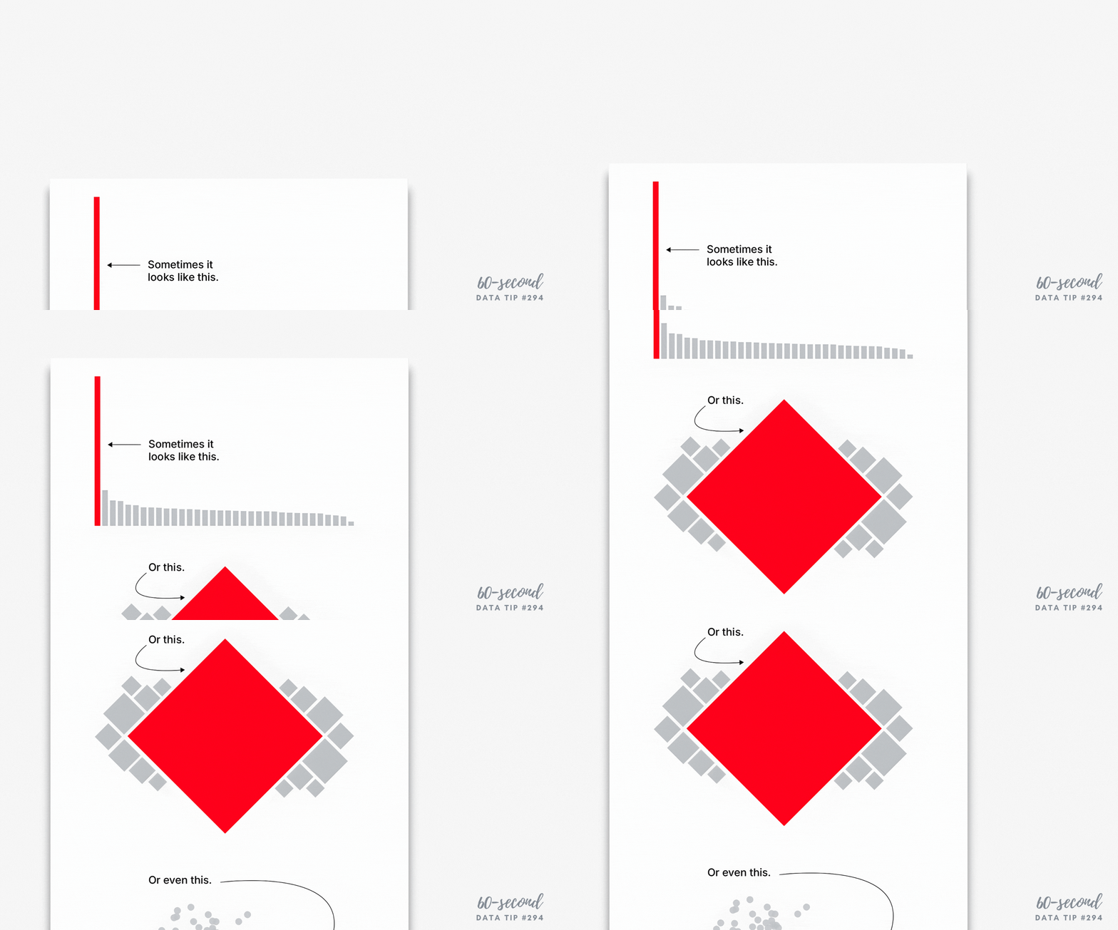
For a great ten-minute summary of the research, check out this video. What to do to avoid this pitfall? The video suggests that we find ways to represent variability within groups as shown below:

To see past data tips, click HERE.

*When visualizing data, we should consider how humans think including heuristics (i.e. mental shortcuts) and biases. Some of them have particular relevance to data visualization such as the fundamental attribution error, which is our tendency to relate behavior to a person’s character and personality rather than to the person’s context. So when someone cuts you off in traffic, if you write them off as a jerk rather than someone who is late for work or distracted, that’s the fundamental attribution error.


Let’s talk about YOUR data!

Got the feeling that you and your colleagues would use your data more effectively if you could see it better? Data Viz for Nonprofits (DVN) can help you get the ball rolling with an interactive data dashboard and beautiful charts, maps, and graphs for your next presentation, report, proposal, or webpage. Through a short-term consultation, we can help you to clarify the questions you want to answer and goals you want to track. DVN then visualizes your data to address those questions and track those goals.

Data Viz Pitfalls and Landmines: Polarization

Charts, maps, and graphs can be great tools for illuminating trends and patterns in data. But data visualization has its pitfalls and landmines. Sometimes charts, graphs, and maps can have harmful consequences, intended or not. So I’m starting a series of 60-Second Data Tips that point out pitfalls and landmines to avoid. This time it’s about polarization.

When visualizing data, we should consider how humans think including heuristics (i.e. mental shortcuts) and biases. That’s a tall order given how many shortcuts and biases affect our thinking. See Diagram B below. Some of them have particular relevance to data visualization such as conformity bias, which is the tendency to change one's beliefs or behavior to fit in with others. Can data visualization exacerbate this bias?

You are likely familiar with charts showing U.S. attitudes toward public policies which highlight the gap between Democrats and Republicans. Researchers conducted experiments to explore whether such charts invoke viewers’ social-normative conformity bias, influencing them to match the divided opinions shown in the visualization. In three experiments described in Polarizing Political Polls: How Visualization Design Choices Can Shape Public Opinion and Increase Political Polarization, researchers either aggregated data as non-partisan "All US Adults," or partisan "Democrat" / "Republican." (See Diagram A) They found that the partisan charts tended to increase viewers’ polarization while the non-partisan charts did not, leading the researchers to conclude that visualizing partisan divisions can further divide us.

So when showing differences of opinions across various groups, we should take this finding into consideration. Is our ultimate aim to divide or unite?

Diagram A

Diagram B

Source: https://upload.wikimedia.org/wikipedia/commons/c/ce/Cognitive_Bias_Codex_With_Definitions%2C_an_Extension_of_the_work_of_John_Manoogian_by_Brian_Morrissette.jpg

To see past data tips, click HERE.


Let’s talk about YOUR data!

Got the feeling that you and your colleagues would use your data more effectively if you could see it better? Data Viz for Nonprofits (DVN) can help you get the ball rolling with an interactive data dashboard and beautiful charts, maps, and graphs for your next presentation, report, proposal, or webpage. Through a short-term consultation, we can help you to clarify the questions you want to answer and goals you want to track. DVN then visualizes your data to address those questions and track those goals.


Avoid This Danger When Choosing Metrics

60-SECOND DATA TIP_3.png

I’m all about making data clear and easy-to-digest. But there is a danger in it. The clarity may cause you accept what the data seems to tell you. You may not linger. You may not reflect.

Writer Margaret J. Wheatley warns us that “without reflection, we go blindly on our way, creating more unintended consequences, and failing to achieve anything useful.”

Economist Charles Goodhart recognized this danger in the metrics we create to measure our progress. At first, a certain metric may seem like a good indicator of progress. If we want kids in an after-school track program to increase their endurance, we might measure how far they run at the beginning of the program and then again at the end.  Makes sense, right? We might then try to motivate students by offering them free running shorts if they increase their miles by a certain amount. But, that’s when students might start gaming the system. They can increase their miles not only by training hard and running farther over time but also by running very short distances at the start. This is the kind of unintended consequence that Goodhart warned us about. His law states: “When a measure becomes a target, it ceases to be a good measure.” 

The solution? First, reflection. Consider the potential unintended consequences of each of your metrics, particularly those tied to incentives. Second, use multiple metrics to provide a more balanced understanding of progress.  In our running example, in addition to the change in miles participants run, you might also measure resting heart rates at the beginning and end of the program, knowing that a lower resting heart rate generally indicates a higher level of cardiovascular fitness.

See other data tips in this series for more information on how to effectively visualize and make good use of your organization's data. 

Data Viz Don'ts

60-SECOND DATA TIP_3.png

This week’s 60-second tip is to head on over to Sarah Leo’s article on Medium the next time you have 8 minutes to spare and read about mistakes she and others at The Economist have made when visualizing data. It’s called “Mistakes, we’ve made a few: learning from our errors in data visualization.”

First, it will make you feel better about your own mistakes. Even the pros get it wrong sometimes.

Second, it will test your data viz prowess. If you have been digesting my bite-sized morsels of data viz wisdom on a regular basis, then use this article as a little quiz. Take a look at Leo’s “before” and “after” vizes and figure out why the “after” version is better.

Third, it may give you some new ideas on how to visualize your own data!

See other data tips in this series for more information on how to effectively visualize and make good use of your organization's data. 

Error by Roselin Christina.S from the Noun Project