How To Hack A Bar Chart

Reposted from January 2019

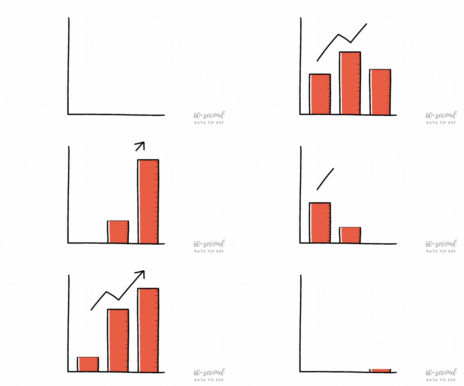
Choosing a chart type is like making breakfast for your kids. Bar charts are Cheerios. You know they will eat it and it’s healthy. Now come the buts:

But #1:  Cheerios is boring and you wish they had a wider palate.

But #2: If you give them a quinoa breakfast bowl, it will go uneaten and you might as well have given them Cheerios.

When it comes to data visualization, Maarten Lambrechts says don't settle for Cheerios. He calls the problem “xenographobia” or the fear of weird charts. And he implores us to boost our viewers’ “graphicacy” by feeding them the equivalents of quinoa breakfast bowls in the chart world.

Here’s what I think. We should neither spook our children at breakfast time nor our funders, board members, and staff throughout the day. But we should try to slowly widen their palates. One way to do that is to take something they know and love and hack it a bit. Throw some nuts on the Cheerios. Use color in novel ways to enliven a bar chart.

Over the next several weeks, I will offer up different ways to hack a bar chart. Stay tuned!

To see past data tips, click HERE.


Let’s talk about YOUR data!

Got the feeling that you and your colleagues would use your data more effectively if you could see it better? Data Viz for Nonprofits (DVN) can help you get the ball rolling with an interactive data dashboard and beautiful charts, maps, and graphs for your next presentation, report, proposal, or webpage. Through a short-term consultation, we can help you to clarify the questions you want to answer and goals you want to track. DVN then visualizes your data to address those questions and track those goals.

Ideas You Should Steal From This Viz (Installment 7)

Today I offer up yet another steal-worthy viz: Emergency Calls Dashboard created with Tableau by Pradeep Kumar G. This one is genius. It seems to defy basic graphic design rules. It includes many charts and lots of small text and numbers and yet it’s readable and not overwhelming.

As you can see, the charts are contained within four rectangular views, each with the dimensions of a phone screen. Tableau dashboards can include layouts for different types of devices with varying screen sizes. When you publish these layouts, people viewing your dashboard experience a design optimized for their device (phone, tablet, or desktop.)

If you view the Emergency Calls Dashboard with a phone, you will see just one of the four views and can use the icons at the bottom of the screen to navigate to the other views, as shown in the image to the right.

Effective phone layouts usually:

  • Limit a dashboard’s focus and content (you can only get so much on this small canvas),

  • Reduce interactivity (dealing with filters on a phone can be annoying*), and

  • Use a vertical orientation (vertical scrolling is easier than horizontal scrolling).

The Emergency Calls Dashboard has all of these features, so the phone view works quite well. Indeed, these phone views are so effective that they also work when laid out side-by-side in the desktop view.

When building dashboards for multiple device types, dashboard designers often start with the desktop view and then simplify that larger, more detailed design for the phone view. The Emergency Calls Dashboard demonstrates the benefit of beginning with the phone view. If you design a simple, readable phone view that makes effective use of its limited canvas, you can use this design to fit more information in the desktop or tablet layout. Even if you aren’t designing for multiple screen sizes, following the tips for effective phone layouts will serve you well, opening up possibilities for including more data in one view without overwhelming the user.

I’ve embedded the dashboard below so that you can interact with it.

*The Tableau Mobile app optimises filters for phones, making them pop and easier to use. It also allows for logical scrolling, swiping, pinching, and zooming. However, some of your users may not use the app.


Let’s talk about YOUR data!

Got the feeling that you and your colleagues would use your data more effectively if you could see it better? Data Viz for Nonprofits (DVN) can help you get the ball rolling with an interactive data dashboard and beautiful charts, maps, and graphs for your next presentation, report, proposal, or webpage. Through a short-term consultation, we can help you to clarify the questions you want to answer and goals you want to track. DVN then visualizes your data to address those questions and track those goals.

How To Make Your Data Viz More Accessible: Screen Readers and Keyboard Navigation

In a series of 60-second data tips, I’m taking on one basic accessibility issue at a time. This week it’s about screen readers and keyboard navigation. We do not all perceive in the same way. Some people with vision or physical limitations, navigate charts, graphs, and maps using only the keyboard (no mouse) and screen readers to understand the content.

A screen reader is an assistive technology primarily used by people with vision impairments. It converts text, buttons, images and other screen elements into speech or braille. Here’s one in action:

Source: Highcharts on YouTube

You can make your data visualizations more screen reader- and keyboard-friendly by doing the following:

1) Understand the capabilities of the tool you use to create visualizations.

Some simple Googling can help you to figure this out. For example, if you use Tableau, this page explains that once you publish and embed a Tableau dashboard into a web page that conforms to Web Content Accessibility guidelines (WCAG 2.0 AA), screen readers should be able to interpret them. Further, dashboards created in Tableau 2021.3 and later have a default top-to-bottom, left-to-right “focus order” (i.e. the order in which elements of a visualization are narrated by a screen reader).

2) Reduce the number of marks in visualizations.

Marks are the visual elements used to represent data in a chart, graph, or map. Think bars, lines, circles, etc. When there are a lot of marks, it can be difficult to understand a visualization using a screen reader. You can reduce the number of marks by:

  • Including only the most important data points,

  • Aggregating data points into groups (e.g. rather than showing the population of 40 cities with 40 bars, you could group them into small, medium, and large cities and show just three bars representing the average population for each group), and

  • Adding filters that allow the user to see fewer data points at a time.

3) Add text that clarifies the content of the visualization

Titles, subtitles, captions, and legends make a visualization more accessible to everyone including those using screen readers.

If you are interested in a deep dive into accessibility issues and solutions, you can find plenty of information online including Chartability.

To see past data tips, click HERE.


Let’s talk about YOUR data!

Got the feeling that you and your colleagues would use your data more effectively if you could see it better? Data Viz for Nonprofits (DVN) can help you get the ball rolling with an interactive data dashboard and beautiful charts, maps, and graphs for your next presentation, report, proposal, or webpage. Through a short-term consultation, we can help you to clarify the questions you want to answer and goals you want to track. DVN then visualizes your data to address those questions and track those goals.


How To Make Your Data Viz More Accessible: Color Blindness

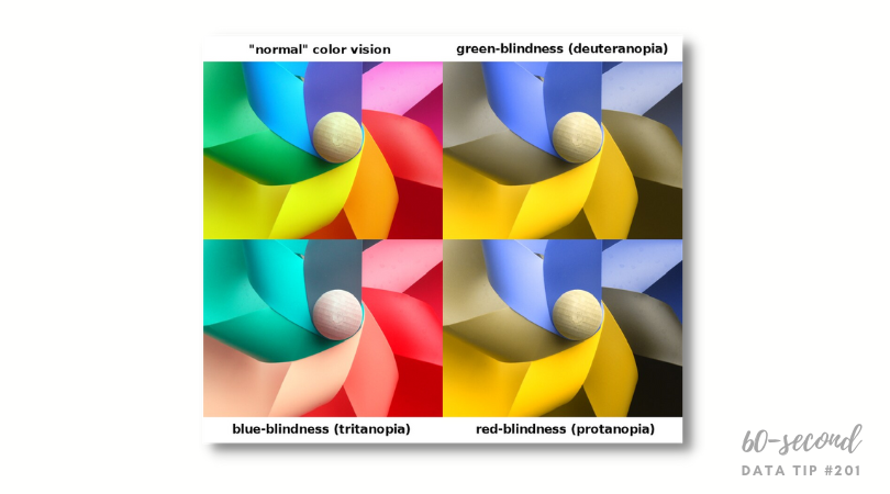
In a series of 60-second data tips, I’m taking on one basic accessiblity issue at at time. This week it’s color. About 1 in 20 people have color blindness meaning that two colors which appear distinct to a person with normal color vision may appear to be the same to a person with color blindness. There are different types of color blindness (as shown above), but the most common is red/green color blindness (aka deuteranopia). Becasuse color plays an important role in many data vizes by drawing attention to certain trends, distinguishing among categories, or illustrating relationships, we should be careful in choosing colors to make our visualizations accessible to more people.

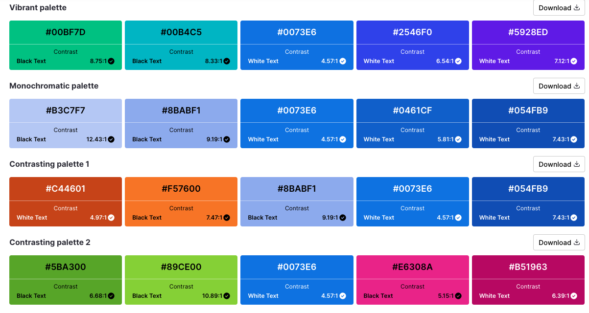
Some data viz tools, such as Tableau, have built-in colorblind palettes. You can also generate an accessible color palette using an online generator like this one from Venngage.

If you are interested in a deep dive into accessibility issues and solutions, you can find plenty of information online including Chartability.

To see past data tips, click HERE.

Sources: Coloring for Colorblindness, Build Accessible Dashboards by Tableau, Accessible color palette generator by Venngage


Let’s talk about YOUR data!

Got the feeling that you and your colleagues would use your data more effectively if you could see it better? Data Viz for Nonprofits (DVN) can help you get the ball rolling with an interactive data dashboard and beautiful charts, maps, and graphs for your next presentation, report, proposal, or webpage. Through a short-term consultation, we can help you to clarify the questions you want to answer and goals you want to track. DVN then visualizes your data to address those questions and track those goals.


What's The Right Text Size to Make Data Viz Accessible?

Here’s another in a series of tips on how to make data visualizations accessible to audience members with issues that affect their ability to see or interact with a visualization. This week it’s text size.

The rule of thumb is: Text must not be smaller than 9 point in size. Ideally only minor text is rendered at 9 point (e.g. axis labels) while all other text is larger. The viz below has a lot of text, and most of it is 9 point. To increase its accessibility, I might increase the key sentences in the captions to 11 point. But, at the least, I’d bump up the 8 point text, near the bottom, to 9 point, which is what you see in the “After” version below.

If you are interested in a deep dive into accessibility issues and solutions, you can find plenty of information online including Chartability.

To see past data tips, click HERE.


Let’s talk about YOUR data!

Got the feeling that you and your colleagues would use your data more effectively if you could see it better? Data Viz for Nonprofits (DVN) can help you get the ball rolling with an interactive data dashboard and beautiful charts, maps, and graphs for your next presentation, report, proposal, or webpage. Through a short-term consultation, we can help you to clarify the questions you want to answer and goals you want to track. DVN then visualizes your data to address those questions and track those goals.


How To Make Your Data Viz More Accessible, Tip#1

If you are trying to reach a large audience with your charts, maps, and graphs, then consider accessibility issues. Even if your data viz is meant for a small, specific audience, you may not be aware that certain people in the group are, for example, color blind or have other issues that affect their ability to see or interact with a visualization.

If you are interested in a deep dive into accessibility issues and solutions, you can find plenty of information online including Chartability. In a series of 60-second data tips, I’m taking on one basic accessibility issue at at time. This week it’s contrast.

Data visualizations must be perceivable to be accessible. This means that users can readily identify content using their senses: sight, sound, and touch. When the contrast between the critical content and the background or adjacent colors is low, the content can be difficult to perceive for some people. So shapes and large text should have more than a 3:1 contrast against background or adjacent content, and regular text should have more than a 4.5:1 contrast. Here’s a tool to determine contrast ratio.

The colors in the first stacked bar chart below have low contrast to each other (less than 2 to 1) and so some may have difficulty distinguishing among the bar segments. The second stacked bar chart, by contrast (pun intended), has a higher ratio (3 to 1) and thus is much easier to perceive.

To see past data tips, click HERE.


Let’s talk about YOUR data!

Got the feeling that you and your colleagues would use your data more effectively if you could see it better? Data Viz for Nonprofits (DVN) can help you get the ball rolling with an interactive data dashboard and beautiful charts, maps, and graphs for your next presentation, report, proposal, or webpage. Through a short-term consultation, we can help you to clarify the questions you want to answer and goals you want to track. DVN then visualizes your data to address those questions and track those goals.


Data Viz Resources You Should Know: Data Visualisation Catalogue

Here’s a new addition to my highly-curated resources list: the Data Visualisation Catalogue. I occasionally write a 60-second data tip describing a particular resource, including why I think it’s cool. And I link each of these tips to a resources list on my website.

What is it?

It’s simply a list of chart types with definitions. You can use it like you would a bird guide: you come across a chart you’ve never seen before in the wild and want to know more about it. In this case, you can review the chart icons in the “View by List” page to find one that looks like the one you’ve encountered. Or you can use it like you would a menu: you want a chart but are not sure what your options are. In this case, you can use the “Search by Function” page to find chart that best suits your purpose.

Who’s it for?

Anyone who wants to know more about charts.

Who’s behind it?

Severino Ribecca, a freelance designer in Poland, built and maintains the catalogue along with a blog on various data viz topics.

Why I think it’s cool

I love the simplicity of this site. There are other chart choosers online (easily found with a little Googling) but I find myself going back to this catalogue again and again when I need more information on a chart because it’s so user-friendly.


Let’s talk about YOUR data!

Got the feeling that you and your colleagues would use your data more effectively if you could see it better? Data Viz for Nonprofits (DVN) can help you get the ball rolling with an interactive data dashboard and beautiful charts, maps, and graphs for your next presentation, report, proposal, or webpage. Through a short-term consultation, we can help you to clarify the questions you want to answer and goals you want to track. DVN then visualizes your data to address those questions and track those goals.


Data Viz Resources You Should Know: Tableau Tim

Here’s a new addition to my highly-curated resources list: Tableau Tim. I occasionally write a 60-second data tip describing a particular resource, including why I think it’s cool. And I link each of these tips to a resources list on my website.

What is it?

Tableau Tim and Tableau Tim You Tube are treasure troves of videos on Tableau, a powerful tool for visualizing data in the form of interactive charts, graphs, and maps. These collections include how-tos, introductions to new functions in Tableau, quick tips, etc.

Who’s it for?

It’s really for anyone interested in learning more about Tableau, from the absolute beginner to the absolute veteran.

Who’s behind it?

Tim Ngwena is an analytics professional based at The Information Lab in the UK and a Tableau Ambassador from 2020-21.

Why I think it’s cool

Tim is what’s cool. He is an extremely good explainer. If you don’t know anything about Tableau, check out his video called Tableau explained in under 10 mins! And if you are looking for free Tableau training, you might check out his Tableau Desktop Crash Course which takes you for zero to a published dashboard in three hours.


Let’s talk about YOUR data!

Got the feeling that you and your colleagues would use your data more effectively if you could see it better? Data Viz for Nonprofits (DVN) can help you get the ball rolling with an interactive data dashboard and beautiful charts, maps, and graphs for your next presentation, report, proposal, or webpage. Through a short-term consultation, we can help you to clarify the questions you want to answer and goals you want to track. DVN then visualizes your data to address those questions and track those goals.
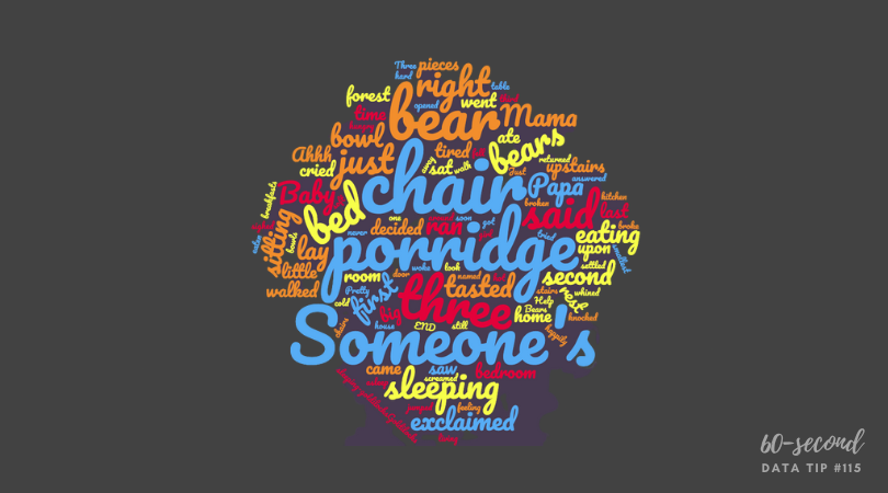

Data Viz Resources You Should Know: We All Count

In my IRL and virtual travels, I’ve come across many cool resources both for those wanting to stick their toes in data viz (and related topics) and those ready to dive into the deep end. So I’ve been thinking about creating a resource list on my website. The problem is: I sort of hate resource lists. They usually overwhelm me. They offer up too many resources which are poorly described or not described at all. And I end up hopping into a bunch of time-sucking rabbit holes and emerge cranky.

So I’m going to try slowly building a highly-curated resource list through 60-Second Data Tips. I will occassionally write a tip describing a particular resource, including why I think it’s cool. And I’ll link each of these tips to a resource list on my website. My first recommended resource is: We All Count.

What is it?

We All Count is a project to increase equity in data science. Data equity, according to We All Count, involves “principles of fairness, transparency, inclusion and justice regardless of who may be experiencing them. Overt or unintentional racism, sexism, classism, heteronormativity, colonialism, ableism, ageism, and religious intolerance are just a few factors that can skew the equity of any data project.” We All Count does its work through:

  1. A data equity community including a newsletter and community forum;

  2. Developing tools, case studies, practices, and systems to improve equity in data science including the Data Equity Framework which is a systematic way of looking at data projects;

  3. Training people in how to bring data equity to their work; and

  4. Consulting with organizations on data equity issues.

Who’s it for?

It’s mostly for data scientists looking for ways to collect and analyze data in a more equitable way. However, the site has some great tools for nonprofits concerned about using data more equitably including a Data Jargon Decoder. They also offer a series of free webinars about current issues in data science which sometimes include topics of interest to anyone dealing with data, not just data scientists. And you can ask questions about how to collect, interpret, and present data in an equitable way on their online forum.

Who’s behind it?

Heather Krause started We All Count. Heather is a mathematical statistician with experience working on complex data problems and producing real-world knowledge.

Why I think it’s cool

We All Count is focused on practical solutions to knotty data equity issues. They don’t just complain. They offer up real-world solutions to issues such as how to collect demographic data on surveys.


Let’s talk about YOUR data!

Got the feeling that you and your colleagues would use your data more effectively if you could see it better? Data Viz for Nonprofits (DVN) can help you get the ball rolling with an interactive data dashboard and beautiful charts, maps, and graphs for your next presentation, report, proposal, or webpage. Through a short-term consultation, we can help you to clarify the questions you want to answer and goals you want to track. DVN then visualizes your data to address those questions and track those goals.


It's Love Data Week!

What’s that?

Love Data Week is an international celebration of data, taking place every year during the week of Valentine's Day. Nonprofit organizations, universities, government agencies, corporations and individuals are encouraged to host and participate in data-related events and activities.

What’s in it for me?

Lots of free online events, many of which are relevant to nonprofit work such as workshops on data visualization, infographics, open (i.e. free) data, data privacy, etc. See a full list of events HERE.

Where can I learn more?

HERE.

To see past data tips, click HERE.


Let’s talk about YOUR data!

Got the feeling that you and your colleagues would use your data more effectively if you could see it better? Data Viz for Nonprofits (DVN) can help you get the ball rolling with an interactive data dashboard and beautiful charts, maps, and graphs for your next presentation, report, proposal, or webpage. Through a short-term consultation, we can help you to clarify the questions you want to answer and goals you want to track. DVN then visualizes your data to address those questions and track those goals.


Before Showing A Percentage, Read This

Reposted from October 2021 (And yes, I know that the percentages > 100%, that’s the joke. . . .)

Here’s what I’m going to do in 60 seconds today:

  • Give you three percentages. They might be the type of percentages that you share in proposals, reports, your website, or in social media posts.

  • Give you the backstory on these percentages.

  • Convince you to think carefully next time you want to present a percentage.

Here goes.

#1: Two percent of clients in Program A dropped out in the first three days of the program.

#2: 60% of first time donors in March made a second gift.

#3: 25% of people who attended our XYZ event said that they were unlikely or very unlikely to recommend the event to others.

And here is the backstory on each of the percentages:

#1: Two percent of clients in Program A dropped out in the first three days of the program. Backstory: There were 50 participants in Program A. That means only one person dropped out.

#2: 60% of first time donors in March made a second gift. Backstory: There were 5 new donors in March. That means that 3 made second gifts.

#3: 25% of people who attended our XYZ event said that they were unlikely or very unlikely to recommend the event to others. Backstory: Eight people attended XYZ event. That means two people provided the low rating.

Did the backstories cast a different light on the percentages for you? Perhaps you were imagining more people were involved? When the numerator or the denominator is fairly small, it’s usually best to present both in raw numbers rather than give a percentage. The raw numbers present a clearer understanding of the situation that you’re trying to describe. In fact, when numbers are small, percentages can be downright misleading.


Let’s talk about YOUR data!

Got the feeling that you and your colleagues would use your data more effectively if you could see it better? Data Viz for Nonprofits (DVN) can help you get the ball rolling with an interactive data dashboard and beautiful charts, maps, and graphs for your next presentation, report, proposal, or webpage. Through a short-term consultation, we can help you to clarify the questions you want to answer and goals you want to track. DVN then visualizes your data to address those questions and track those goals.


9 Ways to Make Your Data Visualizations Stand Out

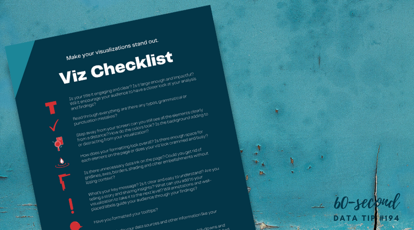
Data visualizers from around the world flex their muscles each week by creating charts, maps, and graphs using a common data set. It’s called Makeover Monday. Even if you don’t participate, it’s a great way to see the range of ways a single data set can be visualized and to consider the pros and cons of different approaches. Check out the Makeover Monday site which provides a wealth of information from past Makover Monday challenges including favorite vizes associated with each challenge. The Makeover Monday folks also shared this “Viz Checklist” with the world. And I’m offering it up as this week’s data tip. Use it next time you visualize data to ensure a polished result.

Source: https://www.makeovermonday.co.uk/

To see past data tips, click HERE.


Let’s talk about YOUR data!

Got the feeling that you and your colleagues would use your data more effectively if you could see it better? Data Viz for Nonprofits (DVN) can help you get the ball rolling with an interactive data dashboard and beautiful charts, maps, and graphs for your next presentation, report, proposal, or webpage. Through a short-term consultation, we can help you to clarify the questions you want to answer and goals you want to track. DVN then visualizes your data to address those questions and track those goals.


Why and How To Use Free Data

There’s a treasure trove of free data out there. And I know what you are thinking: “I can barely deal with my own data much less anyone else’s!” But think again. What if you could show the need for your services, your potential audiences, or other factors that affect your work without having to collect any data yourself?

Here’s an example of something you might do. I downloaded free data (in the form of an Excel spreadsheet) from the U.S. Department of Agriculture’s website on food access in 2019. I then combined this data with a list of counties that a (fictional) organization serves in Illinois to create the map below.

You can find any number of websites with lists of free data sources, such as this one. I found the USDA data by following the link from this page to Data.gov which is home to the US government’s open data.* I then clicked on “Data” on the navigation menu and searched for the topic of interest to me.

Fair warning, when searching for free data online, you are likely to find yourself in quite a few rabbit holes. So here are a few tips to make your search more fruitful:

  • Before you begin searching, know what you are looking for. Consider what geographies, time periods, or populations you need. Also, think about what data format you need. Perhaps you can only deal with Excel or CSV files. When visiting a free data site, determine if any of the data files available for download meet your needs asap. If it’s not clear, then give up and try another site.

  • If you need local data, check out your city government’s website. Many have open data available for download.*

  • Look for a data dictionary or some other type of documentation to understand what is included in the data, how the data was collected, and what each data field means. Sometimes this is included on a tab in the downloaded data file. Pay attention to what might be missing from the data and the biases that could be baked into it.

  • Link back to data sources (or attribute with text) when showing the data in charts, maps, and graphs.

  • Combine free data with your own data using zip codes, city names, census tracts or other data fields to link the two data sources.


    * Open data is data that can be freely used, re-used, and redistributed by anyone, subject only, at most, to the requirement to attribute and share-alike.


Let’s talk about YOUR data!

Got the feeling that you and your colleagues would use your data more effectively if you could see it better? Data Viz for Nonprofits (DVN) can help you get the ball rolling with an interactive data dashboard and beautiful charts, maps, and graphs for your next presentation, report, proposal, or webpage. Through a short-term consultation, we can help you to clarify the questions you want to answer and goals you want to track. DVN then visualizes your data to address those questions and track those goals.


How To Activate Board Member Fundraising With Visuals

I recently came across this excellent article by The Fundraising Authority. As promised in the title, it provides a “Simple, Step-by-Step Process for Getting Your Board to Refer New Prospects to Your Non-Profit.” In a nutshell, here are the four steps:

  1. Explain how referrals work and assure your board members that no one they refer will be asked for money until they indicate a desire to get involved.

  2. Show board members how many people they actually know through a mind mapping exercise.

  3. Ask board members for referrals usually in person.

  4. Bring referral success stories back to board meetings on a regular basis.

My tip is to enhance steps 2 and 4 with visuals.

Visuals for Step 2: For the mind map, the point is for board members to brainstorm all the people they know by considering people in different categories of their lives. You can use Canva whiteboards (or a similar tool) to create a mind map that the board member (pictured in the middle) can use to add the names of people in each category on virtual post-it notes.

Visuals for Step 4: The article claims that “this is a key step. Nothing will convince your board members to bring you more referrals than hearing from other board members that have done it successfully.” You can visualize the donors that various board members brought in using tools like Flourish to show their networks, as in this example. Scroll over the circles to interact with it and learn more. Some board members brought in donors who, in turn, brought in other donors. To make something similar, select one of the network graph templates on Flourish and fill in the data needed. (See snapshots of the data I added for the visual below.)

Links data

(used to show who is connected to whom)

Points data

(used to show groups by color, size points according to amount of donations, and add images for board members)

To see past data tips, click HERE.


Let’s talk about YOUR data!

Got the feeling that you and your colleagues would use your data more effectively if you could see it better? Data Viz for Nonprofits (DVN) can help you get the ball rolling with an interactive data dashboard and beautiful charts, maps, and graphs for your next presentation, report, proposal, or webpage. Through a short-term consultation, we can help you to clarify the questions you want to answer and goals you want to track. DVN then visualizes your data to address those questions and track those goals.


Ideas You Should Steal From This Viz (Installment 6)

Today I offer up yet another steal-worthy viz called “Flags of Inequality” created by Rita Costa and Beatriz Malveiro. Below is a partial view of the viz. But to have the whole experience and to see why I think it’s so great, click HERE.

The magic in this viz is the way the creators lead you through the meaning of each color. Color legends don’t get much attention in most vizes. But this viz guides you through the legend before showing you any data at all. It works well because, while the pride flag may be familiar to us, the various types of LGBTI equality laws and policies represented by the colors may not be. So the viz first grounds us in the meaning behind the colors so that we can fully appreciate the flags and make comparsions among countries. If you have data with complex or unfamilar categories, starting with the color legend might be a good idea.

To see past data tips, click HERE.


Let’s talk about YOUR data!

Got the feeling that you and your colleagues would use your data more effectively if you could see it better? Data Viz for Nonprofits (DVN) can help you get the ball rolling with an interactive data dashboard and beautiful charts, maps, and graphs for your next presentation, report, proposal, or webpage. Through a short-term consultation, we can help you to clarify the questions you want to answer and goals you want to track. DVN then visualizes your data to address those questions and track those goals.


Best Data Viz of 2022

Looking for a fun (if somewhat geeky) study/work break? Check out these best-of lists for 2022:

New York Times

Toward Data Science

Vox

FiveThirtyEight

FlowingData

To see past data tips, click HERE.


Let’s talk about YOUR data!

Got the feeling that you and your colleagues would use your data more effectively if you could see it better? Data Viz for Nonprofits (DVN) can help you get the ball rolling with an interactive data dashboard and beautiful charts, maps, and graphs for your next presentation, report, proposal, or webpage. Through a short-term consultation, we can help you to clarify the questions you want to answer and goals you want to track. DVN then visualizes your data to address those questions and track those goals.

Visualize 2023

May your 2023 be filled with great data viz ideas. Happy Holidays from Data Viz For Nonprofits.

To see past data tips, click HERE.


Let’s talk about YOUR data!

Got the feeling that you and your colleagues would use your data more effectively if you could see it better? Data Viz for Nonprofits (DVN) can help you get the ball rolling with an interactive data dashboard and beautiful charts, maps, and graphs for your next presentation, report, proposal, or webpage. Through a short-term consultation, we can help you to clarify the questions you want to answer and goals you want to track. DVN then visualizes your data to address those questions and track those goals.

Why You Should Know About Dot Matrix Charts

Reposted from September 2020

I’d like to introduce you to yet another chart type. The idea is to fill up your toolbox for making sense of data. This week, I give you the dot matrix chart.

Active Ingredients (What is a dot matrix chart?)

Dot matrix charts show us data units as dots (or squares). A single data unit could be a person, a group of people, a building, a program, or any other thing that you are counting. Each dot is colored to show which category or group the data unit falls into.

Uses

Dot matrix charts are simple yet mighty. They give a quick overview of the relative size of different categories and how the parts relate to the whole. I was reminded of the power of dot matrices recently when reading about the COVID-19 School Response Dashboard in an article on the National Public Radio (NPR) website. The dashboard shows data drawn from reports from K-12 schools on their confirmed and suspected coronavirus cases, along with the safety strategies they're using.

If you check out the dashboard, you see these charts showing the percent of schools reporting cases among students and staff. Take a look at the Y-axis. It ranges from 0% to 1%. This allows you to see small differences between the charts on the left (confirmed and suspected cases) and the charts on the right (only confirmed cases). But it has a big disadvantage. It doesn’t give you a visual sense of just how few students and staff have, or may have, been infected based on data that schools have. (Note: A big unknown is the number of asymptomatic/untested students or staff. Rates might be higher if more students and staff were tested.)

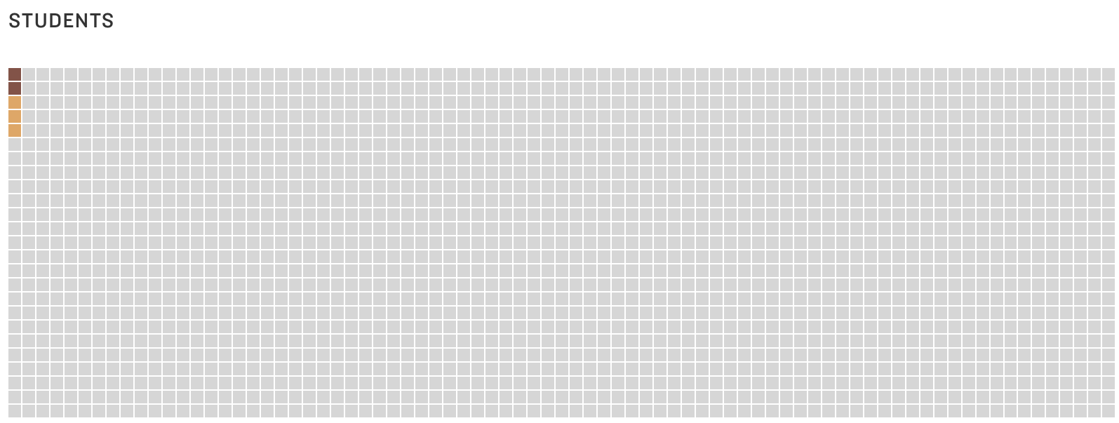
NPR recast this same data in a dot matrix chart (below) with each square representing 50 people.* And the first thing you comprehend is that the vast majority of staff and students at the reporting schools have not been infected (again according to information that schools have). Without much more effort, you see that there are more suspected than confirmed cases. No need to inspect the Y-axis or subtract percent of confirmed cases from the percent of confirmed and suspected cases.

Warnings

All those dots or squares require a good bit of page or screen real estate. Sure, one circle or square can represent more than one person or other data unit. But at some point, a bar chart might make more sense. Dot matrix charts work best when there are just a few categories and the aim is to communicate one or two simple messages.

Fun Fact

Dots or squares need not be displayed in rectangular form. This Policy Viz chart arrays the dots in a semi-circle to show the distribution of U.S. House members in different political parties. Gray dots represent empty seats. You can learn how to create a chart like this one using Excel HERE.

Source: PolicyViz

To see past data tips, including those about other chart types, click HERE.

*Note that the percentages displayed on the dashboard do not exactly match the numbers in the NPR dot matrix chart because the dashboard shows real-time data, and NPR used data from the dashboard on an earlier date than 9/24/20, the date when I took the image of the dashboard.


Let’s talk about YOUR data!

Got the feeling that you and your colleagues would use your data more effectively if you could see it better? Data Viz for Nonprofits (DVN) can help you get the ball rolling with an interactive data dashboard and beautiful charts, maps, and graphs for your next presentation, report, proposal, or webpage. Through a short-term consultation, we can help you to clarify the questions you want to answer and goals you want to track. DVN then visualizes your data to address those questions and track those goals.


What’s Missing From Your Social Media Posts

Reposted from May 2020

You aren’t deploying data viz. When I peruse nonprofit posts, I mostly see:

  • Bad photos,

  • Headshots,

  • Stock images (only some of which clearly relate to the text), or

  • No image at all.

Twitter, Facebook, and LinkedIn are like crowded highways packed with billboards. If we add charts, maps, and graphs to our billboards, we can both grab attention and say something meaningful. But the image and message should be simple and clear to travelers zooming by.

What types of vizes work best? Here are four to consider.

1. Maps

If the map shows a geography we know like the U.S. or our own city, we have a lot of prior knowledge that we can apply. This makes maps easy to digest on the fly. We look for our own location. We compare east to west or cities to rural areas. Consider showing the distribution of the need you are addressing, the location of your clientele, or where you are providing services using a map.

Source: tennessean.com, image: feedingamerica.org

2. BANs (Big Ass Numbers)

Just one large number can capture attention. The BANs shown here are from Women Will, a Google initiative focused on economic empowerment for women. They won a Shorty Award, which honors the best content creators on social media. Think about what single number you might share that could spark interest in your work. Add a link from your BAN post to a chart that provides more context and detail for that number.

Source: shortyawards.com

3. Line graph showing a clear trend

Line graphs are familiar. Many show change over time. So if we make it clear what is changing (here it’s number of deaths) and over what period of time, we can tell a quick and powerful story without much more than an angled line. But keep it simple with only one line or multiple lines but only one highlighted in color and the rest grayed out. Consider showing how the need for your services or your impact has changed over time.

source: informationisbeautiful.net

4. Bar chart showing a clear comparison

Bar charts also are trusted friends. We get them. When deploying bar charts, use color strategically to encourage a comparison of a target group to the others. This post from the World Wildlife Fund is a follow-up to an earlier post which asked followers a question. This post gives them the answer in a simple bar chart and shows them what percent of followers guessed each answer (see numbers on the right.)

Source: shortyawards.com                                 i.    

To see past data tips, including those about other chart types, click HERE.


Let’s talk about YOUR data!

Got the feeling that you and your colleagues would use your data more effectively if you could see it better? Data Viz for Nonprofits (DVN) can help you get the ball rolling with an interactive data dashboard and beautiful charts, maps, and graphs for your next presentation, report, proposal, or webpage. Through a short-term consultation, we can help you to clarify the questions you want to answer and goals you want to track. DVN then visualizes your data to address those questions and track those goals.


How To Make More "Fragrant" Data Visualizations

Whether we are trying to find a certain address as we walk down a street, to purchase clothes online, or to extract meaning from a chart, map, or graph, we foraging for information. I recently came across the idea of “information foraging” and following “an information scent” in this article on web user behavior. It got me thinking about how to boost the information scent in a data visualization. “A strong information scent is found,” according to the article, “when an element within the design suggests the user is moving nearer to their goal.” On an e-commerce website, a button that takes you to your shopping cart has a strong information scent. Below are a couple of data dashboards that I came across on the Tableau Public site that I think give off a strong information scent. See if you agree and consider using these strategies in your own data presentations.

The Potential of Female Wealth

In this dashboard, Jennifer Dawes provides a strong information scent using color, starting at the title. If you simply follow the color purple — which always means female — through the title, subtitles, and chart marks, you get a high-level understanding of where, when, and how females have accumulated wealth. I also like how the dots along the right border pique your curiosity and draw you through the dashboard to explore the wealthiest individuals in the world. Scroll around on the dashboard to learn more.

Source: Jennifer Dawes on Tableau Public

Is India Nearing A Water Crisis?

This dashboard begins with a “fragrant” table of contents. It’s visually engaging. It provides a summary of all the information included in the dashboard. And clicking on a number on the table of contents brings you to a page with more charts and maps on the topic noted. Additionally, the detail pages each include a prominent conclusion that can be drawn from the data on that page such as “Groundwater across India is at critical levels due to excessive usage.” These conclusions provide a scent or clue about what to explore in the adjacent charts.

Source: Varun Jain on Tableau Public

To see past data tips, click HERE.


Let’s talk about YOUR data!

Got the feeling that you and your colleagues would use your data more effectively if you could see it better? Data Viz for Nonprofits (DVN) can help you get the ball rolling with an interactive data dashboard and beautiful charts, maps, and graphs for your next presentation, report, proposal, or webpage. Through a short-term consultation, we can help you to clarify the questions you want to answer and goals you want to track. DVN then visualizes your data to address those questions and track those goals.