Uses
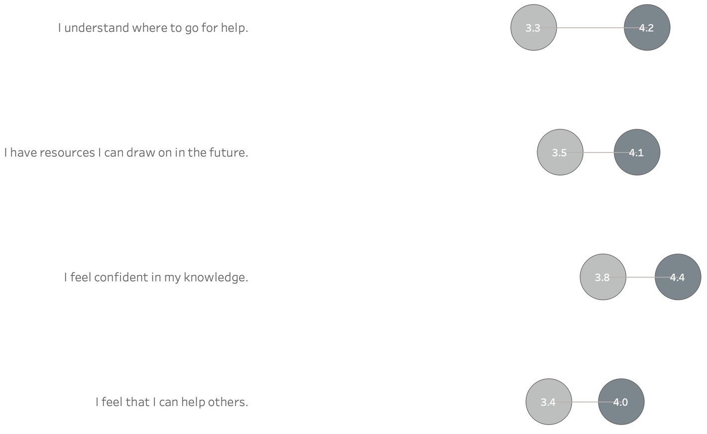
Span charts provide the extreme values. So if you want your viewer to appreciate the range of values and compare the range of different subgroups, as the example above does, it can be quite effective. In addition to salary ranges, a nonprofit organization might use a span chart to show the range between:
The largest and smallest donation amounts per person by year or by subgroup.
The highest and lowest grade point average of students in a tutoring program by semester or by subgroup.
The most and least days of participation among adults in a job training program by month or by subgroup.
Here are instructions for creating a span chart with Tableau and Excel.
Warnings
Span charts do not show the values in between the minimum and maximum or the average value. So you have no sense of the distribution of data points. Are the values evenly distributed or are most at the high or low end? If understanding the distribution is important, you can pair a span chart with a chart that provides more information on the in-between values, as the example above does. Other chart types which show distribution include: histograms, scatter charts, and box plots.
Fun Fact
Span charts go by a variety of names including range bar/column graph, floating bar graph, difference graph, and high-low graph.
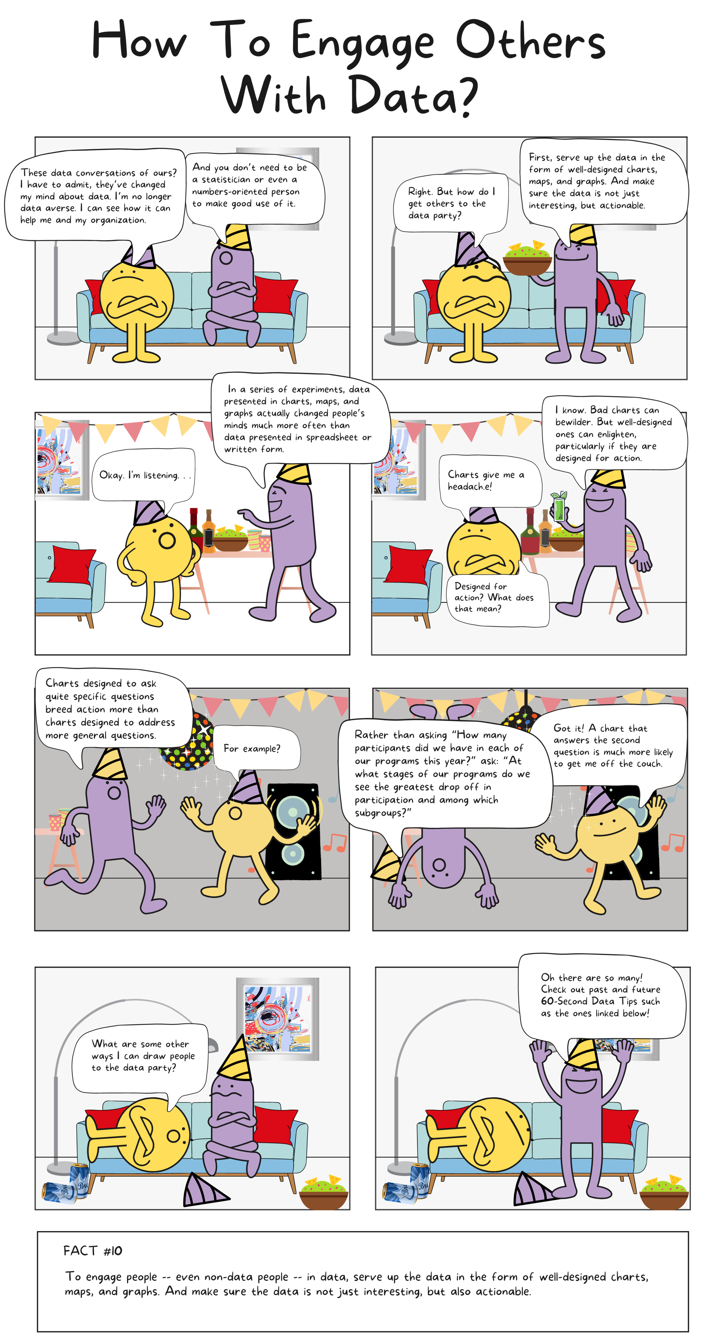
To see past data tips, including those about other chart types, scroll down or click HERE.
Sources: The Data Visualisation Catalogue