Two Ways to Offer The "Just Right" Data Portion

60-SECOND DATA TIP #8 (3).png

Reposted from June 2018

Pretend that you are Goldilocks and your porridge is data. How much data is just right? Just enough to engage your funders, staff, or board members, but not so much as to be overwhelming?

To answer this question, we might consider Miller’s Law. George A. Miller was a psychology professor at Princeton University and wrote one of the most frequently cited papers in psychology: "The Magical Number Seven, Plus or Minus Two: Some Limits on Our Capacity for Processing Information."

Miller conducted experiments on human memory and concluded that the number of objects that an average human can remember in the short-term is 7 ± 2.  Objects can include symbols like numbers or abstract concepts. We also can hold several groups of related objects in mind.

Armed with this knowledge, we can make visualizations of data (charts, maps, graphs) easier to digest by:

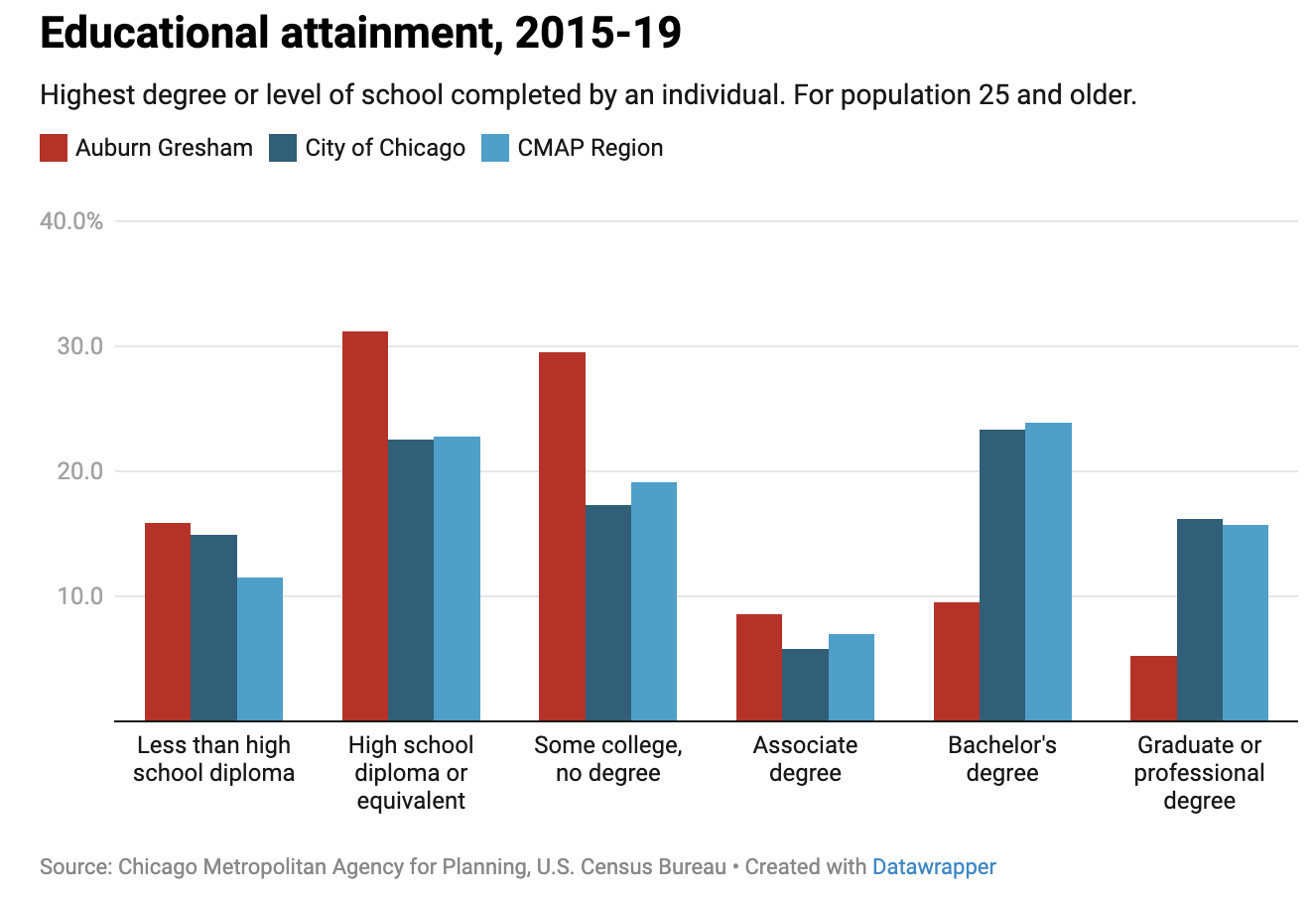
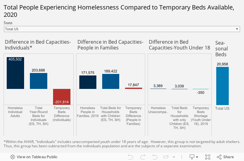
1) Grouping data into categories. Whenever you have a graph or chart with more than 5 data categories, the individual units start to lose their individuality and are perceived by our eyes as a single whole. In the “before” and “after” examples below, the after chart is easier to process because it combines data on donors into just two groups: those in Chicago and those in other cities.

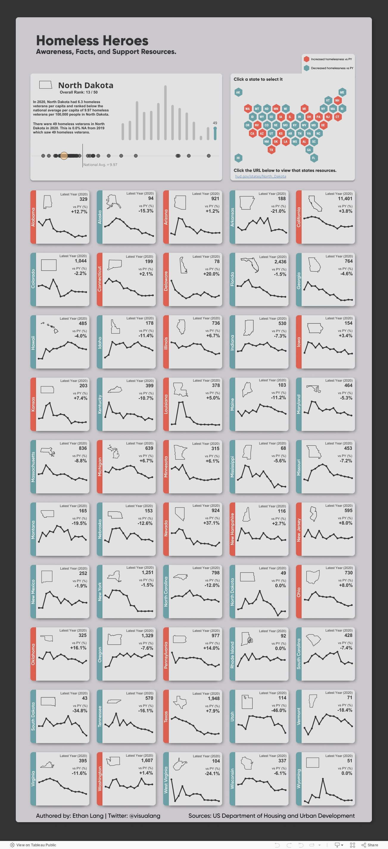
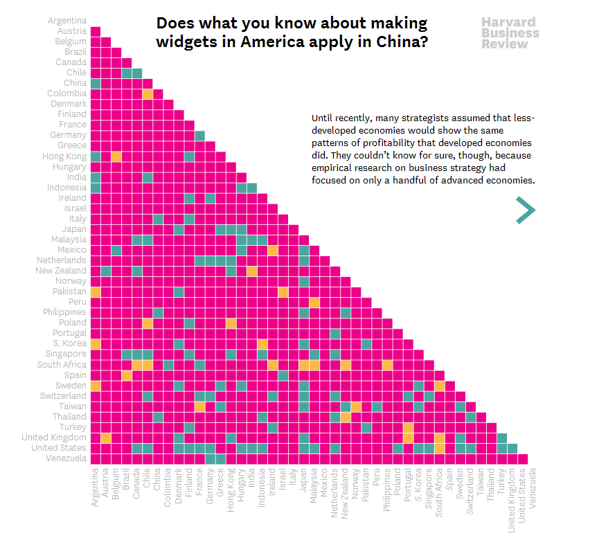
2) Highlight one or two single categories and gray out the rest. The second chart below (called a parallel coordinates chart) includes a line for each of the 50 states showing the prevalence of various diseases in each state. But only one state (Hawaii) is highlighted and the rest are grayed out. Thus there are really only two data categories to compare: 1) Hawaii and 2) the rest of the states.

BEFORE: TOO MANY GROUPS

many groups.jpg

AFTER: JUST TWO GROUPS

two groups.jpg

HIGHLIGHT ONE GROUP

hawaii.jpg

Let’s talk about YOUR data!

Got the feeling that you and your colleagues would use your data more effectively if you could see it better? Data Viz for Nonprofits (DVN) can help you get the ball rolling with an interactive data dashboard and beautiful charts, maps, and graphs for your next presentation, report, proposal, or webpage. Through a short-term consultation, we can help you to clarify the questions you want to answer and goals you want to track. DVN then visualizes your data to address those questions and track those goals.


Context is King

This “sketchplanation” elegantly demonstrates the importance of context in understanding anything. Since data visualizations are supposed to help people understand something, we should pay close attention to context when creating them, adding as much context as is needed for others to appreciate what’s going on and act on it. Considering the following charts . . .

Low-context chart

This is your garden variety chart. I see them all the time. Sure, it provides some context by comparing clients served in different zip code areas. But it doesn’t give me enough context to understand if these numbers are high, low, or somewhere in between. This chart needs more context.

xx

Moderate-context chart

This chart is better than the one above. By providing the previous year’s numbers, we can see where there has been increases and decreases and how large and small they were as well as compare the number increases (3) to the number of decreases (1).

xx

Moderate-context chart

This chart, too, allows for better assessment of the numbers than the first chart did. By simply adding a reference line for the goal, we have a better understanding of what’s going on and where we might need to take action. A reference line showing the average number of clients per zip code might also be helpful.

xx

High-context chart

This “small multiples chart”* gives us much more context by showing how the current numbers compare to past years. Consider, for example, the trend for 60601. Just knowing the current and past years’ numbers would not give you an appreciation of the overall upward trend.

*Small multiples chart: a series of similar graphs or charts using the same scale and axes, allowing them to be easily compared


Let’s talk about YOUR data!

Got the feeling that you and your colleagues would use your data more effectively if you could see it better? Data Viz for Nonprofits (DVN) can help you get the ball rolling with an interactive data dashboard and beautiful charts, maps, and graphs for your next presentation, report, proposal, or webpage. Through a short-term consultation, we can help you to clarify the questions you want to answer and goals you want to track. DVN then visualizes your data to address those questions and track those goals.


Interesting Versus Actionable Data

60-SECOND DATA TIP_4 (3).gif

Reposted from October 2021

It’s easy to get lost in a sea of interesting data when what you really need is actionable data. As Oracle’s Nate Mayfield points out, you know when you’ve presented only interesting data when you get this type of response: “Oh, cool. Yeah, that's great to know.” On the other hand, if you hear “Oh, okay. I can definitely decide what to do now,” then you’ve presented actionable data.

The key to presenting actionable data is to ask specific—rather than broad—questions. And then design your charts, maps, and graphs to answer those narrower questions. Mayfield’s article focuses on the types of questions a business might ask. Let’s consider the types of questions a nonprofit might ask:

Interesting Questions.png

Mayfield notes that data dashboards that are designed for a wide range of users tend to address only interesting questions. “Because they are intended for a broad set of users, with a lot of filters, you can in theory answer a lot of questions with these sprawling dashboards,” says Mayfield. “The problem is people quickly get lost in them and don’t spend the time required to answer their questions.” Instead, Mayfield advises us to create simple dashboards that answer quite specific questions such as the actionable questions above. So consider a series of simple dashboards, each designed to provide answers that prompt action for a particular type of user.

To see past data tips, including tips on other types of pantry staple data, click HERE.


Let’s talk about YOUR data!

Got the feeling that you and your colleagues would use your data more effectively if you could see it better? Data Viz for Nonprofits (DVN) can help you get the ball rolling with an interactive data dashboard and beautiful charts, maps, and graphs for your next presentation, report, proposal, or webpage. Through a short-term consultation, we can help you to clarify the questions you want to answer and goals you want to track. DVN then visualizes your data to address those questions and track those goals.


Ideas You Should Steal From This Viz (Installment 8)

Today I offer up yet another steal-worthy viz. The Racial Wealth Gap viz uses data from the U.S. Federal Reserve’s Survey of Consumer Finances to show the proportion of households that own different kinds of assets by racial group. Here’s what I like about this chart (and what you should steal from it):

  1. The use 100 families in addition to percentages. We can wrap our brains around 100 families. We can imagine it.

  2. The use of icons that help tell the story and also remind us of Monopoly pieces.

  3. Highlighting the gaps between the White group and other racial groups. The pink squares help us to appreciate how large the gaps are and how they compare across different asset groups.

To see past data tips, click HERE.


Let’s talk about YOUR data!

Got the feeling that you and your colleagues would use your data more effectively if you could see it better? Data Viz for Nonprofits (DVN) can help you get the ball rolling with an interactive data dashboard and beautiful charts, maps, and graphs for your next presentation, report, proposal, or webpage. Through a short-term consultation, we can help you to clarify the questions you want to answer and goals you want to track. DVN then visualizes your data to address those questions and track those goals.


Bar Chart Hack #5: A Little Fine-Tuning Can Transform A Chart


Welcome back to the 60-Second Data Tip series, “How to Hack a Bar Chart.” This week we look at some graphical fine-tuning that can transform a traditional bar chart into something that’s more engaging and more informative.

First I’ll show. Then I’ll tell.

Take a look at Chart A below. Then take a look at Chart B.

large_small_data (version 1).jpg

Chart A

voices.png

Chart B


Both are bar charts showing the same data. But B wins, hands down. Why?

Chart A truncates the Y-axis making the difference between large and small counties look bigger than it actually is. Chart B, by contrast, fills in the whole bar and darkens the portion not attending school or employed, thus giving us a sense of the size of both groups (those who are in and out of school and work) in large and small counties.

Chart B points us to the main takeaway with the title and annotations.

Chart B doesn’t have unnecessary and distracting visual elements such as gridlines and axes labels.

Chart B provides images to further emphasize the contrast between large and small counties.

To see past data tips, click HERE.


Let’s talk about YOUR data!

Got the feeling that you and your colleagues would use your data more effectively if you could see it better? Data Viz for Nonprofits (DVN) can help you get the ball rolling with an interactive data dashboard and beautiful charts, maps, and graphs for your next presentation, report, proposal, or webpage. Through a short-term consultation, we can help you to clarify the questions you want to answer and goals you want to track. DVN then visualizes your data to address those questions and track those goals.


Ideas You Should Steal From This Viz (Installment 7)

Today I offer up yet another steal-worthy viz: Emergency Calls Dashboard created with Tableau by Pradeep Kumar G. This one is genius. It seems to defy basic graphic design rules. It includes many charts and lots of small text and numbers and yet it’s readable and not overwhelming.

As you can see, the charts are contained within four rectangular views, each with the dimensions of a phone screen. Tableau dashboards can include layouts for different types of devices with varying screen sizes. When you publish these layouts, people viewing your dashboard experience a design optimized for their device (phone, tablet, or desktop.)

If you view the Emergency Calls Dashboard with a phone, you will see just one of the four views and can use the icons at the bottom of the screen to navigate to the other views, as shown in the image to the right.

Effective phone layouts usually:

  • Limit a dashboard’s focus and content (you can only get so much on this small canvas),

  • Reduce interactivity (dealing with filters on a phone can be annoying*), and

  • Use a vertical orientation (vertical scrolling is easier than horizontal scrolling).

The Emergency Calls Dashboard has all of these features, so the phone view works quite well. Indeed, these phone views are so effective that they also work when laid out side-by-side in the desktop view.

When building dashboards for multiple device types, dashboard designers often start with the desktop view and then simplify that larger, more detailed design for the phone view. The Emergency Calls Dashboard demonstrates the benefit of beginning with the phone view. If you design a simple, readable phone view that makes effective use of its limited canvas, you can use this design to fit more information in the desktop or tablet layout. Even if you aren’t designing for multiple screen sizes, following the tips for effective phone layouts will serve you well, opening up possibilities for including more data in one view without overwhelming the user.

I’ve embedded the dashboard below so that you can interact with it.

*The Tableau Mobile app optimises filters for phones, making them pop and easier to use. It also allows for logical scrolling, swiping, pinching, and zooming. However, some of your users may not use the app.


Let’s talk about YOUR data!

Got the feeling that you and your colleagues would use your data more effectively if you could see it better? Data Viz for Nonprofits (DVN) can help you get the ball rolling with an interactive data dashboard and beautiful charts, maps, and graphs for your next presentation, report, proposal, or webpage. Through a short-term consultation, we can help you to clarify the questions you want to answer and goals you want to track. DVN then visualizes your data to address those questions and track those goals.


9 Ways to Make Your Data Visualizations Stand Out

Data visualizers from around the world flex their muscles each week by creating charts, maps, and graphs using a common data set. It’s called Makeover Monday. Even if you don’t participate, it’s a great way to see the range of ways a single data set can be visualized and to consider the pros and cons of different approaches. Check out the Makeover Monday site which provides a wealth of information from past Makover Monday challenges including favorite vizes associated with each challenge. The Makeover Monday folks also shared this “Viz Checklist” with the world. And I’m offering it up as this week’s data tip. Use it next time you visualize data to ensure a polished result.

Source: https://www.makeovermonday.co.uk/

To see past data tips, click HERE.


Let’s talk about YOUR data!

Got the feeling that you and your colleagues would use your data more effectively if you could see it better? Data Viz for Nonprofits (DVN) can help you get the ball rolling with an interactive data dashboard and beautiful charts, maps, and graphs for your next presentation, report, proposal, or webpage. Through a short-term consultation, we can help you to clarify the questions you want to answer and goals you want to track. DVN then visualizes your data to address those questions and track those goals.


Best Data Viz of 2022

Looking for a fun (if somewhat geeky) study/work break? Check out these best-of lists for 2022:

New York Times

Toward Data Science

Vox

FiveThirtyEight

FlowingData

To see past data tips, click HERE.


Let’s talk about YOUR data!

Got the feeling that you and your colleagues would use your data more effectively if you could see it better? Data Viz for Nonprofits (DVN) can help you get the ball rolling with an interactive data dashboard and beautiful charts, maps, and graphs for your next presentation, report, proposal, or webpage. Through a short-term consultation, we can help you to clarify the questions you want to answer and goals you want to track. DVN then visualizes your data to address those questions and track those goals.


Ideas You Should Steal From This Viz (Installment 4)

“Every artist gets asked the question: ‘Where do you get your ideas?’ The honest artist answers, ‘I steal them.’ . . . What a good artist understands is that nothing comes from nowhere. All creative work builds on what came before.” —Austin Kleon in Steal Like An Artist.

Today I offer up another steal-worthy interactive viz that I came across in the Tableau Public Gallery. Scroll down for ideas to steal from this viz.


Source: Ethan Lang on Tableau Public


Here’s what I suggest you steal from this viz:

  • Side-by-side comparisons. It’s simple to compare states to one another since they are arrayed alongside each other.

  • Good news/bad news colors. The red/blue color coding makes it easy to discern states with decreased rates of homelessness from those with increased rates both in the national map and in the individual state charts.

  • Easy look up. If you want to dig into one state’s data, you can select it on the map and get more detail on the charts in the upper left hand panel.

To see past data tips, click HERE.


Let’s talk about YOUR data!

Got the feeling that you and your colleagues would use your data more effectively if you could see it better? Data Viz for Nonprofits (DVN) can help you get the ball rolling with an interactive data dashboard and beautiful charts, maps, and graphs for your next presentation, report, proposal, or webpage. Through a short-term consultation, we can help you to clarify the questions you want to answer and goals you want to track. DVN then visualizes your data to address those questions and track those goals.


Viz Makeover: The Clustered Bar Chart

I rarely find clustered bar charts to be enlightening. Take this one I recently came across in an article about Chicago’s Auburn Gresham neighborhood. Take about 5 seconds and see what you extract from it. Then scroll down.

My guess is that you didn’t extract much. By the time you’ve read the title and figured out which colors relate to which geographic areas, your 5 seconds are up. Below is my makeover. Take another 5 seconds to review it and then scroll down.

I hope you at least got this from your 5-second review: Auburn-Gresham’s residents were much less likely to have a college degree than residents of the city/metro area in general. Here’s what I did:

  • Aggregated the groups into just two larger groups: those with and without college degrees. And I distinguished the groups with labels and colors. What makes a clustered bar chart confusing is the requirement to review multiple groups and compare the bars within each one of them.

  • Retained the subgroups but de-emphasized them so that they do not distract the viewer from the larger story. Each subgroup is represented by a shade of orange or blue and the exact percent of residents in each group is available on demand by scrolling over the bar segments.

  • Converted to a diverging bar chart to allow the viewer to more easily compare the size of the college and no-college groups.

  • Changed the title to a question to clarify what the viewer can learn from the chart.


To see past data tips, click HERE.


Let’s talk about YOUR data!

Got the feeling that you and your colleagues would use your data more effectively if you could see it better? Data Viz for Nonprofits (DVN) can help you get the ball rolling with an interactive data dashboard and beautiful charts, maps, and graphs for your next presentation, report, proposal, or webpage. Through a short-term consultation, we can help you to clarify the questions you want to answer and goals you want to track. DVN then visualizes your data to address those questions and track those goals.


Pop Quiz: Guess What This Chart Shows

Go ahead and make a guess from the options below. Then scroll down to see how your response compares with others’ and what the answer is!

Keep scrolling!

The answer: The decline in child poverty in the U.S.


As recently reported in The New York Times, “the sharp retreat of child poverty represents major progress and has drawn surprisingly little notice, even among policy experts.” Read the article (and view the detailed line chart) to learn more about the role of government aid in lifting children and families out of poverty.

I share this chart with you—in this way—for a couple of reasons:

1) It’s an engagement strategy you can use. Rather than present a list of stats to your audience, you can engage them in your data by first quizzing them on an interesting, fun, or counterintuitive finding from your data.

2) Bad new bias. Bad news is more likely to be reported than good news, possibly because bad news sells, according to this article citing various research. Perhaps because of that bias, we may be more likely to assume a chart is telling a negative story. This chart is a reminder of the importance of taking a broader view to gain a more balanced understanding of an issue.

To see past data tips, click HERE.


Let’s talk about YOUR data!

Got the feeling that you and your colleagues would use your data more effectively if you could see it better? Data Viz for Nonprofits (DVN) can help you get the ball rolling with an interactive data dashboard and beautiful charts, maps, and graphs for your next presentation, report, proposal, or webpage. Through a short-term consultation, we can help you to clarify the questions you want to answer and goals you want to track. DVN then visualizes your data to address those questions and track those goals.


How To Make Your Data Riveting

Reposted from September 2019

Attention is like a bouncer at the entrance to our brains. For anything to get inside and make a difference in how we think and act, it first has to win our attention. And I don’t have to tell you (although here I go anyway) that we each have limited attention and lots of things are competing for it. So if you aim to influence others’ thoughts and actions with data, give some consideration to the nature of attention.

What wins people’s attention? 1) Stuff that stands out and 2) Stuff related to our desires or goals. The former wins our “exogenous” attention. The latter wins our “endogenous” attention.

Say you are at a crowded cocktail party. You are going to notice stuff that stands out like loud noises or bright lights. But you will also notice stuff that does not stand out but is of particular interest to you such as that woman standing in far corner whom you were hoping to see. You may also notice if one of your favorite songs is playing softly in the background.

We can make use of this understanding of attention when we visualize data by:

  • Making the most important aspects stand out.  Vary the size, color, and space around text and data points. For example, make the title much larger than the rest of the text or color all of the data points gray except for the ones you want to call attention to.

  • Pointing to aspects that may interest your intended viewers. Use titles, subtitles, data labels and captions to highlight and explain aspects of the data that may be particularly engaging for your intended audience.

Check out the before-and-after vizes below to see how I’ve applied these techniques to focus my audience’s attention.

BEFORE

AFTER


Let’s talk about YOUR data!

Got the feeling that you and your colleagues would use your data more effectively if you could see it better? Data Viz for Nonprofits (DVN) can help you get the ball rolling with an interactive data dashboard and beautiful charts, maps, and graphs for your next presentation, report, proposal, or webpage. Through a short-term consultation, we can help you to clarify the questions you want to answer and goals you want to track. DVN then visualizes your data to address those questions and track those goals.


How To Reveal The People In The Data

Charts, maps, and graphs are, by nature, abstractions. And it can be easy to forget about the folks that the bars, circles, and lines represent. Plus sharing information on your clientele presents not only a visualization challenge, but also a privacy challenge since we rarely have permission to share information on all of our participants. Here’s my answer to that challenge. First, get permission from a handful of participants to share their stories. The visualization below provides an example of what we could do with that information. Each chart represents individuals with distinct shapes within groups. And scrolling over shapes colored in yellow reveals a photo and profile of an individual participant in select groups. Thus the charts convey both the aggregate story and individual stories. Try interacting with it yourself. I built this example using Tableau Public, the free version of Tableau.

And here is some more information on how to show the real people behind the data.


Let’s talk about YOUR data!

Got the feeling that you and your colleagues would use your data more effectively if you could see it better? Data Viz for Nonprofits (DVN) can help you get the ball rolling with an interactive data dashboard and beautiful charts, maps, and graphs for your next presentation, report, proposal, or webpage. Through a short-term consultation, we can help you to clarify the questions you want to answer and goals you want to track. DVN then visualizes your data to address those questions and track those goals.


Upcoming Free Data Viz Webinars

webinars by Amelia Kohm

To see past data tips, click HERE.


Let’s talk about YOUR data!

Got the feeling that you and your colleagues would use your data more effectively if you could see it better? Data Viz for Nonprofits (DVN) can help you get the ball rolling with an interactive data dashboard and beautiful charts, maps, and graphs for your next presentation, report, proposal, or webpage. Through a short-term consultation, we can help you to clarify the questions you want to answer and goals you want to track. DVN then visualizes your data to address those questions and track those goals.


Ideas You Should Steal From This Viz (Installment 4)

“Every artist gets asked the question: ‘Where do you get your ideas?’ The honest artist answers, ‘I steal them.’ . . . What a good artist understands is that nothing comes from nowhere. All creative work builds on what came before.” —Austin Kleon in Steal Like An Artist.

Today I offer up another steal-worthy interactive viz that I came across in the Tableau Public Gallery.


Source: Eugenio Gallastegui on Tableau Public


Here’s what I suggest you steal from this scatterplot:

  • Use color and labels to distinguish clusters. “Donor Score” appears to be a measure of engagement. By distinguishing groups based on their income and level of engagement, this scatterplot chart effectively shows the need for various strategies moving forward.

  • Use icons instead of dots. The chart reminds us that we are considering individual people by using human icons rather than dots on the scatterplot.

  • Provide detail on demand about individuals. The chart also lets us see the forest and the trees. If you scroll over icons, you learn more about the individuals in each group.

What I don’t think works so well on this chart is the size legend showing the age of donors and volunteers. It’s quite hard to discern the various sizes of the icons and form any ideas on the possible relationship between age and group membership.

To see past data tips, click HERE.


Let’s talk about YOUR data!

Got the feeling that you and your colleagues would use your data more effectively if you could see it better? Data Viz for Nonprofits (DVN) can help you get the ball rolling with an interactive data dashboard and beautiful charts, maps, and graphs for your next presentation, report, proposal, or webpage. Through a short-term consultation, we can help you to clarify the questions you want to answer and goals you want to track. DVN then visualizes your data to address those questions and track those goals.


Upcoming Free Webinars

Jun 22, 2022, 8:00 am PT/11:00 am ET

Data visualization is like one of those unlikely couples. One partner is outgoing and a great storyteller. The other is introverted and sticks to the facts. To make great charts, maps, and graphs, you need to channel both partners in this odd couple: the artist and the analyst. In this workshop, I will offer up 10 key rules about composition that artists know and that analysts (and the rest of us) can apply when presenting data.

Presenter: Amelia Kohm | Data Viz for Nonprofits. Sponsor: Nonprofit Learning Lab

REGISTER for this free event.


July 20, 2022, 1:00 pm PT/4:00 pm ET

Almost every organization has two superpowers. The first is the data that they have packed away in databases and spreadsheets, often collecting virtual dust on their servers. The second is the visual faculties of their donors, clients, board members and staff members. While most of us glaze over at the sight of a spreadsheet, humans are wired to process visual information at lightning speed. By visualizing our data, we make it more accessible and usable.

You will leave this webinar with a clear understanding of:

  • The two superpowers organizations have and how to wield them more often and more effectively;

  • How you can use data visualization (aka data viz) to address key problems you face showing and evaluating your impact;

  • The types of visualizations that work best for different purposes; and

  • How to turn a good viz into a great one.

Presenter: Amelia Kohm | Data Viz for Nonprofits. Sponsor: techsoup

REGISTER for this free event.


Let’s talk about YOUR data!

Got the feeling that you and your colleagues would use your data more effectively if you could see it better? Data Viz for Nonprofits (DVN) can help you get the ball rolling with an interactive data dashboard and beautiful charts, maps, and graphs for your next presentation, report, proposal, or webpage. Through a short-term consultation, we can help you to clarify the questions you want to answer and goals you want to track. DVN then visualizes your data to address those questions and track those goals.


What We've Learned From All Those COVID Charts

COVID has taught us a lot about a lot of things, including data viz. Early in the pandemic, I asked: Which are worse: COVID haircuts or COVID charts? We all needed ways to understand what was happening, how bad it was, and what we should do. And many public and private entities turned to data viz to convey this information. But not all of them did a great job, particularly at the beginning. With time, those visualizing this data have learned a great deal, and we can apply this learning to charts showing all types of data.

The digital magazine, Sapiens, recently reviewed the “emerging consensus” around how to display COVID data. In this tip, I give you the 60-second version of these rules and how they might apply to the work of any nonprofit organization.

1. Cases should be reported on a population-adjusted basis. Whether you are counting cases of COVID, school drop outs, or food insecurity, raw numbers don’t mean much. One hundred drop outs in a small school district should raise more alarms than the same number in a large district. Per-capita numbers are better. They allow us to compare populations of different sizes.

2. Cases should be reported on a rolling weekly basis. Numbers of cases can fluctuate on a daily basis for a variety of reasons. And these spikes and dips can make it difficult to discern overall trends. Regardless of the type of cases you are reporting, presenting rolling averages (aka moving averages) often works better than showing daily cases.

3. Certain thresholds are meaningful and remain so over time. Per capita numbers may give us a better sense of the magnitude of a problem, but they don’t tell us what to do. The color-coded COVID risks levels serve that purpose. We can show similar thresholds in charts showing other issues. For example, the dashboard below indicates when the number of people experiencing homelessness exceeds temporary beds available and thus when further action is needed.

Source: National Alliance to End Homelessness

4. Heat maps are useful. Heat maps use color to convey meaning. And among COVID maps, as noted in the Sapiens article, “colors and threshold values vary, but everyone is speaking the same general language. Green, blue, and white tend to mean things are under control while yellow, orange, and red suggest increasing danger.” Thus heat maps show us not only when action is needed but also where it’s needed. For example, in the maps below, states with high ranks and colored in blue shades are healthier, and states with low ranks and colored in orange shades are less healthy according to the Overall Health Index and the Chronic Illness Index. Gray states are in the middle of the range. This map helps us to discern corridors of good and poor health.


Let’s talk about YOUR data!

Got the feeling that you and your colleagues would use your data more effectively if you could see it better? Data Viz for Nonprofits (DVN) can help you get the ball rolling with an interactive data dashboard and beautiful charts, maps, and graphs for your next presentation, report, proposal, or webpage. Through a short-term consultation, we can help you to clarify the questions you want to answer and goals you want to track. DVN then visualizes your data to address those questions and track those goals.


Ideas You Should Steal From This Viz (Installment 3)

“Every artist gets asked the question: ‘Where do you get your ideas?’ The honest artist answers, ‘I steal them.’ . . . What a good artist understands is that nothing comes from nowhere. All creative work builds on what came before.” —Austin Kleon in Steal Like An Artist.

Today I offer up another steal-worthy viz. Take a look:

Source: Nicole Mark on Tableau Public

Here’s what I suggest you steal from this viz:

  • Use a quote for the title. As noted in another data tip, titles are among the most important elements of a viz but often little effort goes into them. Nicole Mark, who created this viz, could easily have slapped on this title: “Number of People Who Fled Ukraine, February to March 2022.” Instead, Nicole humanized the crisis with a quote from Volodymyr Zelenskyy.

  • Show just the trajectory. To focus attention on the dramatic increase in the number of people fleeing Ukraine, the axes and gridlines have been removed.

  • Connect key information with color. The quote, the key statistic in the lower right corner, and the line on the chart are the only elements in red and thus appear more important than the other information and are visually related to each other.

To see past data tips, click HERE.


Let’s talk about YOUR data!

Got the feeling that you and your colleagues would use your data more effectively if you could see it better? Data Viz for Nonprofits (DVN) can help you get the ball rolling with an interactive data dashboard and beautiful charts, maps, and graphs for your next presentation, report, proposal, or webpage. Through a short-term consultation, we can help you to clarify the questions you want to answer and goals you want to track. DVN then visualizes your data to address those questions and track those goals.


Presenting Data Fast and Slow

Sometimes we approach the challenge of sharing data with others as if we were trying to con a pet into taking a pill. We think that our audience is too busy, disinterested, or distracted to focus on the data. So we wrap it in something that attracts their attention and feed it to them as quickly as possible. The problem with this approach is that it may get the data into their brains—momentarily—but it won’t stay there long. See where the pill ends up in this video.

If we want others to LEARN from the data — which involves not only retaining it but also drawing knowledge from it and applying that knowledge in the future — then we need a different approach. Daniel Kahneman’s Thinking Fast and Slow can help us.

First a little background on how the brain works, according to the evidence Kahneman presents. For learning to happen, information first must get past System 1 of our brains. This is where fast thinking happens. System 1 is the harried gate keeper, madly processing all of the information that comes in through our senses, pitching most of it, keeping only what is deemed necessary. But getting through the gate is only half the battle. Once in, information confronts System 2. This is the part of the brain that allows for conscious thought or slow thinking. The problem is that System 2 is lazy. Conscious thought is hard, and System 2 is always looking for an excuse to avoid it. But if System 2 engages with information, the resulting knowledge can find its way to long-term memory and learning happens.

So the challenge when presenting data is to get past System 1 AND engage System 2. Let’s consider a viz from Harvard Business Review (HBR) that I think meets both parts of this challenge. Yes, it’s an example from the for-profit world, but could easily work with nonprofit data. Take a look.

How to get data past System 1

Getting data past the System 1 fast-thinking gate keeper is all about grabbing attention. We process images much more quickly than words and numbers, so images are a great foot-in-the-door. The HBR viz does it with bright colors and a cool-looking, somewhat unusual chart. There’s plenty of information out there about how to attract attention, including the use of images with:

  • Stand out colors and textures

  • Human faces (we are wired to focus on them)

  • Novelty (images that are unusual in size, placement, etc.)

Data visualizations can use color as well as images to draw attention. But getting past System 1 is not nearly enough. For learning to happen, the viz also has to engage System 2.

How to engage System 2

System 2 is smart but lazy. So we need to pique its interest. The HBR viz starts with a title that poses a question. When confronted with an interesting question, we may be more likely to stick around for an answer. Then the viz leads you through the answer in a visually engaging way (see interactive version of the viz HERE). These are two great ways to slow down and engage the brain with data. Here’s a list of ways to engage System 2:

  • Ask a question in the title as the HBR viz does—questions beg answers.

  • Make it personal. We may be more likely to engage with data when we have a personal connection with it. This New York Times viz, for example, allows you to enter in your county to see what the barriers to COVID vaccination are in your area.

  • Highlight a surprising finding. Many of us love the counterintuitive and the creative. If you draw attention to something new that the data suggests, you may have a better chance at hooking System 2. For example, this viz from The Economist shows that China emits far less greenhouse gas per person than Western countries at the same stage of economic development. Or check out this viz by Dimiter Toshkov showing that small countries can be big players in development and good governance.

  • Hand draw it. There is some evidence that making information harder to consume, for example by presenting it with harder-to-read fonts, makes the brain slow down and engage in effortful and analytic processing. Although the jury is still out on this, I do find myself more likely to engage in hand-drawn vizes like two of the winners of the World Data Visualization Prize in 2019. Perhaps it’s simply the novelty of hand-drawn charts that engages me. Anyway, it’s something you might consider, and all you need is a pen and paper.

  • Walk them through it. A great way to slow down your viewers is to set the pace by walking them through the data as HBR does in the example. I love how HBR presents what the data might look like if our assumptions were confirmed followed by what it actually looks like.

Sources: Veritasium, Visual Content Space, MIT News, Springer Link,


Let’s talk about YOUR data!

Got the feeling that you and your colleagues would use your data more effectively if you could see it better? Data Viz for Nonprofits (DVN) can help you get the ball rolling with an interactive data dashboard and beautiful charts, maps, and graphs for your next presentation, report, proposal, or webpage. Through a short-term consultation, we can help you to clarify the questions you want to answer and goals you want to track. DVN then visualizes your data to address those questions and track those goals.


How To Visualize Cycles

Every organization experiences cyclical or seasonal patterns. Understanding how funding, participation, volunteering, and other factors change in predictable ways over time can help us to plan for the future. The problem is that we don’t always see these patterns. We get caught up in currents issues and crises, and it’s hard to step back and see what’s coming next. Visualizing your data can reveal cyclical or seasonal patterns in helpful ways. This often involves aggregating data from multiple years by specific time periods such as season, quarter, or day of the week. Here are some examples.

Working with a statistician named William Farr in the 1800s, Florence Nightingale analyzed mortality rates during the Crimean War. She and Farr discovered that most of the soldiers who died in the conflict perished not in combat but as a result of “preventable diseases” caused by bad hygiene. Nightingale invented the polar area chart (shown below), a variant of the pie chart, meant “to affect thro’ the Eyes what we fail to convey to the public through their word-proof ears.” Each pie represented a twelve-month period of the war, with each slice showing the number of deaths per month, growing outward if the number increased, and color-coded to show the causes of death (blue: preventable, red: wounds, black: other). The New York Times showed the seasonal pattern of COVID cases using a somewhat similar chart.

Source: Wikipedia

In the dashboard below, Curtis Harris reveals not only patterns in taxi rides by time of day but also by day of the week. We can see, for example, that few people are using taxis between 2 and 3 am, particularly at the beginning of the week.

Source: Curtis Harris on Tableau Public

This varsity-level viz (below) by Lindsay Betzendahl shows the seasonality of the flu. Each dot represents one week in a particular year. Each “ray” consists of dots for the same week of different years. So the ray at the 12:00 position represents the first week in January for each year between 2007 to 2018. The size of the dots show the number of influenza cases. So we can see that cases surge during the winter weeks, in general, but we also can see outbreaks during other seasons in particular years. Betzendahl explains how to create such a chart in Tableau here.

Source: Lindsay Betzendahl on Tableau Public


Let’s talk about YOUR data!

Got the feeling that you and your colleagues would use your data more effectively if you could see it better? Data Viz for Nonprofits (DVN) can help you get the ball rolling with an interactive data dashboard and beautiful charts, maps, and graphs for your next presentation, report, proposal, or webpage. Through a short-term consultation, we can help you to clarify the questions you want to answer and goals you want to track. DVN then visualizes your data to address those questions and track those goals.