Why Nonprofits Can Ditch Statistics

60-SECOND DATA TIP_4.gif

Today’s tip is to check out Maryfrances Porter and Alison Nagel’s excellent article Why Nonprofits Shouldn’t Use Statistics on the Depict Studio Blog. Here is a 60-second version with my two cents.

I agree with Porter and Nagel that you probably should not be worrying about statistics due to :

  1. Small numbers. Most nonprofit organizations are not serving thousands or millions, but rather tens and hundreds. It’s hard to draw scientifically defensible conclusions based on small numbers. Any individual in a small group has an outsized impact on the group as a whole.

  2. No reasonable comparison group. To make a scientifically defensible claim about the impact of your program, you usually need to compare your participants to a random group of people who do not participate in the program. And, as Porter and Nagel note, “we’ve never met a nonprofit so flush that they had money to track people they don’t serve.”

So how should nonprofits use all that data that they collect everyday? Porter and Nagel suggests that organizations:

  1. Look for pattens, themes and trends. When considering data on participation, feedback from surveys and focus groups, and other data you may collect, look for themes and patterns. Then consider how those themes and patterns change over time and how they differ among subgroups. The best way to see patterns, themes, and trends is in the form of charts, maps, and graphs.

  2. Consider possible causes. Based on your experience, what might be the reasons behind the patterns, themes, and trends you see? Consideration of this question with your colleagues can lead to valuable hypotheses. You can use these hypotheses to make program changes and see if the data you subsequently collect suggest that those changes led to more positive outcomes. You are not demonstrating impact in a scientific way, but you are using data to inform your decisions.

I don’t agree with Porter and Nagel that you have to know what graphs you want before creating them in Tableau. Actually, I think Tableau provides a more nimble way of exploring your data in different visual formats than you can in Excel. But use whatever tool you are comfortable with. Or hire someone (like Data Viz for Nonprofits) to visualize your data for you. An interactive dashboard makes it easy to track your progress on a regular basis.

To see past data tips, including lots of tips on ways to visualize nonprofit data, click HERE.


Let’s talk about YOUR data!

Got the feeling that you and your colleagues would use your data more effectively if you could see it better? Data Viz for Nonprofits (DVN) can help you get the ball rolling with an interactive data dashboard and beautiful charts, maps, and graphs for your next presentation, report, proposal, or webpage. Through a short-term consultation, we can help you to clarify the questions you want to answer and goals you want to track. DVN then visualizes your data to address those questions and track those goals.


Ideas You Should Steal From This Viz (Installment 1)

60-SECOND DATA TIP_3.png

“Every artist gets asked the question: ‘Where do you get your ideas?’ The honest artist answers, ‘I steal them.’ . . . What a good artist understands is that nothing comes from nowhere. All creative work builds on what came before.” —Austin Kleon in Steal Like An Artist.

Today’s tip is to steal ideas from other data visualizations. Here’s a viz I recently came across in the Tableau Public Gallery:

Source: Jacqui Moore on Tableau Public

Source: Jacqui Moore on Tableau Public

I’ve stacked the four squares below so that you can see it close up. And here’s what I suggest you steal from this viz:

  • Simple charts. The viz has only two types of charts: bar charts and line graphs. And they are so simple to read. Distracting elements (like axes and gridlines) are eliminated so that you can easily compare the world to North America, both now and over time.

  • Repetition of charts. The same charts are repeated for each of four categories, making comparison among categories quite easy.

  • Images. The simple images relating to mountains, terrestrial, freshwater, and marine help us to distinguish among the four categories and add visual appeal.

  • Controlled color palette. The viz focuses attention on the four categories by diverging from the monochromatic color scheme only in the images.

Untitled design (1).png

I look forward to sharing other steal-worthy data visualizations with you in future data tips! To see past data tips, click HERE.


Let’s talk about YOUR data!

Got the feeling that you and your colleagues would use your data more effectively if you could see it better? Data Viz for Nonprofits (DVN) can help you get the ball rolling with an interactive data dashboard and beautiful charts, maps, and graphs for your next presentation, report, proposal, or webpage. Through a short-term consultation, we can help you to clarify the questions you want to answer and goals you want to track. DVN then visualizes your data to address those questions and track those goals.


Understand Social Media Impact Using "Pantry Staple" Data

60-SECOND DATA TIP_3.gif

Social media data is another staple in our data pantries. Your organization probably has it. But you might not make good use of it. Why? Well, social media analytics come in many flavors and can bewilder. Posts are like bait. The better the bait, the more nibbles and bites leading to website traffic and eventually to more donations, volunteers, participation, and other types of engagement. But we need a way to easily decipher which types of bait are working best. And drawing this information out of the data can be a challenge.

Need some inspiration? Check out Alice McKnight’s dashboard below. It provides a broad array of social media data in an appealing and accessible format. We can see how effective social media posts are at various times. The charts along the top give us the basic trends over the last several months. It also shows us what topics are drawing attention. Give it a try. Check out the “View By” options which filter the two charts at the bottom. Then consider how you might visualize your own social media data using similar charts.

Source: Alice McKnight on Tableau Public

To see past data tips, including tips on other types of pantry staple data, click HERE.


Let’s talk about YOUR data!

Got the feeling that you and your colleagues would use your data more effectively if you could see it better? Data Viz for Nonprofits (DVN) can help you get the ball rolling with an interactive data dashboard and beautiful charts, maps, and graphs for your next presentation, report, proposal, or webpage. Through a short-term consultation, we can help you to clarify the questions you want to answer and goals you want to track. DVN then visualizes your data to address those questions and track those goals.


Truth and Beauty

Reposted and Updated from November 2018

Reposted and Updated from November 2018

Real data people care about truth, not beauty. More accurately, they care about evidence that might suggest a truth. So they don’t really embrace truth, just the pursuit of it. However, they don’t have any time for pursuing beauty. Indeed, they may see beauty as deception. A glossy chart or graph is the province of advertisers or advocates seeking to influence rather than to fully inform.

I’m here to argue — both to “real” data people and the rest of us — that we should not discount beauty when visualizing data. Indeed, it might be worth our while to pursue it as we pursue truth. The reason? Well, because we like pretty things. If that sounds like a flimsy explanation,  stick with me a bit longer.

Research evidence suggests that visually attractive things make us happy. (See “The Beauty-Happiness Connection” in The Atlantic for more on this.) And a positive mood, in turn, helps to expand our working memory, which allows us to process more information. So rather than being deceptive window dressing, beauty can actually more deeply engage the viewer in the pursuit of truth.

How can we make data more beautiful? Check out my series of tips on rules that artists know and that analysts (and the rest of us) can apply when presenting data. Here is the cheat sheet with all ten rules which includes links to the tips.

See other data tips in this series for more information on how to effectively visualize and make good use of your organization's data.

Understand Your Budget Using "Pantry Staple" Data

60-SECOND DATA TIP_3.png

Budget data is another staple in our data pantries. We need our staff, board members, funders, clients, and other stakeholders to understand this data. But many of them are not comfortable with financial spreadsheets. Here are some ways to present budget data that allow others to gain quick insight and, perhaps, dig deeper. These examples all come from the public sector but are easily applied to a nonprofit organization’s budget.

2016 U.S. Budget

The Obama administration made the Byzantine federal budget accessible to the world through this simple treemap. We can see where the lion's share of the money goes and which areas receive relatively little funding. Click HERE to see the interactive version which provides more information when you scroll over or click on a rectangle. Treemaps are easy to make in Tableau, Excel, and other apps.

School District of Philadelphia Budget

I find this sunburst chart daunting in static form. But check out the interactive version HERE. If you scroll over the inner ring, you can see that 96 percent of funds went to school budgets. Then move to successive outer rings to see how school and administrative budgets break down into smaller categories. You can build sunburst charts in Excel and other apps.

Oak Park, Illinois Budget

This interactive area chart showing the Oak Park, IL budget emphasizes change over time in the area chart at the top. But you can click on any year to see how the budget broke down by funds in the bar chart below. If you click on the downward arrow next to a given fund, you get even more detailed information on that fund. You can build this type of interactive viz in Tableau.

To see past data tips, including tips on other types of pantry staple data, click HERE.


Let’s talk about YOUR data!

Got the feeling that you and your colleagues would use your data more effectively if you could see it better? Data Viz for Nonprofits (DVN) can help you get the ball rolling with an interactive data dashboard and beautiful charts, maps, and graphs for your next presentation, report, proposal, or webpage. Through a short-term consultation, we can help you to clarify the questions you want to answer and goals you want to track. DVN then visualizes your data to address those questions and track those goals.


Details, Details (And When To Include Them)

Reposted from October 2019

Reposted from October 2019

What I remember most about the movie “Inside Out” is a scene about forgetting. And it has helped to shape my thoughts on presenting data.

In the 2015 Pixar film, memories are shining orbs sent through vacuum tubes to “Long Term,” a mammoth storage room with, nevertheless, limited capacity. So “Mind Workers” continuously cull the memory orbs, discarding the unnecessary ones – old phone numbers, piano lessons, names of past presidents – into the “Memory Dump.” I remembered this scene most recently when:

1) I heard Bryan Caplan interviewed on NPR. He’s an economist who wrote the thought-provoking book The Case Against Education. One argument Caplan makes against education is that we mostly forget it.  He cites studies that show little retention of both facts and generalized skills post college.

 2) My 12- and 14-year-old daughters’ shared with me YouTube channels like Oversimplified, In A Nutshell, and Crash Course. These funny, brief videos explain stuff I’ve forgotten (or perhaps never learned, who knows?) like the origins of the French Revolution and how the immune system works.

So here’s the question: Given that our brains are continuously purging information, particularly details, and retaining, at best, big picture stuff that can be contained in a 10-minute video, should we not bother with the details in the first place? My short answer is no. For me, it’s about who should spend time on the details and when.

If you are presenting data in any form, it’s incumbent upon you to know the details of the data -- what the trends are overall and by subgroup, who or what is not represented in the data, where the outliers are. And then the idea is to transfer aspects of this knowledge in the right form for the right people, paying as much attention to what you exclude as to what you include.

Some of the people will only need the biggest picture, but even they should to be tipped off to any exceptions to the rule hidden in the data. They also need to know where to go to learn more if and when they want to. Some of the people will need a more detailed rendering of the data, but don’t give them so many trees that they can’t see the forest. Indeed, they may retain the details more if you give them a general picture first which serves as a scaffolding on which they can attach details presented later.

And here’s hoping you retain the gist of this data tip!

Data Viz for Nonprofits help organizations to effectively and beautifully present their data on websites, reports, slide decks, interactive data dashboards and more. Click HERE to learn more about our services and HERE to set up a meeting to discuss how we can meet your particular needs.

How to Gain Insight By Widening Your Perspective

60-SECOND DATA TIP_3.png

We all live, by necessity, in our own little worlds. We interact with our colleagues and our participants, clients, or audiences way more often that we interact with other folks. This way of life has both its comforts and dangers. One of these dangers may have never occurred to you. Academic types call it “selecting on the dependent variable.” Catchy name, right? It sounds more complex than it is. It simply means paying attention only to cases in which some phenomenon is observed and ignoring cases in which it is not observed.

Here’s an example from my own life. For years I suffered from back pain. I saw all kinds of physicians, and they all agreed that that three ruptured discs in my spine were causing the pain. The ruptured discs were plain enough to see on an MRI, so I accepted the diagnosis. Then, after 10 years of unsuccessful treatments, I learned of many reports in the medical literature of ruptured discs in patients with no history of back pain. The ruptured discs were discovered on CT or MRI studies conducted to investigate other parts of the body. If ruptured discs caused back pain, there should be a clear correlation between the observation of ruptured discs and back pain. We have all heard that correlation does not, on its own, imply causation. But I encountered physicians who were willing to label something as a cause (ruptured discs) without even a strong correlation with the effect (back pain)! It wasn’t until I started looking at other possible causes (stress/anger) that I solved the problem and began to feel better.

My doctors were drawing conclusions based on what they observed in their own worlds: patients with back pain and the MRIs of these patients’ spines. They weren’t looking at the spines of patients without pain. If they had, they might have drawn a different conclusion. If doctors, who know more about science than most of us, can make this sort of mistake, the rest of us should also beware.

Think about the ideas you develop based on just the participants, clients, and audiences your program or organization serves. Then widen the circle. Does your idea hold up when you consider similar participants, clients, and audiences in other programs or organizations? For example, you might think: participants who drop out of this program live far away from the program site. Perhaps. But are there similar programs (within your organization or at other organizations) that participants are willing to travel to? If so, then you might consider what other aspects of the program or characteristics of the participants might lead to drop out.

To see past data tips, click HERE.


Let’s talk about YOUR data!

Got the feeling that you and your colleagues would use your data more effectively if you could see it better? Data Viz for Nonprofits (DVN) can help you get the ball rolling with an interactive data dashboard and beautiful charts, maps, and graphs for your next presentation, report, proposal, or webpage. Through a short-term consultation, we can help you to clarify the questions you want to answer and goals you want to track. DVN then visualizes your data to address those questions and track those goals.


How To Consume Data

Reposted from April 2018

Reposted from April 2018

Charts, graphs, maps, and other types of data visualizations (aka “data viz”) often pull me in, especially if they are visually striking. But until I became versed in the art and science of data visualization, even dazzling charts often would frustrate me. I could not extract their meaning quickly and thus moved on.

There are five steps in quickly consuming a data viz. I know that doesn’t sound quick, but most steps take only seconds to do. In each step, you answer a simple question. The questions are:

1.     What’s this about? What question is it answering?

This first question comes from a 1940 classic book called How To Read A Book by Mortimer J. Adler. Adler maintains that you don’t save time on books by learning to speed-read. Instead, you save time by making an informed decision about what to and what not to read. And the best way to make this decision is to do an “inspectional read” which means skimming through titles, headings, tables of context, etc. Similarly, when you encounter a chart, map, or graph in text, skim over it by reading the title and subtitle, and any captions or annotations. Then determine what its about and, more specifically, what question it is trying to answer.

2.     What’s my guess about the answer to that question?

This might seem like an unnecessary step, but studies have shown that comprehension increases when a reader forms questions about a text before consuming it. A question primes your brain for an answer. The more our curiosity is piqued, the easier all learning becomes.

3.     What’s the quality of the data?

This might be the most important step and the least likely to be taken. At least determine the source of the data and whether the source appears to be reliable and credible. True, individuals will disagree on which sources are reliable and credible. Some of us, however, might be wary of data from institutions with clear political leanings or agendas. If no data source is noted, the viz is not worth your time.

For extra credit, look for information on what is and what is NOT included in the data. Consider, for example, the time period of the data and the demographics of people represented by the data. You are trying to determine if the data are equal to the task of the visualization. Can it really answer its question(s)? Or are there gaps in the data that weaken its ability to answer the questions fully or at all?

4.     What more can I learn from the structure of the viz

If you have gotten this far, you are engaged by the viz. Now consider what it all means. A visualization is, by nature, an abstraction of reality. It shows data collected in the real world using position, color, shape, and size to represent the data. Thus it’s important to understand what these visual cues mean in the particular viz you are consuming.

5.     What is the answer to the question and what questions am I left with?

Finally, consider what answers you see in the viz and how they compared to your expectations. And to prime yourself to consider future information on the same subject, ask yourself what else you’d like to know about it. 

See other data tips in this series for more information on how to effectively visualize and make good use of your organization's data.


Data + Experience = Insight

60-SECOND DATA TIP_3.gif

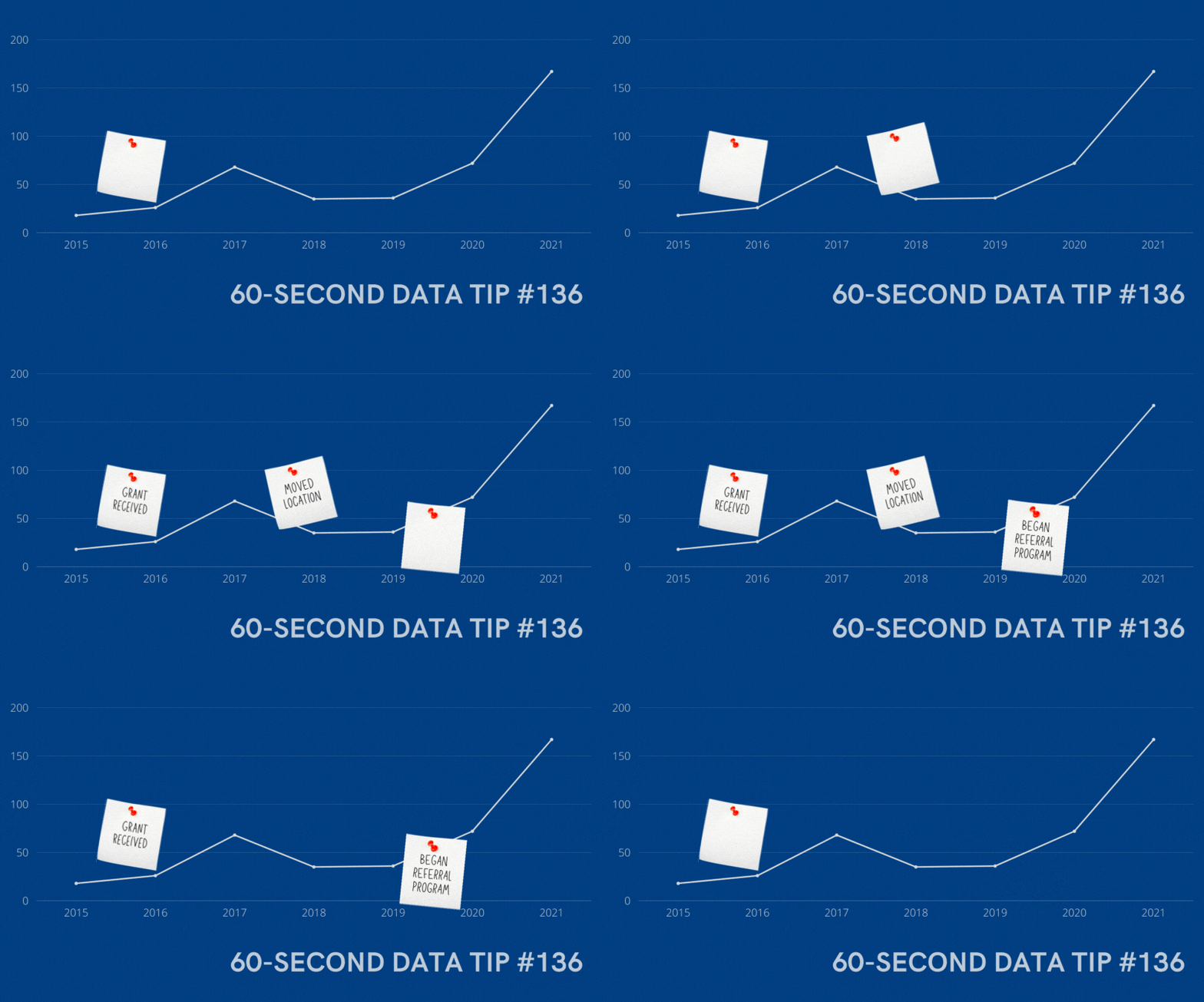
Data can’t take you all the way to a decision. In real life, you will never have enough data. So you’ll need to apply your own experience and your colleagues’ experiences to understand the implications of data for your work. Here’s a great way to apply experience to data. It’s from Dabbling In The Data: A Hands-On Guide to Participatory Data Analysis, a guide from Public Profit.

Dabbling in The Data describes how to do this group activity in person. I’ve adapted it to an online experience using Canva, but you can use any brainstorming app that allows for real-time collaboration. It’s simple yet powerful.

4.png

Step 1: Choose a template.

Sign up for a free Canva account. Start a new design; choose a size for your design; and then click on the “Templates” tab on the sidebar. Type in “brainstorm” in the search window to see template options (see A above.) I chose this template from the “Brainwriting” template group.

1.png

Step 2: Add a chart and customize.

Next add a chart showing change over time on some key measure you want to better understand. In this example, the key measure is the number of lessons provided to participants over a 7-year period. You can cut and paste an image of the chart from another program like Excel, or you can create the chart in Canva by click on the “Elements” tab in the sidebar (see B above), choosing a chart type, and then entering the data points (see C above.) I’ve added a chart and customized the instructions and notepads below. Note, it’s important to position the chart backward (see D above) and lock the chart in place (see E above) so that others can place notepads on top of the chart.

2.png

Step 3: Share the chart with your colleagues and invite them to add milestones.

Your colleagues will need free Canva accounts as well. To share the chart in real time, click on “Share” (see F above) and type in your colleagues' email addresses, making sure to allow them to edit the design. Ask the group to think about the key organizational milestones that occurred during the time represented in the chart and to add those milestones to the chart using the notepads at the bottom of the screen. Encourage them to also add detail to notepads added by others.

3.png

Step 4: Discuss.

Discuss how changes in the key metric over time might be related to the organizational milestones. Consider how this understanding of pivotal events can help you better show progress to stakeholders and to plan for the future. For example, if the implementation of a new program was followed by a decrease in participation, what about the new program may have caused the decrease? What else was going on at the time that may have contributed to the decline?

To see past data tips, click HERE.


Let’s talk about YOUR data!

Got the feeling that you and your colleagues would use your data more effectively if you could see it better? Data Viz for Nonprofits (DVN) can help you get the ball rolling with an interactive data dashboard and beautiful charts, maps, and graphs for your next presentation, report, proposal, or webpage. Through a short-term consultation, we can help you to clarify the questions you want to answer and goals you want to track. DVN then visualizes your data to address those questions and track those goals.

Data TMI? It's A Thing

Reposted from October 2019

Reposted from October 2019

TMI* is a problem in many realms. It has become a parenting truism to only answer the question asked when our kids ask about sex. “Don't tell the kid every single thing you know about a topic; keep it pretty simple and let them ask you for more detail if they need it,” says  Dr. Carol Queen, a sexologist.

I think the same principle applies to data dashboards. Those of us who create dashboards have a tendency to add too many charts, too many filters, too many measures, too many dimensions. The idea is to anticipate almost any question the user might have and make it answerable with the dashboard. But usually, that’s TMI. We overwhelm the user. It’s not clear why or how to use the dashboard and so it’s not used at all.

So listen to the sexologist. When designing dashboards, focus each one on just a few questions that your intended users have. Then beta test them with a few of those users. If they want more detail, they will ask for it.

Data Viz for Nonprofits help organizations to effectively and beautifully present their data on websites, reports, slide decks, interactive data dashboards and more. Click HERE to learn more about our services and HERE to set up a meeting to discuss how we can meet your particular needs.

* too much information

Understand Donations Using "Pantry Staple" Data

60-SECOND DATA TIP_3.gif

The vast majority of nonprofits have some type of list of donors and donations. Tell me that you don’t have a database or spreadsheet that looks something like this.

Screen Shot 2021-04-19 at 11.10.23 AM.png

Use Case: Tracking Progress to Goal

Now tell me that this data would not be way more useable in this interactive dashboard. Give it a try. You can see both how you are doing overall in relation to your goal and how different types of donors and donations are contributing to your progress. This dashboard can be created using Tableau Public, the free version of Tableau.

To see past data tips, including tips on other types of pantry staple data, click HERE.


Let’s talk about YOUR data!

Got the feeling that you and your colleagues would use your data more effectively if you could see it better? Data Viz for Nonprofits (DVN) can help you get the ball rolling with an interactive data dashboard and beautiful charts, maps, and graphs for your next presentation, report, proposal, or webpage. Through a short-term consultation, we can help you to clarify the questions you want to answer and goals you want to track. DVN then visualizes your data to address those questions and track those goals.

How to Put The Viewer In The Viz

60-SECOND DATA TIP_3 (2).gif

Here’s a surefire way to engage your donors, staff, board members, and others in your data: put them in it. I’ve talked about how to place the “viewer in the viz” before. And The New York Times recently reminded me just how powerful this strategy can be.

This series of interactive visualizations from The New York Times shows you, right out of the gates, whether you live in a Democratic or Republican bubble. Then it zooms out to zip code areas near you and finally focuses on the segregated political landscape in the U.S. more generally.

I recommend you interact with the NYT viz and let it inspire you. Think about how you can engage various stakeholders in your data by using a similar technique. For example, show viewers . . .

  • How close they are to a problem. Rather than present statistics on food insecurity in your region, ask viewers to enter their zip code to see how many families near them don’t have consistent access to healthy food.

  • How accurate their understanding of an issues is. Ask them how many women experience domestic abuse or how many children experience poverty, and then show them how far off the mark they are. Check out this example!

  • How their habits or lifestyle contribute to—or help to reduce—a problem. Check out this Carbon Footprint Calculator for a great example.

  • What category they fall into. We all love to discover groups we belong to. Think of Harry Potter’s sorting hat. Consider elucidating an issue by showing viewers where they fall in relation to that issue. That’s what I did with this data personality viz.

And no, you don’t need to be a tech wiz to make these types of interactive visualizations. You can make them using Tableau Public, the free version of Tableau (or a similar data viz application) and embed them in your website. I’m also happy to create something like this for you.


Let’s talk about YOUR data!

Got the feeling that you and your colleagues would use your data more effectively if you could see it better? Data Viz for Nonprofits (DVN) can help you get the ball rolling with an interactive data dashboard and beautiful charts, maps, and graphs for your next presentation, report, proposal, or webpage. Through a short-term consultation, we can help you to clarify the questions you want to answer and goals you want to track. DVN then visualizes your data to address those questions and track those goals.


Understand Your Volunteers Using "Pantry Staple" Data

60-SECOND DATA TIP_3 (1).gif

If your organization is like most nonprofits, you rely on volunteers to get the job done. And you probably have at least some basic “pantry staple” data on volunteers.

Pantry Staple Data: Volunteer Data

The volunteer data you already have can be leveraged to:

  • Impress funders, donors, and other stakeholders. Show them how you are using this free resource to move the needle.

  • Recruit new volunteers. As we have discussed in this blog before, we are all influenced by peers. So show how many volunteers you have to attract even more.

  • Manage volunteers more effectively. Seeing clearly what’s going on with your volunteers will help you to retain them, make better use of them, and recruit new ones. This is the subject of today’s tip.

Use Case: Maximizing Volunteer Time and Value

This volunteer data dashboard uses a variety of charts to answer the who, what, where, and when questions that you may have about your volunteers. With this detailed view of volunteers, an organization can start thinking about how to activate inactive volunteers, what types of new volunteers to target, and when during the year to deploy volunteers.

Source: Jin Tat on Tableau Public

Source: Jin Tat on Tableau Public

This simple map dashboard provides insight into the distribution of volunteers—and volunteer hours—among sites. This understanding can help you decide if and how to redistribute volunteers. Both this dashboard and the one above can be created using Tableau Public, the free version of Tableau.

Source:CCE on Tableau Public

Source:CCE on Tableau Public

To see past data tips, click HERE.


Let’s talk about YOUR data!

Got the feeling that you and your colleagues would use your data more effectively if you could see it better? Data Viz for Nonprofits (DVN) can help you get the ball rolling with an interactive data dashboard and beautiful charts, maps, and graphs for your next presentation, report, proposal, or webpage. Through a short-term consultation, we can help you to clarify the questions you want to answer and goals you want to track. DVN then visualizes your data to address those questions and track those goals.

Understand Program Drop Out Using "Pantry Staple" Data

60-SECOND DATA TIP_3.png

Data, like ingredients, can be divided into two groups: the data we have on hand (kind of like pantry staples) and the data we’d like to have. We spend a lot of time bemoaning that we don’t have the data we want, the type of data that can really show impact. But while we pursue new and better data, we also can do more with the data already in our databases and spreadsheets.

In the coming weeks and months, your weekly 60-second data tip occasionally will feature a type of pantry staple data and a suggestion on how to visualize it for a particular purpose. This time it’s about using participation data to show drop out rates.

Pantry Staple Data: Participation Data

If you provide any type of human service —education, case work, counseling, job training, whatever — you have participation data. At the least, you probably collect data on participants’ names and the services or programs provided to them. But you also likely have demographic data on them (age, address, employment, etc.), when they participated, and maybe some other data to boot. This type of data can be a gold mine for understanding and showing your reach and comparing how different types of participants fare in your programs.

Use Case: Showing Drop Out

Drop outs are inevitable. Participants leave our programs and services for a wide range of reasons. Ideally, we would survey or interview each participant who drops out to better understand why. But even without this type of data, we can learn a lot about drop outs and apply this knowledge to future decisions.

The funnel chart below shows the decreasing number of participants at each stage of a food service training program. We can see that few of those who attend orientation make it all the way to a job. And we can see at which stages there is the most/least drop off. This funnel chart also can be interactive. A filter can be added to show results for particularly subgroups, such those in different age, race/ethnicity, or family status groups.

It looks cool and makes intuitive sense, but a funnel chart is just a bar chart on its side with a mirror image. Check out these easy instructions for making funnel charts in Tableau and Excel.

Screen Shot 2021-03-15 at 1.12.48 PM.png
Screen Shot 2021-03-15 at 1.12.11 PM.png

The dashboard below also provides a wealth of information on another type of drop out: employee turnover. These charts can be applied to participant/client drop out data as well to show when they leave, what programs they leave from, and why they leave. And even if we don’t have the why data, what we know about the who, what, where, and when of drop outs can help us to discover the why. For example, if more folks are dropping out during the summer, maybe it’s because of childcare issues. If more people in certain neighborhoods are dropping out, maybe the programs in that area need strengthening.

Source: Alexandria Heusinger on Tableau Public

Source: Alexandria Heusinger on Tableau Public

To see past data tips, click HERE.


Let’s talk about YOUR data!

Got the feeling that you and your colleagues would use your data more effectively if you could see it better? Data Viz for Nonprofits (DVN) can help you get the ball rolling with an interactive data dashboard and beautiful charts, maps, and graphs for your next presentation, report, proposal, or webpage. Through a short-term consultation, we can help you to clarify the questions you want to answer and goals you want to track. DVN then visualizes your data to address those questions and track those goals.


The Problem with Large Numbers (And What To Do About it)

60-SECOND DATA TIP_3.gif

BANs (Big Ass Numbers) are gaining prominent positions in data dashboards, websites, social media, email marketing, and annual reports these days. They are meant to impress. Wow! 359,234 meals served! Cool! $6 million raised!

But there is a problem with big numbers. Our brains can’t fully digest them. As noted in a 2017 Wall Street Journal article, “Big numbers befuddle us, and our lack of comprehension compromises our ability to judge information about government budgets, scientific findings, the economy and other topics that convey meaning with abstract figures, like millions, billions, and trillions.”

When quantifying the breadth of a problem or solution, nonprofits may toss out lots of giant figures, as in the bewildering graphic below. But without context, even numbers in the hundreds or thousands can bewilder.

So what can we do to make BANs more meaningful? Researchers at Columbia University and Microsoft found that they could improve numerical comprehension by using “perspectives,” which are simple sentences that relate a large number to something more familiar to us.

They found, for example, that when told that the number of registered firearms in the U.S. is about 300 million, study participants not only had trouble comprehending this number but also recalling it and assessing its likely accuracy. However, when told that there is about one firearm per person in the U.S., significantly more people could comprehend, assess, and recall the quantity. Makes sense to me. We can imagine a group of people, each holding a firearm, but we are hard pressed to imagine a pile of 300 million firearms.

So before you present a large number, consider a perspective that will make it relatable for your audience. Below are some formulas used in the Columbia/Microsoft study for developing perspectives.


Let’s talk about YOUR data!

Got the feeling that you and your colleagues would use your data more effectively if you could see it better? Data Viz for Nonprofits (DVN) can help you get the ball rolling with an interactive data dashboard and beautiful charts, maps, and graphs for your next presentation, report, proposal, or webpage. Through a short-term consultation, we can help you to clarify the questions you want to answer and goals you want to track. DVN then visualizes your data to address those questions and track those goals.


To Improve Anything First Test Your Thinking

Reposted from October 2018

Reposted from October 2018

Pop quiz. Take yourself back to your seventh grade science class. Wake up from your drowsy, awkward, tween state and then answer this question: “What is a null hypothesis?”

Stay tuned for the answer. First, why are we talking about null hypotheses? Because if you are going to improve anything, you gotta get your null hypothesis on. As I’ve said before, progress in organizations – and indeed, in all of human history – happens when we admit ignorance. The null hypothesis is all about admitting ignorance.

Your science teacher didn’t tell you to make a guess (or a hypothesis) and then look for evidence to support it. Instead, your teacher said to state the opposite of what you believe (or, more specifically, that no relationship exists between two things) and then try to refute it. That opposite statement is the null hypothesis.

Why go at it backwards? The power of the null hypothesis is that it forces you to look beyond your expectations. For example, your hypothesis might be that girls do best in your life skills program based on what you’ve seen so far. The null hypothesis for such a hypothesis might be: there is no difference in performance in the life skills program based on gender. Looking for evidence to support the null hypothesis opens your eyes to other factors (besides gender) that may be at play. Perhaps kids who can sit for longer periods of time do better in the program, and those patient kids often are girls. If so, then you have some powerful information. Maybe building in some movement time will improve overall performance?

If patience and other factors you explore don’t seem to be related to performance, then maybe gender is the key factor.

I’m not suggesting that you launch highly technical controlled experiments. Instead, I’m asking you to first consider that you might be wrong and then pay attention to data that supports such a conclusion. It can point you to new and powerful strategies.

See other data tips in this series for more information on how to effectively visualize and make good use of your organization's data.

Photo by Andrew Shiau on Unsplash

What To Do With Incomplete Data

60-SECOND DATA TIP_3.png

Here’s the super short version of this data tip: when designing data viz, don’t mix complete and incomplete data. Below is the somewhat-longer-but-still-60-seconds version of this data tip.

The graphs below were on the Chicago Public Schools (CPS) website and show the number of confirmed COVID-19 cases associated with CPS buildings. I’ve added the pink lines and captions to direct your attention to the last two data points. The first image shows what the graph looked like on Monday, January 18th, and the second image shows what the graph looked like 5 days later on Saturday, January 23rd.

If you went to this website on January 18th and looked that this graph, you might very well have concluded that cases had recently plummeted. But you’d be wrong. To understand what was really going on, you’d have to notice that the last data point (1/23) was in the future and put that information together with a caption saying “Case counts are updated Monday through Friday (excluding holidays) after impacted individuals are notified.” So the graph shows complete data for past weeks but incomplete data for the current week. The last data point shows week-to-date data.

Unless your aim is to confuse or deceive, why present data in this way? Instead, when you have complete data for various time periods or groups and incomplete data for other time periods or groups, consider the following:

  • If you are updating data on a daily basis, then show day intervals (rather than week intervals as in the graphs above) on the X-axis.

  • Create a separate chart showing a running total for the incomplete time period or group and place it alongside the graph showing complete data.

  • If neither of the solutions above work for you, at least color the dots, lines, or other marks representing the incomplete data in a color different from the complete data to alert the viewer to the difference and include a color legend to explain the difference.

Thanks to Carol White of CBWhite marketing research and strategy consulting for pointing out this graph to me! To see past data tips, click HERE.


Let’s talk about YOUR data!

Got the feeling that you and your colleagues would use your data more effectively if you could see it better? Data Viz for Nonprofits (DVN) can help you get the ball rolling with an interactive data dashboard and beautiful charts, maps, and graphs for your next presentation, report, proposal, or webpage. Through a short-term consultation, we can help you to clarify the questions you want to answer and goals you want to track. DVN then visualizes your data to address those questions and track those goals.


What's Your Data Personality?

Re-posted from July 2019

Re-posted from July 2019

Some of us might be resistant to data but who can resist an over-simplistic personality quiz? I’ve developed a tool to determine your data personality. Just answer two questions and BOOM you fall into (or on the border of) one of four personality types. But wait! That’s not all. You also get a “data prescription” tailored to your personality type.

Sure, the tool is highly unscientific. But it’s fun and throws some light on how we can help ourselves and those with other data personalities (living in the next cubicle, board room, or across the world wide web) to better understand and use data.

What are the four data personality types? Well, there’s . . .

The Wonky

These are the unabashed number lovers with a deep belief that, with enough data, we can make much better decisions. They yearn for equations and algorithms. They find meaning in all those Greek statistical symbols that baffle the rest of us. Data Prescription: Feed the Wonky a steady and ample diet of data in almost any form. But also help them to communicate data to the not-so-wonky through charts, maps, and graphs so that the message behind the data is as clear to others as it is to them.

The Intimidated

The intimidated long for the objectivity that data and the scientific method offer. They want something besides their gut or conventional wisdom as a compass. But they glaze over at the sight of a spreadsheet and worry that they cannot confidently assess the quality or implications of their data. Data Prescription: Relax the Intimidated with well-designed charts, maps, and graphs.

The Cautious

These folks are comfortable with numbers. They took stats in high school or college and aced it. But they worry about the accuracy of data, particularly data they did not collect themselves. Data Prescription: Like the Intimidated, the Cautious do well with charts, maps, and graphs but also need assurances regarding data sources. While you should be upfront about the sources and limitations of your data with all data personality types, provide more detailed information to the Cautious.

The Averse

In the Averse, we find the perfect storm: both a distaste for and a distrust of data. Data Prescription: They need to be eased along in their engagement with data. Try starting with data that’s familiar to them. And what’s more familiar and fascinating than data about ourselves? So try putting-the-viewer-in-the-viz. Show The Averse how their height, salary, diet, or opinions compare to that of others. Ask them to guess a statistic before showing them the answer. (For a great example of this, see this article in the Guardian.) As you move them into more complex data, make your charts as simple and user-friendly as possible. This often includes sign posts directing them through the viz.

Yes, visualized data (in the form of charts, maps, and graphs) are prescribed for all data personality types. They either clarify data for you or for others who need to understand it. Data viz is no cure-all but it often helps, particularly in nonprofits which are often staffed by the Intimidated and the Averse.

I hope this personality quiz — like so many overly-simplistic quizes — makes you feel less alone and gets you thinking about upping your data game.

For many tips on why and how to visualize data, take a stroll through past 60-Second Data Tips.


Composition Rules Cheat Sheet

60-SECOND DATA TIP_3.png

Over the past 10 weeks, I’ve given you composition rules to elevate your data viz. Today I give you the cheat sheet. Bookmark it! Print it out and pin it to your bulletin board!


Let’s talk about YOUR data!

Got the feeling that you and your colleagues would use your data more effectively if you could see it better? Data Viz for Nonprofits (DVN) can help you get the ball rolling with an interactive data dashboard and beautiful charts, maps, and graphs for your next presentation, report, proposal, or webpage. Through a short-term consultation, we can help you to clarify the questions you want to answer and goals you want to track. DVN then visualizes your data to address those questions and track those goals.


10 Rules To Elevate Your Data Viz (Rule #10)

60-SECOND DATA TIP_3.png

Here is a simple strategy you can take from the graphic design playbook to make your data viz better: divide your design into thirds. It’s one of 10 composition rules for good design. Here’s the 60-second version of this rule.

Composition Rules (#10) by Amelia Kohm

What Does “Divide Your Design Into Thirds” Mean?

To apply the “rule of thirds” strategy, create a grid on your screen (or paper, if you’re old school) with three rows and three columns. Then place your focal points at the intersections of the vertical and horizontal lines. But avoid placing anything in the exact middle. This approach goes all the way back to the Renaissance artists who found it made for a pleasing composition. Some say it gives the eye places to move without getting stuck in the middle.

How Can I Apply This Rule to Data Viz?

As far as I can tell, data visualizers have not embraced this rule. I was hard pressed to find any good examples. But I think it’s something more of us should keep in mind. It is a time-tested method for arriving at a balanced and interesting composition. Consider placing key text, images, and charts according to the rule of thirds.

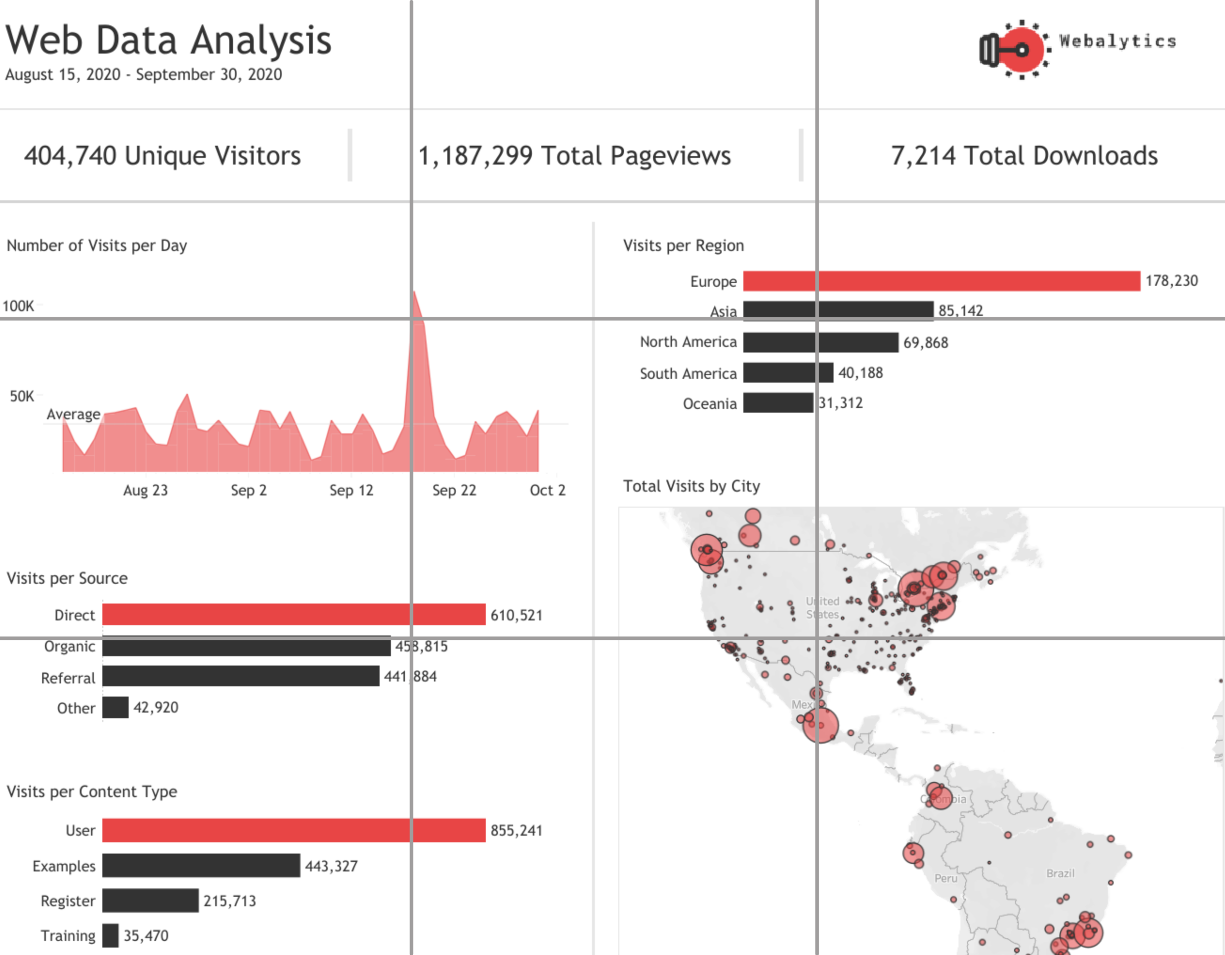
To be clear, when you place the focal points within the cells of a 3 x 3 grid, you are NOT applying the rule of thirds. As you can see in this example, the focal points are not at the intersections of the grid (which I’ve superimposed on the dashboard). Sure, it makes for a clean, user-friendly composition, but it’s probably not the most exciting thing you’ve ever seen.

Source: Varun Goenka on Tableau Public

Source: Varun Goenka on Tableau Public

This is the only dashboard I came across, after several hours of searching, that came close to the rule of thirds. Again, I’ve superimposed the grid, and you can see that the intersections do land on some key elements, including one key data point on the Number of Visits per Day graph. And it does have a more dynamic feel than the dashboard above.

Source: : Seema M. Rathod on Tableau Public

Source: : Seema M. Rathod on Tableau Public

Since I couldn’t find a great data viz example of the rule of thirds (either in my own portfolio or others’), I leave you with this mock-up for a dashboard which I made to show you just how pleasing this approach can be when applied to a data viz composition. Now you try it!

nogride@2x.png

And here it is with the grid that I used to place the elements.

withgrid@2x.png

To see past data tips, including those about other composition rules, click HERE.


Let’s talk about YOUR data!

Got the feeling that you and your colleagues would use your data more effectively if you could see it better? Data Viz for Nonprofits (DVN) can help you get the ball rolling with an interactive data dashboard and beautiful charts, maps, and graphs for your next presentation, report, proposal, or webpage. Through a short-term consultation, we can help you to clarify the questions you want to answer and goals you want to track. DVN then visualizes your data to address those questions and track those goals.