
Here is a simple strategy you can take from the graphic design playbook to make your data viz better: divide your design into thirds. It’s one of 10 composition rules for good design. Here’s the 60-second version of this rule.
What Does “Divide Your Design Into Thirds” Mean?
To apply the “rule of thirds” strategy, create a grid on your screen (or paper, if you’re old school) with three rows and three columns. Then place your focal points at the intersections of the vertical and horizontal lines. But avoid placing anything in the exact middle. This approach goes all the way back to the Renaissance artists who found it made for a pleasing composition. Some say it gives the eye places to move without getting stuck in the middle.
How Can I Apply This Rule to Data Viz?
As far as I can tell, data visualizers have not embraced this rule. I was hard pressed to find any good examples. But I think it’s something more of us should keep in mind. It is a time-tested method for arriving at a balanced and interesting composition. Consider placing key text, images, and charts according to the rule of thirds.
To be clear, when you place the focal points within the cells of a 3 x 3 grid, you are NOT applying the rule of thirds. As you can see in this example, the focal points are not at the intersections of the grid (which I’ve superimposed on the dashboard). Sure, it makes for a clean, user-friendly composition, but it’s probably not the most exciting thing you’ve ever seen.

Source: Varun Goenka on Tableau Public
This is the only dashboard I came across, after several hours of searching, that came close to the rule of thirds. Again, I’ve superimposed the grid, and you can see that the intersections do land on some key elements, including one key data point on the Number of Visits per Day graph. And it does have a more dynamic feel than the dashboard above.
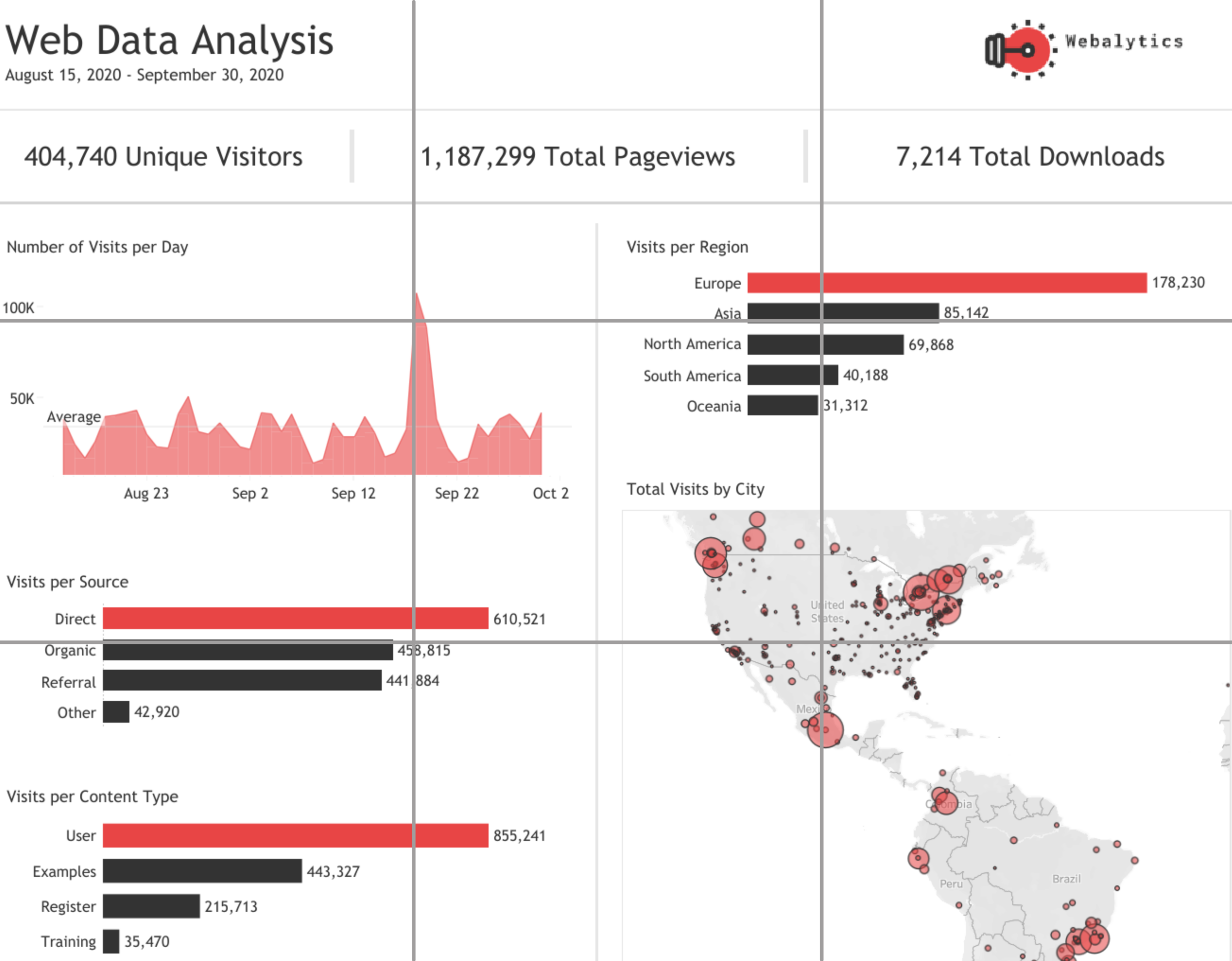
Source: : Seema M. Rathod on Tableau Public
Since I couldn’t find a great data viz example of the rule of thirds (either in my own portfolio or others’), I leave you with this mock-up for a dashboard which I made to show you just how pleasing this approach can be when applied to a data viz composition. Now you try it!

And here it is with the grid that I used to place the elements.

To see past data tips, including those about other composition rules, click HERE.
Let’s talk about YOUR data!
Got the feeling that you and your colleagues would use your data more effectively if you could see it better? Data Viz for Nonprofits (DVN) can help you get the ball rolling with an interactive data dashboard and beautiful charts, maps, and graphs for your next presentation, report, proposal, or webpage. Through a short-term consultation, we can help you to clarify the questions you want to answer and goals you want to track. DVN then visualizes your data to address those questions and track those goals.


