
“Good design is like a refrigerator—when it works, no one notices, but when it doesn’t, it sure stinks.”
–Irene Au
A jumble of elements in any design, including data visualization design, stinks. That’s why alignment is one of 10 composition rules for good design. Here’s the 60-second version of this rule.
What Does “Align Elements” Mean?
Alignment is placing text and other design elements so they line up. It orders and organizes your elements. It also creates visual connections and improves the overall readability of a design. You can align elements to a margin or to other elements in a design. Elements can also be aligned along a central axis.
How Can I Apply This Rule to Data Viz?
Aligning charts, maps, graphs, titles, subtitles, and other elements of a data viz design is a simple way to bring order to your composition. Like straightening up a messy room, aligning elements makes it easier for the viewer to navigate the design and find information. Also, a clean design, like a clean room, is more inviting.
To improve alignment, consider:
Using left alignment with text in most cases. It’s how we read and usually works best. Only use right or center alignment with a small amount of text (like a title or subtitle).
Using a grid. Many design and data viz tools have grid overlays. Some can snap your elements onto your grid.
Now let’s consider some examples.
In this dashboard, the charts, maps, titles, and text boxes are aligned both vertically and horizontally along a 4 x 3 grid. The result is a balanced and approachable look despite the multitude of charts and text elements.
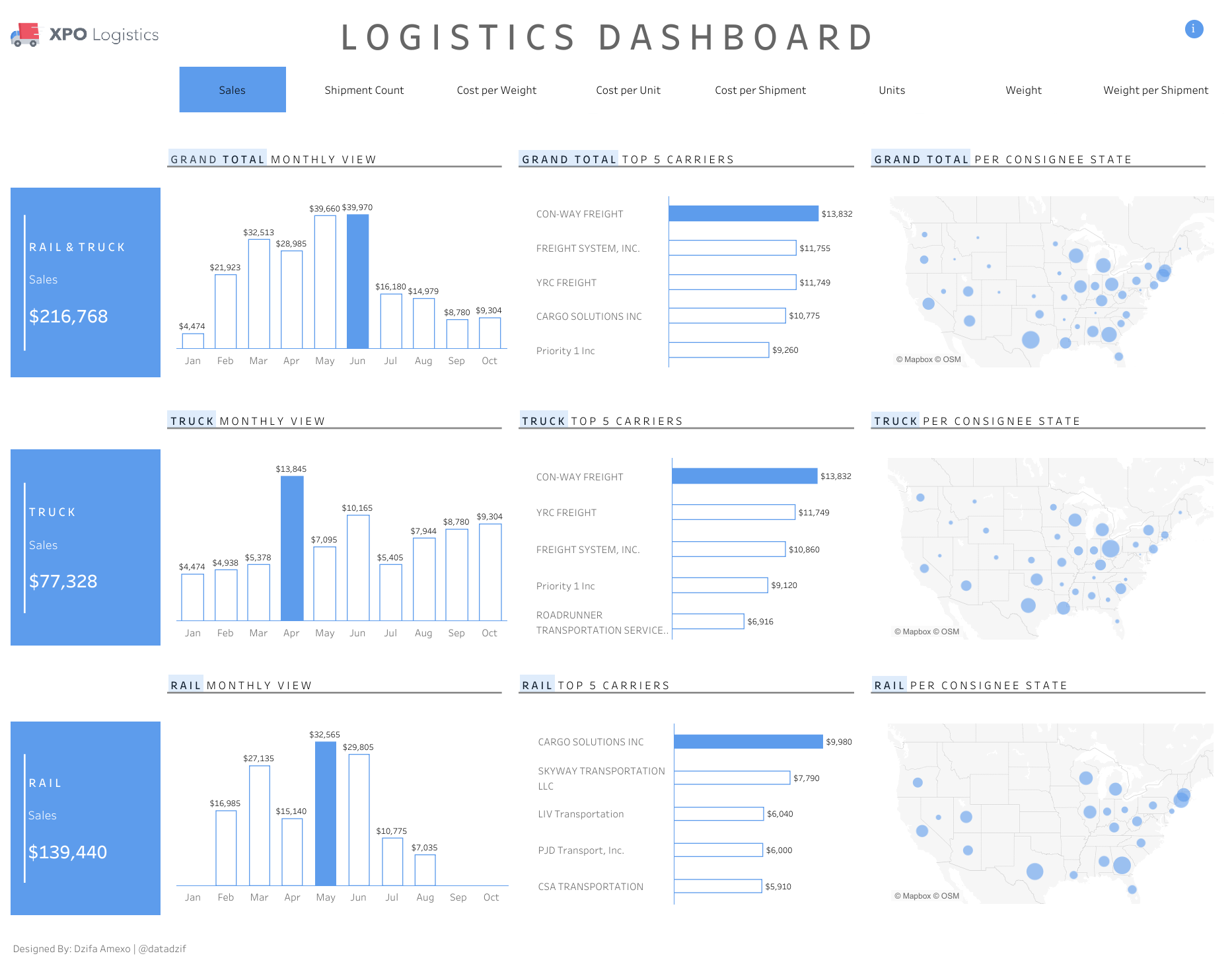
Source: Dzifa Amexo on Tableau Public
This composition uses both left and right alignment to create a serene, symmetrical design. The designer emphasizes alignment by adding actual lines along some of the text elements.

Source: Dhruv Popat on Tableau Public
This diverging bar chart makes good use of center alignment, but the numbers at the top are not aligned with the text and chart below, giving it an off-kilter feel.

Source: Sanaz Jamloo on Tableau Public
To see past data tips, including those about other composition rules, click HERE.
Let’s talk about YOUR data!
Got the feeling that you and your colleagues would use your data more effectively if you could see it better? Data Viz for Nonprofits (DVN) can help you get the ball rolling with an interactive data dashboard and beautiful charts, maps, and graphs for your next presentation, report, proposal, or webpage. Through a short-term consultation, we can help you to clarify the questions you want to answer and goals you want to track. DVN then visualizes your data to address those questions and track those goals.


