Understand Donations Using "Pantry Staple" Data

60-SECOND DATA TIP_3.gif

The vast majority of nonprofits have some type of list of donors and donations. Tell me that you don’t have a database or spreadsheet that looks something like this.

Screen Shot 2021-04-19 at 11.10.23 AM.png

Use Case: Tracking Progress to Goal

Now tell me that this data would not be way more useable in this interactive dashboard. Give it a try. You can see both how you are doing overall in relation to your goal and how different types of donors and donations are contributing to your progress. This dashboard can be created using Tableau Public, the free version of Tableau.

To see past data tips, including tips on other types of pantry staple data, click HERE.


Let’s talk about YOUR data!

Got the feeling that you and your colleagues would use your data more effectively if you could see it better? Data Viz for Nonprofits (DVN) can help you get the ball rolling with an interactive data dashboard and beautiful charts, maps, and graphs for your next presentation, report, proposal, or webpage. Through a short-term consultation, we can help you to clarify the questions you want to answer and goals you want to track. DVN then visualizes your data to address those questions and track those goals.


How to Put The Viewer In The Viz

60-SECOND DATA TIP_3 (2).gif

Here’s a surefire way to engage your donors, staff, board members, and others in your data: put them in it. I’ve talked about how to place the “viewer in the viz” before. And The New York Times recently reminded me just how powerful this strategy can be.

This series of interactive visualizations from The New York Times shows you, right out of the gates, whether you live in a Democratic or Republican bubble. Then it zooms out to zip code areas near you and finally focuses on the segregated political landscape in the U.S. more generally.

I recommend you interact with the NYT viz and let it inspire you. Think about how you can engage various stakeholders in your data by using a similar technique. For example, show viewers . . .

  • How close they are to a problem. Rather than present statistics on food insecurity in your region, ask viewers to enter their zip code to see how many families near them don’t have consistent access to healthy food.

  • How accurate their understanding of an issues is. Ask them how many women experience domestic abuse or how many children experience poverty, and then show them how far off the mark they are. Check out this example!

  • How their habits or lifestyle contribute to—or help to reduce—a problem. Check out this Carbon Footprint Calculator for a great example.

  • What category they fall into. We all love to discover groups we belong to. Think of Harry Potter’s sorting hat. Consider elucidating an issue by showing viewers where they fall in relation to that issue. That’s what I did with this data personality viz.

And no, you don’t need to be a tech wiz to make these types of interactive visualizations. You can make them using Tableau Public, the free version of Tableau (or a similar data viz application) and embed them in your website. I’m also happy to create something like this for you.


Let’s talk about YOUR data!

Got the feeling that you and your colleagues would use your data more effectively if you could see it better? Data Viz for Nonprofits (DVN) can help you get the ball rolling with an interactive data dashboard and beautiful charts, maps, and graphs for your next presentation, report, proposal, or webpage. Through a short-term consultation, we can help you to clarify the questions you want to answer and goals you want to track. DVN then visualizes your data to address those questions and track those goals.


Understand Your Volunteers Using "Pantry Staple" Data

60-SECOND DATA TIP_3 (1).gif

If your organization is like most nonprofits, you rely on volunteers to get the job done. And you probably have at least some basic “pantry staple” data on volunteers.

Pantry Staple Data: Volunteer Data

The volunteer data you already have can be leveraged to:

  • Impress funders, donors, and other stakeholders. Show them how you are using this free resource to move the needle.

  • Recruit new volunteers. As we have discussed in this blog before, we are all influenced by peers. So show how many volunteers you have to attract even more.

  • Manage volunteers more effectively. Seeing clearly what’s going on with your volunteers will help you to retain them, make better use of them, and recruit new ones. This is the subject of today’s tip.

Use Case: Maximizing Volunteer Time and Value

This volunteer data dashboard uses a variety of charts to answer the who, what, where, and when questions that you may have about your volunteers. With this detailed view of volunteers, an organization can start thinking about how to activate inactive volunteers, what types of new volunteers to target, and when during the year to deploy volunteers.

Source: Jin Tat on Tableau Public

Source: Jin Tat on Tableau Public

This simple map dashboard provides insight into the distribution of volunteers—and volunteer hours—among sites. This understanding can help you decide if and how to redistribute volunteers. Both this dashboard and the one above can be created using Tableau Public, the free version of Tableau.

Source:CCE on Tableau Public

Source:CCE on Tableau Public

To see past data tips, click HERE.


Let’s talk about YOUR data!

Got the feeling that you and your colleagues would use your data more effectively if you could see it better? Data Viz for Nonprofits (DVN) can help you get the ball rolling with an interactive data dashboard and beautiful charts, maps, and graphs for your next presentation, report, proposal, or webpage. Through a short-term consultation, we can help you to clarify the questions you want to answer and goals you want to track. DVN then visualizes your data to address those questions and track those goals.


The Problem with Large Numbers (And What To Do About it)

60-SECOND DATA TIP_3.gif

BANs (Big Ass Numbers) are gaining prominent positions in data dashboards, websites, social media, email marketing, and annual reports these days. They are meant to impress. Wow! 359,234 meals served! Cool! $6 million raised!

But there is a problem with big numbers. Our brains can’t fully digest them. As noted in a 2017 Wall Street Journal article, “Big numbers befuddle us, and our lack of comprehension compromises our ability to judge information about government budgets, scientific findings, the economy and other topics that convey meaning with abstract figures, like millions, billions, and trillions.”

When quantifying the breadth of a problem or solution, nonprofits may toss out lots of giant figures, as in the bewildering graphic below. But without context, even numbers in the hundreds or thousands can bewilder.

So what can we do to make BANs more meaningful? Researchers at Columbia University and Microsoft found that they could improve numerical comprehension by using “perspectives,” which are simple sentences that relate a large number to something more familiar to us.

They found, for example, that when told that the number of registered firearms in the U.S. is about 300 million, study participants not only had trouble comprehending this number but also recalling it and assessing its likely accuracy. However, when told that there is about one firearm per person in the U.S., significantly more people could comprehend, assess, and recall the quantity. Makes sense to me. We can imagine a group of people, each holding a firearm, but we are hard pressed to imagine a pile of 300 million firearms.

So before you present a large number, consider a perspective that will make it relatable for your audience. Below are some formulas used in the Columbia/Microsoft study for developing perspectives.


Let’s talk about YOUR data!

Got the feeling that you and your colleagues would use your data more effectively if you could see it better? Data Viz for Nonprofits (DVN) can help you get the ball rolling with an interactive data dashboard and beautiful charts, maps, and graphs for your next presentation, report, proposal, or webpage. Through a short-term consultation, we can help you to clarify the questions you want to answer and goals you want to track. DVN then visualizes your data to address those questions and track those goals.


What's Your Data Personality?

Re-posted from July 2019

Re-posted from July 2019

Some of us might be resistant to data but who can resist an over-simplistic personality quiz? I’ve developed a tool to determine your data personality. Just answer two questions and BOOM you fall into (or on the border of) one of four personality types. But wait! That’s not all. You also get a “data prescription” tailored to your personality type.

Sure, the tool is highly unscientific. But it’s fun and throws some light on how we can help ourselves and those with other data personalities (living in the next cubicle, board room, or across the world wide web) to better understand and use data.

What are the four data personality types? Well, there’s . . .

The Wonky

These are the unabashed number lovers with a deep belief that, with enough data, we can make much better decisions. They yearn for equations and algorithms. They find meaning in all those Greek statistical symbols that baffle the rest of us. Data Prescription: Feed the Wonky a steady and ample diet of data in almost any form. But also help them to communicate data to the not-so-wonky through charts, maps, and graphs so that the message behind the data is as clear to others as it is to them.

The Intimidated

The intimidated long for the objectivity that data and the scientific method offer. They want something besides their gut or conventional wisdom as a compass. But they glaze over at the sight of a spreadsheet and worry that they cannot confidently assess the quality or implications of their data. Data Prescription: Relax the Intimidated with well-designed charts, maps, and graphs.

The Cautious

These folks are comfortable with numbers. They took stats in high school or college and aced it. But they worry about the accuracy of data, particularly data they did not collect themselves. Data Prescription: Like the Intimidated, the Cautious do well with charts, maps, and graphs but also need assurances regarding data sources. While you should be upfront about the sources and limitations of your data with all data personality types, provide more detailed information to the Cautious.

The Averse

In the Averse, we find the perfect storm: both a distaste for and a distrust of data. Data Prescription: They need to be eased along in their engagement with data. Try starting with data that’s familiar to them. And what’s more familiar and fascinating than data about ourselves? So try putting-the-viewer-in-the-viz. Show The Averse how their height, salary, diet, or opinions compare to that of others. Ask them to guess a statistic before showing them the answer. (For a great example of this, see this article in the Guardian.) As you move them into more complex data, make your charts as simple and user-friendly as possible. This often includes sign posts directing them through the viz.

Yes, visualized data (in the form of charts, maps, and graphs) are prescribed for all data personality types. They either clarify data for you or for others who need to understand it. Data viz is no cure-all but it often helps, particularly in nonprofits which are often staffed by the Intimidated and the Averse.

I hope this personality quiz — like so many overly-simplistic quizes — makes you feel less alone and gets you thinking about upping your data game.

For many tips on why and how to visualize data, take a stroll through past 60-Second Data Tips.







Create A Map Dashboard To Show Your Organization's Reach

60-SECOND DATA TIP_3.gif

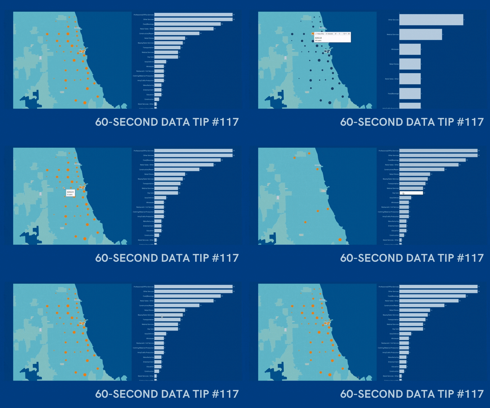
An interactive map is a great way to show donors, board members, prospective funders and other stakeholders whom you serve, including their age, location, income, and other characteristics. I’m doing a webinar on December 10, 2020 where I will teach you how to create an interactive map dashboard, like the one below, in less than an hour using Tableau Public, the free version of Tableau, a powerful data visualization tool. You can create a map dashboard with a simple Excel file, as long as it includes geographic data, such as zip codes. And you can embed the dashboard on your website, as I’ve done here. Play around with the dashboard below to explore the possibilities. And click HERE to register for the webinar.


Let’s talk about YOUR data!

Got the feeling that you and your colleagues would use your data more effectively if you could see it better? Data Viz for Nonprofits (DVN) can help you get the ball rolling with an interactive data dashboard and beautiful charts, maps, and graphs for your next presentation, report, proposal, or webpage. Through a short-term consultation, we can help you to clarify the questions you want to answer and goals you want to track. DVN then visualizes your data to address those questions and track those goals.


How To Show The Real People Behind The Data

60-SECOND DATA TIP_3 (1).png

Data visualizations can provide something that photos and case studies—for all of their visceral appeal—cannot. Context. Charts, maps, and graphs give us the critical context that we cannot see in a photo or in a story about one person, such as how prevalent a problem is, where it is occurring, or the impact of a program over time.

Data visualizations, of course, also have a downside. A chart, map, or graph is an abstraction that aggregates the stories of many individuals. And, as Joshua Smith points out: “It’s really hard to tell a powerful story in aggregate when all of the humans and all of their lives and moments and emotions are plotted under a single data point, often represented through a behavioral variable, e.g. “sales”, or “likes”. In aggregate, we lose all the parts and pieces that make characters relatable and memorable.”

So can we have the best of both worlds? Can we put photos and other information about real people into data visualizations? Yes! Consider one of these strategies.

Follow Individuals Through The Data

The idea is to explain an issue, a problem, or a situation through the stories of select individuals. Ludovic Tavernier explains the the situation of Somali refugees through the stories of two Somali women. Ayaan and Shamshi, in a series of visualizations entitled Two Years Late. Tavernier labels particular data points to show where Ayaan and Shamshi fit into the larger picture.

Source: Ludovic Tavernier (on Tablea Public)

Source: Ludovic Tavernier (on Tablea Public)

Dot = Person

Another approach is to make each mark (e.g. dot, square, bar) represent an actual person and allow the viewer to scroll over marks to learn more about these individuals. This is Eve Thomas’ strategy in Stop and Search which shows the disproportionate rate at which Black people are stopped and searched in London.

Source: Eve Thomas (on Tableau Public)

Source: Eve Thomas (on Tableau Public)

Here’s another example from JR Copreros in which each dot represents a real person who was convicted of a crime and later exonerated.

Source: JR Copreros (on Tableau Public)

Source: JR Copreros (on Tableau Public)

Show Both The Forest and The Trees

Perhaps the simplest strategy is to include both aggregated data (the forest) and disaggregated data (the trees) in the same visualization. The chart below shows the number of absences for both individual students and the average number of absences across all students.

revamp.png

Filter Charts By Individuals

Another way to zoom in on particular trees is to include a filter that allows you to show results for just one person. This visualization by David Borczuk allows you to choose just one woman in Madagascar who suffered from obstetric fistula, a medical condition in which a hole develops in the birth canal as a result of childbirth.

Source: David Borczuk (on Tableau Public)

Source: David Borczuk (on Tableau Public)

On the lighter side, you can click on any character in Glee to learn more about that character in various charts in this data dashboard by Jennifer Dawes.

To see past data tips, click HERE.


Let’s talk about YOUR data!

Got the feeling that you and your colleagues would use your data more effectively if you could see it better? Data Viz for Nonprofits (DVN) can help you get the ball rolling with an interactive data dashboard and beautiful charts, maps, and graphs for your next presentation, report, proposal, or webpage. Through a short-term consultation, we can help you to clarify the questions you want to answer and goals you want to track. DVN then visualizes your data to address those questions and track those goals.


How To Use Big A** Numbers

60-SECOND DATA TIP_3 (1).png

You already know about BANs even if you don’t think you do. They are Big Ass Numbers meant to catch your attention. You see them everywhere these days, featured in bold fonts on websites, brochures, and reports; sprinkled throughout PowerPoint presentations; and arrayed as KPIs* in data dashboards.

BANs are having a moment. And they can be powerful. But watch out for overdoing it. When lots of BANs crowd a single display, they steal each other’s limelight and bewilder the audience. Anyone who gives a BAN a moment’s thought might wonder: “Wow, 5,000 meals sounds like a lot, but what is the need? What do similar organizations provide?”

So use BANs sparingly and give them space so they can shine. Also, provide context when possible: “5,000 meals served and no one turned away.”

Steve Wexler also advises using one or two BANs when they provide a good overall summary of a lot of data and when they clarify and provide context for subsequent charts, maps, and graphs.

And for some great ways to design BANs, check out Adam McCann’s 20 Ways to Visualize KPIs.

See other data tips in this series for more information on how to effectively visualize and make good use of your organization's data. 

*key performance indicators

The Ingredient Missing From Your Website

Copy of Add a heading (1).gif

If the internet is a street, and websites are storefronts, then homepages are the window displays. Effective displays give you the gist of the organization and lure you in. When I stroll down nonprofit lane, I rarely see displays featuring data visualizations (aka data viz) like charts, maps, and graphs. That makes sense, right? Data viz lacks the visceral appeal of photos. Images of a child receiving medical care, a homeless adult eating a meal, or a home being rebuilt after a hurricane are more compelling than a chart.

I get that. But there’s a missed opportunity here. Prominently-displayed, well-designed data viz provides something that photos cannot. Context. Charts, maps, and graphs can quickly show website visitors the critical context that they cannot see in a photo, such as how prevalent a problem is, where it is occurring, or the impact of a program over time.

Recently, I did a little review of the 12 sites that won a Web Award in 2019 for best in industry or outstanding website in the nonprofit category. I expected that these sites would be better than most when it came to featuring data viz. I gave myself three minutes to review each site. And I awarded 2 points for data viz on their homepage, 2 points for data viz on their work/impact page,* and 1 point for data viz on any other page that I could visit in the balance of my three-minute tour. My definition of data viz was not strict. I counted any display of data not described in text or presented in a table. BANs (Big Ass Numbers), timelines, and flowcharts counted. (See the results in the chart below.)

The data viz situation in these sites was even worse than I expected. I found:

  • Only two of the twelve sites had data viz on their homepages.

  • Five of the sites had no data viz that could be found in three minutes.

  • The vizes I found were: 3 BANs, 2 maps, 1 timeline, and 1 flowchart, none of which provided a wealth of insight.

website review.png

To make your website stand out, even among award-winning sites, consider prominently displaying a variety of data visualizations (not just BANs). Visualizations can provide the necessary context to bring both problems and solutions into greater focus.

One last thing before we go. I give the best-content-not-related-to-data-viz award to the website called “Get In Touch With Your Testes With Nad & Tad.” See Grab Your Balls And Check Out These Videos on the homepage. It’s a must-see.

To see past data tips, including those about other chart types, click HERE.

*Work/impact page: any page on menu bar describing their work and/or impact


Let’s talk about YOUR data!

Got the feeling that you and your colleagues would use your data more effectively if you could see it better? Data Viz for Nonprofits (DVN) can help you get the ball rolling with an interactive data dashboard and beautiful charts, maps, and graphs for your next presentation, report, proposal, or webpage. Through a short-term consultation, we can help you to clarify the questions you want to answer and goals you want to track. DVN then visualizes your data to address those questions and track those goals.


Why Our Brains Glitch On COVID Data And Why Nonprofits Should Take Notice

Copy of Add a heading (1).gif

I’ve said it before. It’s not enough to present data clearly and beautifully. If we want the brains of our staff members, board members, policymakers, donors, and clients to absorb data AND use it for decision-making, we have to present it in brain-friendly ways. And brain-friendly means avoiding common brain glitches. I’ve talked about how our brains glitch when dealing with small numbers.

The pandemic has brought to the fore another known issue with our brains. They glitch when confronted with exponential growth. And, as a result, we make the wrong decisions. The good news is that we can learn from this problem. And this learning can benefit our causes and organizations well past the pandemic. Let me walk you through this in the remaining 50 seconds.

We default to LINEAR not EXPONENTIAL growth. Linear growth means that something is growing by the same amount at each time step. Your hair, for example, grows about a half inch each month. Exponential growth is different. It means that something is growing in proportion to its current value, such as doubling at each time step.

Here’s a common example that reveals the glitch: Would you prefer to receive:

  1. $1,000 a day for the next 30 days or

  2. 1 cent on the first day, 2 cents on the second day, 4 cents on the third day, 8 cents on the fourth day and so on for 30 days?

Given a short time to consider, most folks choose option 1 in which the linear growth results in $30,000. But in option 2, the exponential growth results in over $5 million!

Most of us have heard that COVID grows at an exponential rate. And we probably understand what that means: if one person infects two others and then each of those people infect two others, the number of infections is doubling at each time step. But we fail to appreciate the impact of exponential growth and thus fail to choose the wisest actions when faced with an exponential growth problem or opportunity. For example, there is evidence that those who underestimate the effect of exponential growth on the spread of the virus are less likely to take precautions like social distancing and wearing masks.

We can (sometimes) overcome the glitch with a nudge. There is also evidence that simple nudges can help people to better estimate the impact of exponential growth. Nudges can include showing raw numbers instead of graphs or reminding people that the number of cases doubles at each step rather than grows at a constant rate or asking people to do the math to more clearly see the effect of doubling. It’s important to note, however, that there is also research suggesting that our brains can be pretty resistant corrections.

What does this mean for your organization? Exponential growth crops up in regular, non-pandemic life more often than you’d think. If your organization is dealing with issues as diverse as food spoilage, human population growth, invasive species, forest fires, or cancer, then you need a way to effectively communicate exponential growth. To deal with this glitch you can:

  • Turn to the research. Look for studies that tested ways to correct glitches and then apply the effective ones to your work.

  • Test your data presentations before they go live. It may sound simple, but it’s a step few of us take. Identify a few people with a similar level of expertise in the subject matter and data as those in your target audience. Then ask them what they think the data in your presentation shows. Perhaps show them a few versions of the same data in different types of charts or tables and see which ones are easiest to process quickly and accurately. But don’t stop there. Ask what actions they might consider based on their interpretations. Then use their responses to revise and test again.

  • Ask rather than tell. You can engage your stakeholders while also nudging them toward greater understanding. Ask them how soon they think a particular problem will grow to a particular size if left unchecked. If their answer is off the mark, you’ve got their attention. Now explain how the problem is growing exponentially.

To see past data tips, click HERE.


Let’s talk about YOUR data!

Got the feeling that you and your colleagues would use your data more effectively if you could see it better? Data Viz for Nonprofits (DVN) can help you get the ball rolling with an interactive data dashboard and beautiful charts, maps, and graphs for your next presentation, report, proposal, or webpage. Through a short-term consultation, we can help you to clarify the questions you want to answer and goals you want to track. DVN then visualizes your data to address those questions and track those goals.


How To Show Your Organization's Pre- and Post-COVID Data

60-SECOND DATA TIP_3 (1).gif

It’s time to reconsider your plans for showing progress in 2020. The chart, map, or graph you planned to use on your website, in your annual report, or at the quarterly board meeting may no longer apply or may tell the wrong story. The lives of those you serve and the way you serve them probably have changed. The question is: how can you show progress and provide enough context so that viewers get it right and get it quickly. Below are some ideas. If your organization has come up with other solutions, please let me know, and I’ll share them in a future data tip.

1.png

1. Distinguish pre- and post-COVID periods

This is the simplest solution. Make sure to distinguish the COVID period in your charts using color, shading, borders, and captions. Viewers will expect to see differences between pre- and post-COVID periods. So show them where to apply these different expectations.

Copy of Add a heading.png

2. Emphasize COVID period

You might consider emphasizing the COVID period by enlarging it and showing an adjusted goal for this time. Even if your service capacity has decreased, you could be doing well compared to adjusted goals.

3.png

3. Discourage pre/post comparisons

In some cases, you may want to discourage pre- and post-COVID comparisons given how much circumstances have changed. You might show only the COVID period, perhaps along with an adjusted goal reference line.

Copy of Add a heading (1).png

4. Focus on adaptation over time

Although some programs and services may have come to a screeching halt, others may have ramped up speedily. There are plenty of ways to show these changes in charts that clearly distinguish both periods.


To see past data tips, including those about other chart types, click HERE.


Let’s talk about YOUR data!

Got the feeling that you and your colleagues would use your data more effectively if you could see it better? Data Viz for Nonprofits (DVN) can help you get the ball rolling with an interactive data dashboard and beautiful charts, maps, and graphs for your next presentation, report, proposal, or webpage. Through a short-term consultation, we can help you to clarify the questions you want to answer and goals you want to track. DVN then visualizes your data to address those questions and track those goals.


What’s Missing From Your Social Media Posts

60-SECOND DATA TIP_3 (1).png

You aren’t deploying data viz. When I peruse nonprofit posts, I mostly see:

  • Bad photos,

  • Headshots,

  • Stock images (only some of which clearly relate to the text), or

  • No image at all.

Twitter, Facebook, and LinkedIn are like crowded highways packed with billboards. If we add charts, maps, and graphs to our billboards, we can both grab attention and say something meaningful. But the image and message should be simple and clear to travelers zooming by.

What types of vizes work best? Here are four to consider.

1. Maps

48fb0369-a09a-47b8-b1fa-3d62648fa798-043019-food-insecurity_Online.png

If the map shows a geography we know like the U.S. or our own city, we have a lot of prior knowledge that we can apply. This makes maps easy to digest on the fly. We look for our own location. We compare east to west or cities to rural areas. Consider showing the distribution of the need you are addressing, the location of your clientele, or where you are providing services using a map.

Source: tennessean.com, image: feedingamerica.org

2. BANs (Big Ass Numbers)

fba63339-4274-4df9-af2d-eebb1cb906fa.png

Just one large number can capture attention. The BANs shown here are from Women Will, a Google initiative focused on economic empowerment for women. They won a Shorty Award, which honors the best content creators on social media. Think about what single number you might share that could spark interest in your work. Add a link from your BAN post to a chart that provides more context and detail for that number.

Source: shortyawards.com

3. Line graph showing a clear trend

tuburculosis-deaths-falling-worldwide.png

Line graphs are familiar. Many show change over time. So if we make it clear what is changing (here it’s number of deaths) and over what period of time, we can tell a quick and powerful story without much more than an angled line. But keep it simple with only one line or multiple lines but only one highlighted in color and the rest grayed out. Consider showing how the need for your services or your impact has changed over time.

source: informationisbeautiful.net

4. Bar chart showing a clear comparison

857c8d90-6607-4fc8-9236-c2bee8b717da.png

Bar charts also are trusted friends. We get them. When deploying bar charts, use color strategically to encourage a comparison of a target group to the others. This post from the World Wildlife Fund is a follow-up to an earlier post which asked followers a question. This post gives them the answer in a simple bar chart and shows them what percent of followers guessed each answer (see numbers on the right.)

Source: shortyawards.com                                 i.    

To see past data tips, including those about other chart types, click HERE.


Let’s talk about YOUR data!

Got the feeling that you and your colleagues would use your data more effectively if you could see it better? Data Viz for Nonprofits (DVN) can help you get the ball rolling with an interactive data dashboard and beautiful charts, maps, and graphs for your next presentation, report, proposal, or webpage. Through a short-term consultation, we can help you to clarify the questions you want to answer and goals you want to track. DVN then visualizes your data to address those questions and track those goals.


Managing Amid Uncertainty: What You Can Know and Show

60-SECOND DATA TIP_3 (1).png

Does your organization feel like the guy in the picture above? Heretofore, you and your colleagues have been climbing a challenging mountain. The journey has been daunting at times but despite occasional setbacks, your trend has been upward. And just as you were ready to take on the next steep incline, you encounter a cliff — or at least what feels like a cliff. The path ahead is foggy and uncertain.

How to deal with the uncertainty that the pandemic had brought into most aspects of life, including our work? One response is to try to bring the present and possible future into focus through charts, maps, and graphs. “In many ways, data visualization has been instrumental to how we’re processing COVID-19,” writes Stephen Gossett at Built In. “The Washington Post’s animated-dots simulation became the paper’s most-viewed article ever.” But Gossett goes on to describe the dangers of visualizing uncertain data. As I wrote in an earlier data tip on “Low-CAL” data, data visualizations can make situations appear more certain than they actually are. We should look for the fine print that describes Context, Assumptions, and Limitations and be wary of visualizations that lack this information.

So what can you confidently know and show about your organization now?

  • Your past efficacy or impact. It’s a good time to dust off old charts. Or better yet, revive past data with new and improved visualizations that show your staff, board, and current and prospective supporters how well you have done in the past and thus how worthy of investment your organization is.

  • Your ability to adapt. For extra credit, show your stakeholders how well you have adapted to changes in the past, particularly unexpected ones. Show in charts how you resurged after a cut in public funding or how you built new programs to address unexpected needs in your community.

  • Your current efforts. Show how much money and person hours you have invested, how many people you have served, how many funds you have raised, or how you have redirected resources to new programs.

Even amid all of the uncertainty, there are some “known knowns” (in the words of former US Secretary of Defense, Donald Rumsfeld). While we are waiting for the “known unknowns” and the “unknown unknowns” to come into focus, we can move forward by showing what we do know.

 To see past data tips, including those about other chart types, click HERE.


Let’s talk about YOUR data!

Got the feeling that you and your colleagues would use your data more effectively if you could see it better? Data Viz for Nonprofits (DVN) can help you get the ball rolling with an interactive data dashboard and beautiful charts, maps, and graphs for your next presentation, report, proposal, or webpage. Through a short-term consultation, we can help you to clarify the questions you want to answer and goals you want to track. DVN then visualizes your data to address those questions and track those goals.


How To Continuously Update Your Outdated Annual Report

60-SECOND DATA TIP_3.png

What were you doing on this date last year? If you don’t remember, and if it seems like a long time ago, then reconsider your annual report. Showing your donors, board members, and other stakeholders what you were doing a year ago (or even more, depending on how long it takes to produce your annual report) is not always the best strategy. What if you could describe to them – not only in words but also numbers – what is happening right now? Programs like Tableau make this possible. You can create an online multi-page report, complete with photos, illustrations, and interactive charts. But the numbers on those charts will show what is happening now rather than a year ago. And, of course, you also can show trends over time. Even the free version of Tableau (called Tableau Public) allows you to connect charts to real-time data. The Tableau Foundation has its own “living” rather than “annual” report. To take a look, click here and scroll down!

See other data tips in this series for more information on how to effectively visualize and make good use of your organization's data. 

3 PowerPoint Laws to Always Obey

60-SECOND DATA TIP_3 (1).png

Charts, graphs, and maps often make their debut in PowerPoint presentations (or the like.) This is a problem. A bad PowerPoint can kill even a great data visualization.

We already know PowerPoints are a problem. We have napped through many of them in our careers. And we even know, when we are on the creating end, that they shouldn’t be text heavy. But we don’t know what else do besides typing in a few bullet points and pasting in some bad clip art.

Since I’m committed to giving you something useful in 60-second portions, this week I give you my top three PowerPoint laws (yes laws – you might not take mere recommendations as seriously, and this is important!)

Law #1: Slides are for seeing. Think about the last subtitled movie you saw. Did you miss a lot of the action while reading? Research shows we are quite good at simultaneously processing pictures and spoken words. But our brains go on overdrive when processing pictures plus written text – like during subtitled movies. And our brains can completely shut down when processing written text plus spoken words, which is what we ask audiences to do during our Powerpoints.* So move those bullet points to your script or speaking notes and use a well-designed data visualization or a great free photo from websites like Unsplash.

Law #2: Portion control. The hard truth is that our audience members are going to walk away from our presentation retaining just a few ideas whether we like it or not. If we shower them with ten, twenty, thirty ideas, we don’t control which ones they retain. So choose just a few and weed out the rest. Then feature only one idea per slide. And go easy on the charts, maps, and graphs. They are more difficult to process than photos or illustrations, so give your viewers a cognitive break between charts.

Law #3: Obey visual hierarchy. Remember what Antoine de Saint-Exupery said: “Perfection is achieved, not when there is nothing more to add, but when there is nothing left to take away.” Simplify your slides with one compelling image or one chart, map, or graph (which, itself, has been stripped down to what is necessary). Make sure there is plenty of empty space around the image or chart to give it prominence. Then enlarge only the most important elements while reducing the size of the rest. Similarly, use color sparingly to draw attention to the most important aspects of the slide. And for much more on visual hierarchy, check out this great article on Canva.

See other data tips in this series for more information on how to effectively visualize and make good use of your organization's data. 

* For more on this, check out Moreno and Mayer’s studies on multimedia learning.

Photos by NeONBRAND and Cody Davis on Unsplash