Interesting Versus Actionable Data

60-SECOND DATA TIP_4 (3).gif

It’s easy to get lost in a sea of interesting data when what you really need is actionable data. As Oracle’s Nate Mayfield points out, you know when you’ve presented only interesting data when you get this type of response: “Oh, cool. Yeah, that's great to know.” On the other hand, if you hear “Oh, okay. I can definitely decide what to do now,” then you’ve presented actionable data.

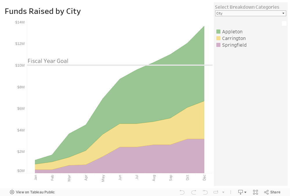
The key to presenting actionable data is to ask specific—rather than broad—questions. And then design your charts, maps, and graphs to answer those narrower questions. Mayfield’s article focuses on the types of questions a business might ask. Let’s consider the types of questions a nonprofit might ask:

Interesting Questions.png

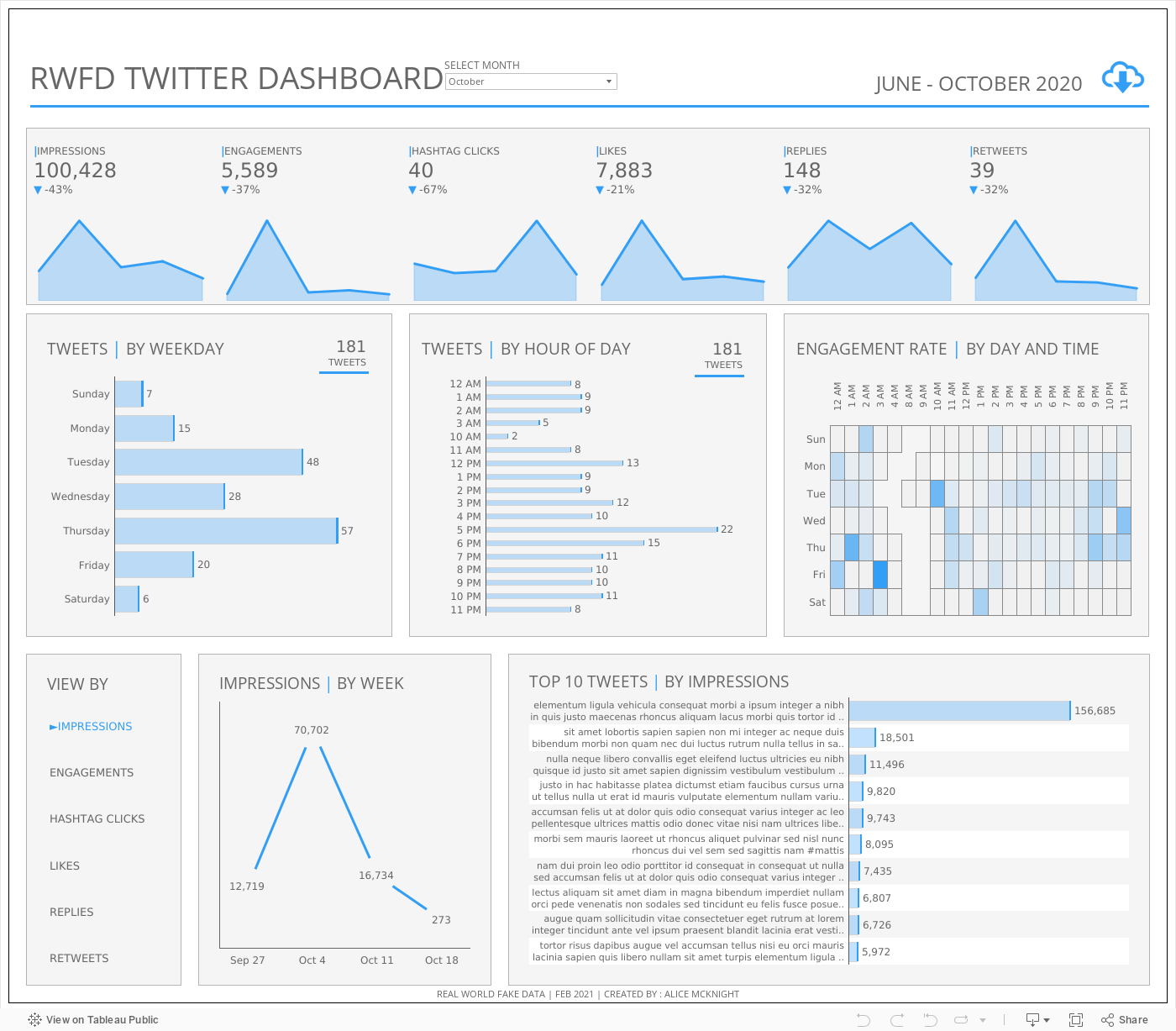
Mayfield notes that data dashboards that are designed for a wide range of users tend to address only interesting questions. “Because they are intended for a broad set of users, with a lot of filters, you can in theory answer a lot of questions with these sprawling dashboards,” says Mayfield. “The problem is people quickly get lost in them and don’t spend the time required to answer their questions.” Instead, Mayfield advises us to create simple dashboards that answer quite specific questions such as the actionable questions above. So consider a series of simple dashboards, each designed to provide answers that prompt action for a particular type of user.

To see past data tips, including tips on other types of pantry staple data, click HERE.


Let’s talk about YOUR data!

Got the feeling that you and your colleagues would use your data more effectively if you could see it better? Data Viz for Nonprofits (DVN) can help you get the ball rolling with an interactive data dashboard and beautiful charts, maps, and graphs for your next presentation, report, proposal, or webpage. Through a short-term consultation, we can help you to clarify the questions you want to answer and goals you want to track. DVN then visualizes your data to address those questions and track those goals.


Before Showing A Percentage, Read This

60-SECOND DATA TIP_4 (1).png

Here’s what I’m going to do in 60 seconds today:

  • Give you three percentages. They might be the type of percentages that you share in proposals, reports, your website, or in social media posts.

  • Give you the backstory on these percentages.

  • Convince you to think carefully next time you want to present a percentage.

Here goes.

#1: Two percent of clients in Program A dropped out in the first three days of the program.

#2: 60% of first time donors in March made a second gift.

#3: 25% of people who attended our XYZ event said that they were unlikely or very unlikely to recommend the event to others.

And here is the backstory on each of the percentages:

#1: Two percent of clients in Program A dropped out in the first three days of the program. Backstory: There were 50 participants in Program A. That means only one person dropped out.

#2: 60% of first time donors in March made a second gift. Backstory: There were 5 new donors in March. That means that 3 made second gifts.

#3: 25% of people who attended our XYZ event said that they were unlikely or very unlikely to recommend the event to others. Backstory: Eight people attended XYZ event. That means two people provided the low rating.

Did the backstories cast a different light on the percentages for you? Perhaps you were imagining more people were involved? When the numerator or the denominator is fairly small, it’s usually best to present both in raw numbers rather than give a percentage. The raw numbers present a clearer understanding of the situation that you’re trying to describe. In fact, when numbers are small, percentages can be downright misleading.


Let’s talk about YOUR data!

Got the feeling that you and your colleagues would use your data more effectively if you could see it better? Data Viz for Nonprofits (DVN) can help you get the ball rolling with an interactive data dashboard and beautiful charts, maps, and graphs for your next presentation, report, proposal, or webpage. Through a short-term consultation, we can help you to clarify the questions you want to answer and goals you want to track. DVN then visualizes your data to address those questions and track those goals.


Invisible Assumptions Driving Your Organization

Reposted from January 7, 2020

Reposted from January 7, 2020

People and organizations have ideas about what leads to what. We are aware of some of these ideas. But others are so ingrained that we mistake them for facts of life.

Psychologists call the visible ideas explicit theories and the invisible ones implicit theories. Both explicit and implicit theories affect how we perceive and act in the world. If, for example, we believe—either explicitly or implicitly--that hard work leads to success, we are more likely to perceive evidence that supports our theory (aka confirmation bias) and to work hard ourselves and encourage it in our offspring, clients, and employees.

If this idea is explicit, then we are more likely to examine it, compare it to the ideas of others, and even test it. However, if it’s implicit, then it will probably never occur to us to examine it because we are not fully aware that we believe it or that things could be any other way. (For more on implicit and explicit theories, check out this.)

Implicit theories also affect what data we gather and use. If we have an implicit hard work theory, we might gather data to assess what type of work or effort is most likely to lead to success but, unless we make the implicit theory explicit, we are not likely to collect data to see if clients who put in more training hours actually had more success.

Every organization has implicit theories. Do any of these seem familiar?

  • Meetings make people feel included/empowered.

  • With more money, we could be more effective.

  • Special events help to cultivate new donors.

Some of these assumptions might be true, at least under certain circumstances. But no matter how data-driven we are, we are not going to collect data to test ideas we are not fully aware of.

Staff meetings are great places to listen for implicit theories. Next time your colleagues and you are discussing an issue, see if you can detect a few of them. What assumptions lie behind your assessments, decisions, and actions?


Let’s talk about YOUR data!

Got the feeling that you and your colleagues would use your data more effectively if you could see it better? Data Viz for Nonprofits (DVN) can help you get the ball rolling with an interactive data dashboard and beautiful charts, maps, and graphs for your next presentation, report, proposal, or webpage. Through a short-term consultation, we can help you to clarify the questions you want to answer and goals you want to track. DVN then visualizes your data to address those questions and track those goals.


Photo by PoL Úbeda Hervàs flickr.com/photos/polubeda/


How To Showcase Your Sites With An Interactive Map

60-SECOND DATA TIP_3 (4).png

Here’s a viz you can use. It is interactive, can be built in Tableau Public for free, and can be embedded in your website. This example shows affordable housing sites. Give it a try below and check out these features:

  • The circles on the map show the location of the sites. The color of the circles show the type of site, and the size of the circles indicates number of units (but you can size your circles by any measure such as number of people served or programs offered.)

  • Click on a site on the map to see more information, to the right, about the site including a photo.

  • When you click on a site, it is also highlighted on the chart below so you can compare that site to the others.

To learn how to create an interactive map with similar features in Tableau Public, check out this tutorial. I’d also be happy to build one for you, customized to your needs. Just click “Schedule A Free Consultation” below.

Let’s talk about YOUR data!

Got the feeling that you and your colleagues would use your data more effectively if you could see it better? Data Viz for Nonprofits (DVN) can help you get the ball rolling with an interactive data dashboard and beautiful charts, maps, and graphs for your next presentation, report, proposal, or webpage. Through a short-term consultation, we can help you to clarify the questions you want to answer and goals you want to track. DVN then visualizes your data to address those questions and track those goals.


Can Excel Actually Be Fun?

Great-Graphs-Design-Principles_Making-the-Case-GIF.gif

This week’s quick tip is to check out Ann Emery’s excellent course on extracting the full power of Excel. If you register using the link below, you'll ALSO get bonus content from guest experts including me! The additional 50 lessons come from a team of more than a dozen guest experts about Tableau, R, one-pagers, UX, PowerPoint, photographs, report covers, tables, and more.

Learn more and register HERE by September 17, 2021.

What’s Included:

  • 180+ video lessons that you can watch anytime

  • Step-by-step instructions for making beginner, intermediate, and advanced graphs in Excel

  • 20+ templates to download and follow along

  • Office Hours (almost) every week in 2020 and 2021 to talk about your projects

  • 7 additional Live Trainings just for participants in this cohort

  • Discussion boards to interact with fellow dataviz enthusiasts

  • Private Data Vizards community of fellow participants

  • Weekly emails to cheer you on

  • Lifetime access so you don't feel rushed

  • Examples from a variety of industries (public health, juvenile justice, museums, and more)

  • Behind-the-scenes Excel magic tricks guaranteed to make your jaw drop

  • Early bird bonuses like 1:1 consultations and Swag Bags

How to Show Problems and Solutions in One Chart

Reposted from September 16,  2020

Reposted from September 16, 2020

Data visualizations are kind of like beards or kale. They used to be decidedly uncool, but are now hip, at least in certain circles. Yet, even with the rising popularity of charts, maps, and graphs, I think many of us have a faint feeling of aversion when encountering them. For one, they may be hard to decipher. But there’s another problem too. They often are the bearers of bad news. They show us how widespread a problem is or how it’s increasing. Worse, they rarely give us any hope of improvement.

Wouldn’t charts, maps, and graphs be more engaging and helpful if they showed both problems AND solutions? Let’s talk about how to get that done.

Show Two Scenarios

Show the difference between how things play out with and without an intervention or program. The now-famous flatten the curve graph (shown below) did this without any real data. The point was just to show how the number of cases would likely differ with and without public health measures to slow the spread of COVID.

Here’s a graph that shows two scenarios with real data. The data point labels are particularly helpful in this example. By comparing two different cities, the graph suggests that a delay in the start of social distancing interventions may have a huge effect on the severity of an outbreak.

Show A Change In The Trend

Another way to present a problem along with a solution is to show how a trend alters following an intervention. This graph shows projected data for several types of interventions: the current policy, alternative policies, and the absence of policies. In the absence of policies, global warming is expected to reach 4.1°C – 4.8°C above pre-industrial levels by the end of the century. Current policies are projected to result in about a 3.0° rise over pre-industrial levels. Other pledges and targets that governments have made would limit warming to even lower amounts.

This one effectively uses bubble size and color to show a trend alteration following the introduction of the measles vaccine.

On the uncool-to-very-cool spectrum, data visualizations that show both problems and solutions are very cool. To see what other things are cool/uncool check out CoolnessGraphed.com.

To see past data tips, including those about other chart types, click HERE.


Let’s talk about YOUR data!

Got the feeling that you and your colleagues would use your data more effectively if you could see it better? Data Viz for Nonprofits (DVN) can help you get the ball rolling with an interactive data dashboard and beautiful charts, maps, and graphs for your next presentation, report, proposal, or webpage. Through a short-term consultation, we can help you to clarify the questions you want to answer and goals you want to track. DVN then visualizes your data to address those questions and track those goals.


How to Show Your Progress With Color Alone

60-SECOND DATA TIP_3.png

"Color is a power which directly influences the soul." -Wassily Kandinsky

It’s August, so it seems appropriate to talk about heat maps. I’ve blogged about this simple yet powerful chart type before. It takes advantage of the power of color like no other chart I know. Heat maps use variations in color to show differences among categories (e.g. people living in different zip codes) or differences across a scale (e.g. people with different income levels). In a lot of cases, it’s simply a table with color added to the cells.

The enormous potential of a heat map is clear in Philip Bump’s recent heat map in The Washington Post, which took its inspiration from Thomas Wood’s similar chart. As Bump notes, this chart is “elegantly simple.” The rows are states, grouped by region. The columns are presidential election years. And shades of red and blue indicate the parties of candidates who won in each state, with darker shades indicating wider margins. Here’s part of the chart:

Source: The Washington Post, August 24, 2021

Source: The Washington Post, August 24, 2021

By carefully grouping the states into regions and subregions, the chart reveals interesting patterns: shifts from blue to red (and vice versa) as well as shifts from greater to lesser margins (and vice versa).

Think about how you can show change over time in the problems you are addressing or the services you are offering using color and strategic groupings. Here are some possible applications for organizations like yours:

  • Show shifts in service use over time among two (or more) groups such as adults represented by one color and children represented by another. Each row might be a zip code area and rows could be grouped by city.

  • Show changes in pollution over time produced by two (or more) sources such as vehicles represented by one color and factories by another. Each row might be a country and rows could be grouped by continent.

  • Show variation in client make up over time among two (or more) groups such as higher income groups represented by one color and lower income groups by another. Each row might be a program site and rows could be grouped by neighborhood.

You can create heat maps in many data viz programs. Here is how to create them in Excel and in Tableau.


Let’s talk about YOUR data!

Got the feeling that you and your colleagues would use your data more effectively if you could see it better? Data Viz for Nonprofits (DVN) can help you get the ball rolling with an interactive data dashboard and beautiful charts, maps, and graphs for your next presentation, report, proposal, or webpage. Through a short-term consultation, we can help you to clarify the questions you want to answer and goals you want to track. DVN then visualizes your data to address those questions and track those goals.


Ideas You Should Steal From This Viz (Installment 2)

60-SECOND DATA TIP_3.png

“Every artist gets asked the question: ‘Where do you get your ideas?’ The honest artist answers, ‘I steal them.’ . . . What a good artist understands is that nothing comes from nowhere. All creative work builds on what came before.” —Austin Kleon in Steal Like An Artist.

Recently, I recommended that you steal ideas from this data viz . Today I offer up another steal-worthy interactive viz that I came across in the Tableau Public Gallery.

Source: Ellen Blackburn on Tableau Public

Here’s what I suggest you steal from this viz:

  • Vertical Timeline. The vertical timeline looks cool and works better than a horizontal one on a phone screen.

  • Self-Explanatory Chart. Each action by the Trump Administration is represented by a square. I would have stated this in the subtitle, but I think the chart is pretty self-explanatory once you begin interacting with it (give it a try). It’s easy to see when there were more or fewer actions and what proportion of actions are considered anti-LGBTQ+ and anti-trans.

  • Detail on Demand. When you scroll over the squares, you get a lot more detail on the particular actions. But none of this detail is visible until you start scrolling. So the details do not obscure the overall patterns and change over time.

  • Controlled color palette. Using just two colors for the squares and one color for the text lets the patterns shine through. Also, the off-white background looks like a piece of paper, making the viz seem more approachable.

To see past data tips, click HERE.


Let’s talk about YOUR data!

Got the feeling that you and your colleagues would use your data more effectively if you could see it better? Data Viz for Nonprofits (DVN) can help you get the ball rolling with an interactive data dashboard and beautiful charts, maps, and graphs for your next presentation, report, proposal, or webpage. Through a short-term consultation, we can help you to clarify the questions you want to answer and goals you want to track. DVN then visualizes your data to address those questions and track those goals.


Why You Should Know About Bubble Charts

Reposted and Updated from January 21,  2020

Reposted and Updated from January 21, 2020

With so much depressing news, we could all use some bubbles right now. Even if they are only in chart form. This is a repost from a series of tips on different chart types. In each tip, l give you need-to-know information in a format akin to the “Drug Facts” on the back of medication boxes: active ingredients (what the chart is), uses (when to use it), and warnings (what to look out for when creating the chart). The idea is to fill up your toolbox with a variety of tools for making sense of data. This week, I (re)give you the bubble chart.

Active Ingredients (What is a bubble chart?)

A bubble chart is really just a souped-up scatterplot. Like the scatterplot, it’s a graph with plotted points that show the relationship between two sets of data. Here’s a scatter plot showing the relationship between the height and girth of black cherry trees:

We can see that there is a relationship between height and girth. As trees get taller, they also tend to get wider. The scatterplot becomes a bubble chart when we size the points according to another measure, in this case the volume of the trees.

Now we can see that as height and girth increase, the volume of black cherry trees also tends to increase. Sometimes folks add another measure or dimension to bubble charts using color, such as in this example.

Uses

Use a bubble chart when you want to show the relationship between two measures plus a bit more. In the bubble chart above, we can see that as the cost of smartphones (position on X-axis) increased, the growth in sales (position on Y-axis) decreased AND that sales were particularly high in China, Emerging Asia, and North America in 2017 (size of bubbles) AND that the boom markets with cheap phones were mainly emerging markets (color of bubbles). That’s a lot of information in a fairly small space.

Warnings

When you cram too much information into bubble charts, viewers struggle to see core relationships and trends. So don’t use too many data points, too many sizes, or too many colors. Scroll down to the end of this tip to see a bubble chart that confuses more than elucidates.

Put your most important measures on the X and Y axes. Remember that humans are really good at discerning position along a common scale. So viewers are most likely to comprehend the relationship between the X and Y measures first.

Show your less important measures or dimensions with size and color. Humans can only make general comparisons when it comes to size and color. We are hard pressed to say if one shade is twice as dark as another or if one circle is three times the size of another.

To see past data tips, including those about other chart types, click HERE.

There’s too much information in this bubble chart!

Source: European Beer Consumption | Mekko Graphics

I found most of these bubble charts on Grafiti.


Let’s talk about YOUR data!

Got the feeling that you and your colleagues would use your data more effectively if you could see it better? Data Viz for Nonprofits (DVN) can help you get the ball rolling with an interactive data dashboard and beautiful charts, maps, and graphs for your next presentation, report, proposal, or webpage. Through a short-term consultation, we can help you to clarify the questions you want to answer and goals you want to track. DVN then visualizes your data to address those questions and track those goals.


Why Nonprofits Can Ditch Statistics

60-SECOND DATA TIP_4.gif

Today’s tip is to check out Maryfrances Porter and Alison Nagel’s excellent article Why Nonprofits Shouldn’t Use Statistics on the Depict Studio Blog. Here is a 60-second version with my two cents.

I agree with Porter and Nagel that you probably should not be worrying about statistics due to :

  1. Small numbers. Most nonprofit organizations are not serving thousands or millions, but rather tens and hundreds. It’s hard to draw scientifically defensible conclusions based on small numbers. Any individual in a small group has an outsized impact on the group as a whole.

  2. No reasonable comparison group. To make a scientifically defensible claim about the impact of your program, you usually need to compare your participants to a random group of people who do not participate in the program. And, as Porter and Nagel note, “we’ve never met a nonprofit so flush that they had money to track people they don’t serve.”

So how should nonprofits use all that data that they collect everyday? Porter and Nagel suggests that organizations:

  1. Look for pattens, themes and trends. When considering data on participation, feedback from surveys and focus groups, and other data you may collect, look for themes and patterns. Then consider how those themes and patterns change over time and how they differ among subgroups. The best way to see patterns, themes, and trends is in the form of charts, maps, and graphs.

  2. Consider possible causes. Based on your experience, what might be the reasons behind the patterns, themes, and trends you see? Consideration of this question with your colleagues can lead to valuable hypotheses. You can use these hypotheses to make program changes and see if the data you subsequently collect suggest that those changes led to more positive outcomes. You are not demonstrating impact in a scientific way, but you are using data to inform your decisions.

I don’t agree with Porter and Nagel that you have to know what graphs you want before creating them in Tableau. Actually, I think Tableau provides a more nimble way of exploring your data in different visual formats than you can in Excel. But use whatever tool you are comfortable with. Or hire someone (like Data Viz for Nonprofits) to visualize your data for you. An interactive dashboard makes it easy to track your progress on a regular basis.

To see past data tips, including lots of tips on ways to visualize nonprofit data, click HERE.


Let’s talk about YOUR data!

Got the feeling that you and your colleagues would use your data more effectively if you could see it better? Data Viz for Nonprofits (DVN) can help you get the ball rolling with an interactive data dashboard and beautiful charts, maps, and graphs for your next presentation, report, proposal, or webpage. Through a short-term consultation, we can help you to clarify the questions you want to answer and goals you want to track. DVN then visualizes your data to address those questions and track those goals.


Ideas You Should Steal From This Viz (Installment 1)

60-SECOND DATA TIP_3.png

“Every artist gets asked the question: ‘Where do you get your ideas?’ The honest artist answers, ‘I steal them.’ . . . What a good artist understands is that nothing comes from nowhere. All creative work builds on what came before.” —Austin Kleon in Steal Like An Artist.

Today’s tip is to steal ideas from other data visualizations. Here’s a viz I recently came across in the Tableau Public Gallery:

Source: Jacqui Moore on Tableau Public

Source: Jacqui Moore on Tableau Public

I’ve stacked the four squares below so that you can see it close up. And here’s what I suggest you steal from this viz:

  • Simple charts. The viz has only two types of charts: bar charts and line graphs. And they are so simple to read. Distracting elements (like axes and gridlines) are eliminated so that you can easily compare the world to North America, both now and over time.

  • Repetition of charts. The same charts are repeated for each of four categories, making comparison among categories quite easy.

  • Images. The simple images relating to mountains, terrestrial, freshwater, and marine help us to distinguish among the four categories and add visual appeal.

  • Controlled color palette. The viz focuses attention on the four categories by diverging from the monochromatic color scheme only in the images.

Untitled design (1).png

I look forward to sharing other steal-worthy data visualizations with you in future data tips! To see past data tips, click HERE.


Let’s talk about YOUR data!

Got the feeling that you and your colleagues would use your data more effectively if you could see it better? Data Viz for Nonprofits (DVN) can help you get the ball rolling with an interactive data dashboard and beautiful charts, maps, and graphs for your next presentation, report, proposal, or webpage. Through a short-term consultation, we can help you to clarify the questions you want to answer and goals you want to track. DVN then visualizes your data to address those questions and track those goals.


Understand Social Media Impact Using "Pantry Staple" Data

60-SECOND DATA TIP_3.gif

Social media data is another staple in our data pantries. Your organization probably has it. But you might not make good use of it. Why? Well, social media analytics come in many flavors and can bewilder. Posts are like bait. The better the bait, the more nibbles and bites leading to website traffic and eventually to more donations, volunteers, participation, and other types of engagement. But we need a way to easily decipher which types of bait are working best. And drawing this information out of the data can be a challenge.

Need some inspiration? Check out Alice McKnight’s dashboard below. It provides a broad array of social media data in an appealing and accessible format. We can see how effective social media posts are at various times. The charts along the top give us the basic trends over the last several months. It also shows us what topics are drawing attention. Give it a try. Check out the “View By” options which filter the two charts at the bottom. Then consider how you might visualize your own social media data using similar charts.

Source: Alice McKnight on Tableau Public

To see past data tips, including tips on other types of pantry staple data, click HERE.


Let’s talk about YOUR data!

Got the feeling that you and your colleagues would use your data more effectively if you could see it better? Data Viz for Nonprofits (DVN) can help you get the ball rolling with an interactive data dashboard and beautiful charts, maps, and graphs for your next presentation, report, proposal, or webpage. Through a short-term consultation, we can help you to clarify the questions you want to answer and goals you want to track. DVN then visualizes your data to address those questions and track those goals.


Truth and Beauty

Reposted and Updated from November 2018

Reposted and Updated from November 2018

Real data people care about truth, not beauty. More accurately, they care about evidence that might suggest a truth. So they don’t really embrace truth, just the pursuit of it. However, they don’t have any time for pursuing beauty. Indeed, they may see beauty as deception. A glossy chart or graph is the province of advertisers or advocates seeking to influence rather than to fully inform.

I’m here to argue — both to “real” data people and the rest of us — that we should not discount beauty when visualizing data. Indeed, it might be worth our while to pursue it as we pursue truth. The reason? Well, because we like pretty things. If that sounds like a flimsy explanation,  stick with me a bit longer.

Research evidence suggests that visually attractive things make us happy. (See “The Beauty-Happiness Connection” in The Atlantic for more on this.) And a positive mood, in turn, helps to expand our working memory, which allows us to process more information. So rather than being deceptive window dressing, beauty can actually more deeply engage the viewer in the pursuit of truth.

How can we make data more beautiful? Check out my series of tips on rules that artists know and that analysts (and the rest of us) can apply when presenting data. Here is the cheat sheet with all ten rules which includes links to the tips.

See other data tips in this series for more information on how to effectively visualize and make good use of your organization's data.

Understand Your Budget Using "Pantry Staple" Data

60-SECOND DATA TIP_3.png

Budget data is another staple in our data pantries. We need our staff, board members, funders, clients, and other stakeholders to understand this data. But many of them are not comfortable with financial spreadsheets. Here are some ways to present budget data that allow others to gain quick insight and, perhaps, dig deeper. These examples all come from the public sector but are easily applied to a nonprofit organization’s budget.

2016 U.S. Budget

The Obama administration made the Byzantine federal budget accessible to the world through this simple treemap. We can see where the lion's share of the money goes and which areas receive relatively little funding. Click HERE to see the interactive version which provides more information when you scroll over or click on a rectangle. Treemaps are easy to make in Tableau, Excel, and other apps.

School District of Philadelphia Budget

I find this sunburst chart daunting in static form. But check out the interactive version HERE. If you scroll over the inner ring, you can see that 96 percent of funds went to school budgets. Then move to successive outer rings to see how school and administrative budgets break down into smaller categories. You can build sunburst charts in Excel and other apps.

Oak Park, Illinois Budget

This interactive area chart showing the Oak Park, IL budget emphasizes change over time in the area chart at the top. But you can click on any year to see how the budget broke down by funds in the bar chart below. If you click on the downward arrow next to a given fund, you get even more detailed information on that fund. You can build this type of interactive viz in Tableau.

To see past data tips, including tips on other types of pantry staple data, click HERE.


Let’s talk about YOUR data!

Got the feeling that you and your colleagues would use your data more effectively if you could see it better? Data Viz for Nonprofits (DVN) can help you get the ball rolling with an interactive data dashboard and beautiful charts, maps, and graphs for your next presentation, report, proposal, or webpage. Through a short-term consultation, we can help you to clarify the questions you want to answer and goals you want to track. DVN then visualizes your data to address those questions and track those goals.


Details, Details (And When To Include Them)

Reposted from October 2019

Reposted from October 2019

What I remember most about the movie “Inside Out” is a scene about forgetting. And it has helped to shape my thoughts on presenting data.

In the 2015 Pixar film, memories are shining orbs sent through vacuum tubes to “Long Term,” a mammoth storage room with, nevertheless, limited capacity. So “Mind Workers” continuously cull the memory orbs, discarding the unnecessary ones – old phone numbers, piano lessons, names of past presidents – into the “Memory Dump.” I remembered this scene most recently when:

1) I heard Bryan Caplan interviewed on NPR. He’s an economist who wrote the thought-provoking book The Case Against Education. One argument Caplan makes against education is that we mostly forget it.  He cites studies that show little retention of both facts and generalized skills post college.

 2) My 12- and 14-year-old daughters’ shared with me YouTube channels like Oversimplified, In A Nutshell, and Crash Course. These funny, brief videos explain stuff I’ve forgotten (or perhaps never learned, who knows?) like the origins of the French Revolution and how the immune system works.

So here’s the question: Given that our brains are continuously purging information, particularly details, and retaining, at best, big picture stuff that can be contained in a 10-minute video, should we not bother with the details in the first place? My short answer is no. For me, it’s about who should spend time on the details and when.

If you are presenting data in any form, it’s incumbent upon you to know the details of the data -- what the trends are overall and by subgroup, who or what is not represented in the data, where the outliers are. And then the idea is to transfer aspects of this knowledge in the right form for the right people, paying as much attention to what you exclude as to what you include.

Some of the people will only need the biggest picture, but even they should to be tipped off to any exceptions to the rule hidden in the data. They also need to know where to go to learn more if and when they want to. Some of the people will need a more detailed rendering of the data, but don’t give them so many trees that they can’t see the forest. Indeed, they may retain the details more if you give them a general picture first which serves as a scaffolding on which they can attach details presented later.

And here’s hoping you retain the gist of this data tip!

Data Viz for Nonprofits help organizations to effectively and beautifully present their data on websites, reports, slide decks, interactive data dashboards and more. Click HERE to learn more about our services and HERE to set up a meeting to discuss how we can meet your particular needs.

How to Gain Insight By Widening Your Perspective

60-SECOND DATA TIP_3.png

We all live, by necessity, in our own little worlds. We interact with our colleagues and our participants, clients, or audiences way more often that we interact with other folks. This way of life has both its comforts and dangers. One of these dangers may have never occurred to you. Academic types call it “selecting on the dependent variable.” Catchy name, right? It sounds more complex than it is. It simply means paying attention only to cases in which some phenomenon is observed and ignoring cases in which it is not observed.

Here’s an example from my own life. For years I suffered from back pain. I saw all kinds of physicians, and they all agreed that that three ruptured discs in my spine were causing the pain. The ruptured discs were plain enough to see on an MRI, so I accepted the diagnosis. Then, after 10 years of unsuccessful treatments, I learned of many reports in the medical literature of ruptured discs in patients with no history of back pain. The ruptured discs were discovered on CT or MRI studies conducted to investigate other parts of the body. If ruptured discs caused back pain, there should be a clear correlation between the observation of ruptured discs and back pain. We have all heard that correlation does not, on its own, imply causation. But I encountered physicians who were willing to label something as a cause (ruptured discs) without even a strong correlation with the effect (back pain)! It wasn’t until I started looking at other possible causes (stress/anger) that I solved the problem and began to feel better.

My doctors were drawing conclusions based on what they observed in their own worlds: patients with back pain and the MRIs of these patients’ spines. They weren’t looking at the spines of patients without pain. If they had, they might have drawn a different conclusion. If doctors, who know more about science than most of us, can make this sort of mistake, the rest of us should also beware.

Think about the ideas you develop based on just the participants, clients, and audiences your program or organization serves. Then widen the circle. Does your idea hold up when you consider similar participants, clients, and audiences in other programs or organizations? For example, you might think: participants who drop out of this program live far away from the program site. Perhaps. But are there similar programs (within your organization or at other organizations) that participants are willing to travel to? If so, then you might consider what other aspects of the program or characteristics of the participants might lead to drop out.

To see past data tips, click HERE.


Let’s talk about YOUR data!

Got the feeling that you and your colleagues would use your data more effectively if you could see it better? Data Viz for Nonprofits (DVN) can help you get the ball rolling with an interactive data dashboard and beautiful charts, maps, and graphs for your next presentation, report, proposal, or webpage. Through a short-term consultation, we can help you to clarify the questions you want to answer and goals you want to track. DVN then visualizes your data to address those questions and track those goals.


How To Consume Data

Reposted from April 2018

Reposted from April 2018

Charts, graphs, maps, and other types of data visualizations (aka “data viz”) often pull me in, especially if they are visually striking. But until I became versed in the art and science of data visualization, even dazzling charts often would frustrate me. I could not extract their meaning quickly and thus moved on.

There are five steps in quickly consuming a data viz. I know that doesn’t sound quick, but most steps take only seconds to do. In each step, you answer a simple question. The questions are:

1.     What’s this about? What question is it answering?

This first question comes from a 1940 classic book called How To Read A Book by Mortimer J. Adler. Adler maintains that you don’t save time on books by learning to speed-read. Instead, you save time by making an informed decision about what to and what not to read. And the best way to make this decision is to do an “inspectional read” which means skimming through titles, headings, tables of context, etc. Similarly, when you encounter a chart, map, or graph in text, skim over it by reading the title and subtitle, and any captions or annotations. Then determine what its about and, more specifically, what question it is trying to answer.

2.     What’s my guess about the answer to that question?

This might seem like an unnecessary step, but studies have shown that comprehension increases when a reader forms questions about a text before consuming it. A question primes your brain for an answer. The more our curiosity is piqued, the easier all learning becomes.

3.     What’s the quality of the data?

This might be the most important step and the least likely to be taken. At least determine the source of the data and whether the source appears to be reliable and credible. True, individuals will disagree on which sources are reliable and credible. Some of us, however, might be wary of data from institutions with clear political leanings or agendas. If no data source is noted, the viz is not worth your time.

For extra credit, look for information on what is and what is NOT included in the data. Consider, for example, the time period of the data and the demographics of people represented by the data. You are trying to determine if the data are equal to the task of the visualization. Can it really answer its question(s)? Or are there gaps in the data that weaken its ability to answer the questions fully or at all?

4.     What more can I learn from the structure of the viz

If you have gotten this far, you are engaged by the viz. Now consider what it all means. A visualization is, by nature, an abstraction of reality. It shows data collected in the real world using position, color, shape, and size to represent the data. Thus it’s important to understand what these visual cues mean in the particular viz you are consuming.

5.     What is the answer to the question and what questions am I left with?

Finally, consider what answers you see in the viz and how they compared to your expectations. And to prime yourself to consider future information on the same subject, ask yourself what else you’d like to know about it. 

See other data tips in this series for more information on how to effectively visualize and make good use of your organization's data.


Data + Experience = Insight

60-SECOND DATA TIP_3.gif

Data can’t take you all the way to a decision. In real life, you will never have enough data. So you’ll need to apply your own experience and your colleagues’ experiences to understand the implications of data for your work. Here’s a great way to apply experience to data. It’s from Dabbling In The Data: A Hands-On Guide to Participatory Data Analysis, a guide from Public Profit.

Dabbling in The Data describes how to do this group activity in person. I’ve adapted it to an online experience using Canva, but you can use any brainstorming app that allows for real-time collaboration. It’s simple yet powerful.

4.png

Step 1: Choose a template.

Sign up for a free Canva account. Start a new design; choose a size for your design; and then click on the “Templates” tab on the sidebar. Type in “brainstorm” in the search window to see template options (see A above.) I chose this template from the “Brainwriting” template group.

1.png

Step 2: Add a chart and customize.

Next add a chart showing change over time on some key measure you want to better understand. In this example, the key measure is the number of lessons provided to participants over a 7-year period. You can cut and paste an image of the chart from another program like Excel, or you can create the chart in Canva by click on the “Elements” tab in the sidebar (see B above), choosing a chart type, and then entering the data points (see C above.) I’ve added a chart and customized the instructions and notepads below. Note, it’s important to position the chart backward (see D above) and lock the chart in place (see E above) so that others can place notepads on top of the chart.

2.png

Step 3: Share the chart with your colleagues and invite them to add milestones.

Your colleagues will need free Canva accounts as well. To share the chart in real time, click on “Share” (see F above) and type in your colleagues' email addresses, making sure to allow them to edit the design. Ask the group to think about the key organizational milestones that occurred during the time represented in the chart and to add those milestones to the chart using the notepads at the bottom of the screen. Encourage them to also add detail to notepads added by others.

3.png

Step 4: Discuss.

Discuss how changes in the key metric over time might be related to the organizational milestones. Consider how this understanding of pivotal events can help you better show progress to stakeholders and to plan for the future. For example, if the implementation of a new program was followed by a decrease in participation, what about the new program may have caused the decrease? What else was going on at the time that may have contributed to the decline?

To see past data tips, click HERE.


Let’s talk about YOUR data!

Got the feeling that you and your colleagues would use your data more effectively if you could see it better? Data Viz for Nonprofits (DVN) can help you get the ball rolling with an interactive data dashboard and beautiful charts, maps, and graphs for your next presentation, report, proposal, or webpage. Through a short-term consultation, we can help you to clarify the questions you want to answer and goals you want to track. DVN then visualizes your data to address those questions and track those goals.


Data TMI? It's A Thing

Reposted from October 2019

Reposted from October 2019

TMI* is a problem in many realms. It has become a parenting truism to only answer the question asked when our kids ask about sex. “Don't tell the kid every single thing you know about a topic; keep it pretty simple and let them ask you for more detail if they need it,” says  Dr. Carol Queen, a sexologist.

I think the same principle applies to data dashboards. Those of us who create dashboards have a tendency to add too many charts, too many filters, too many measures, too many dimensions. The idea is to anticipate almost any question the user might have and make it answerable with the dashboard. But usually, that’s TMI. We overwhelm the user. It’s not clear why or how to use the dashboard and so it’s not used at all.

So listen to the sexologist. When designing dashboards, focus each one on just a few questions that your intended users have. Then beta test them with a few of those users. If they want more detail, they will ask for it.

Data Viz for Nonprofits help organizations to effectively and beautifully present their data on websites, reports, slide decks, interactive data dashboards and more. Click HERE to learn more about our services and HERE to set up a meeting to discuss how we can meet your particular needs.

* too much information

Understand Donations Using "Pantry Staple" Data

60-SECOND DATA TIP_3.gif

The vast majority of nonprofits have some type of list of donors and donations. Tell me that you don’t have a database or spreadsheet that looks something like this.

Screen Shot 2021-04-19 at 11.10.23 AM.png

Use Case: Tracking Progress to Goal

Now tell me that this data would not be way more useable in this interactive dashboard. Give it a try. You can see both how you are doing overall in relation to your goal and how different types of donors and donations are contributing to your progress. This dashboard can be created using Tableau Public, the free version of Tableau.

To see past data tips, including tips on other types of pantry staple data, click HERE.


Let’s talk about YOUR data!

Got the feeling that you and your colleagues would use your data more effectively if you could see it better? Data Viz for Nonprofits (DVN) can help you get the ball rolling with an interactive data dashboard and beautiful charts, maps, and graphs for your next presentation, report, proposal, or webpage. Through a short-term consultation, we can help you to clarify the questions you want to answer and goals you want to track. DVN then visualizes your data to address those questions and track those goals.