How to Put The Viewer In The Viz

60-SECOND DATA TIP_3 (2).gif

Here’s a surefire way to engage your donors, staff, board members, and others in your data: put them in it. I’ve talked about how to place the “viewer in the viz” before. And The New York Times recently reminded me just how powerful this strategy can be.

This series of interactive visualizations from The New York Times shows you, right out of the gates, whether you live in a Democratic or Republican bubble. Then it zooms out to zip code areas near you and finally focuses on the segregated political landscape in the U.S. more generally.

I recommend you interact with the NYT viz and let it inspire you. Think about how you can engage various stakeholders in your data by using a similar technique. For example, show viewers . . .

  • How close they are to a problem. Rather than present statistics on food insecurity in your region, ask viewers to enter their zip code to see how many families near them don’t have consistent access to healthy food.

  • How accurate their understanding of an issues is. Ask them how many women experience domestic abuse or how many children experience poverty, and then show them how far off the mark they are. Check out this example!

  • How their habits or lifestyle contribute to—or help to reduce—a problem. Check out this Carbon Footprint Calculator for a great example.

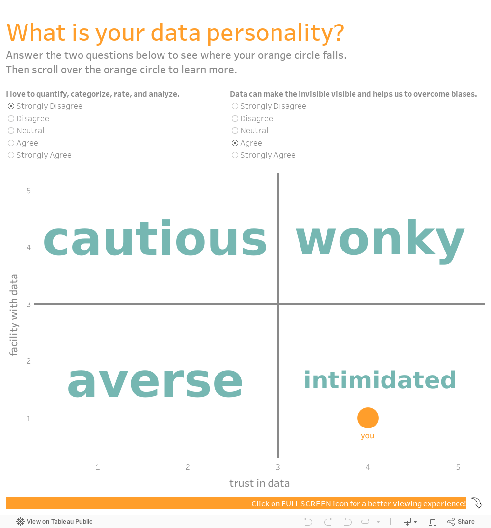
  • What category they fall into. We all love to discover groups we belong to. Think of Harry Potter’s sorting hat. Consider elucidating an issue by showing viewers where they fall in relation to that issue. That’s what I did with this data personality viz.

And no, you don’t need to be a tech wiz to make these types of interactive visualizations. You can make them using Tableau Public, the free version of Tableau (or a similar data viz application) and embed them in your website. I’m also happy to create something like this for you.


Let’s talk about YOUR data!

Got the feeling that you and your colleagues would use your data more effectively if you could see it better? Data Viz for Nonprofits (DVN) can help you get the ball rolling with an interactive data dashboard and beautiful charts, maps, and graphs for your next presentation, report, proposal, or webpage. Through a short-term consultation, we can help you to clarify the questions you want to answer and goals you want to track. DVN then visualizes your data to address those questions and track those goals.


Understand Your Volunteers Using "Pantry Staple" Data

60-SECOND DATA TIP_3 (1).gif

If your organization is like most nonprofits, you rely on volunteers to get the job done. And you probably have at least some basic “pantry staple” data on volunteers.

Pantry Staple Data: Volunteer Data

The volunteer data you already have can be leveraged to:

  • Impress funders, donors, and other stakeholders. Show them how you are using this free resource to move the needle.

  • Recruit new volunteers. As we have discussed in this blog before, we are all influenced by peers. So show how many volunteers you have to attract even more.

  • Manage volunteers more effectively. Seeing clearly what’s going on with your volunteers will help you to retain them, make better use of them, and recruit new ones. This is the subject of today’s tip.

Use Case: Maximizing Volunteer Time and Value

This volunteer data dashboard uses a variety of charts to answer the who, what, where, and when questions that you may have about your volunteers. With this detailed view of volunteers, an organization can start thinking about how to activate inactive volunteers, what types of new volunteers to target, and when during the year to deploy volunteers.

Source: Jin Tat on Tableau Public

Source: Jin Tat on Tableau Public

This simple map dashboard provides insight into the distribution of volunteers—and volunteer hours—among sites. This understanding can help you decide if and how to redistribute volunteers. Both this dashboard and the one above can be created using Tableau Public, the free version of Tableau.

Source:CCE on Tableau Public

Source:CCE on Tableau Public

To see past data tips, click HERE.


Let’s talk about YOUR data!

Got the feeling that you and your colleagues would use your data more effectively if you could see it better? Data Viz for Nonprofits (DVN) can help you get the ball rolling with an interactive data dashboard and beautiful charts, maps, and graphs for your next presentation, report, proposal, or webpage. Through a short-term consultation, we can help you to clarify the questions you want to answer and goals you want to track. DVN then visualizes your data to address those questions and track those goals.


Understand Program Drop Out Using "Pantry Staple" Data

60-SECOND DATA TIP_3.png

Data, like ingredients, can be divided into two groups: the data we have on hand (kind of like pantry staples) and the data we’d like to have. We spend a lot of time bemoaning that we don’t have the data we want, the type of data that can really show impact. But while we pursue new and better data, we also can do more with the data already in our databases and spreadsheets.

In the coming weeks and months, your weekly 60-second data tip occasionally will feature a type of pantry staple data and a suggestion on how to visualize it for a particular purpose. This time it’s about using participation data to show drop out rates.

Pantry Staple Data: Participation Data

If you provide any type of human service —education, case work, counseling, job training, whatever — you have participation data. At the least, you probably collect data on participants’ names and the services or programs provided to them. But you also likely have demographic data on them (age, address, employment, etc.), when they participated, and maybe some other data to boot. This type of data can be a gold mine for understanding and showing your reach and comparing how different types of participants fare in your programs.

Use Case: Showing Drop Out

Drop outs are inevitable. Participants leave our programs and services for a wide range of reasons. Ideally, we would survey or interview each participant who drops out to better understand why. But even without this type of data, we can learn a lot about drop outs and apply this knowledge to future decisions.

The funnel chart below shows the decreasing number of participants at each stage of a food service training program. We can see that few of those who attend orientation make it all the way to a job. And we can see at which stages there is the most/least drop off. This funnel chart also can be interactive. A filter can be added to show results for particularly subgroups, such those in different age, race/ethnicity, or family status groups.

It looks cool and makes intuitive sense, but a funnel chart is just a bar chart on its side with a mirror image. Check out these easy instructions for making funnel charts in Tableau and Excel.

Screen Shot 2021-03-15 at 1.12.48 PM.png
Screen Shot 2021-03-15 at 1.12.11 PM.png

The dashboard below also provides a wealth of information on another type of drop out: employee turnover. These charts can be applied to participant/client drop out data as well to show when they leave, what programs they leave from, and why they leave. And even if we don’t have the why data, what we know about the who, what, where, and when of drop outs can help us to discover the why. For example, if more folks are dropping out during the summer, maybe it’s because of childcare issues. If more people in certain neighborhoods are dropping out, maybe the programs in that area need strengthening.

Source: Alexandria Heusinger on Tableau Public

Source: Alexandria Heusinger on Tableau Public

To see past data tips, click HERE.


Let’s talk about YOUR data!

Got the feeling that you and your colleagues would use your data more effectively if you could see it better? Data Viz for Nonprofits (DVN) can help you get the ball rolling with an interactive data dashboard and beautiful charts, maps, and graphs for your next presentation, report, proposal, or webpage. Through a short-term consultation, we can help you to clarify the questions you want to answer and goals you want to track. DVN then visualizes your data to address those questions and track those goals.


The Problem with Large Numbers (And What To Do About it)

60-SECOND DATA TIP_3.gif

BANs (Big Ass Numbers) are gaining prominent positions in data dashboards, websites, social media, email marketing, and annual reports these days. They are meant to impress. Wow! 359,234 meals served! Cool! $6 million raised!

But there is a problem with big numbers. Our brains can’t fully digest them. As noted in a 2017 Wall Street Journal article, “Big numbers befuddle us, and our lack of comprehension compromises our ability to judge information about government budgets, scientific findings, the economy and other topics that convey meaning with abstract figures, like millions, billions, and trillions.”

When quantifying the breadth of a problem or solution, nonprofits may toss out lots of giant figures, as in the bewildering graphic below. But without context, even numbers in the hundreds or thousands can bewilder.

So what can we do to make BANs more meaningful? Researchers at Columbia University and Microsoft found that they could improve numerical comprehension by using “perspectives,” which are simple sentences that relate a large number to something more familiar to us.

They found, for example, that when told that the number of registered firearms in the U.S. is about 300 million, study participants not only had trouble comprehending this number but also recalling it and assessing its likely accuracy. However, when told that there is about one firearm per person in the U.S., significantly more people could comprehend, assess, and recall the quantity. Makes sense to me. We can imagine a group of people, each holding a firearm, but we are hard pressed to imagine a pile of 300 million firearms.

So before you present a large number, consider a perspective that will make it relatable for your audience. Below are some formulas used in the Columbia/Microsoft study for developing perspectives.


Let’s talk about YOUR data!

Got the feeling that you and your colleagues would use your data more effectively if you could see it better? Data Viz for Nonprofits (DVN) can help you get the ball rolling with an interactive data dashboard and beautiful charts, maps, and graphs for your next presentation, report, proposal, or webpage. Through a short-term consultation, we can help you to clarify the questions you want to answer and goals you want to track. DVN then visualizes your data to address those questions and track those goals.


To Improve Anything First Test Your Thinking

Reposted from October 2018

Reposted from October 2018

Pop quiz. Take yourself back to your seventh grade science class. Wake up from your drowsy, awkward, tween state and then answer this question: “What is a null hypothesis?”

Stay tuned for the answer. First, why are we talking about null hypotheses? Because if you are going to improve anything, you gotta get your null hypothesis on. As I’ve said before, progress in organizations – and indeed, in all of human history – happens when we admit ignorance. The null hypothesis is all about admitting ignorance.

Your science teacher didn’t tell you to make a guess (or a hypothesis) and then look for evidence to support it. Instead, your teacher said to state the opposite of what you believe (or, more specifically, that no relationship exists between two things) and then try to refute it. That opposite statement is the null hypothesis.

Why go at it backwards? The power of the null hypothesis is that it forces you to look beyond your expectations. For example, your hypothesis might be that girls do best in your life skills program based on what you’ve seen so far. The null hypothesis for such a hypothesis might be: there is no difference in performance in the life skills program based on gender. Looking for evidence to support the null hypothesis opens your eyes to other factors (besides gender) that may be at play. Perhaps kids who can sit for longer periods of time do better in the program, and those patient kids often are girls. If so, then you have some powerful information. Maybe building in some movement time will improve overall performance?

If patience and other factors you explore don’t seem to be related to performance, then maybe gender is the key factor.

I’m not suggesting that you launch highly technical controlled experiments. Instead, I’m asking you to first consider that you might be wrong and then pay attention to data that supports such a conclusion. It can point you to new and powerful strategies.

See other data tips in this series for more information on how to effectively visualize and make good use of your organization's data.

Photo by Andrew Shiau on Unsplash

What To Do With Incomplete Data

60-SECOND DATA TIP_3.png

Here’s the super short version of this data tip: when designing data viz, don’t mix complete and incomplete data. Below is the somewhat-longer-but-still-60-seconds version of this data tip.

The graphs below were on the Chicago Public Schools (CPS) website and show the number of confirmed COVID-19 cases associated with CPS buildings. I’ve added the pink lines and captions to direct your attention to the last two data points. The first image shows what the graph looked like on Monday, January 18th, and the second image shows what the graph looked like 5 days later on Saturday, January 23rd.

If you went to this website on January 18th and looked that this graph, you might very well have concluded that cases had recently plummeted. But you’d be wrong. To understand what was really going on, you’d have to notice that the last data point (1/23) was in the future and put that information together with a caption saying “Case counts are updated Monday through Friday (excluding holidays) after impacted individuals are notified.” So the graph shows complete data for past weeks but incomplete data for the current week. The last data point shows week-to-date data.

Unless your aim is to confuse or deceive, why present data in this way? Instead, when you have complete data for various time periods or groups and incomplete data for other time periods or groups, consider the following:

  • If you are updating data on a daily basis, then show day intervals (rather than week intervals as in the graphs above) on the X-axis.

  • Create a separate chart showing a running total for the incomplete time period or group and place it alongside the graph showing complete data.

  • If neither of the solutions above work for you, at least color the dots, lines, or other marks representing the incomplete data in a color different from the complete data to alert the viewer to the difference and include a color legend to explain the difference.

Thanks to Carol White of CBWhite marketing research and strategy consulting for pointing out this graph to me! To see past data tips, click HERE.


Let’s talk about YOUR data!

Got the feeling that you and your colleagues would use your data more effectively if you could see it better? Data Viz for Nonprofits (DVN) can help you get the ball rolling with an interactive data dashboard and beautiful charts, maps, and graphs for your next presentation, report, proposal, or webpage. Through a short-term consultation, we can help you to clarify the questions you want to answer and goals you want to track. DVN then visualizes your data to address those questions and track those goals.


What's Your Data Personality?

Re-posted from July 2019

Re-posted from July 2019

Some of us might be resistant to data but who can resist an over-simplistic personality quiz? I’ve developed a tool to determine your data personality. Just answer two questions and BOOM you fall into (or on the border of) one of four personality types. But wait! That’s not all. You also get a “data prescription” tailored to your personality type.

Sure, the tool is highly unscientific. But it’s fun and throws some light on how we can help ourselves and those with other data personalities (living in the next cubicle, board room, or across the world wide web) to better understand and use data.

What are the four data personality types? Well, there’s . . .

The Wonky

These are the unabashed number lovers with a deep belief that, with enough data, we can make much better decisions. They yearn for equations and algorithms. They find meaning in all those Greek statistical symbols that baffle the rest of us. Data Prescription: Feed the Wonky a steady and ample diet of data in almost any form. But also help them to communicate data to the not-so-wonky through charts, maps, and graphs so that the message behind the data is as clear to others as it is to them.

The Intimidated

The intimidated long for the objectivity that data and the scientific method offer. They want something besides their gut or conventional wisdom as a compass. But they glaze over at the sight of a spreadsheet and worry that they cannot confidently assess the quality or implications of their data. Data Prescription: Relax the Intimidated with well-designed charts, maps, and graphs.

The Cautious

These folks are comfortable with numbers. They took stats in high school or college and aced it. But they worry about the accuracy of data, particularly data they did not collect themselves. Data Prescription: Like the Intimidated, the Cautious do well with charts, maps, and graphs but also need assurances regarding data sources. While you should be upfront about the sources and limitations of your data with all data personality types, provide more detailed information to the Cautious.

The Averse

In the Averse, we find the perfect storm: both a distaste for and a distrust of data. Data Prescription: They need to be eased along in their engagement with data. Try starting with data that’s familiar to them. And what’s more familiar and fascinating than data about ourselves? So try putting-the-viewer-in-the-viz. Show The Averse how their height, salary, diet, or opinions compare to that of others. Ask them to guess a statistic before showing them the answer. (For a great example of this, see this article in the Guardian.) As you move them into more complex data, make your charts as simple and user-friendly as possible. This often includes sign posts directing them through the viz.

Yes, visualized data (in the form of charts, maps, and graphs) are prescribed for all data personality types. They either clarify data for you or for others who need to understand it. Data viz is no cure-all but it often helps, particularly in nonprofits which are often staffed by the Intimidated and the Averse.

I hope this personality quiz — like so many overly-simplistic quizes — makes you feel less alone and gets you thinking about upping your data game.

For many tips on why and how to visualize data, take a stroll through past 60-Second Data Tips.


Composition Rules Cheat Sheet

60-SECOND DATA TIP_3.png

Over the past 10 weeks, I’ve given you composition rules to elevate your data viz. Today I give you the cheat sheet. Bookmark it! Print it out and pin it to your bulletin board!


Let’s talk about YOUR data!

Got the feeling that you and your colleagues would use your data more effectively if you could see it better? Data Viz for Nonprofits (DVN) can help you get the ball rolling with an interactive data dashboard and beautiful charts, maps, and graphs for your next presentation, report, proposal, or webpage. Through a short-term consultation, we can help you to clarify the questions you want to answer and goals you want to track. DVN then visualizes your data to address those questions and track those goals.


10 Rules To Elevate Your Data Viz (Rule #10)

60-SECOND DATA TIP_3.png

Here is a simple strategy you can take from the graphic design playbook to make your data viz better: divide your design into thirds. It’s one of 10 composition rules for good design. Here’s the 60-second version of this rule.

Composition Rules (#10) by Amelia Kohm

What Does “Divide Your Design Into Thirds” Mean?

To apply the “rule of thirds” strategy, create a grid on your screen (or paper, if you’re old school) with three rows and three columns. Then place your focal points at the intersections of the vertical and horizontal lines. But avoid placing anything in the exact middle. This approach goes all the way back to the Renaissance artists who found it made for a pleasing composition. Some say it gives the eye places to move without getting stuck in the middle.

How Can I Apply This Rule to Data Viz?

As far as I can tell, data visualizers have not embraced this rule. I was hard pressed to find any good examples. But I think it’s something more of us should keep in mind. It is a time-tested method for arriving at a balanced and interesting composition. Consider placing key text, images, and charts according to the rule of thirds.

To be clear, when you place the focal points within the cells of a 3 x 3 grid, you are NOT applying the rule of thirds. As you can see in this example, the focal points are not at the intersections of the grid (which I’ve superimposed on the dashboard). Sure, it makes for a clean, user-friendly composition, but it’s probably not the most exciting thing you’ve ever seen.

Source: Varun Goenka on Tableau Public

Source: Varun Goenka on Tableau Public

This is the only dashboard I came across, after several hours of searching, that came close to the rule of thirds. Again, I’ve superimposed the grid, and you can see that the intersections do land on some key elements, including one key data point on the Number of Visits per Day graph. And it does have a more dynamic feel than the dashboard above.

Source: : Seema M. Rathod on Tableau Public

Source: : Seema M. Rathod on Tableau Public

Since I couldn’t find a great data viz example of the rule of thirds (either in my own portfolio or others’), I leave you with this mock-up for a dashboard which I made to show you just how pleasing this approach can be when applied to a data viz composition. Now you try it!

nogride@2x.png

And here it is with the grid that I used to place the elements.

withgrid@2x.png

To see past data tips, including those about other composition rules, click HERE.


Let’s talk about YOUR data!

Got the feeling that you and your colleagues would use your data more effectively if you could see it better? Data Viz for Nonprofits (DVN) can help you get the ball rolling with an interactive data dashboard and beautiful charts, maps, and graphs for your next presentation, report, proposal, or webpage. Through a short-term consultation, we can help you to clarify the questions you want to answer and goals you want to track. DVN then visualizes your data to address those questions and track those goals.


10 Rules To Elevate Your Data Viz (Rule #9)

“Good design is like a refrigerator—when it works, no one notices, but when it doesn’t, it sure stinks.”

–Irene Au

A jumble of elements in any design, including data visualization design, stinks. That’s why alignment is one of 10 composition rules for good design. Here’s the 60-second version of this rule.

Composition Rules (#9) by Amelia Kohm

What Does “Align Elements” Mean?

Alignment is placing text and other design elements so they line up. It orders and organizes your elements. It also creates visual connections and improves the overall readability of a design. You can align elements to a margin or to other elements in a design. Elements can also be aligned along a central axis.

How Can I Apply This Rule to Data Viz?

Aligning charts, maps, graphs, titles, subtitles, and other elements of a data viz design is a simple way to bring order to your composition. Like straightening up a messy room, aligning elements makes it easier for the viewer to navigate the design and find information. Also, a clean design, like a clean room, is more inviting.

To improve alignment, consider:

  • Using left alignment with text in most cases. It’s how we read and usually works best. Only use right or center alignment with a small amount of text (like a title or subtitle).

  • Using a grid. Many design and data viz tools have grid overlays. Some can snap your elements onto your grid.

Now let’s consider some examples.

In this dashboard, the charts, maps, titles, and text boxes are aligned both vertically and horizontally along a 4 x 3 grid. The result is a balanced and approachable look despite the multitude of charts and text elements.

Source: Dzifa Amexo on Tableau Public

Source: Dzifa Amexo on Tableau Public

This composition uses both left and right alignment to create a serene, symmetrical design. The designer emphasizes alignment by adding actual lines along some of the text elements.

Source: Dhruv Popat on Tableau Public

Source: Dhruv Popat on Tableau Public

This diverging bar chart makes good use of center alignment, but the numbers at the top are not aligned with the text and chart below, giving it an off-kilter feel.

Source: Sanaz Jamloo on Tableau Public

Source: Sanaz Jamloo on Tableau Public

To see past data tips, including those about other composition rules, click HERE.


Let’s talk about YOUR data!

Got the feeling that you and your colleagues would use your data more effectively if you could see it better? Data Viz for Nonprofits (DVN) can help you get the ball rolling with an interactive data dashboard and beautiful charts, maps, and graphs for your next presentation, report, proposal, or webpage. Through a short-term consultation, we can help you to clarify the questions you want to answer and goals you want to track. DVN then visualizes your data to address those questions and track those goals.


10 Rules To Elevate Your Data Viz (Rule #8)

trees (1).gif

Design — including data viz design — is about both the elements that you include (text, images, charts, etc.) and about the space between them. Using this “white space” strategically is one of ten composition rules discussed in greater detail in this article from Canva. Read on for the 60-second version of this rule.

Composition Rules (#8) by Amelia Kohm

What Does “White Space” Mean?

“White space” is the space between and around elements in a design. Think of a single tree in an empty field versus a tree surrounded by other trees in a forest. If you want the viewer to focus on a particular tree (or chart, chart element, or title) clear the area around it.

How Can I Apply This Rule to Data Viz?

Too often we look for ways to pack more information into a dashboard or other type of data viz design. But when we do this, we lose the power of white space.

Use white space to draw attention to your focal points. Use white space to give the eye some breathing room. And, as long as I’m mixing metaphors, consider this: a busy, crowded design is a cacophony in which none of the individual components can be fully appreciated. So delete unnecessary elements or, if the viz is interactive, make additional information available on demand by scrolling or clicking a button.

Here’s an example of a dashboard that crowds information into one view, leaving little white space. As a result, it’s difficult to determine the focal points and, unless you are familiar with the data or highly motivated to extract meaning, you may give up on it quickly.

Source: Peter James Walker on Tableau Public

Source: Peter James Walker on Tableau Public

This dashboard, by contrast, uses plenty of white space to highlight focal points and not overwhelm the viewer.

Source: Sarah Burnett on Tableau Public

Source: Sarah Burnett on Tableau Public

To see past data tips, including those about other composition rules, click HERE.


Let’s talk about YOUR data!

Got the feeling that you and your colleagues would use your data more effectively if you could see it better? Data Viz for Nonprofits (DVN) can help you get the ball rolling with an interactive data dashboard and beautiful charts, maps, and graphs for your next presentation, report, proposal, or webpage. Through a short-term consultation, we can help you to clarify the questions you want to answer and goals you want to track. DVN then visualizes your data to address those questions and track those goals.


10 Rules To Elevate Your Data Viz (Rule #7)

60-SECOND DATA TIP_3.png

“Rhythm is music’s pattern in time. Whatever other elements a given piece of music may have (e.g., patterns in pitch or timbre), rhythm is the one indispensable element of all music.” (Britannica.com). Repetition serves the same role in visual composition as rhythm does in music. And it’s one of ten composition rules discussed in greater detail in this article from Canva. Read on for the 60-second version of this rule.

Composition Rules (#7) by Amelia Kohm

What Does “Repeat Elements of Your Design” Mean?

Like rhythm in music, repetition brings unity to any design. It marries disparate elements. In a single composition, repeating typeface, color, shapes, or images can result in a balanced, coordinated look. In a series of compositions, repeating visual elements helps to tie them together, communicating that each is part of a larger whole.

How Can I Apply This Rule to Data Viz?

It’s a good idea to keep a record of the typefaces, type sizes, line weights, colors, etc. that you use in any data viz project ( (aka a “style guide”), and look for opportunities to repeat them. When designing a multi-page dashboard, using similar styes and layouts for each will help the user to find information quickly.

Let’s consider some examples of data viz that effectively use repetition.

Small multiples charts show the power of repetition. Zach Gemignani describes this approach well. “Small multiples use the same basic graphic or chart to display difference slices of a data set. Small multiples can show rich, multi-dimensional data without trying to cram all that information into a single, overly-complex chart.” Once you know how to read one of the side-by-side charts, you can quickly extract meaning from the whole array. The small multiples chart below allows us to rapidly discern that women directors have directed a small percentage of the most popular movies regardless of genre, with no clear improvement over time.

Source Max Tham on Tableau Public

Source Max Tham on Tableau Public

This dashboard repeats the same charts and KPIs for each unit in a hospital. It allows administrators to rapidly assess the current need and distribution of resources, compare units, and adjust resources accordingly. Repetition of color, fonts, and header styles also helps to unify information about different units.

Source: Slalom NYC on Tableau Public

Source: Slalom NYC on Tableau Public

In this series of dashboards on crises in various African nations, Alexander Varlamo uses a strict style guide to unify them.

Source: Alexander Varlamov on Tableau Public

Source: Alexander Varlamov on Tableau Public

To see past data tips, including those about other composition rules, click HERE.


Let’s talk about YOUR data!

Got the feeling that you and your colleagues would use your data more effectively if you could see it better? Data Viz for Nonprofits (DVN) can help you get the ball rolling with an interactive data dashboard and beautiful charts, maps, and graphs for your next presentation, report, proposal, or webpage. Through a short-term consultation, we can help you to clarify the questions you want to answer and goals you want to track. DVN then visualizes your data to address those questions and track those goals.


10 Rules To Elevate Your Data Viz (Rule #6)

60-SECOND DATA TIP_3.png

Today I give you a composition rule which is often ignored in data viz — but at its peril. The rule is deploy contrast. It’s one of ten composition rules discussed in greater detail in this article from Canva. Read on for the 60-second version of this rule.

Composition Rules (#6) by Amelia Kohm

What Does “Boosting or Reducing Contrast” Mean?

Our brains are wired to perceive objects that differ significantly from their background. The objects that really pop out are those that contrast due to their color, size, orientation, or motion. So when designing charts, maps, and graphs, we should give some thought to contrast.

How Can I Apply This Rule to Data Viz?

Not only do we want our focal points to pop out, we also want some aspects of the composition, those lower in the hierarchy, to fade a bit by NOT contrasting as strongly with the background. By doing this, we not only help our main titles, captions, and data points to shine, we also provide more information for the interested viewer.

Let’s consider some examples of data viz that effectively use contrast.

Below is a series of visualizations related to the 2020 explosion in Beirut. It uses contrasting size and color to make some elements pop (the title, the KPIs, and the location of destruction and damage on the map) and other elements fade backward (the explanatory text and location of other ammonium nitrate disasters.)

Source: Soha Elghany on Tableau Public

Source: Soha Elghany on Tableau Public

Similarly these vizes, showing rat sightings in New York, effectively use shades of gray so that the viewer can easily pick out the locations where — and the years and months when — rats are most visible.

Source: Claire Kim on Tableau Public

Source: Claire Kim on Tableau Public

In these vizes, red and white contrast with the black background. Red is used for key information about poverty. White is used for important contextual information. And gray is used for everything else.

Source: Ash Shih on Tableau Public

Source: Ash Shih on Tableau Public

To see past data tips, including those about other composition rules, click HERE.


Let’s talk about YOUR data!

Got the feeling that you and your colleagues would use your data more effectively if you could see it better? Data Viz for Nonprofits (DVN) can help you get the ball rolling with an interactive data dashboard and beautiful charts, maps, and graphs for your next presentation, report, proposal, or webpage. Through a short-term consultation, we can help you to clarify the questions you want to answer and goals you want to track. DVN then visualizes your data to address those questions and track those goals.


10 Rules To Elevate Your Data Viz (Rule #5)

60-SECOND DATA TIP_3.png

Using complementing elements is one of ten composition rules discussed in greater detail in this article from Canva. And it applies as much to data viz as to any other type of composition. Read on for the 60-second version of this rule.

Composition Rules (#5) by Amelia Kohm

What Does “Use Complementing Elements” Mean?

Graphic design artists choose images that look good together. Data visualizers should do the same by making sure that charts, maps, and graphs which are presented together complement each other visually,

How Can I Apply This Rule to Data Viz?

  • Use the same color palette in each chart. And remember that the meaning of a color should be the same in side-by-side charts. You should not use a dark blue to signify participants aged 20-40 in one chart and to signify those living in a particular zip code area in an adjacent chart.

  • Use the same chart type for each chart. Part of the beauty of the small multiple chart is that the elements of the composition complement each other due to their similarity. Please see example below.

  • Use consistent type in each chart. You wouldn’t use different fonts or font sizes in side-by-side charts, would you? Yes? Well, then this tip is for you.

  • Use similar marks and channels in each chart. Data visualizations represent data using “marks” such as bars, lines, and circles. A mark represents data through “channels” which include its position, shape, size, or color. A larger circle, for example, can mean a greater number of something than a smaller circle. Charts that use similar marks and channels have similar looks and thus tend to complement each other visually.

Let’s look at some examples.

This dashboard repeats colors, charts, and marks and so, although a lot of different data is presented, the overall look is unified because the elements complement each other.

Source: Alex Dixon and Tarannum Ansari on Tableau Public

Source: Alex Dixon and Tarannum Ansari on Tableau Public

The repetition of chart types in small multiples charts, like this one, makes for a cohesive overall design.

Source: Christian Felix on Tableau Public

Source: Christian Felix on Tableau Public

And here again, the designer repeats visual elements such as text boxes and chart types to bring the different aspects of the composition together.

Source: Chantilly Jaggernauth on Tableau Public

Source: Chantilly Jaggernauth on Tableau Public

To see past data tips, including those about other composition rules, click HERE.


Let’s talk about YOUR data!

Got the feeling that you and your colleagues would use your data more effectively if you could see it better? Data Viz for Nonprofits (DVN) can help you get the ball rolling with an interactive data dashboard and beautiful charts, maps, and graphs for your next presentation, report, proposal, or webpage. Through a short-term consultation, we can help you to clarify the questions you want to answer and goals you want to track. DVN then visualizes your data to address those questions and track those goals.


10 Rules To Elevate Your Data Viz (Rule #4)

60-SECOND DATA TIP_3.png

Balancing out your elements is one of ten composition rules discussed in greater detail in this article from Canva. And it applies as much to data viz as to other types of composition. Read on for the 60-second version of this rule.

Composition Rules (#4) by Amelia Kohm

What Does “Balancing Elements” Mean?

Think of how you balance things on an old fashioned balance scale (pictured above). You can achieve balance by:

1) Placing the same elements on each side. This is called symmetrical balance.

2) Placing an assortment of elements which total to the same weight on each side. This is called asymmetrical balance.

What do we mean by weight when it comes to design? Well, more prominent (larger, darker, brighter) objects have more weight than less prominent ones.

How Can I Apply This Rule to Data Viz?

When designing a dashboard or any other type of composition that involves data viz, give some thought to where you place elements to balance them out.

The top part of this dashboard shows asymmetrical balance. The title and text on the left are balanced by the mini charts and KPI* on the right. The small multiples chart that comprises the rest of the dashboard is an example of symmetrical balance.

This dashboard achieves asymmetrical balance by placing the title and text in the upper left corner and information about the City of Toronto in the lower right corner. The map, which crosses from the lower left to the upper right, is placed for symmetry as well. Each quadrant of the composition has similar weight.

To see past data tips, including those about other composition rules, click HERE.

*KPI: Key Performance Indicator


Let’s talk about YOUR data!

Got the feeling that you and your colleagues would use your data more effectively if you could see it better? Data Viz for Nonprofits (DVN) can help you get the ball rolling with an interactive data dashboard and beautiful charts, maps, and graphs for your next presentation, report, proposal, or webpage. Through a short-term consultation, we can help you to clarify the questions you want to answer and goals you want to track. DVN then visualizes your data to address those questions and track those goals.


10 Rules To Elevate Your Data Viz (Rule #3)

60-SECOND DATA TIP_3 (1).png

Graphic artists think about hierarchy whenever they design anything. Analysts making charts and graphs often ignore hierarchy, but at their peril. This is one of ten composition rules discussed in greater detail in this article from Canva. Read on for the 60-second data viz version of this rule.

Composition Rules (#3) by Amelia Kohm

What Does “Hierarchy” Mean?

You create a hierarchy when you design elements (like text, images, and charts) according to their significance. Generally, the most significant elements are bigger and bolder, and the less significant ones are smaller and fainter. We’ve already talked about making your focal point big, bold, and centrally located. We’ve also talked about using leading lines to direct attention from the focal point to other elements in the composition. The visual hierarchy provides additional cues to help the viewer discern: 1) what are the key takeaways, and 2) what are the more minor details.

How Can I Apply This Rule to Data Viz?

Consider the most important elements of your data viz including titles, subtitles, labels, charts, and chart elements (such as particular lines on a line chart or particular dots on a scatterplot.) Then make your most important elements bigger or bolder. You might also add more white space around them or give them a contrasting color to the rest of the viz. Then make the less important elements smaller and/or fainter.

Below are two versions of a data dashboard by Swati Dave. The first image shows the dashboard with many of the hierarchy cues removed. The second image show’s Dave’s original dashboard which applies a visual hierarchy to help guide you through the viz. Which do you find easier to digest?

Dashboard With Few Hierarchy Cues

bad hierarchy.png

Dashboard With More Hierarchy Cues

Good hierarchy.png

To see past data tips, including those about other composition rules, click HERE.


Let’s talk about YOUR data!

Got the feeling that you and your colleagues would use your data more effectively if you could see it better? Data Viz for Nonprofits (DVN) can help you get the ball rolling with an interactive data dashboard and beautiful charts, maps, and graphs for your next presentation, report, proposal, or webpage. Through a short-term consultation, we can help you to clarify the questions you want to answer and goals you want to track. DVN then visualizes your data to address those questions and track those goals.


10 Rules to Elevate Your Data Viz (Rule #2)

60-SECOND DATA TIP_3.png

Here’s another composition rule that artists know and that analysts can apply when presenting data: direct the eye with leading lines. This is one of ten rules discussed in greater detail in this article from Canva.

What Does “Direct The Eye With Leading Lines” Mean?

The first thing you want your audience to see is the focal point. Leading lines are like signposts which tell the viewer where to go after the focal point. They can be lines, arrows, or other shapes which guide viewers’ eyes in a certain direction.

How Can I Apply This Rule to Data Viz?

Flowcharts, as I’ve written before, are engaging, easy to digest, and charmingly analog. And what makes them so user-friendly are the leading lines directing our attention from the focal point (in this case: “Do you plan to vote?”) to other elements of the chart.

Source: Christian Felix on Tableau Public

Source: Christian Felix on Tableau Public

This chart on air quality uses leading lines to relate the bar chart at the top to locations on the world map below.

Source: Pradeep Kumar G on Tableau Public

Source: Pradeep Kumar G on Tableau Public

Leading lines can be used to draw attention to particular data points. In this chart, leading lines are used to direct your focus to foods that have a particularly high and low carbon footprint.

To see past data tips, including those about other composition rules, click HERE.


Let’s talk about YOUR data!

Got the feeling that you and your colleagues would use your data more effectively if you could see it better? Data Viz for Nonprofits (DVN) can help you get the ball rolling with an interactive data dashboard and beautiful charts, maps, and graphs for your next presentation, report, proposal, or webpage. Through a short-term consultation, we can help you to clarify the questions you want to answer and goals you want to track. DVN then visualizes your data to address those questions and track those goals.


10 Rules to Elevate Your Data Viz (Rule #1)

60-SECOND DATA TIP_3.png

Data visualization is like one of those unlikely couples. One partner is outgoing and a great storyteller. The other is introverted and sticks to the facts. To make great charts, maps, and graphs, you need to channel both partners in this odd couple: the artist and the analyst.

So over the next several weeks, I’m going to offer up key rules about composition that artists know and that analysts (and the rest of us) can apply when presenting data. I will focus on ten rules discussed in more detail in this article from Canva. This time it’s about finding your focus.

Composition Rules (#1) by Amelia Kohm

What Does “Find Your Focus” Mean?

Decide what you want your audience to focus on first. To choose a focal point, think about the main message you hope to communicate. You can direct attention to words or data points related to your focal point by placing them in the center of the composition, by coloring them so that they contrast with the background, or by using larger type than used elsewhere in the composition.

How Can I Apply This Rule to Data Viz?

Source: Richard Speigal on Tableau Public

Source: Richard Speigal on Tableau Public

This map uses contrasting color to direct your attention to the focal point: the location of lighthouses in England and Wales. The focal point is also the title, which is in much larger type than the rest of the text. Finally, the color chosen looks like radiating light, further emphasizing the focal point.

Source: Agata Ketterick on Tableau Public

Source: Agata Ketterick on Tableau Public

This map also uses contrasting color to clarify the focal point: locations of extreme snowfall. And it uses color strategically: white=snow. These locations are placed in the center of the image and further emphasized by the bar chart.

Source: Zainab Ayodimeji on Tableau Public

Source: Zainab Ayodimeji on Tableau Public

This simple bar chart uses the title and contrasting colors to ensure that you don’t miss the focal point.

Stay tuned for more composition rules in coming weeks!

To see past data tips, click HERE.


Let’s talk about YOUR data!

Got the feeling that you and your colleagues would use your data more effectively if you could see it better? Data Viz for Nonprofits (DVN) can help you get the ball rolling with an interactive data dashboard and beautiful charts, maps, and graphs for your next presentation, report, proposal, or webpage. Through a short-term consultation, we can help you to clarify the questions you want to answer and goals you want to track. DVN then visualizes your data to address those questions and track those goals.


Title@2x.png

Data source: Pew Research Center, 2020

The data shown here are from the American Trends Panel Wave 59 survey conducted by Pew Research Center. The American Trends Panel is a nationally representative panel of randomly selected U.S. adults recruited from landline and cellphone random-digit-dial surveys. The survey dates are January 6-January 20, 2020. The chart includes data on respondents who identified themselves, in response to a survey question regarding ideology, as "Very Liberal," "Liberal," "Very Conservative," or "Conservative." Respondents who identified as "Moderate" or did not respond to the ideology question are not included in the data shown on the charts. For more information on the survey, click here..

Why You Should Know About Box Plots

60-SECOND DATA TIP_3.png

Here’s yet another in a series of tips on different chart types. The idea is to fill up your toolbox for making sense of data. This week, I give you the box plot.

Active Ingredients (What is a box plot?)

Like a histogram, a box plot shows how spread out your data points are. The box plot below shows the affordability of housing in neighborhoods in ten cities. Each red circle represents a zip code area. The gray boxes show where 50 percent of the zip code areas fall on the affordability scale (larger numbers mean more affordable, smaller ones mean less affordable). And the median (or middle number) is where the dark gray meets the light gray.

boxplot1.png

Box plots also show a lot of other information (see image below). Some call this type of chart “a box and whisker plot” because the lines extending from the boxes are known as the “whiskers.”

Source: Flowing Data

Source: Flowing Data

Uses

A box plot provides a detailed snapshot of your data. No data points are hidden or obscured by summarizing numbers such as averaging them. For example, Houston and Chicago have the same average affordability score (.13) but we can see at a glance that although they are similarly affordable cities, Houston has a wider range of affordability. And, we can see that although New York is, in general, more affordable than Los Angeles, New York has some zip code areas that are much less affordable than the median seems to suggest. There are also some extreme outliers including the circle at -1.0 affordability which is New York City's 10013 zip code area (Soho and Tribeca).

Warnings

Not everyone (or every application) draws a box plot the same. For example, sometimes the whiskers extend to the minimum and maximum values and others place outliers beyond the lines. However most box plots include the median, upper quartile and lower quartile.

Fun Fact

Mary Eleanor Spear invented what she called a “range bar” in the 1950s. It would later be known as the box plot.

To see past data tips, including those about other chart types, click HERE.


Let’s talk about YOUR data!

Got the feeling that you and your colleagues would use your data more effectively if you could see it better? Data Viz for Nonprofits (DVN) can help you get the ball rolling with an interactive data dashboard and beautiful charts, maps, and graphs for your next presentation, report, proposal, or webpage. Through a short-term consultation, we can help you to clarify the questions you want to answer and goals you want to track. DVN then visualizes your data to address those questions and track those goals.