“Rhythm is music’s pattern in time. Whatever other elements a given piece of music may have (e.g., patterns in pitch or timbre), rhythm is the one indispensable element of all music.” (Britannica.com). Repetition serves the same role in visual composition as rhythm does in music. And it’s one of ten composition rules discussed in greater detail in this article from Canva. Read on for the 60-second version of this rule.
What Does “Repeat Elements of Your Design” Mean?
Like rhythm in music, repetition brings unity to any design. It marries disparate elements. In a single composition, repeating typeface, color, shapes, or images can result in a balanced, coordinated look. In a series of compositions, repeating visual elements helps to tie them together, communicating that each is part of a larger whole.
How Can I Apply This Rule to Data Viz?
It’s a good idea to keep a record of the typefaces, type sizes, line weights, colors, etc. that you use in any data viz project ( (aka a “style guide”), and look for opportunities to repeat them. When designing a multi-page dashboard, using similar styes and layouts for each will help the user to find information quickly.
Let’s consider some examples of data viz that effectively use repetition.
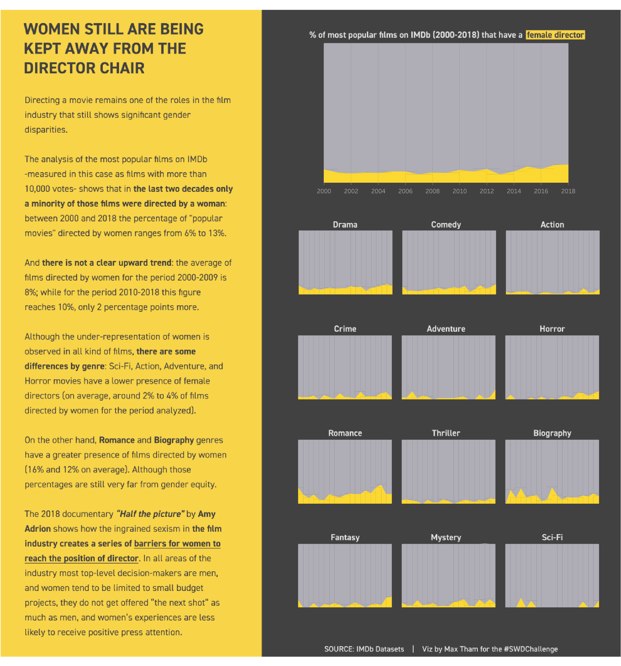
Small multiples charts show the power of repetition. Zach Gemignani describes this approach well. “Small multiples use the same basic graphic or chart to display difference slices of a data set. Small multiples can show rich, multi-dimensional data without trying to cram all that information into a single, overly-complex chart.” Once you know how to read one of the side-by-side charts, you can quickly extract meaning from the whole array. The small multiples chart below allows us to rapidly discern that women directors have directed a small percentage of the most popular movies regardless of genre, with no clear improvement over time.
Source Max Tham on Tableau Public
This dashboard repeats the same charts and KPIs for each unit in a hospital. It allows administrators to rapidly assess the current need and distribution of resources, compare units, and adjust resources accordingly. Repetition of color, fonts, and header styles also helps to unify information about different units.
Source: Slalom NYC on Tableau Public
In this series of dashboards on crises in various African nations, Alexander Varlamo uses a strict style guide to unify them.
Source: Alexander Varlamov on Tableau Public
To see past data tips, including those about other composition rules, click HERE.
Let’s talk about YOUR data!
Got the feeling that you and your colleagues would use your data more effectively if you could see it better? Data Viz for Nonprofits (DVN) can help you get the ball rolling with an interactive data dashboard and beautiful charts, maps, and graphs for your next presentation, report, proposal, or webpage. Through a short-term consultation, we can help you to clarify the questions you want to answer and goals you want to track. DVN then visualizes your data to address those questions and track those goals.


