
Here’s yet another in a series of tips on different chart types. The idea is to fill up your toolbox for making sense of data. This week, I give you the box plot.
Active Ingredients (What is a box plot?)
Like a histogram, a box plot shows how spread out your data points are. The box plot below shows the affordability of housing in neighborhoods in ten cities. Each red circle represents a zip code area. The gray boxes show where 50 percent of the zip code areas fall on the affordability scale (larger numbers mean more affordable, smaller ones mean less affordable). And the median (or middle number) is where the dark gray meets the light gray.

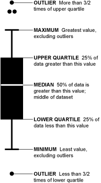
Box plots also show a lot of other information (see image below). Some call this type of chart “a box and whisker plot” because the lines extending from the boxes are known as the “whiskers.”
Source: Flowing Data
Uses
A box plot provides a detailed snapshot of your data. No data points are hidden or obscured by summarizing numbers such as averaging them. For example, Houston and Chicago have the same average affordability score (.13) but we can see at a glance that although they are similarly affordable cities, Houston has a wider range of affordability. And, we can see that although New York is, in general, more affordable than Los Angeles, New York has some zip code areas that are much less affordable than the median seems to suggest. There are also some extreme outliers including the circle at -1.0 affordability which is New York City's 10013 zip code area (Soho and Tribeca).
Warnings
Not everyone (or every application) draws a box plot the same. For example, sometimes the whiskers extend to the minimum and maximum values and others place outliers beyond the lines. However most box plots include the median, upper quartile and lower quartile.
Fun Fact
Mary Eleanor Spear invented what she called a “range bar” in the 1950s. It would later be known as the box plot.
To see past data tips, including those about other chart types, click HERE.
Let’s talk about YOUR data!
Got the feeling that you and your colleagues would use your data more effectively if you could see it better? Data Viz for Nonprofits (DVN) can help you get the ball rolling with an interactive data dashboard and beautiful charts, maps, and graphs for your next presentation, report, proposal, or webpage. Through a short-term consultation, we can help you to clarify the questions you want to answer and goals you want to track. DVN then visualizes your data to address those questions and track those goals.


