How Data Viz Can Save Your Thanksgiving

Your next data challenge may involve turkey. And I’m here to help. This week we take a break from nonprofit data and consider Thanksgiving data.

Thanksgiving involves many more dishes than you would normally serve in one meal. If you are in charge this year, and you have a medium to small oven and fridge, you have to be strategic. When should you cook, chill, and reheat each dish to make the most of your time and limited oven/fridge space?

I give you my Thanksgiving Game Plan Gantt Chart (partially pictured below) originally shared in tip #87. It has become a Thanksgiving tradition here at Data Viz for Nonprofits, and works like a charm. I made it in Google Sheets. Nothing fancy, but it does the trick. Feel free to adapt it to your recipes or perhaps your next fundraising event!

Happy Turkey/Tofurky Day. And stay tuned. Next week we will return to the series of data tip comic strips on essential data facts for non-data people.


Let’s talk about YOUR data!

Got the feeling that you and your colleagues would use your data more effectively if you could see it better? Data Viz for Nonprofits (DVN) can help you get the ball rolling with an interactive data dashboard and beautiful charts, maps, and graphs for your next presentation, report, proposal, or webpage. Through a short-term consultation, we can help you to clarify the questions you want to answer and goals you want to track. DVN then visualizes your data to address those questions and track those goals.


10 Rules To Elevate Your Data Viz (Rule #3)

60-SECOND DATA TIP_3 (1).png

Graphic artists think about hierarchy whenever they design anything. Analysts making charts and graphs often ignore hierarchy, but at their peril. This is one of ten composition rules discussed in greater detail in this article from Canva. Read on for the 60-second data viz version of this rule.

Composition Rules (#3) by Amelia Kohm

What Does “Hierarchy” Mean?

You create a hierarchy when you design elements (like text, images, and charts) according to their significance. Generally, the most significant elements are bigger and bolder, and the less significant ones are smaller and fainter. We’ve already talked about making your focal point big, bold, and centrally located. We’ve also talked about using leading lines to direct attention from the focal point to other elements in the composition. The visual hierarchy provides additional cues to help the viewer discern: 1) what are the key takeaways, and 2) what are the more minor details.

How Can I Apply This Rule to Data Viz?

Consider the most important elements of your data viz including titles, subtitles, labels, charts, and chart elements (such as particular lines on a line chart or particular dots on a scatterplot.) Then make your most important elements bigger or bolder. You might also add more white space around them or give them a contrasting color to the rest of the viz. Then make the less important elements smaller and/or fainter.

Below are two versions of a data dashboard by Swati Dave. The first image shows the dashboard with many of the hierarchy cues removed. The second image show’s Dave’s original dashboard which applies a visual hierarchy to help guide you through the viz. Which do you find easier to digest?

Dashboard With Few Hierarchy Cues

bad hierarchy.png

Dashboard With More Hierarchy Cues

Good hierarchy.png

To see past data tips, including those about other composition rules, click HERE.


Let’s talk about YOUR data!

Got the feeling that you and your colleagues would use your data more effectively if you could see it better? Data Viz for Nonprofits (DVN) can help you get the ball rolling with an interactive data dashboard and beautiful charts, maps, and graphs for your next presentation, report, proposal, or webpage. Through a short-term consultation, we can help you to clarify the questions you want to answer and goals you want to track. DVN then visualizes your data to address those questions and track those goals.


10 Rules to Elevate Your Data Viz (Rule #2)

60-SECOND DATA TIP_3.png

Here’s another composition rule that artists know and that analysts can apply when presenting data: direct the eye with leading lines. This is one of ten rules discussed in greater detail in this article from Canva.

What Does “Direct The Eye With Leading Lines” Mean?

The first thing you want your audience to see is the focal point. Leading lines are like signposts which tell the viewer where to go after the focal point. They can be lines, arrows, or other shapes which guide viewers’ eyes in a certain direction.

How Can I Apply This Rule to Data Viz?

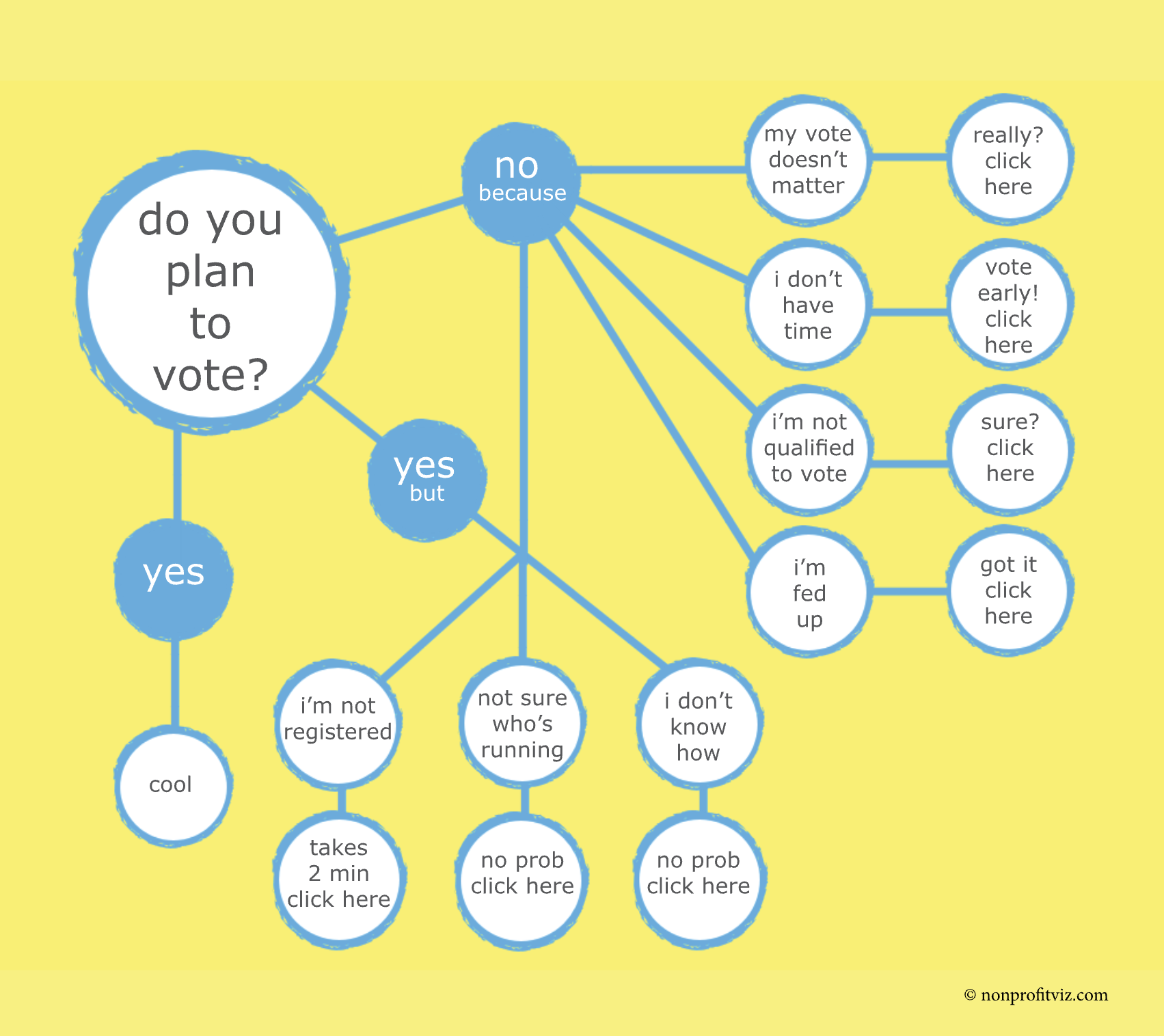
Flowcharts, as I’ve written before, are engaging, easy to digest, and charmingly analog. And what makes them so user-friendly are the leading lines directing our attention from the focal point (in this case: “Do you plan to vote?”) to other elements of the chart.

Source: Christian Felix on Tableau Public

Source: Christian Felix on Tableau Public

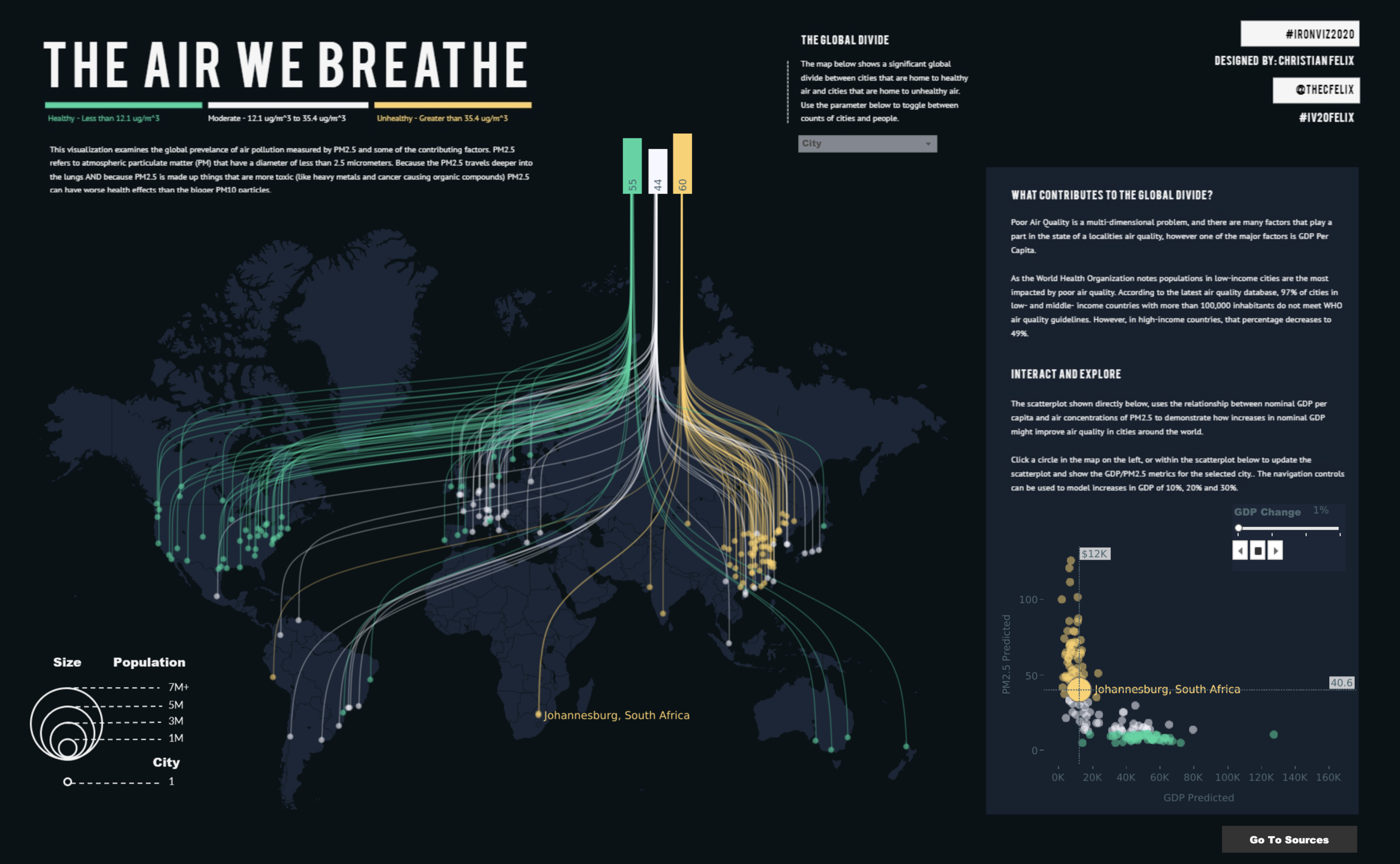
This chart on air quality uses leading lines to relate the bar chart at the top to locations on the world map below.

Source: Pradeep Kumar G on Tableau Public

Source: Pradeep Kumar G on Tableau Public

Leading lines can be used to draw attention to particular data points. In this chart, leading lines are used to direct your focus to foods that have a particularly high and low carbon footprint.

To see past data tips, including those about other composition rules, click HERE.


Let’s talk about YOUR data!

Got the feeling that you and your colleagues would use your data more effectively if you could see it better? Data Viz for Nonprofits (DVN) can help you get the ball rolling with an interactive data dashboard and beautiful charts, maps, and graphs for your next presentation, report, proposal, or webpage. Through a short-term consultation, we can help you to clarify the questions you want to answer and goals you want to track. DVN then visualizes your data to address those questions and track those goals.


10 Rules to Elevate Your Data Viz (Rule #1)

60-SECOND DATA TIP_3.png

Data visualization is like one of those unlikely couples. One partner is outgoing and a great storyteller. The other is introverted and sticks to the facts. To make great charts, maps, and graphs, you need to channel both partners in this odd couple: the artist and the analyst.

So over the next several weeks, I’m going to offer up key rules about composition that artists know and that analysts (and the rest of us) can apply when presenting data. I will focus on ten rules discussed in more detail in this article from Canva. This time it’s about finding your focus.

Composition Rules (#1) by Amelia Kohm

What Does “Find Your Focus” Mean?

Decide what you want your audience to focus on first. To choose a focal point, think about the main message you hope to communicate. You can direct attention to words or data points related to your focal point by placing them in the center of the composition, by coloring them so that they contrast with the background, or by using larger type than used elsewhere in the composition.

How Can I Apply This Rule to Data Viz?

Source: Richard Speigal on Tableau Public

Source: Richard Speigal on Tableau Public

This map uses contrasting color to direct your attention to the focal point: the location of lighthouses in England and Wales. The focal point is also the title, which is in much larger type than the rest of the text. Finally, the color chosen looks like radiating light, further emphasizing the focal point.

Source: Agata Ketterick on Tableau Public

Source: Agata Ketterick on Tableau Public

This map also uses contrasting color to clarify the focal point: locations of extreme snowfall. And it uses color strategically: white=snow. These locations are placed in the center of the image and further emphasized by the bar chart.

Source: Zainab Ayodimeji on Tableau Public

Source: Zainab Ayodimeji on Tableau Public

This simple bar chart uses the title and contrasting colors to ensure that you don’t miss the focal point.

Stay tuned for more composition rules in coming weeks!

To see past data tips, click HERE.


Let’s talk about YOUR data!

Got the feeling that you and your colleagues would use your data more effectively if you could see it better? Data Viz for Nonprofits (DVN) can help you get the ball rolling with an interactive data dashboard and beautiful charts, maps, and graphs for your next presentation, report, proposal, or webpage. Through a short-term consultation, we can help you to clarify the questions you want to answer and goals you want to track. DVN then visualizes your data to address those questions and track those goals.

How Data Viz Can Save Your Thanksgiving

meal.jpg

Well it looks like the gantt chart (tip #87) has become a Thanksgiving tradition here at Data Viz for Nonprofits. Thanksgiving involves many more dishes than you would normally serve in one meal. Even if you are cooking for just those in your household (and I hope you are), logistics are key. So I give you my color-coded gantt chart. I use it every year, and it works like a charm. I took all my recipe data and came up with this chart to make sure I had my timing right. Made it in good old Excel. Nothing fancy, but it did the trick. Feel free to adapt it to your recipes or perhaps your next fundraising event!

Happy Turkey/Tofurky Day.

gantt.jpg

Let’s talk about YOUR data!

Got the feeling that you and your colleagues would use your data more effectively if you could see it better? Data Viz for Nonprofits (DVN) can help you get the ball rolling with an interactive data dashboard and beautiful charts, maps, and graphs for your next presentation, report, proposal, or webpage. Through a short-term consultation, we can help you to clarify the questions you want to answer and goals you want to track. DVN then visualizes your data to address those questions and track those goals.


Why You Should Know About Parallel Coordinates Plots

60-SECOND DATA TIP_3.png

Here is another tip in a series of tips on different chart types. The idea is to fill up your toolbox with an array of charts good for making sense of data. This week, I give you the parallel coordinates plot.

Active Ingredients (What is a parallel coordinates plot?)

Parallel coordinates plots look kind of like the electrical poles and wires along the highway. They are a series of axes (that’s the pole part) connected by various lines (that’s the wire part). Each axis represents a variable that you can measure numerically. Each line represents an individual unit, group, or category. For example, each line might be program that your organization offers. And one axis might be enrollment, another axis drop out rate, and another average rating on participant surveys. You can compare programs by seeing where each line hits each axis.

Uses

Parallel coordinate plots are great when you have a lot of measures and want to compare a bunch of individual units, groups, or categories on those measures. In the example below, each axis represents a different chronic illness and each line represents a state in the U.S. So we can see that the percent of adults with kidney disease is much lower than the percent of adults with arthritis across states. But we can also see where there is variation among states. For example, Oregon has a much larger percent of adults with depression than does Hawaii. The line for Hawaii is highlighted to allow the viewer to compare Hawaii to other states on various chronic illnesses. Note that in this example, each axis uses the same scale (percent of adults) but in some parallel coordinate plots, each axis has a different scale depending on the unit of measure appropriate for each variable.

plot.png

Warnings

The order of the axes will affect how the data is perceived. In the example, I ordered the axes from diseases with relatively low prevalence to those with relatively high prevalence to allow the viewer to easily distinguish diseases in this way.

Parallel coordinate plots can get cluttered fast. You can avoid this by limiting the number of lines or axes or by greying out most of them and highlighting just one or two as in the example above.

Fun Fact

Parallel coordinates plots go way back, to at least the 1880s when Henry Gannett and Fletcher Hewes published one in the Statistical Atlas of the United States. Check out their parallel coordinates plot which shows the ranks of states on a wide range of issues in 1880 including populations density (DC ranked number 1), per capita wealth (California ranked number 1), and literacy rate (Wyoming ranked number 1).

To see past data tips, including those about other chart types, click HERE.


Let’s talk about YOUR data!

Got the feeling that you and your colleagues would use your data more effectively if you could see it better? Data Viz for Nonprofits (DVN) can help you get the ball rolling with an interactive data dashboard and beautiful charts, maps, and graphs for your next presentation, report, proposal, or webpage. Through a short-term consultation, we can help you to clarify the questions you want to answer and goals you want to track. DVN then visualizes your data to address those questions and track those goals.