
Here’s another composition rule that artists know and that analysts can apply when presenting data: direct the eye with leading lines. This is one of ten rules discussed in greater detail in this article from Canva.
What Does “Direct The Eye With Leading Lines” Mean?
The first thing you want your audience to see is the focal point. Leading lines are like signposts which tell the viewer where to go after the focal point. They can be lines, arrows, or other shapes which guide viewers’ eyes in a certain direction.
How Can I Apply This Rule to Data Viz?
Source: Data Viz for Nonprofits
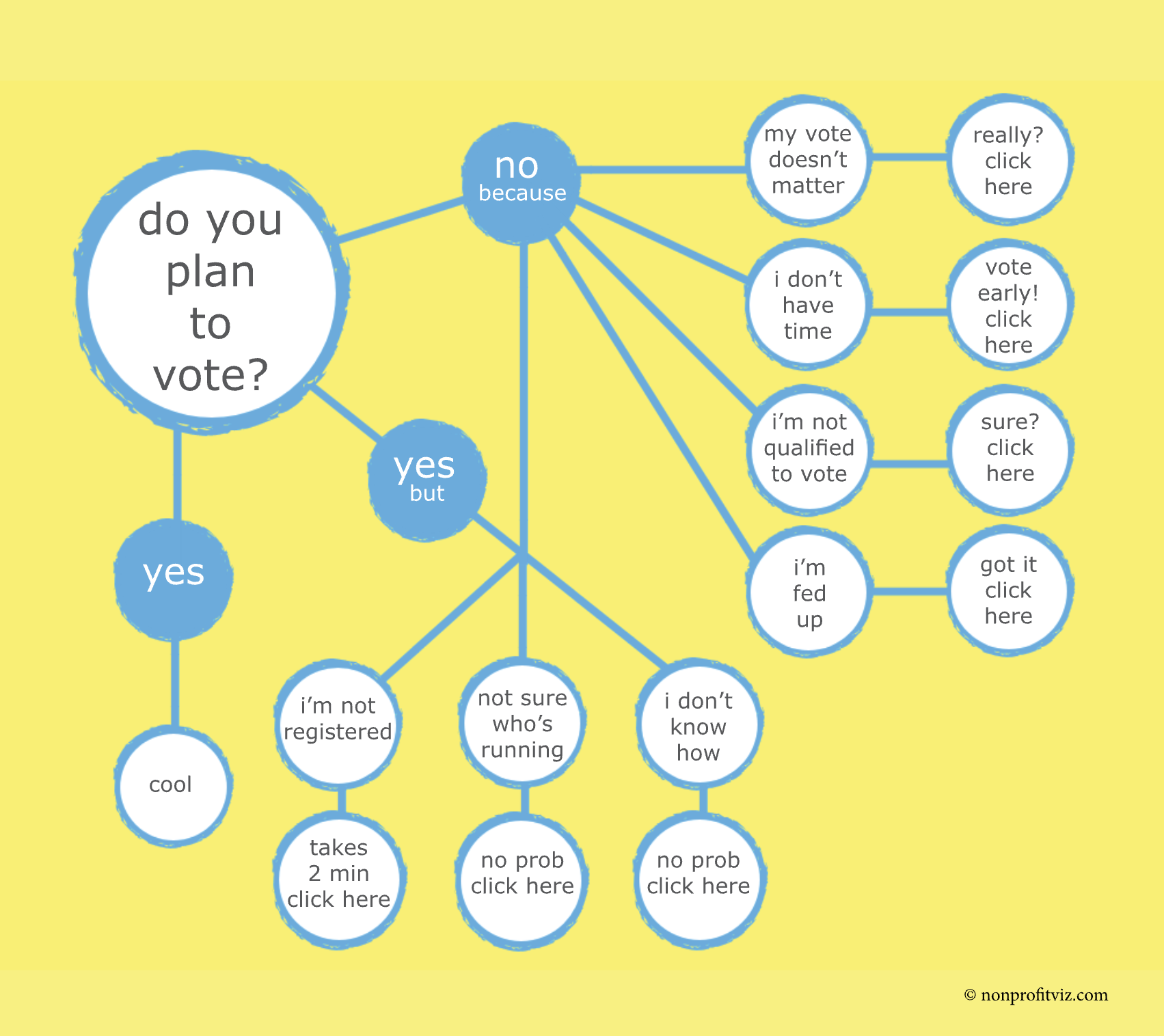
Flowcharts, as I’ve written before, are engaging, easy to digest, and charmingly analog. And what makes them so user-friendly are the leading lines directing our attention from the focal point (in this case: “Do you plan to vote?”) to other elements of the chart.

Source: Christian Felix on Tableau Public
This chart on air quality uses leading lines to relate the bar chart at the top to locations on the world map below.

Source: Pradeep Kumar G on Tableau Public
Leading lines can be used to draw attention to particular data points. In this chart, leading lines are used to direct your focus to foods that have a particularly high and low carbon footprint.
To see past data tips, including those about other composition rules, click HERE.
Let’s talk about YOUR data!
Got the feeling that you and your colleagues would use your data more effectively if you could see it better? Data Viz for Nonprofits (DVN) can help you get the ball rolling with an interactive data dashboard and beautiful charts, maps, and graphs for your next presentation, report, proposal, or webpage. Through a short-term consultation, we can help you to clarify the questions you want to answer and goals you want to track. DVN then visualizes your data to address those questions and track those goals.


