Using complementing elements is one of ten composition rules discussed in greater detail in this article from Canva. And it applies as much to data viz as to any other type of composition. Read on for the 60-second version of this rule.
What Does “Use Complementing Elements” Mean?
Graphic design artists choose images that look good together. Data visualizers should do the same by making sure that charts, maps, and graphs which are presented together complement each other visually,
How Can I Apply This Rule to Data Viz?
Use the same color palette in each chart. And remember that the meaning of a color should be the same in side-by-side charts. You should not use a dark blue to signify participants aged 20-40 in one chart and to signify those living in a particular zip code area in an adjacent chart.
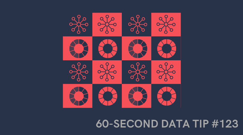
Use the same chart type for each chart. Part of the beauty of the small multiple chart is that the elements of the composition complement each other due to their similarity. Please see example below.
Use consistent type in each chart. You wouldn’t use different fonts or font sizes in side-by-side charts, would you? Yes? Well, then this tip is for you.
Use similar marks and channels in each chart. Data visualizations represent data using “marks” such as bars, lines, and circles. A mark represents data through “channels” which include its position, shape, size, or color. A larger circle, for example, can mean a greater number of something than a smaller circle. Charts that use similar marks and channels have similar looks and thus tend to complement each other visually.
Let’s look at some examples.
This dashboard repeats colors, charts, and marks and so, although a lot of different data is presented, the overall look is unified because the elements complement each other.

Source: Alex Dixon and Tarannum Ansari on Tableau Public
The repetition of chart types in small multiples charts, like this one, makes for a cohesive overall design.

Source: Christian Felix on Tableau Public
And here again, the designer repeats visual elements such as text boxes and chart types to bring the different aspects of the composition together.

Source: Chantilly Jaggernauth on Tableau Public
To see past data tips, including those about other composition rules, click HERE.
Let’s talk about YOUR data!
Got the feeling that you and your colleagues would use your data more effectively if you could see it better? Data Viz for Nonprofits (DVN) can help you get the ball rolling with an interactive data dashboard and beautiful charts, maps, and graphs for your next presentation, report, proposal, or webpage. Through a short-term consultation, we can help you to clarify the questions you want to answer and goals you want to track. DVN then visualizes your data to address those questions and track those goals.


