This week’s quick tip is to check out Ann Emery’s excellent course on extracting the full power of Excel. If you register using the link below, you'll ALSO get bonus content from guest experts including me! The additional 50 lessons come from a team of more than a dozen guest experts about Tableau, R, one-pagers, UX, PowerPoint, photographs, report covers, tables, and more.
Learn more and register HERE by September 17, 2021.
What’s Included:
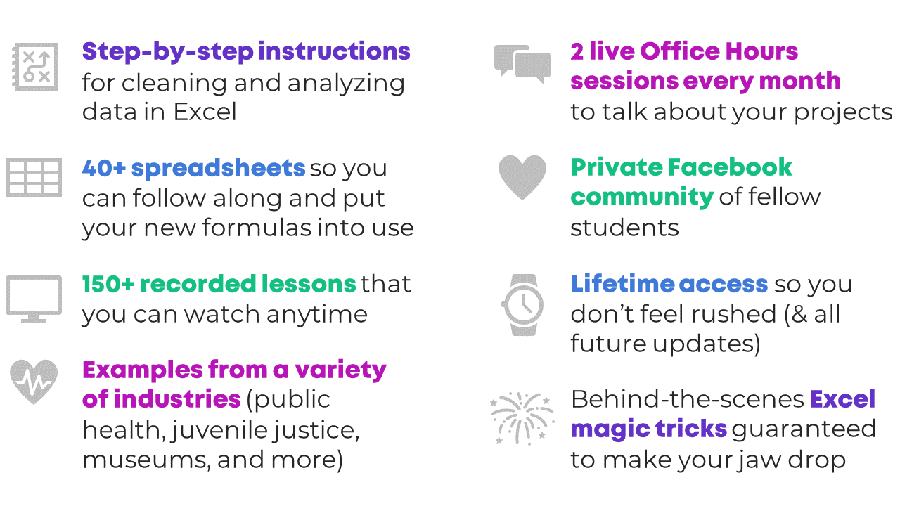
180+ video lessons that you can watch anytime
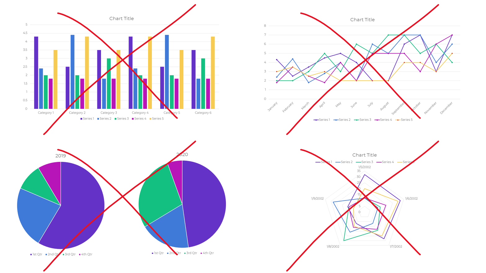
Step-by-step instructions for making beginner, intermediate, and advanced graphs in Excel
20+ templates to download and follow along
Office Hours (almost) every week in 2020 and 2021 to talk about your projects
7 additional Live Trainings just for participants in this cohort
Discussion boards to interact with fellow dataviz enthusiasts
Private Data Vizards community of fellow participants
Weekly emails to cheer you on
Lifetime access so you don't feel rushed
Examples from a variety of industries (public health, juvenile justice, museums, and more)
Behind-the-scenes Excel magic tricks guaranteed to make your jaw drop
Early bird bonuses like 1:1 consultations and Swag Bags
Commodo cursus magna, vel scelerisque nisl consectetur et. Donec id elit non mi porta gravida at eget metus.
Lorem ipsum dolor sit amet, consectetur adipiscing elit. Vestibulum id ligula porta felis euismod semper.
Quisque iaculis facilisis lacinia. Mauris euismod pellentesque tellus sit amet mollis.
Sed purus sem, scelerisque ac rhoncus eget, porttitor nec odio. Lorem ipsum dolor sit amet.
Vivamus pellentesque vitae neque at vestibulum. Donec efficitur mollis dui vel pharetra.
Praesent id libero id metus varius consectetur ac eget diam. Nulla felis nunc, consequat laoreet lacus id.
Donec id justo non metus auctor commodo ut quis enim. Mauris fringilla dolor vel condimentum imperdiet.
Commodo cursus magna, vel scelerisque nisl consectetur et. Donec id elit non mi porta gravida at eget metus.
Lorem ipsum dolor sit amet, consectetur adipiscing elit. Vestibulum id ligula porta felis euismod semper.


Donec id justo non metus auctor commodo ut quis enim. Mauris fringilla dolor vel condimentum imperdiet.