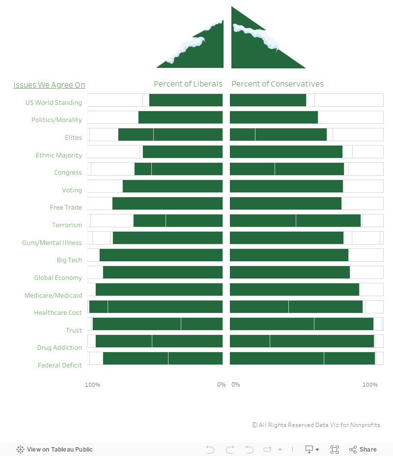
Data source: Pew Research Center, 2020

Data source: Pew Research Center, 2020

Here’s yet another in a series of tips on different chart types. The idea is to fill up your toolbox for making sense of data. This week, I give you the box plot.
Active Ingredients (What is a box plot?)
Like a histogram, a box plot shows how spread out your data points are. The box plot below shows the affordability of housing in neighborhoods in ten cities. Each red circle represents a zip code area. The gray boxes show where 50 percent of the zip code areas fall on the affordability scale (larger numbers mean more affordable, smaller ones mean less affordable). And the median (or middle number) is where the dark gray meets the light gray.

Box plots also show a lot of other information (see image below). Some call this type of chart “a box and whisker plot” because the lines extending from the boxes are known as the “whiskers.”
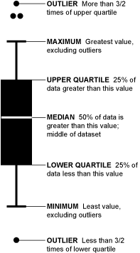
Source: Flowing Data
Uses
A box plot provides a detailed snapshot of your data. No data points are hidden or obscured by summarizing numbers such as averaging them. For example, Houston and Chicago have the same average affordability score (.13) but we can see at a glance that although they are similarly affordable cities, Houston has a wider range of affordability. And, we can see that although New York is, in general, more affordable than Los Angeles, New York has some zip code areas that are much less affordable than the median seems to suggest. There are also some extreme outliers including the circle at -1.0 affordability which is New York City's 10013 zip code area (Soho and Tribeca).
Warnings
Not everyone (or every application) draws a box plot the same. For example, sometimes the whiskers extend to the minimum and maximum values and others place outliers beyond the lines. However most box plots include the median, upper quartile and lower quartile.
Fun Fact
Mary Eleanor Spear invented what she called a “range bar” in the 1950s. It would later be known as the box plot.
To see past data tips, including those about other chart types, click HERE.
Got the feeling that you and your colleagues would use your data more effectively if you could see it better? Data Viz for Nonprofits (DVN) can help you get the ball rolling with an interactive data dashboard and beautiful charts, maps, and graphs for your next presentation, report, proposal, or webpage. Through a short-term consultation, we can help you to clarify the questions you want to answer and goals you want to track. DVN then visualizes your data to address those questions and track those goals.
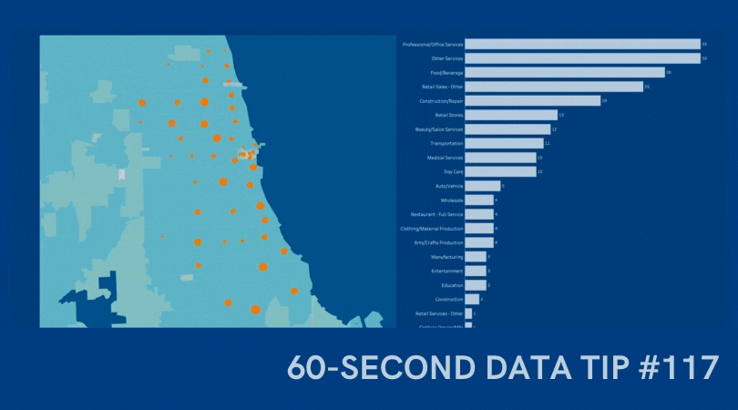
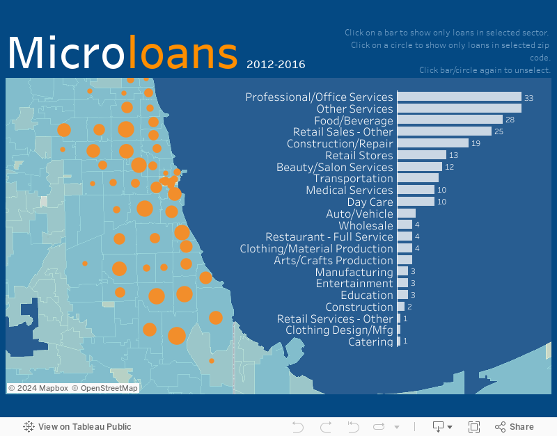
An interactive map is a great way to show donors, board members, prospective funders and other stakeholders whom you serve, including their age, location, income, and other characteristics. I’m doing a webinar on December 10, 2020 where I will teach you how to create an interactive map dashboard, like the one below, in less than an hour using Tableau Public, the free version of Tableau, a powerful data visualization tool. You can create a map dashboard with a simple Excel file, as long as it includes geographic data, such as zip codes. And you can embed the dashboard on your website, as I’ve done here. Play around with the dashboard below to explore the possibilities. And click HERE to register for the webinar.
Got the feeling that you and your colleagues would use your data more effectively if you could see it better? Data Viz for Nonprofits (DVN) can help you get the ball rolling with an interactive data dashboard and beautiful charts, maps, and graphs for your next presentation, report, proposal, or webpage. Through a short-term consultation, we can help you to clarify the questions you want to answer and goals you want to track. DVN then visualizes your data to address those questions and track those goals.

Well it looks like the gantt chart (tip #87) has become a Thanksgiving tradition here at Data Viz for Nonprofits. Thanksgiving involves many more dishes than you would normally serve in one meal. Even if you are cooking for just those in your household (and I hope you are), logistics are key. So I give you my color-coded gantt chart. I use it every year, and it works like a charm. I took all my recipe data and came up with this chart to make sure I had my timing right. Made it in good old Excel. Nothing fancy, but it did the trick. Feel free to adapt it to your recipes or perhaps your next fundraising event!
Happy Turkey/Tofurky Day.

Got the feeling that you and your colleagues would use your data more effectively if you could see it better? Data Viz for Nonprofits (DVN) can help you get the ball rolling with an interactive data dashboard and beautiful charts, maps, and graphs for your next presentation, report, proposal, or webpage. Through a short-term consultation, we can help you to clarify the questions you want to answer and goals you want to track. DVN then visualizes your data to address those questions and track those goals.

Data visualizations can provide something that photos and case studies—for all of their visceral appeal—cannot. Context. Charts, maps, and graphs give us the critical context that we cannot see in a photo or in a story about one person, such as how prevalent a problem is, where it is occurring, or the impact of a program over time.
Data visualizations, of course, also have a downside. A chart, map, or graph is an abstraction that aggregates the stories of many individuals. And, as Joshua Smith points out: “It’s really hard to tell a powerful story in aggregate when all of the humans and all of their lives and moments and emotions are plotted under a single data point, often represented through a behavioral variable, e.g. “sales”, or “likes”. In aggregate, we lose all the parts and pieces that make characters relatable and memorable.”
So can we have the best of both worlds? Can we put photos and other information about real people into data visualizations? Yes! Consider one of these strategies.
Follow Individuals Through The Data
The idea is to explain an issue, a problem, or a situation through the stories of select individuals. Ludovic Tavernier explains the the situation of Somali refugees through the stories of two Somali women. Ayaan and Shamshi, in a series of visualizations entitled Two Years Late. Tavernier labels particular data points to show where Ayaan and Shamshi fit into the larger picture.

Source: Ludovic Tavernier (on Tablea Public)
Dot = Person
Another approach is to make each mark (e.g. dot, square, bar) represent an actual person and allow the viewer to scroll over marks to learn more about these individuals. This is Eve Thomas’ strategy in Stop and Search which shows the disproportionate rate at which Black people are stopped and searched in London.

Source: Eve Thomas (on Tableau Public)
Here’s another example from JR Copreros in which each dot represents a real person who was convicted of a crime and later exonerated.

Source: JR Copreros (on Tableau Public)
Show Both The Forest and The Trees
Perhaps the simplest strategy is to include both aggregated data (the forest) and disaggregated data (the trees) in the same visualization. The chart below shows the number of absences for both individual students and the average number of absences across all students.

Filter Charts By Individuals
Another way to zoom in on particular trees is to include a filter that allows you to show results for just one person. This visualization by David Borczuk allows you to choose just one woman in Madagascar who suffered from obstetric fistula, a medical condition in which a hole develops in the birth canal as a result of childbirth.

Source: David Borczuk (on Tableau Public)
On the lighter side, you can click on any character in Glee to learn more about that character in various charts in this data dashboard by Jennifer Dawes.
To see past data tips, click HERE.
Got the feeling that you and your colleagues would use your data more effectively if you could see it better? Data Viz for Nonprofits (DVN) can help you get the ball rolling with an interactive data dashboard and beautiful charts, maps, and graphs for your next presentation, report, proposal, or webpage. Through a short-term consultation, we can help you to clarify the questions you want to answer and goals you want to track. DVN then visualizes your data to address those questions and track those goals.
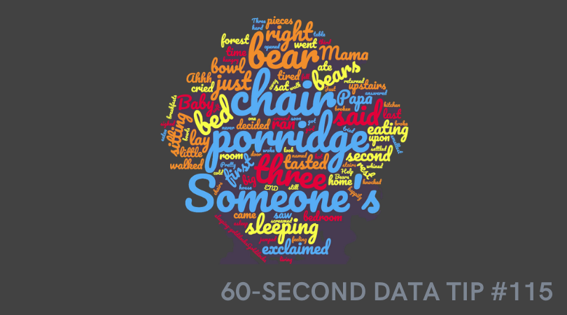
This tip is a warning. In other tips, I have encouraged you to use a particular type of chart for specific purposes. But in this tip, I’ll suggest that you NEVER use this chart under ANY circumstance. I’m not alone is my aversion to word clouds. Plenty of others, including Jacob Harris, a senior software architect at The New York Times, have articulated their distaste. This tip is basically the 60-second version of Harris’ 2011 article on the topic.
Active Ingredients (What is a word cloud?)
A word cloud shows how many times various words in a document are used. More common words are larger. Less common ones are smaller. The varying sized words are arranged “into some vaguely artistic arrangement,” as Harris puts it.
Uses
There are no good uses of the word cloud. As its name suggests, it clouds meaning rather than clarifies it. I created the word cloud above using one of the many online word cloud generators. It shows the frequency of various words in “Goldilocks and the Three Bears.” Does it provide any insight into the story for you?
Sometimes organizations create word clouds not to convey insight but because they want a graphic on a topic and can’t think of what else to use. But photos or illustrations of almost anything are almost always going to be more engaging than a bunch of words floating around in a cloud.
Warnings
The number of times a word is used tells us nothing about the meaning of the text. Different words can have the same meaning and, conversely, the same word can have different meanings in different contexts. To get to meaning, you need to look at the frequency of concepts or themes, not words.
Word clouds aren’t the best tool even when the point is to analyze word usage. Check out the series of simple bar charts below. They provide more insight than any word cloud could because they allow us to easily discern the most/least popular words.

Source: NOW1051
(Sort of) Fun Fact
The word cloud technique originated online in the 1990s when they were called “tag clouds” and were use to show the popularity of keywords in bookmarks.
To see past data tips, including those about other chart types, click HERE.
Got the feeling that you and your colleagues would use your data more effectively if you could see it better? Data Viz for Nonprofits (DVN) can help you get the ball rolling with an interactive data dashboard and beautiful charts, maps, and graphs for your next presentation, report, proposal, or webpage. Through a short-term consultation, we can help you to clarify the questions you want to answer and goals you want to track. DVN then visualizes your data to address those questions and track those goals.

A wide range of election maps are in your immediate future. What you learn from those maps depends, in part, on how they are designed. Indeed, election maps and other types of maps can change our attitudes toward issues. In this 15-second tip, I recommend that you invest an additional couple of minutes watching The New York Times’ excellent slide show on how election maps can fool you. It will help you to be both a better consumer and designer of maps.
To see past data tips, including those about other chart types, click HERE.

Another week, another useful chart to consider. This week, I give you the stacked area graph.
Active Ingredients (What is a stacked area graph?)
The stacked area graph is a variation of the area graph, which is simply a line graph with the area below the line filled in with color. In a stacked area chart, there’s more than one variable, so more than one line and shaded area. Additionally, these areas are stacked, one on top of the other.
Uses
Use this type of graph to compare the proportion of data units (people, groups, places, things, etc.) in different categories over time. This example from the Urban Institute does a great job of showing the relatively long sentences of those convicted of violent crime compared to the sentences of those convicted of other offenses. When this cohort of inmates entered prison in 2000, those convicted of violent crimes made up just 30 percent of the entire group. But 14 years later, they represented more than 80 percent of those still incarcerated.
2000 Entry Cohort by Offense Type

Source: The Urban Institute
Warnings
It can be difficult to discern exactly how many (or what percent of) data units each band of color represents. The lowest band is clear. But you have to do some math to determine the other bands. For example, in the chart above, I have to subtract 30 percent from about 58 percent to determine the percent of inmates in 2000 convicted of property crimes (the yellow band). The line graph below does a better job of showing what percent of the overall cohort each offense group represented over time. So only use a stacked area graph when you want viewers to focus mainly on the proportion of data units in each group over time.

Fun Fact
A cool variant of the stacked area graph is the streamgraph in which the bands are placed around a central axis rather than stacked on top of an axis. The New York Times’s streamgraph on movie box office revenues helped to make streamgraphs popular.
To see past data tips, including those about other chart types, click HERE.
Got the feeling that you and your colleagues would use your data more effectively if you could see it better? Data Viz for Nonprofits (DVN) can help you get the ball rolling with an interactive data dashboard and beautiful charts, maps, and graphs for your next presentation, report, proposal, or webpage. Through a short-term consultation, we can help you to clarify the questions you want to answer and goals you want to track. DVN then visualizes your data to address those questions and track those goals.
This week, I give you yet another useful-if-done-right chart, the Venn diagram.
Active Ingredients (What is a Venn Diagram?)
ICYMI, a Venn diagram shows overlapping categories or sets usually represented by circles.
Uses
These diagrams are great for showing the degree to which categories or sets overlap and what elements fall inside/outside of each set and each overlapping portion. The take home message is usually the shaded area where all of the circles intersect. So make that area easy to locate using color and labels. This example shows how an organization bridges the gap among three different types of organizations working on foreign policy.
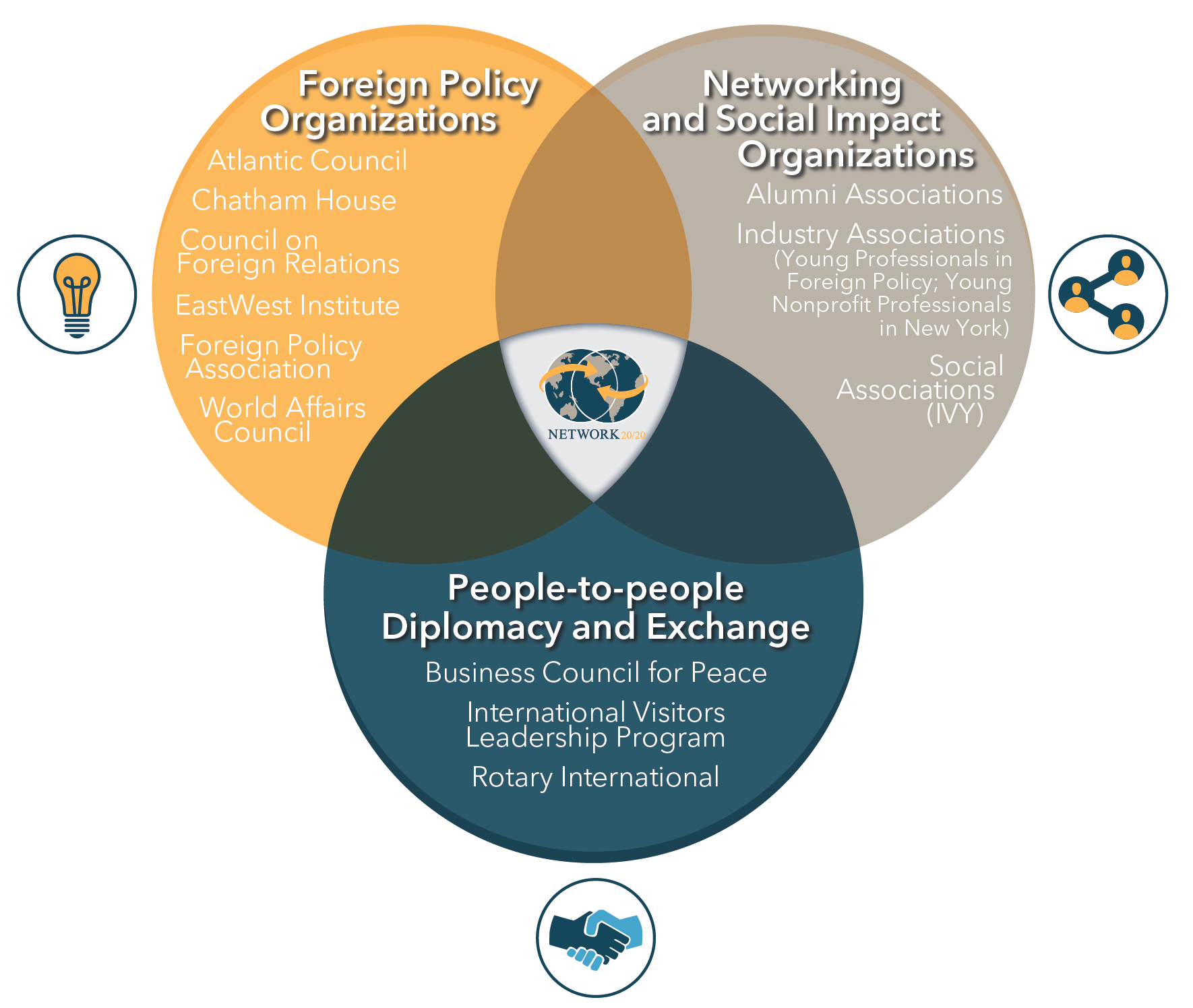
Source: Network 20/20
Warnings
For me, Venn-diagram-fatigue sets in early. I get tired of discerning the meaning of each overlapping area pretty quickly. So I’d suggest limiting the number of circles. And, more importantly, clearly labeling the sets.
Here’s one that I gave up on after about 15 seconds:

Source: @DanNeidle
On the other hand, this Venn diagram works even with four sets because the sets (orphaned, wealthy, sidekick, and masked) are clearly marked and the intersection labels are simple.

Source: gliffy.com
Fun Fact
English mathematician John Venn is credited with inventing the Venn diagram in the 1860s, and, according to Phil Plait, there are two kinds of people in the world . . .

Source: DiscoverMagazine.com
To see past data tips, including those about other chart types, click HERE.
Got the feeling that you and your colleagues would use your data more effectively if you could see it better? Data Viz for Nonprofits (DVN) can help you get the ball rolling with an interactive data dashboard and beautiful charts, maps, and graphs for your next presentation, report, proposal, or webpage. Through a short-term consultation, we can help you to clarify the questions you want to answer and goals you want to track. DVN then visualizes your data to address those questions and track those goals.

Here is another tip in a series of tips on different chart types. The idea is to fill up your toolbox with an array of charts good for making sense of data. This week, I give you the parallel coordinates plot.
Active Ingredients (What is a parallel coordinates plot?)
Parallel coordinates plots look kind of like the electrical poles and wires along the highway. They are a series of axes (that’s the pole part) connected by various lines (that’s the wire part). Each axis represents a variable that you can measure numerically. Each line represents an individual unit, group, or category. For example, each line might be program that your organization offers. And one axis might be enrollment, another axis drop out rate, and another average rating on participant surveys. You can compare programs by seeing where each line hits each axis.
Uses
Parallel coordinate plots are great when you have a lot of measures and want to compare a bunch of individual units, groups, or categories on those measures. In the example below, each axis represents a different chronic illness and each line represents a state in the U.S. So we can see that the percent of adults with kidney disease is much lower than the percent of adults with arthritis across states. But we can also see where there is variation among states. For example, Oregon has a much larger percent of adults with depression than does Hawaii. The line for Hawaii is highlighted to allow the viewer to compare Hawaii to other states on various chronic illnesses. Note that in this example, each axis uses the same scale (percent of adults) but in some parallel coordinate plots, each axis has a different scale depending on the unit of measure appropriate for each variable.

Warnings
The order of the axes will affect how the data is perceived. In the example, I ordered the axes from diseases with relatively low prevalence to those with relatively high prevalence to allow the viewer to easily distinguish diseases in this way.
Parallel coordinate plots can get cluttered fast. You can avoid this by limiting the number of lines or axes or by greying out most of them and highlighting just one or two as in the example above.
Fun Fact
Parallel coordinates plots go way back, to at least the 1880s when Henry Gannett and Fletcher Hewes published one in the Statistical Atlas of the United States. Check out their parallel coordinates plot which shows the ranks of states on a wide range of issues in 1880 including populations density (DC ranked number 1), per capita wealth (California ranked number 1), and literacy rate (Wyoming ranked number 1).
To see past data tips, including those about other chart types, click HERE.
Got the feeling that you and your colleagues would use your data more effectively if you could see it better? Data Viz for Nonprofits (DVN) can help you get the ball rolling with an interactive data dashboard and beautiful charts, maps, and graphs for your next presentation, report, proposal, or webpage. Through a short-term consultation, we can help you to clarify the questions you want to answer and goals you want to track. DVN then visualizes your data to address those questions and track those goals.

I’d like to introduce you to yet another chart type. The idea is to fill up your toolbox for making sense of data. This week, I give you the dot matrix chart.
Active Ingredients (What is a dot matrix chart?)
Dot matrix charts show us data units as dots (or squares). A single data unit could be a person, a group of people, a building, a program, or any other thing that you are counting. Each dot is colored to show which category or group the data unit falls into.
Uses
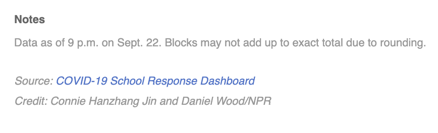
Dot matrix charts are simple yet mighty. They give a quick overview of the relative size of different categories and how the parts relate to the whole. I was reminded of the power of dot matrices recently when reading about the COVID-19 School Response Dashboard in an article on the National Public Radio (NPR) website. The dashboard shows data drawn from reports from K-12 schools on their confirmed and suspected coronavirus cases, along with the safety strategies they're using.
If you check out the dashboard, you see these charts showing the percent of schools reporting cases among students and staff. Take a look at the Y-axis. It ranges from 0% to 1%. This allows you to see small differences between the charts on the left (confirmed and suspected cases) and the charts on the right (only confirmed cases). But it has a big disadvantage. It doesn’t give you a visual sense of just how few students and staff have, or may have, been infected based on data that schools have. (Note: A big unknown is the number of asymptomatic/untested students or staff. Rates might be higher if more students and staff were tested.)

NPR recast this same data in a dot matrix chart (below) with each square representing 50 people.* And the first thing you comprehend is that the vast majority of staff and students at the reporting schools have not been infected (again according to information that schools have). Without much more effort, you see that there are more suspected than confirmed cases. No need to inspect the Y-axis or subtract percent of confirmed cases from the percent of confirmed and suspected cases.


Source: National Public Radio
Warnings
All those dots or squares require a good bit of page or screen real estate. Sure, one circle or square can represent more than one person or other data unit. But at some point, a bar chart might make more sense. Dot matrix charts work best when there are just a few categories and the aim is to communicate one or two simple messages.
Fun Fact
Dots or squares need not be displayed in rectangular form. This Policy Viz chart arrays the dots in a semi-circle to show the distribution of U.S. House members in different political parties. Gray dots represent empty seats. You can learn how to create a chart like this one using Excel HERE.

Source: PolicyViz
To see past data tips, including those about other chart types, click HERE.
Got the feeling that you and your colleagues would use your data more effectively if you could see it better? Data Viz for Nonprofits (DVN) can help you get the ball rolling with an interactive data dashboard and beautiful charts, maps, and graphs for your next presentation, report, proposal, or webpage. Through a short-term consultation, we can help you to clarify the questions you want to answer and goals you want to track. DVN then visualizes your data to address those questions and track those goals.

Here’s one more in a series of tips on different chart types. The idea is to fill up your toolbox for making sense of data. This week, I give you the Sankey diagram.
Active Ingredients (What is a Sankey diagram?)
Sankey diagrams use arrows or lines to show flow to and from stages in a process. The wider the arrow or line, the larger the quantity of flow. The arrows or lines may be colored to represent different categories or to show the transition from one stage to another.
Uses
Organizations are full of processes. Sankey diagrams help you to understand the flow of people, money, energy, or other things through a process. The example below shows the flow of undergraduate engineering students at the University of Pennsylvania from their summer internships and jobs to their employment and other experiences post graduation. We can see, for example, that most students who were in technology and financial services post graduation also were in those areas during their junior summer. However, students who started graduate school after graduation from college had a wider variety of experiences during the prior summer.

Source: The Signal
Warnings
Creating a Sankey diagram can be a challenge. You can’t highlight a data table and click “Sankey Diagram” in Excel. There are some programs designed specifically to create Sankey diagrams and others that will create a Sankey diagram with some hacking. Here is a great summary of software options.
Fun Facts
You may have seen Charles Minard's map of Napoleon's Russian Campaign of 1812 which shows dwindling troops across time and space (see image below). It’s a sort of Sankey diagram on top of a map and was created in 1869. However, the chart was named for Matthew Henry Phineas Riall Sankey, an Irish captain who created a chart in 1898 to show the energy efficiency of a steam engine.

Source: Wikimedia
To see past data tips, including those about other chart types, click HERE.
Got the feeling that you and your colleagues would use your data more effectively if you could see it better? Data Viz for Nonprofits (DVN) can help you get the ball rolling with an interactive data dashboard and beautiful charts, maps, and graphs for your next presentation, report, proposal, or webpage. Through a short-term consultation, we can help you to clarify the questions you want to answer and goals you want to track. DVN then visualizes your data to address those questions and track those goals.

Data visualizations are kind of like beards or kale. They used to be decidedly uncool, but are now hip, at least in certain circles. Yet, even with the rising popularity of charts, maps, and graphs, I think many of us have a faint feeling of aversion when encountering them. For one, they may be hard to decipher. But there’s another problem too. They often are the bearers of bad news. They show us how widespread a problem is or how it’s increasing. Worse, they rarely give us any hope of improvement.
Wouldn’t charts, maps, and graphs be more engaging and helpful if they showed both problems AND solutions? Let’s talk about how to get that done.
Show the difference between how things play out with and without an intervention or program. The now-famous flatten the curve graph (shown below) did this without any real data. The point was just to show how the number of cases would likely differ with and without public health measures to slow the spread of COVID.

Source: C.T. Bergstrom
Here’s a graph that shows two scenarios with real data. The data point labels are particularly helpful in this example. By comparing two different cities, the graph suggests that a delay in the start of social distancing interventions may have a huge effect on the severity of an outbreak.

Source: Washington Post
Another way to present a problem along with a solution is to show how a trend alters following an intervention. This graph shows projected data for several types of interventions: the current policy, alternative policies, and the absence of policies. In the absence of policies, global warming is expected to reach 4.1°C – 4.8°C above pre-industrial levels by the end of the century. Current policies are projected to result in about a 3.0° rise over pre-industrial levels. Other pledges and targets that governments have made would limit warming to even lower amounts.

Source: Climate Action Tracker
This one effectively uses bubble size and color to show a trend alteration following the introduction of the measles vaccine.

Source: Sciencemag.org
On the uncool-to-very-cool spectrum, data visualizations that show both problems and solutions are very cool. To see what other things are cool/uncool check out CoolnessGraphed.com.
To see past data tips, including those about other chart types, click HERE.
Got the feeling that you and your colleagues would use your data more effectively if you could see it better? Data Viz for Nonprofits (DVN) can help you get the ball rolling with an interactive data dashboard and beautiful charts, maps, and graphs for your next presentation, report, proposal, or webpage. Through a short-term consultation, we can help you to clarify the questions you want to answer and goals you want to track. DVN then visualizes your data to address those questions and track those goals.

You already know about BANs even if you don’t think you do. They are Big Ass Numbers meant to catch your attention. You see them everywhere these days, featured in bold fonts on websites, brochures, and reports; sprinkled throughout PowerPoint presentations; and arrayed as KPIs* in data dashboards.
BANs are having a moment. And they can be powerful. But watch out for overdoing it. When lots of BANs crowd a single display, they steal each other’s limelight and bewilder the audience. Anyone who gives a BAN a moment’s thought might wonder: “Wow, 5,000 meals sounds like a lot, but what is the need? What do similar organizations provide?”
So use BANs sparingly and give them space so they can shine. Also, provide context when possible: “5,000 meals served and no one turned away.”
Steve Wexler also advises using one or two BANs when they provide a good overall summary of a lot of data and when they clarify and provide context for subsequent charts, maps, and graphs.
And for some great ways to design BANs, check out Adam McCann’s 20 Ways to Visualize KPIs.
See other data tips in this series for more information on how to effectively visualize and make good use of your organization's data.
*key performance indicators

If the internet is a street, and websites are storefronts, then homepages are the window displays. Effective displays give you the gist of the organization and lure you in. When I stroll down nonprofit lane, I rarely see displays featuring data visualizations (aka data viz) like charts, maps, and graphs. That makes sense, right? Data viz lacks the visceral appeal of photos. Images of a child receiving medical care, a homeless adult eating a meal, or a home being rebuilt after a hurricane are more compelling than a chart.
I get that. But there’s a missed opportunity here. Prominently-displayed, well-designed data viz provides something that photos cannot. Context. Charts, maps, and graphs can quickly show website visitors the critical context that they cannot see in a photo, such as how prevalent a problem is, where it is occurring, or the impact of a program over time.
Recently, I did a little review of the 12 sites that won a Web Award in 2019 for best in industry or outstanding website in the nonprofit category. I expected that these sites would be better than most when it came to featuring data viz. I gave myself three minutes to review each site. And I awarded 2 points for data viz on their homepage, 2 points for data viz on their work/impact page,* and 1 point for data viz on any other page that I could visit in the balance of my three-minute tour. My definition of data viz was not strict. I counted any display of data not described in text or presented in a table. BANs (Big Ass Numbers), timelines, and flowcharts counted. (See the results in the chart below.)
The data viz situation in these sites was even worse than I expected. I found:
Only two of the twelve sites had data viz on their homepages.
Five of the sites had no data viz that could be found in three minutes.
The vizes I found were: 3 BANs, 2 maps, 1 timeline, and 1 flowchart, none of which provided a wealth of insight.

To make your website stand out, even among award-winning sites, consider prominently displaying a variety of data visualizations (not just BANs). Visualizations can provide the necessary context to bring both problems and solutions into greater focus.
One last thing before we go. I give the best-content-not-related-to-data-viz award to the website called “Get In Touch With Your Testes With Nad & Tad.” See Grab Your Balls And Check Out These Videos on the homepage. It’s a must-see.
To see past data tips, including those about other chart types, click HERE.
*Work/impact page: any page on menu bar describing their work and/or impact
Got the feeling that you and your colleagues would use your data more effectively if you could see it better? Data Viz for Nonprofits (DVN) can help you get the ball rolling with an interactive data dashboard and beautiful charts, maps, and graphs for your next presentation, report, proposal, or webpage. Through a short-term consultation, we can help you to clarify the questions you want to answer and goals you want to track. DVN then visualizes your data to address those questions and track those goals.

I’ve said it before. It’s not enough to present data clearly and beautifully. If we want the brains of our staff members, board members, policymakers, donors, and clients to absorb data AND use it for decision-making, we have to present it in brain-friendly ways. And brain-friendly means avoiding common brain glitches. I’ve talked about how our brains glitch when dealing with small numbers.
The pandemic has brought to the fore another known issue with our brains. They glitch when confronted with exponential growth. And, as a result, we make the wrong decisions. The good news is that we can learn from this problem. And this learning can benefit our causes and organizations well past the pandemic. Let me walk you through this in the remaining 50 seconds.
We default to LINEAR not EXPONENTIAL growth. Linear growth means that something is growing by the same amount at each time step. Your hair, for example, grows about a half inch each month. Exponential growth is different. It means that something is growing in proportion to its current value, such as doubling at each time step.
Here’s a common example that reveals the glitch: Would you prefer to receive:
$1,000 a day for the next 30 days or
1 cent on the first day, 2 cents on the second day, 4 cents on the third day, 8 cents on the fourth day and so on for 30 days?
Given a short time to consider, most folks choose option 1 in which the linear growth results in $30,000. But in option 2, the exponential growth results in over $5 million!
Most of us have heard that COVID grows at an exponential rate. And we probably understand what that means: if one person infects two others and then each of those people infect two others, the number of infections is doubling at each time step. But we fail to appreciate the impact of exponential growth and thus fail to choose the wisest actions when faced with an exponential growth problem or opportunity. For example, there is evidence that those who underestimate the effect of exponential growth on the spread of the virus are less likely to take precautions like social distancing and wearing masks.
We can (sometimes) overcome the glitch with a nudge. There is also evidence that simple nudges can help people to better estimate the impact of exponential growth. Nudges can include showing raw numbers instead of graphs or reminding people that the number of cases doubles at each step rather than grows at a constant rate or asking people to do the math to more clearly see the effect of doubling. It’s important to note, however, that there is also research suggesting that our brains can be pretty resistant corrections.
What does this mean for your organization? Exponential growth crops up in regular, non-pandemic life more often than you’d think. If your organization is dealing with issues as diverse as food spoilage, human population growth, invasive species, forest fires, or cancer, then you need a way to effectively communicate exponential growth. To deal with this glitch you can:
Turn to the research. Look for studies that tested ways to correct glitches and then apply the effective ones to your work.
Test your data presentations before they go live. It may sound simple, but it’s a step few of us take. Identify a few people with a similar level of expertise in the subject matter and data as those in your target audience. Then ask them what they think the data in your presentation shows. Perhaps show them a few versions of the same data in different types of charts or tables and see which ones are easiest to process quickly and accurately. But don’t stop there. Ask what actions they might consider based on their interpretations. Then use their responses to revise and test again.
Ask rather than tell. You can engage your stakeholders while also nudging them toward greater understanding. Ask them how soon they think a particular problem will grow to a particular size if left unchecked. If their answer is off the mark, you’ve got their attention. Now explain how the problem is growing exponentially.
To see past data tips, click HERE.
Got the feeling that you and your colleagues would use your data more effectively if you could see it better? Data Viz for Nonprofits (DVN) can help you get the ball rolling with an interactive data dashboard and beautiful charts, maps, and graphs for your next presentation, report, proposal, or webpage. Through a short-term consultation, we can help you to clarify the questions you want to answer and goals you want to track. DVN then visualizes your data to address those questions and track those goals.

It’s time to reconsider your plans for showing progress in 2020. The chart, map, or graph you planned to use on your website, in your annual report, or at the quarterly board meeting may no longer apply or may tell the wrong story. The lives of those you serve and the way you serve them probably have changed. The question is: how can you show progress and provide enough context so that viewers get it right and get it quickly. Below are some ideas. If your organization has come up with other solutions, please let me know, and I’ll share them in a future data tip.

1. Distinguish pre- and post-COVID periods
This is the simplest solution. Make sure to distinguish the COVID period in your charts using color, shading, borders, and captions. Viewers will expect to see differences between pre- and post-COVID periods. So show them where to apply these different expectations.

2. Emphasize COVID period
You might consider emphasizing the COVID period by enlarging it and showing an adjusted goal for this time. Even if your service capacity has decreased, you could be doing well compared to adjusted goals.

3. Discourage pre/post comparisons
In some cases, you may want to discourage pre- and post-COVID comparisons given how much circumstances have changed. You might show only the COVID period, perhaps along with an adjusted goal reference line.

4. Focus on adaptation over time
Although some programs and services may have come to a screeching halt, others may have ramped up speedily. There are plenty of ways to show these changes in charts that clearly distinguish both periods.
To see past data tips, including those about other chart types, click HERE.
Got the feeling that you and your colleagues would use your data more effectively if you could see it better? Data Viz for Nonprofits (DVN) can help you get the ball rolling with an interactive data dashboard and beautiful charts, maps, and graphs for your next presentation, report, proposal, or webpage. Through a short-term consultation, we can help you to clarify the questions you want to answer and goals you want to track. DVN then visualizes your data to address those questions and track those goals.

Data visualization is all about making what’s invisible or not-immediately-perceptible in the outside world visible and clear. You can’t see the range and strength of your clients’ feelings about the programs you offer, but you can show them on a chart. You can’t see the impact of air pollution across thousands of miles from where you stand, but you can see it on a map. In both of these examples, data visualizations show the presence of something. Can they also show the absence of something? And when is nothing something you really should show?
In last week’s data tip, I shared this cartoon which I love because it makes the absence of something — COVID cases averted by individual actions — perceptible with gray lines and dots. That got me thinking about how we visualize the absence of things in charts, maps, and graphs.

See animated version of the cartoon here.
A common problem in almost any endeavor involving data is “missing data.” This is data that was not collected because, for example, a respondent skipped a survey question or someone did not fill in a data field in a database. And often missing data is eliminated from charts, maps, and graphs. We don’t show what we don’t know. But that can be a mistake, especially when the majority of data is missing such as in this pie chart. By showing the amount of unknown and missing values, it emphasizes the need for better data collection so that we can understand which groups are most affected.

source: WBUR
These maps (from March 2020) stress the absence of certain policies rather than the presence of them.

source: Politico
The colors gray or white often are used to signify the absence of something. But this chart uses green to draw your attention to the times when NONE of Britain’s power was generated by coal, presumably helping to make for a greener environment.

source: The Guardian
Zero points on axes also help to show the absence of something. This chart emphasizes the point on the X-axis representing no bias with a red line.

source: The Economist
Consider what absences may be instructive to your staff, board members, funders, clients, or participants. Perhaps it’s the absence of data or the absence of revenue or the absence of problems following an intervention or the absence of essential services in a community. Remember showing nothing can be just as enlightening as showing something.
To see past data tips, including those about other chart types, click HERE.
Got the feeling that you and your colleagues would use your data more effectively if you could see it better? Data Viz for Nonprofits (DVN) can help you get the ball rolling with an interactive data dashboard and beautiful charts, maps, and graphs for your next presentation, report, proposal, or webpage. Through a short-term consultation, we can help you to clarify the questions you want to answer and goals you want to track. DVN then visualizes your data to address those questions and track those goals.

Here are three things we are seeing a lot of these days:
Charts, maps, and graphs showing increasing COVID cases in many parts of the country,
Appeals to the public to wear masks and social distance when out in public, and
People out in public NOT wearing masks and not social distancing.
What gives? I talk a lot about using data viz to shorten the journey from data to action. And, indeed, it can reduce travel times by bringing into focus the message behind the data. But even when our audience clears this first hurdle of understanding what the data show, they confront other hurdles that delay or prevent effective action. These hurdles are likely behind rising COVID cases, and they are likely behind challenges at your organization.
A May 2020 article in Nature Human Behaviour sheds some light on different types of barriers between data and action. A few obstacles that are pertinent to nonprofit organizations are:
Fear. Those rising COVID slopes can evoke fear. So can data that your organization shares to raise funds, get volunteers, or spur activism (on violence, hunger, health needs, etc. ) Research findings suggest that fear only leads to behavior change when people feel capable of dealing with the threat. Otherwise, it can shut down action. So those rising slopes may be more effective when coupled with information that increases viewers’ sense of efficacy in the face of the problem such as: “Your donation of $100 will provide 50 meals to families in need.”
Perceived Norms. You’ve heard it before. We are social animals and are keenly affected by the behavior of others. However, research shows we often are wrong about what other folks are doing. So even if we see the danger in charts, we may do the wrong thing to match our perception of the social norm. In this situation, we need some information to correct our perceptions. For example, charts showing that most people are wearing masks or that those whom we admire are wearing masks can help. Similarly, we can show potential donors, volunteers, and activists what others are doing or giving to prompt action.
Individual Interest. Fighting a pandemic, reducing poverty, addressing climate change, among other aims, require each of us to bear an individual cost for the common good. Charts may suggest how dire the situation is, but it’s hard to relate these big issues to our daily behaviors. We feel the effects of our individual sacrifices, but the impact of those sacrifices on the larger community is harder to perceive — particularly when the impact is invisible because it’s a problem that has been prevented. Research suggests that we can overcome individual interests by providing cues that make the morality of an individual action more clear. Check out this brilliant cartoon which shows COVID cases averted with gray lines. Consider how your organization can show your stakeholders how their (in)actions affect the wider community.
See animated version of the cartoon here.
To see past data tips, including those about other chart types, click HERE.
Got the feeling that you and your colleagues would use your data more effectively if you could see it better? Data Viz for Nonprofits (DVN) can help you get the ball rolling with an interactive data dashboard and beautiful charts, maps, and graphs for your next presentation, report, proposal, or webpage. Through a short-term consultation, we can help you to clarify the questions you want to answer and goals you want to track. DVN then visualizes your data to address those questions and track those goals.

Next time your computer spits out an error message, take a moment to thank it. At least your computer knows when a glitch has occurred. Not so with your brain. You can encounter a system error in your brain without ever knowing it.
If you’re interested, there’s plenty to read about brain glitches. A classic article by Tversky and Kahneman in Science back in 1974 does a great job of describing glitches that get us into trouble when making decisions about uncertain events. Since our brains do not send out error messages, the best we can do is to be aware of potential glitches so that we can avoid drawing the wrong conclusion and then acting on it.
Today, I’m just going to mention just one that any smallish nonprofit should know about. I think you’ll appreciate this glitch more if I can reproduce it in your brain right now. Tversky and Kahneman provide a great example that may do the trick:
“A certain town is served by two hospitals. In the larger hospital about 45 babies are born each day, and in the smaller hospital about 15 babies are born each day. As you know, about 50 percent of all babies are boys. However, the exact percentage varies from day to day. Sometimes it may be higher than 50 percent, sometimes lower. For a period of 1 year, each hospital recorded the days on which more than 60 percent of the babies born were boys.” Which hospital do you think recorded more such days: the larger hospital, the smaller hospital, or do you think they recorded about the same number of days? (Let your brain produce an answer and then scroll down.)
.
.
If your brain said: “about the same number of days” then you’ve encountered a common glitch. We know, in the general population, about 50 percent of babies are born with the sex of male. You are more likely to see this 50/50 split in large groups (aka “samples”) than in small groups because larger groups more closely represent the entire population. Thinking about coin tosses often helps to correct glitches. If you toss a coin just 6 times, you are more likely to get a lopsided result (such as 4 heads and 2 tails) than if you toss it 60 times.
Nonprofits often deal with small groups. This can lead to errors. For example, you may go astray by:
Planning for what’s needed for a large program based on the experience of a small pilot program.
Projecting what the needs of a certain group may be over a longer period of time based on the needs of a group over a shorter period of time.
Applying “evidence based practices” based on studies of large groups to your smaller group of clients which may differ in key ways from the large group.
In summary, beware of small numbers when predicting and planning.
To see past data tips, click HERE.
Got the feeling that you and your colleagues would use your data more effectively if you could see it better? Data Viz for Nonprofits (DVN) can help you get the ball rolling with an interactive data dashboard and beautiful charts, maps, and graphs for your next presentation, report, proposal, or webpage. Through a short-term consultation, we can help you to clarify the questions you want to answer and goals you want to track. DVN then visualizes your data to address those questions and track those goals.


