This tip is a warning. In other tips, I have encouraged you to use a particular type of chart for specific purposes. But in this tip, I’ll suggest that you NEVER use this chart under ANY circumstance. I’m not alone is my aversion to word clouds. Plenty of others, including Jacob Harris, a senior software architect at The New York Times, have articulated their distaste. This tip is basically the 60-second version of Harris’ 2011 article on the topic.
Active Ingredients (What is a word cloud?)
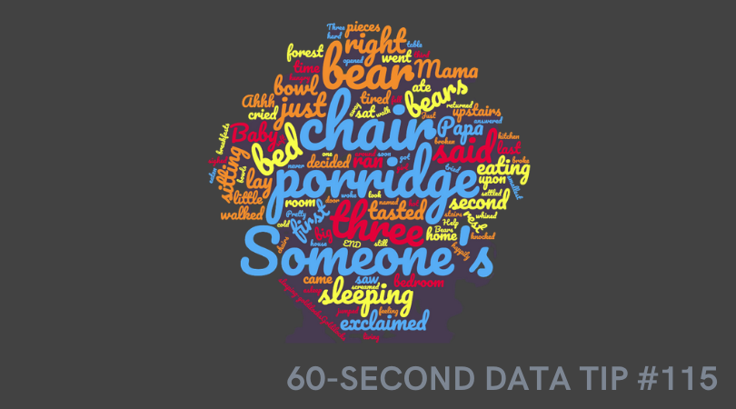
A word cloud shows how many times various words in a document are used. More common words are larger. Less common ones are smaller. The varying sized words are arranged “into some vaguely artistic arrangement,” as Harris puts it.
Uses
There are no good uses of the word cloud. As its name suggests, it clouds meaning rather than clarifies it. I created the word cloud above using one of the many online word cloud generators. It shows the frequency of various words in “Goldilocks and the Three Bears.” Does it provide any insight into the story for you?
Sometimes organizations create word clouds not to convey insight but because they want a graphic on a topic and can’t think of what else to use. But photos or illustrations of almost anything are almost always going to be more engaging than a bunch of words floating around in a cloud.
Warnings
The number of times a word is used tells us nothing about the meaning of the text. Different words can have the same meaning and, conversely, the same word can have different meanings in different contexts. To get to meaning, you need to look at the frequency of concepts or themes, not words.
Word clouds aren’t the best tool even when the point is to analyze word usage. Check out the series of simple bar charts below. They provide more insight than any word cloud could because they allow us to easily discern the most/least popular words.

Source: NOW1051
(Sort of) Fun Fact
The word cloud technique originated online in the 1990s when they were called “tag clouds” and were use to show the popularity of keywords in bookmarks.
To see past data tips, including those about other chart types, click HERE.
Let’s talk about YOUR data!
Got the feeling that you and your colleagues would use your data more effectively if you could see it better? Data Viz for Nonprofits (DVN) can help you get the ball rolling with an interactive data dashboard and beautiful charts, maps, and graphs for your next presentation, report, proposal, or webpage. Through a short-term consultation, we can help you to clarify the questions you want to answer and goals you want to track. DVN then visualizes your data to address those questions and track those goals.


