What To Do With Incomplete Data

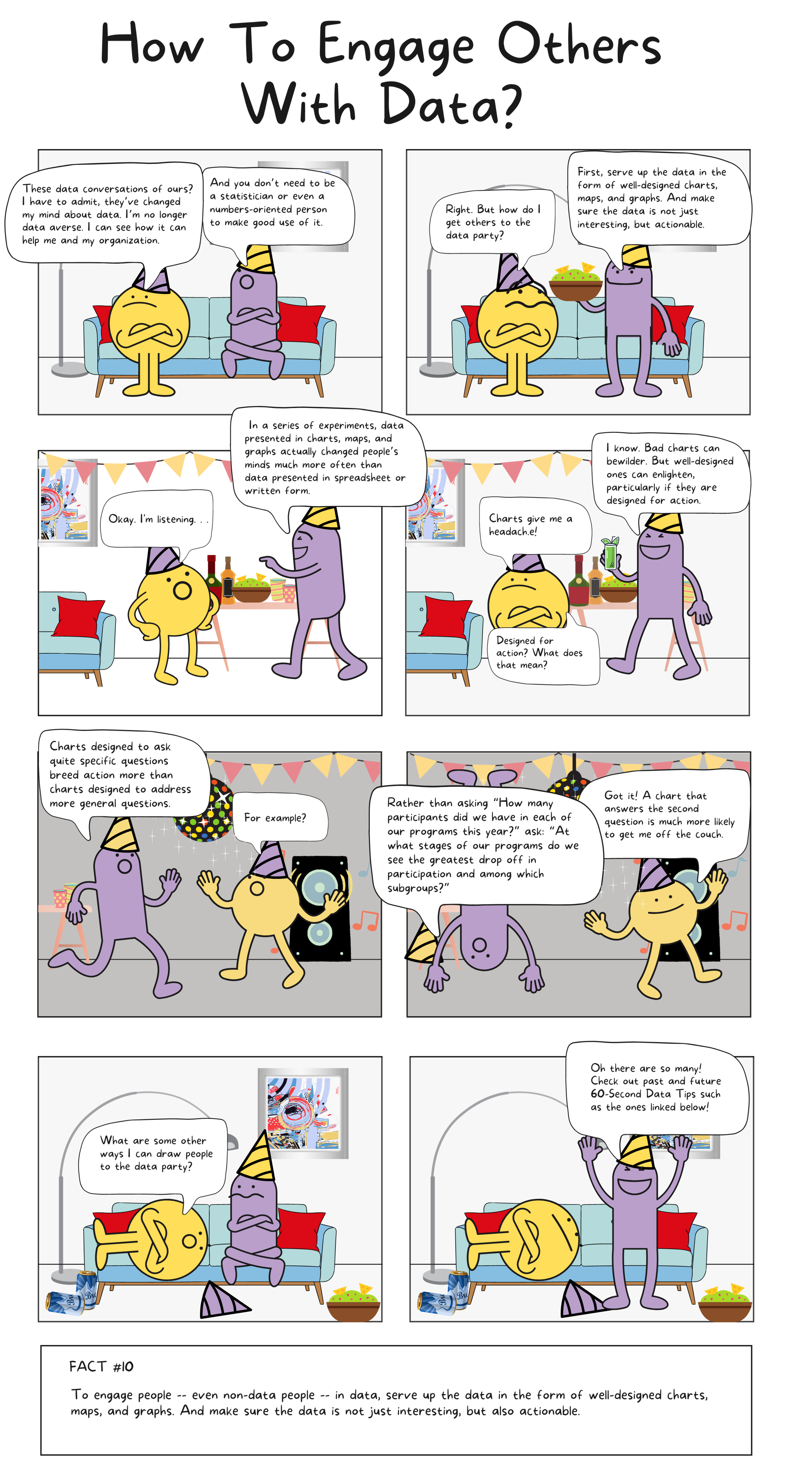
Reposted from March 29, 2021

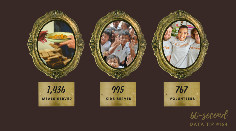
Here’s the super short version of this data tip: when designing data viz, don’t mix complete and incomplete data. Below is the somewhat-longer-but-still-60-seconds version of this data tip.

The graphs below were on the Chicago Public Schools (CPS) website and show the number of confirmed COVID-19 cases associated with CPS buildings. I’ve added the pink lines and captions to direct your attention to the last two data points. The first image shows what the graph looked like on Monday, January 18, 2021 and the second image shows what the graph looked like 5 days later on Saturday, January 23rd.

If you went to this website on January 18th and looked that this graph, you might very well have concluded that cases had recently plummeted. But you’d be wrong. To understand what was really going on, you’d have to notice that the last data point (1/23) was in the future and put that information together with a caption saying “Case counts are updated Monday through Friday (excluding holidays) after impacted individuals are notified.” So the graph shows complete data for past weeks but incomplete data for the current week. The last data point shows week-to-date data.

Unless your aim is to confuse or deceive, why present data in this way? Instead, when you have complete data for various time periods or groups and incomplete data for other time periods or groups, consider the following:

  • If you are updating data on a daily basis, then show day intervals (rather than week intervals as in the graphs above) on the X-axis.

  • Create a separate chart showing a running total for the incomplete time period or group and place it alongside the graph showing complete data.

  • If neither of the solutions above work for you, at least color the dots, lines, or other marks representing the incomplete data in a color different from the complete data to alert the viewer to the difference and include a color legend to explain the difference.

Thanks to Carol White of CBWhite marketing research and strategy consulting for pointing out this graph to me! To see past data tips, click HERE.


Let’s talk about YOUR data!

Got the feeling that you and your colleagues would use your data more effectively if you could see it better? Data Viz for Nonprofits (DVN) can help you get the ball rolling with an interactive data dashboard and beautiful charts, maps, and graphs for your next presentation, report, proposal, or webpage. Through a short-term consultation, we can help you to clarify the questions you want to answer and goals you want to track. DVN then visualizes your data to address those questions and track those goals.


How To Visualize Cycles

Every organization experiences cyclical or seasonal patterns. Understanding how funding, participation, volunteering, and other factors change in predictable ways over time can help us to plan for the future. The problem is that we don’t always see these patterns. We get caught up in currents issues and crises, and it’s hard to step back and see what’s coming next. Visualizing your data can reveal cyclical or seasonal patterns in helpful ways. This often involves aggregating data from multiple years by specific time periods such as season, quarter, or day of the week. Here are some examples.

Working with a statistician named William Farr in the 1800s, Florence Nightingale analyzed mortality rates during the Crimean War. She and Farr discovered that most of the soldiers who died in the conflict perished not in combat but as a result of “preventable diseases” caused by bad hygiene. Nightingale invented the polar area chart (shown below), a variant of the pie chart, meant “to affect thro’ the Eyes what we fail to convey to the public through their word-proof ears.” Each pie represented a twelve-month period of the war, with each slice showing the number of deaths per month, growing outward if the number increased, and color-coded to show the causes of death (blue: preventable, red: wounds, black: other). The New York Times showed the seasonal pattern of COVID cases using a somewhat similar chart.

Source: Wikipedia

In the dashboard below, Curtis Harris reveals not only patterns in taxi rides by time of day but also by day of the week. We can see, for example, that few people are using taxis between 2 and 3 am, particularly at the beginning of the week.

Source: Curtis Harris on Tableau Public

This varsity-level viz (below) by Lindsay Betzendahl shows the seasonality of the flu. Each dot represents one week in a particular year. Each “ray” consists of dots for the same week of different years. So the ray at the 12:00 position represents the first week in January for each year between 2007 to 2018. The size of the dots show the number of influenza cases. So we can see that cases surge during the winter weeks, in general, but we also can see outbreaks during other seasons in particular years. Betzendahl explains how to create such a chart in Tableau here.

Source: Lindsay Betzendahl on Tableau Public


Let’s talk about YOUR data!

Got the feeling that you and your colleagues would use your data more effectively if you could see it better? Data Viz for Nonprofits (DVN) can help you get the ball rolling with an interactive data dashboard and beautiful charts, maps, and graphs for your next presentation, report, proposal, or webpage. Through a short-term consultation, we can help you to clarify the questions you want to answer and goals you want to track. DVN then visualizes your data to address those questions and track those goals.


How To Recognize and Reform Vanity Metrics

Vanity metrics are like cheap, trendy sunglasses. They may help you to look cool, briefly, but they don’t last long and do little to improve your eyesight. You’ve seen vanity metrics, even if you haven’t used this term to describe them. They are those flashy statistics (sometimes called “big ass numbers”) and charts showing how many services an organization has provided or people they’ve served or some other seemingly impressive stat. The problem is that these metrics don’t help you to better understand your current work and improve it. In this tip, I’ll give you some quick advice on recognizing and reforming vanity metrics.

How To Recognize A Vanity Metric

This Tableau article suggests three questions to ask to identify a vanity metric. I’ve put a nonprofit spin on each:

  • What decision can we make with the metric? If the metric can’t help you to make a decision, it’s probably a vanity metric. For example, does knowing how many meals you delivered help you to decide who, what, where, when, or how to deliver meals in the future? Or do you need a more specific metric such as the gap between need and service provision for various subgroups of clients?

  • What can we do to intentionally reproduce the result? Did some random event produce the big number? For example, did you see a bump in the number of participants last year because another organization, providing a similar service, closed down? If you cannot consistently reproduce the same result next year, this isn’t a helpful metric.

  • Is the data a real reflection of the truth? Let’s face it. There are always ways to misrepresent the truth. You can tell the world that attendance at all of your programs last year totaled 3,237. Sounds good, but that’s probably a “duplicated number” and can be misleading depending on what you want to understand or broadcast to the world. Some people likely attended more than one program. So the total number of individuals who participated in any program could be much lower. The central question to ask yourself when considering a metric is whether or not it will help your organization achieve its goals. If your goal is to reach more folks, this metric is not helpful.

How To Reform A Vanity Metric

  • Provide context. The metrics that are worthy of your attention and your stakeholders’ attention are those that are directly related to your goals. You may have overall goals for all of your participants, clients, audiences, services, programs, etc. But you also might have specific goals for subsets of those groups and for specific time periods. Present your metrics in relation to the goals. And compare metrics for subgroups to each other to see where you are making progress and where you are not.

  • Use more than one statistic. Sometimes what you want to improve cannot be measured with just one metric. For example, if you aim to improve the diversity of your staff, you may want to look at a set of metrics together including number, tenure, and seniority of staff by race/ethnicity, gender identification, age, etc.

Sources: Moving Beyond Vanity Metrics, Stanford Social Innovation Review and Vanity Metrics: Definition, How To Identify Them, And Examples, Tableau.


Let’s talk about YOUR data!

Got the feeling that you and your colleagues would use your data more effectively if you could see it better? Data Viz for Nonprofits (DVN) can help you get the ball rolling with an interactive data dashboard and beautiful charts, maps, and graphs for your next presentation, report, proposal, or webpage. Through a short-term consultation, we can help you to clarify the questions you want to answer and goals you want to track. DVN then visualizes your data to address those questions and track those goals.


Why You Should Know About Span Charts

Tired of bar and pie charts but not sure what your other options may be? Meet the simple and friendly span chart.

This is a new addition to a series of tips on different chart types. In each tip, l give you need-to-know information in a format akin to the “Drug Facts” on the back of medication boxes: active ingredients (what the chart is), uses (when to use it), and warnings (what to look out for when creating the chart). The idea is to fill up your toolbox with a variety of tools for making sense of data. And the span chart is a simple tool you can put to good use!

Active Ingredients (What is a span chart?)

A span chart shows the range between a minimum value and a maximum value. Check out the example below which displays the salaries of full-time employees of the City of Chicago in various departments. The chart on top shows the range between the lowest and highest salaries in each department, and when you click on a bar, the chart below shows the salaries of individual employees in that department (which you can see by scrolling over the circles). So we can see, for example, that although the public library department has a wide range of salaries, the large majority of employees earn less than $100K per year.

Uses

Span charts provide the extreme values. So if you want your viewer to appreciate the range of values and compare the range of different subgroups, as the example above does, it can be quite effective. In addition to salary ranges, a nonprofit organization might use a span chart to show the range between:

  1. The largest and smallest donation amounts per person by year or by subgroup.

  2. The highest and lowest grade point average of students in a tutoring program by semester or by subgroup.

  3. The most and least days of participation among adults in a job training program by month or by subgroup.

Here are instructions for creating a span chart with Tableau and Excel.

Warnings

Span charts do not show the values in between the minimum and maximum or the average value. So you have no sense of the distribution of data points. Are the values evenly distributed or are most at the high or low end? If understanding the distribution is important, you can pair a span chart with a chart that provides more information on the in-between values, as the example above does. Other chart types which show distribution include: histograms, scatter charts, and box plots.

Fun Fact

Span charts go by a variety of names including range bar/column graph, floating bar graph, difference graph, and high-low graph.

To see past data tips, including those about other chart types, scroll down or click HERE.

Sources: The Data Visualisation Catalogue


Let’s talk about YOUR data!

Got the feeling that you and your colleagues would use your data more effectively if you could see it better? Data Viz for Nonprofits (DVN) can help you get the ball rolling with an interactive data dashboard and beautiful charts, maps, and graphs for your next presentation, report, proposal, or webpage. Through a short-term consultation, we can help you to clarify the questions you want to answer and goals you want to track. DVN then visualizes your data to address those questions and track those goals.


How To Make Big Numbers Tangible

We’ve talked about the problem with big numbers before. Most recently, we considered the difficulty humans have digesting large numbers and how “perspectives” — simple sentences that relate a large number to something more familiar to us — can help us to understand, assess, and recall numbers. (For more on this, check out the data tip.)

I’m returning to the big number problem today and offering up some new tips for dealing with them. The inspiration for these tips came from the data-driven documentaries of Neil Halloran, specifically his first documentary called The Fallen of World War II. If you have a few more minutes to spare after reading this 60-second tip (and are not among the 13 million + who have viewed it already), I highly recommend that you check it out. It’s 18 minutes long, but the techniques listed below all appear in the first 7 minutes.

Halloran uses the following techniques to make larger numbers understandable. And you don’t need to be a filmmaker to use them. You can apply them to simple data presentations on websites, reports, and PowerPoints.

  1. Use shapes or icons (rather than bars) to represent one or more people, programs, etc. Halloran uses a human figure shape to represent 1,000 people.

  2. Show an aggregate and then break it down by subgroups and time periods. Halloran shows aggregates, such as the total number of U.S. soldiers who died and then, using animation, redistributes the human figures to show how many soldiers died in the European and Pacific theaters and then how many died over time. The animation is cool but not necessary. You can do the same thing with a series of static images. See example below.

  3. Juxtapose photos and charts. To keep the discussion from becoming too abstract, Halloran reminds the audience what actual soldiers (rather than icons) look like by incorporating photos into his presentation. Again, animation is not necessary. Static photos can be placed along side charts.

  4. Walk audience through the data. To give the audience a sense of scale, the video progresses from smaller to larger numbers. Halloran first walks us through casualty stats for the U.S. and European countries. These numbers seem quite high so by the time Russian stats are shown, we are blown away.


Let’s talk about YOUR data!

Got the feeling that you and your colleagues would use your data more effectively if you could see it better? Data Viz for Nonprofits (DVN) can help you get the ball rolling with an interactive data dashboard and beautiful charts, maps, and graphs for your next presentation, report, proposal, or webpage. Through a short-term consultation, we can help you to clarify the questions you want to answer and goals you want to track. DVN then visualizes your data to address those questions and track those goals.


How To Improve Your Organization’s Time Line

Here’s a simple data viz idea. Next time you make a time line showing your organization’s milestones, size those milestone markers (usually circles) according to some key measure. Voila! You are not only showing what happened but also your progress along the way.

The data for such a viz is super simple. Something like this:

Screen Shot 2021-08-24 at 9.01.48 AM.png

I connected the data shown above to Tableau Public (the free version of Tableau) to create the time line below. Vertical time lines not only suggest an upward progression but also work better on phone screens.

Dashboard 1 (3) (1).png

Let’s talk about YOUR data!

Got the feeling that you and your colleagues would use your data more effectively if you could see it better? Data Viz for Nonprofits (DVN) can help you get the ball rolling with an interactive data dashboard and beautiful charts, maps, and graphs for your next presentation, report, proposal, or webpage. Through a short-term consultation, we can help you to clarify the questions you want to answer and goals you want to track. DVN then visualizes your data to address those questions and track those goals.


How To Make Data Dashboards More Comfortable

I’m always looking for ways to make data more comfortable, particularly for non-data people. Sometimes that means creating simple charts that everyone can understand. Sometimes that means limiting the number of charts presented. And today, I offer up another tip: show your data in a familiar environment. For many of us, paper, file folders, paper clips, and post-it notes are familiar and, dare I say, even comforting.

Give this old-school-meets-new-school data dashboard a spin and see what you think. It shows real-time data in an interactive format. And if you’d like some help creating a similar dashboard for your organization, feel free to contact me.


Let’s talk about YOUR data!

Got the feeling that you and your colleagues would use your data more effectively if you could see it better? Data Viz for Nonprofits (DVN) can help you get the ball rolling with an interactive data dashboard and beautiful charts, maps, and graphs for your next presentation, report, proposal, or webpage. Through a short-term consultation, we can help you to clarify the questions you want to answer and goals you want to track. DVN then visualizes your data to address those questions and track those goals.


How To Create More Diverse, Equitable, and Inclusive Data Visualizations

When we visualize information, we make a series of decisions which affect the way that viewers process the information in our charts, maps, and graphs. Sometimes they don’t feel like decisions at all. We go with the default settings in the application we are using. Or we just do something the way it’s usually done. But a more diverse, equitable, and inclusive approach to presenting and visualizing data requires us to make those decisions more consciously and deliberately. Jonathan Schwabish and Alice Feng of the Urban Institute provide some helpful tips, based on the Urban Institute’s own style guide, which you can apply the next time you present data.

Here is a summarized version of Schwabish and Feng’s article.* And here is my 60-second version of their recommendations:

  • Use people-first language in titles, text, and labels associated with charts, maps, and graphs. For example, use “people with disabilities” rather than “disabled people.” Also Urban does not refer strictly to skin color. For example, they refer to “Black people” not “Blacks.”

  • Order and present groups purposefully. The first group shown in a table or the first bar in a graph can affect how readers perceive the relationship or hierarchy among groups. For example, if the first group is “Men,” then it may appear that men are the default group against which other groups should be compared. One way to prevent viewers from making certain comparisons is to display groups in side-by-side charts (aka “small multiples” charts) rather than on a single chart. In general, make ordering and grouping decisions to promote certain comparisons and prevent others.

  • Point to missing groups. If certain groups are missing from the data, explain why in text boxes or footnotes. Also add information on groups included in “Other” categories and consider providing a more specific label than “Other” which can have an exclusionary connotation.

  • Do not use color palettes that reinforce gender or racial stereotypes. This one may seem obvious, but it bears repeating. Also, Urban’s color palette is accessible to people with certain color vision deficiencies, and the contrast between those colors and white and black text meet basic accessibility guidelines.

  • Depict a variety of races and genders when using icons and avoid icons that make inappropriate depictions of people or communities or reinforce stereotypes such as showing traditionally feminine icons to depict nurses or traditionally masculine icons to depict bosses.

  • Find ways to show the people behind the data. Data visualizations are, by definition, abstractions of larger realities. But in the process of abstracting, we may obscure the lived experiences of the real people whom the data represent. Visualizations can remind viewers about the individuals behind the data by, for example, depicting them as individual circles rather than aggregating them in a single bar.

* The full paper has been published as an OSF Preprint and can be accessed here.


Let’s talk about YOUR data!

Got the feeling that you and your colleagues would use your data more effectively if you could see it better? Data Viz for Nonprofits (DVN) can help you get the ball rolling with an interactive data dashboard and beautiful charts, maps, and graphs for your next presentation, report, proposal, or webpage. Through a short-term consultation, we can help you to clarify the questions you want to answer and goals you want to track. DVN then visualizes your data to address those questions and track those goals.


How To Present Diversity Data (or What To Steal From This Diversity Scorecard)

Today’s tip is to take inspiration from Chantilly Jaggernauth’s excellent diversity scoreboard displayed below. It shows diversity among employees in a company but can easily be applied to staff or participants in a nonprofit organization.

I suggest you steal the following ideas from Chantilly:

  • Metric Definitions. In a Tableau Conference session, Chantilly shares the pros and cons of the four metrics in the dashboard. See image of the slide below. None of the metrics are perfect. But together they provide an understanding of where an organization is in its diversity efforts. These definitions are not incorporated in the dashboard itself but could be added through a link or in a tooltip (scroll over) feature.*

  • Views of Diversity. The dashboard provides three views of diversity: overall, gender, and people of color (POC). By providing side-by-side charts with these three views, the dashboard allows users to see variations that overall diversity charts obscure.

  • Color Coding. Each type of diversity has its own color, which makes the comparison among overall, gender, and POC easy, even when you scroll down and can no longer see the column headers. Also the comparison groups (non-diversity, male, and non-POC) are represented by the same colors in lighter shades. This approach makes the dashboard easier to understand. Assigning three additional colors for the comparison groups could be confusing and require a color legend.

  • Simple Charts. These are all charts we all know how to read. So the scorecard is accessible immediately to anyone, even if they are not familiar with the data or the organization.

  • Also, note that the dashboard and the slide use different terms for two of the metrics.

Source: HR Diversity Scorecard on Tableau Public by Lovelytics

Image above from Tableau Conference session called “Next Gen Analytics for Your New Normal” on 11/10/21.


Let’s talk about YOUR data!

Got the feeling that you and your colleagues would use your data more effectively if you could see it better? Data Viz for Nonprofits (DVN) can help you get the ball rolling with an interactive data dashboard and beautiful charts, maps, and graphs for your next presentation, report, proposal, or webpage. Through a short-term consultation, we can help you to clarify the questions you want to answer and goals you want to track. DVN then visualizes your data to address those questions and track those goals.


10 Essential Data Facts For Non-Data People: The Cheat Sheet


Let’s talk about YOUR data!

Got the feeling that you and your colleagues would use your data more effectively if you could see it better? Data Viz for Nonprofits (DVN) can help you get the ball rolling with an interactive data dashboard and beautiful charts, maps, and graphs for your next presentation, report, proposal, or webpage. Through a short-term consultation, we can help you to clarify the questions you want to answer and goals you want to track. DVN then visualizes your data to address those questions and track those goals.


10 Essential Data Facts For Non-Data People (Fact #10)


Let’s talk about YOUR data!

Got the feeling that you and your colleagues would use your data more effectively if you could see it better? Data Viz for Nonprofits (DVN) can help you get the ball rolling with an interactive data dashboard and beautiful charts, maps, and graphs for your next presentation, report, proposal, or webpage. Through a short-term consultation, we can help you to clarify the questions you want to answer and goals you want to track. DVN then visualizes your data to address those questions and track those goals.


10 Essential Data Facts For Non-Data People (Fact #9)

I’m posting comic strips explaining ten essential data facts for non-data people over time. Check out other data facts which have been posted so far by scrolling down or clicking HERE.


Let’s talk about YOUR data!

Got the feeling that you and your colleagues would use your data more effectively if you could see it better? Data Viz for Nonprofits (DVN) can help you get the ball rolling with an interactive data dashboard and beautiful charts, maps, and graphs for your next presentation, report, proposal, or webpage. Through a short-term consultation, we can help you to clarify the questions you want to answer and goals you want to track. DVN then visualizes your data to address those questions and track those goals.


10 Essential Data Facts For Non-Data People (Fact #8)

I’m posting comic strips explaining ten essential data facts for non-data people over time. Check out other data facts which have been posted so far by scrolling down or clicking HERE.


Let’s talk about YOUR data!

Got the feeling that you and your colleagues would use your data more effectively if you could see it better? Data Viz for Nonprofits (DVN) can help you get the ball rolling with an interactive data dashboard and beautiful charts, maps, and graphs for your next presentation, report, proposal, or webpage. Through a short-term consultation, we can help you to clarify the questions you want to answer and goals you want to track. DVN then visualizes your data to address those questions and track those goals.


10 Essential Data Facts For Non-Data People (Fact #7)

I’m posting comic strips explaining ten essential data facts for non-data people over time. Check out other data facts which have been posted so far by scrolling down or clicking HERE.


Let’s talk about YOUR data!

Got the feeling that you and your colleagues would use your data more effectively if you could see it better? Data Viz for Nonprofits (DVN) can help you get the ball rolling with an interactive data dashboard and beautiful charts, maps, and graphs for your next presentation, report, proposal, or webpage. Through a short-term consultation, we can help you to clarify the questions you want to answer and goals you want to track. DVN then visualizes your data to address those questions and track those goals.


10 Essential Data Facts For Non-Data People (Fact #6)

I’m posting comic strips explaining ten essential data facts for non-data people over time. Check out other data facts which have been posted so far by scrolling down or clicking HERE.


Let’s talk about YOUR data!

Got the feeling that you and your colleagues would use your data more effectively if you could see it better? Data Viz for Nonprofits (DVN) can help you get the ball rolling with an interactive data dashboard and beautiful charts, maps, and graphs for your next presentation, report, proposal, or webpage. Through a short-term consultation, we can help you to clarify the questions you want to answer and goals you want to track. DVN then visualizes your data to address those questions and track those goals.


10 Essential Data Facts For Non-Data People (Fact #5)

Source: Tuomi, Ilkka (2000). "Data is more than knowledge". Journal of Management Information Systems. 6 (3): 103–117. doi:10.1080/07421222.1999.11518258.

I’m posting comic strips explaining ten essential data facts for non-data people over time. Check out other data facts which have been posted so far by scrolling down or clicking HERE.


Let’s talk about YOUR data!

Got the feeling that you and your colleagues would use your data more effectively if you could see it better? Data Viz for Nonprofits (DVN) can help you get the ball rolling with an interactive data dashboard and beautiful charts, maps, and graphs for your next presentation, report, proposal, or webpage. Through a short-term consultation, we can help you to clarify the questions you want to answer and goals you want to track. DVN then visualizes your data to address those questions and track those goals.


10 Essential Data Facts For Non-Data People (Fact #4)

I’m posting comic strips explaining ten essential data facts for non-data people over time. Check out other data facts which have been posted so far by scrolling down or clicking HERE.


Let’s talk about YOUR data!

Got the feeling that you and your colleagues would use your data more effectively if you could see it better? Data Viz for Nonprofits (DVN) can help you get the ball rolling with an interactive data dashboard and beautiful charts, maps, and graphs for your next presentation, report, proposal, or webpage. Through a short-term consultation, we can help you to clarify the questions you want to answer and goals you want to track. DVN then visualizes your data to address those questions and track those goals.


How Data Viz Can Save Your Thanksgiving

Your next data challenge may involve turkey. And I’m here to help. This week we take a break from nonprofit data and consider Thanksgiving data.

Thanksgiving involves many more dishes than you would normally serve in one meal. If you are in charge this year, and you have a medium to small oven and fridge, you have to be strategic. When should you cook, chill, and reheat each dish to make the most of your time and limited oven/fridge space?

I give you my Thanksgiving Game Plan Gantt Chart (partially pictured below) originally shared in tip #87. It has become a Thanksgiving tradition here at Data Viz for Nonprofits, and works like a charm. I made it in Google Sheets. Nothing fancy, but it does the trick. Feel free to adapt it to your recipes or perhaps your next fundraising event!

Happy Turkey/Tofurky Day. And stay tuned. Next week we will return to the series of data tip comic strips on essential data facts for non-data people.


Let’s talk about YOUR data!

Got the feeling that you and your colleagues would use your data more effectively if you could see it better? Data Viz for Nonprofits (DVN) can help you get the ball rolling with an interactive data dashboard and beautiful charts, maps, and graphs for your next presentation, report, proposal, or webpage. Through a short-term consultation, we can help you to clarify the questions you want to answer and goals you want to track. DVN then visualizes your data to address those questions and track those goals.


10 Essential Data Facts For Non-Data People (Fact #3)

I’m posting comic strips explaining ten essential data facts for non-data people over time. Check out other data facts which have been posted so far by scrolling down or clicking HERE.


Let’s talk about YOUR data!

Got the feeling that you and your colleagues would use your data more effectively if you could see it better? Data Viz for Nonprofits (DVN) can help you get the ball rolling with an interactive data dashboard and beautiful charts, maps, and graphs for your next presentation, report, proposal, or webpage. Through a short-term consultation, we can help you to clarify the questions you want to answer and goals you want to track. DVN then visualizes your data to address those questions and track those goals.


10 Essential Data Facts For Non-Data People (Fact #2)

I’m posting comic strips explaining ten essential data facts for non-data people over time. Check out other data facts which have been posted so far by scrolling down or clicking HERE.


Let’s talk about YOUR data!

Got the feeling that you and your colleagues would use your data more effectively if you could see it better? Data Viz for Nonprofits (DVN) can help you get the ball rolling with an interactive data dashboard and beautiful charts, maps, and graphs for your next presentation, report, proposal, or webpage. Through a short-term consultation, we can help you to clarify the questions you want to answer and goals you want to track. DVN then visualizes your data to address those questions and track those goals.