How To Showcase Your Sites With An Interactive Map

60-SECOND DATA TIP_3 (4).png

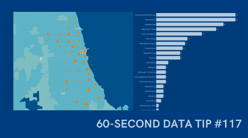
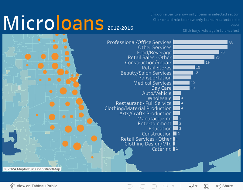
Here’s a viz you can use. It is interactive, can be built in Tableau Public for free, and can be embedded in your website. This example shows affordable housing sites. Give it a try below and check out these features:

  • The circles on the map show the location of the sites. The color of the circles show the type of site, and the size of the circles indicates number of units (but you can size your circles by any measure such as number of people served or programs offered.)

  • Click on a site on the map to see more information, to the right, about the site including a photo.

  • When you click on a site, it is also highlighted on the chart below so you can compare that site to the others.

To learn how to create an interactive map with similar features in Tableau Public, check out this tutorial. I’d also be happy to build one for you, customized to your needs. Just click “Schedule A Free Consultation” below.

Let’s talk about YOUR data!

Got the feeling that you and your colleagues would use your data more effectively if you could see it better? Data Viz for Nonprofits (DVN) can help you get the ball rolling with an interactive data dashboard and beautiful charts, maps, and graphs for your next presentation, report, proposal, or webpage. Through a short-term consultation, we can help you to clarify the questions you want to answer and goals you want to track. DVN then visualizes your data to address those questions and track those goals.


Why You Should Know About Box Plots

60-SECOND DATA TIP_3.png

Here’s yet another in a series of tips on different chart types. The idea is to fill up your toolbox for making sense of data. This week, I give you the box plot.

Active Ingredients (What is a box plot?)

Like a histogram, a box plot shows how spread out your data points are. The box plot below shows the affordability of housing in neighborhoods in ten cities. Each red circle represents a zip code area. The gray boxes show where 50 percent of the zip code areas fall on the affordability scale (larger numbers mean more affordable, smaller ones mean less affordable). And the median (or middle number) is where the dark gray meets the light gray.

boxplot1.png

Box plots also show a lot of other information (see image below). Some call this type of chart “a box and whisker plot” because the lines extending from the boxes are known as the “whiskers.”

Source: Flowing Data

Source: Flowing Data

Uses

A box plot provides a detailed snapshot of your data. No data points are hidden or obscured by summarizing numbers such as averaging them. For example, Houston and Chicago have the same average affordability score (.13) but we can see at a glance that although they are similarly affordable cities, Houston has a wider range of affordability. And, we can see that although New York is, in general, more affordable than Los Angeles, New York has some zip code areas that are much less affordable than the median seems to suggest. There are also some extreme outliers including the circle at -1.0 affordability which is New York City's 10013 zip code area (Soho and Tribeca).

Warnings

Not everyone (or every application) draws a box plot the same. For example, sometimes the whiskers extend to the minimum and maximum values and others place outliers beyond the lines. However most box plots include the median, upper quartile and lower quartile.

Fun Fact

Mary Eleanor Spear invented what she called a “range bar” in the 1950s. It would later be known as the box plot.

To see past data tips, including those about other chart types, click HERE.


Let’s talk about YOUR data!

Got the feeling that you and your colleagues would use your data more effectively if you could see it better? Data Viz for Nonprofits (DVN) can help you get the ball rolling with an interactive data dashboard and beautiful charts, maps, and graphs for your next presentation, report, proposal, or webpage. Through a short-term consultation, we can help you to clarify the questions you want to answer and goals you want to track. DVN then visualizes your data to address those questions and track those goals.


Create A Map Dashboard To Show Your Organization's Reach

60-SECOND DATA TIP_3.gif

An interactive map is a great way to show donors, board members, prospective funders and other stakeholders whom you serve, including their age, location, income, and other characteristics. I’m doing a webinar on December 10, 2020 where I will teach you how to create an interactive map dashboard, like the one below, in less than an hour using Tableau Public, the free version of Tableau, a powerful data visualization tool. You can create a map dashboard with a simple Excel file, as long as it includes geographic data, such as zip codes. And you can embed the dashboard on your website, as I’ve done here. Play around with the dashboard below to explore the possibilities. And click HERE to register for the webinar.


Let’s talk about YOUR data!

Got the feeling that you and your colleagues would use your data more effectively if you could see it better? Data Viz for Nonprofits (DVN) can help you get the ball rolling with an interactive data dashboard and beautiful charts, maps, and graphs for your next presentation, report, proposal, or webpage. Through a short-term consultation, we can help you to clarify the questions you want to answer and goals you want to track. DVN then visualizes your data to address those questions and track those goals.


What You Should Know About Word Clouds

60-SECOND DATA TIP_3.png

This tip is a warning. In other tips, I have encouraged you to use a particular type of chart for specific purposes. But in this tip, I’ll suggest that you NEVER use this chart under ANY circumstance. I’m not alone is my aversion to word clouds. Plenty of others, including Jacob Harris, a senior software architect at The New York Times, have articulated their distaste. This tip is basically the 60-second version of Harris’ 2011 article on the topic.

Active Ingredients (What is a word cloud?)

A word cloud shows how many times various words in a document are used. More common words are larger. Less common ones are smaller. The varying sized words are arranged “into some vaguely artistic arrangement,” as Harris puts it.

Uses

There are no good uses of the word cloud. As its name suggests, it clouds meaning rather than clarifies it. I created the word cloud above using one of the many online word cloud generators. It shows the frequency of various words in “Goldilocks and the Three Bears.” Does it provide any insight into the story for you?

Sometimes organizations create word clouds not to convey insight but because they want a graphic on a topic and can’t think of what else to use. But photos or illustrations of almost anything are almost always going to be more engaging than a bunch of words floating around in a cloud.

Warnings

The number of times a word is used tells us nothing about the meaning of the text. Different words can have the same meaning and, conversely, the same word can have different meanings in different contexts. To get to meaning, you need to look at the frequency of concepts or themes, not words.

Word clouds aren’t the best tool even when the point is to analyze word usage. Check out the series of simple bar charts below. They provide more insight than any word cloud could because they allow us to easily discern the most/least popular words.

Source: NOW1051

Source: NOW1051

(Sort of) Fun Fact

The word cloud technique originated online in the 1990s when they were called “tag clouds” and were use to show the popularity of keywords in bookmarks.

To see past data tips, including those about other chart types, click HERE.


Let’s talk about YOUR data!

Got the feeling that you and your colleagues would use your data more effectively if you could see it better? Data Viz for Nonprofits (DVN) can help you get the ball rolling with an interactive data dashboard and beautiful charts, maps, and graphs for your next presentation, report, proposal, or webpage. Through a short-term consultation, we can help you to clarify the questions you want to answer and goals you want to track. DVN then visualizes your data to address those questions and track those goals.


Seeing Red, Blue, and Purple - What We Can Learn From Election Maps

60-SECOND DATA TIP_3.png

A wide range of election maps are in your immediate future. What you learn from those maps depends, in part, on how they are designed. Indeed, election maps and other types of maps can change our attitudes toward issues. In this 15-second tip, I recommend that you invest an additional couple of minutes watching The New York Times’ excellent slide show on how election maps can fool you. It will help you to be both a better consumer and designer of maps.

To see past data tips, including those about other chart types, click HERE.

Why You Should Know About Stacked Area Graphs

60-SECOND DATA TIP_3 (2).png

Another week, another useful chart to consider. This week, I give you the stacked area graph.

Active Ingredients (What is a stacked area graph?)

The stacked area graph is a variation of the area graph, which is simply a line graph with the area below the line filled in with color. In a stacked area chart, there’s more than one variable, so more than one line and shaded area. Additionally, these areas are stacked, one on top of the other.

Uses

Use this type of graph to compare the proportion of data units (people, groups, places, things, etc.) in different categories over time. This example from the Urban Institute does a great job of showing the relatively long sentences of those convicted of violent crime compared to the sentences of those convicted of other offenses. When this cohort of inmates entered prison in 2000, those convicted of violent crimes made up just 30 percent of the entire group. But 14 years later, they represented more than 80 percent of those still incarcerated.

2000 Entry Cohort by Offense Type

Warnings

It can be difficult to discern exactly how many (or what percent of) data units each band of color represents. The lowest band is clear. But you have to do some math to determine the other bands. For example, in the chart above, I have to subtract 30 percent from about 58 percent to determine the percent of inmates in 2000 convicted of property crimes (the yellow band). The line graph below does a better job of showing what percent of the overall cohort each offense group represented over time. So only use a stacked area graph when you want viewers to focus mainly on the proportion of data units in each group over time.

Dashboard 4.png

Fun Fact

A cool variant of the stacked area graph is the streamgraph in which the bands are placed around a central axis rather than stacked on top of an axis. The New York Times’s streamgraph on movie box office revenues helped to make streamgraphs popular.

To see past data tips, including those about other chart types, click HERE.


Let’s talk about YOUR data!

Got the feeling that you and your colleagues would use your data more effectively if you could see it better? Data Viz for Nonprofits (DVN) can help you get the ball rolling with an interactive data dashboard and beautiful charts, maps, and graphs for your next presentation, report, proposal, or webpage. Through a short-term consultation, we can help you to clarify the questions you want to answer and goals you want to track. DVN then visualizes your data to address those questions and track those goals.


Why You Should Know About Venn Diagrams

60-SECOND DATA TIP_3 8.47.59 PM.gif

This week, I give you yet another useful-if-done-right chart, the Venn diagram.

Active Ingredients (What is a Venn Diagram?)

ICYMI, a Venn diagram shows overlapping categories or sets usually represented by circles.

Uses

These diagrams are great for showing the degree to which categories or sets overlap and what elements fall inside/outside of each set and each overlapping portion. The take home message is usually the shaded area where all of the circles intersect. So make that area easy to locate using color and labels. This example shows how an organization bridges the gap among three different types of organizations working on foreign policy.

Source: Network 20/20

Warnings

For me, Venn-diagram-fatigue sets in early. I get tired of discerning the meaning of each overlapping area pretty quickly. So I’d suggest limiting the number of circles. And, more importantly, clearly labeling the sets.

Here’s one that I gave up on after about 15 seconds:

Source: @DanNeidle

Source: @DanNeidle

On the other hand, this Venn diagram works even with four sets because the sets (orphaned, wealthy, sidekick, and masked) are clearly marked and the intersection labels are simple.

Source: gliffy.com

Source: gliffy.com

Fun Fact

English mathematician John Venn is credited with inventing the Venn diagram in the 1860s, and, according to Phil Plait, there are two kinds of people in the world . . .

To see past data tips, including those about other chart types, click HERE.


Let’s talk about YOUR data!

Got the feeling that you and your colleagues would use your data more effectively if you could see it better? Data Viz for Nonprofits (DVN) can help you get the ball rolling with an interactive data dashboard and beautiful charts, maps, and graphs for your next presentation, report, proposal, or webpage. Through a short-term consultation, we can help you to clarify the questions you want to answer and goals you want to track. DVN then visualizes your data to address those questions and track those goals.


Why You Should Know About Parallel Coordinates Plots

60-SECOND DATA TIP_3.png

Here is another tip in a series of tips on different chart types. The idea is to fill up your toolbox with an array of charts good for making sense of data. This week, I give you the parallel coordinates plot.

Active Ingredients (What is a parallel coordinates plot?)

Parallel coordinates plots look kind of like the electrical poles and wires along the highway. They are a series of axes (that’s the pole part) connected by various lines (that’s the wire part). Each axis represents a variable that you can measure numerically. Each line represents an individual unit, group, or category. For example, each line might be program that your organization offers. And one axis might be enrollment, another axis drop out rate, and another average rating on participant surveys. You can compare programs by seeing where each line hits each axis.

Uses

Parallel coordinate plots are great when you have a lot of measures and want to compare a bunch of individual units, groups, or categories on those measures. In the example below, each axis represents a different chronic illness and each line represents a state in the U.S. So we can see that the percent of adults with kidney disease is much lower than the percent of adults with arthritis across states. But we can also see where there is variation among states. For example, Oregon has a much larger percent of adults with depression than does Hawaii. The line for Hawaii is highlighted to allow the viewer to compare Hawaii to other states on various chronic illnesses. Note that in this example, each axis uses the same scale (percent of adults) but in some parallel coordinate plots, each axis has a different scale depending on the unit of measure appropriate for each variable.

plot.png

Warnings

The order of the axes will affect how the data is perceived. In the example, I ordered the axes from diseases with relatively low prevalence to those with relatively high prevalence to allow the viewer to easily distinguish diseases in this way.

Parallel coordinate plots can get cluttered fast. You can avoid this by limiting the number of lines or axes or by greying out most of them and highlighting just one or two as in the example above.

Fun Fact

Parallel coordinates plots go way back, to at least the 1880s when Henry Gannett and Fletcher Hewes published one in the Statistical Atlas of the United States. Check out their parallel coordinates plot which shows the ranks of states on a wide range of issues in 1880 including populations density (DC ranked number 1), per capita wealth (California ranked number 1), and literacy rate (Wyoming ranked number 1).

To see past data tips, including those about other chart types, click HERE.


Let’s talk about YOUR data!

Got the feeling that you and your colleagues would use your data more effectively if you could see it better? Data Viz for Nonprofits (DVN) can help you get the ball rolling with an interactive data dashboard and beautiful charts, maps, and graphs for your next presentation, report, proposal, or webpage. Through a short-term consultation, we can help you to clarify the questions you want to answer and goals you want to track. DVN then visualizes your data to address those questions and track those goals.


Why You Should Know About Dot Matrix Charts

60-SECOND DATA TIP_3 (1).gif

I’d like to introduce you to yet another chart type. The idea is to fill up your toolbox for making sense of data. This week, I give you the dot matrix chart.

Active Ingredients (What is a dot matrix chart?)

Dot matrix charts show us data units as dots (or squares). A single data unit could be a person, a group of people, a building, a program, or any other thing that you are counting. Each dot is colored to show which category or group the data unit falls into.

Uses

Dot matrix charts are simple yet mighty. They give a quick overview of the relative size of different categories and how the parts relate to the whole. I was reminded of the power of dot matrices recently when reading about the COVID-19 School Response Dashboard in an article on the National Public Radio (NPR) website. The dashboard shows data drawn from reports from K-12 schools on their confirmed and suspected coronavirus cases, along with the safety strategies they're using.

If you check out the dashboard, you see these charts showing the percent of schools reporting cases among students and staff. Take a look at the Y-axis. It ranges from 0% to 1%. This allows you to see small differences between the charts on the left (confirmed and suspected cases) and the charts on the right (only confirmed cases). But it has a big disadvantage. It doesn’t give you a visual sense of just how few students and staff have, or may have, been infected based on data that schools have. (Note: A big unknown is the number of asymptomatic/untested students or staff. Rates might be higher if more students and staff were tested.)

student.png

NPR recast this same data in a dot matrix chart (below) with each square representing 50 people.* And the first thing you comprehend is that the vast majority of staff and students at the reporting schools have not been infected (again according to information that schools have). Without much more effort, you see that there are more suspected than confirmed cases. No need to inspect the Y-axis or subtract percent of confirmed cases from the percent of confirmed and suspected cases.

title.png
studentdots.png

Warnings

All those dots or squares require a good bit of page or screen real estate. Sure, one circle or square can represent more than one person or other data unit. But at some point, a bar chart might make more sense. Dot matrix charts work best when there are just a few categories and the aim is to communicate one or two simple messages.

Fun Fact

Dots or squares need not be displayed in rectangular form. This Policy Viz chart arrays the dots in a semi-circle to show the distribution of U.S. House members in different political parties. Gray dots represent empty seats. You can learn how to create a chart like this one using Excel HERE.

Source: PolicyViz

Source: PolicyViz

To see past data tips, including those about other chart types, click HERE.

*Note that the percentages displayed on the dashboard do not exactly match the numbers in the NPR dot matrix chart because the dashboard shows real-time data, and NPR used data from the dashboard on an earlier date than 9/24/20, the date when I took the image of the dashboard.


Let’s talk about YOUR data!

Got the feeling that you and your colleagues would use your data more effectively if you could see it better? Data Viz for Nonprofits (DVN) can help you get the ball rolling with an interactive data dashboard and beautiful charts, maps, and graphs for your next presentation, report, proposal, or webpage. Through a short-term consultation, we can help you to clarify the questions you want to answer and goals you want to track. DVN then visualizes your data to address those questions and track those goals.


Why You Should Know About Sankey Diagrams

60-SECOND DATA TIP_3 (1).png

Here’s one more in a series of tips on different chart types. The idea is to fill up your toolbox for making sense of data. This week, I give you the Sankey diagram.

Active Ingredients (What is a Sankey diagram?)

Sankey diagrams use arrows or lines to show flow to and from stages in a process. The wider the arrow or line, the larger the quantity of flow. The arrows or lines may be colored to represent different categories or to show the transition from one stage to another.

Uses

Organizations are full of processes. Sankey diagrams help you to understand the flow of people, money, energy, or other things through a process. The example below shows the flow of undergraduate engineering students at the University of Pennsylvania from their summer internships and jobs to their employment and other experiences post graduation. We can see, for example, that most students who were in technology and financial services post graduation also were in those areas during their junior summer. However, students who started graduate school after graduation from college had a wider variety of experiences during the prior summer.

Source: The Signal

Source: The Signal

Warnings

Creating a Sankey diagram can be a challenge. You can’t highlight a data table and click “Sankey Diagram” in Excel. There are some programs designed specifically to create Sankey diagrams and others that will create a Sankey diagram with some hacking. Here is a great summary of software options.

Fun Facts

You may have seen Charles Minard's map of Napoleon's Russian Campaign of 1812 which shows dwindling troops across time and space (see image below). It’s a sort of Sankey diagram on top of a map and was created in 1869. However, the chart was named for Matthew Henry Phineas Riall Sankey, an Irish captain who created a chart in 1898 to show the energy efficiency of a steam engine.

Source: Wikimedia

Source: Wikimedia

To see past data tips, including those about other chart types, click HERE.


Let’s talk about YOUR data!

Got the feeling that you and your colleagues would use your data more effectively if you could see it better? Data Viz for Nonprofits (DVN) can help you get the ball rolling with an interactive data dashboard and beautiful charts, maps, and graphs for your next presentation, report, proposal, or webpage. Through a short-term consultation, we can help you to clarify the questions you want to answer and goals you want to track. DVN then visualizes your data to address those questions and track those goals.


How To Use Big A** Numbers

60-SECOND DATA TIP_3 (1).png

You already know about BANs even if you don’t think you do. They are Big Ass Numbers meant to catch your attention. You see them everywhere these days, featured in bold fonts on websites, brochures, and reports; sprinkled throughout PowerPoint presentations; and arrayed as KPIs* in data dashboards.

BANs are having a moment. And they can be powerful. But watch out for overdoing it. When lots of BANs crowd a single display, they steal each other’s limelight and bewilder the audience. Anyone who gives a BAN a moment’s thought might wonder: “Wow, 5,000 meals sounds like a lot, but what is the need? What do similar organizations provide?”

So use BANs sparingly and give them space so they can shine. Also, provide context when possible: “5,000 meals served and no one turned away.”

Steve Wexler also advises using one or two BANs when they provide a good overall summary of a lot of data and when they clarify and provide context for subsequent charts, maps, and graphs.

And for some great ways to design BANs, check out Adam McCann’s 20 Ways to Visualize KPIs.

See other data tips in this series for more information on how to effectively visualize and make good use of your organization's data. 

*key performance indicators

Why You Should Know About Pictogram Charts

60-SECOND DATA TIP_3 (2).png

This is the seventh in a series of tips on different chart types. The idea is to fill up your toolbox with various types of charts for making sense of data. This week, I give you the pictogram chart.

Active Ingredients (What is a pictogram chart?)

Pictogram charts use icons instead of bars or circles, usually to show how many units are in a group. Probably the most common icon is the stick figure used to represent a person or a group of people (e.g. each stick figure represents 100 people.)

Uses

out+of+10+students+who+got+Little+Bit+support,+improved+their+attendance.+(3).png

Pictogram charts can be useful when bars or circles just seem too abstract, and you want to emphasize that you are talking about people, animals, apartment buildings, or whatever it is that you are measuring. Pictogram charts also come in handy when you want to clarify confusing statistics. Back in data tip #77, I used the pictogram chart below to compare the attendance of students in classrooms with attendance monitors to the attendance of students in classrooms without monitors, assuming 10 students per class. The chart was designed to clarify this statement: “54% more students with monitors improved attendance than students without monitors.” That sounds like a lot until you look at the chart below. The 54% stat is a “relative difference,” which is calculated as the absolute difference divided by the “standard” which, in this case, is the class without monitors. So 4.0 minus 2.6 divided by 2.6 or .54, which when expressed as a percentage is 54%. But the chart makes it clear that we are talking about 4 students vs. 2.6 students, which sounds much less impressive than 54%.

Warnings

Avoid showing too many icons. They are hard to count. Remember that one icon can represent a larger number. Also, don’t display partial icons. If you need to show a number with a decimal, consider showing the whole icon and coloring in just part of it, as in the example above.

Fun Fact

You can find free icons to use in pictogram charts at The Noun Project or at Flaticon.

To see past data tips, including those about other chart types, click HERE.

Let’s talk about YOUR data!

Got the feeling that you and your colleagues would use your data more effectively if you could see it better? Data Viz for Nonprofits (DVN) can help you get the ball rolling with an interactive data dashboard and beautiful charts, maps, and graphs for your next presentation, report, proposal, or webpage. Through a short-term consultation, we can help you to clarify the questions you want to answer and goals you want to track. DVN then visualizes your data to address those questions and track those goals.


Why You Should Know About Gantt Charts

60-SECOND DATA TIP_3.png

This is the sixth in a series of tips on different chart types. The idea is to fill up your toolbox with different charts to make better sense of data. This week, I give you the gantt chart.

Active Ingredients (What is a gantt chart?)

A gantt chart shows the start and end date of a list of activities or tasks. Each row represents a task and each column represents a time period. Here is a gantt chart I made for Thanksgiving. In this case, the tasks are dishes. I used color to show different stages (preparation, cooking, refrigeration, and reheating) for each dish.

Thanksgiving+Game+Plan+2018-1.jpg

Here’s a gantt chart that may be closer to something you’d want to create for your organization:

Sample TIMELINE.jpg

Uses

Gantt charts provide a great way to show the different components or tasks in a project or program, how long each task is going to take, which tasks precede or follow others, and which tasks occur simultaneously. In the Thanksgiving chart, I was particularly interested in which dishes would be cooking at the same time since I have limited space in my oven. Similarly, a gantt chart can clarify if you have enough staff and other resources to conduct simultaneous tasks. You might consider adding a reference line to show the current date, shading portions of the bars to show what is completed and what is left to do, or adding arrows to show which tasks are dependent on each other.

Warnings

As with so many chart types, they can get overly complex and difficult to read. So keep the overall gantt chart simple to give a view of the entire project. If you need to show more detail, you can make related charts that zoom in on subtasks for each of the major tasks on the overall chart. Also, remember to update your gantt chart as timelines and tasks change.

Fun Fact

The gantt chart is named for its inventor, Henry Laurence Gantt, a disciple of Frederick Taylor, the great promoter of scientific management in the early 20th century.

To see past data tips, including those about other chart types, click HERE.


Let’s talk about YOUR data!

Got the feeling that you and your colleagues would use your data more effectively if you could see it better? Data Viz for Nonprofits (DVN) can help you get the ball rolling with an interactive data dashboard and beautiful charts, maps, and graphs for your next presentation, report, proposal, or webpage. Through a short-term consultation, we can help you to clarify the questions you want to answer and goals you want to track. DVN then visualizes your data to address those questions and track those goals.


Why You Should Know About Bullet Graphs

60-SECOND DATA TIP_3.png

This is the fifth in a series of tips on different chart types. The idea is to fill up your toolbox with various charts to make better sense of your data. This week, I give you the bullet graph.

Active Ingredients (What is a bullet graph?)

A bullet graph is a bar chart with context. In the example below, the orange bars show the number of enrollees in the Child Health Plus Program in five New York counties. The black vertical lines and the gray bars provide context. Each black vertical line shows the (fictional) goal for each county. The dark gray shaded bars show 60 percent of the goal, and the light gray bars show 80 percent of the goal. So we can see that Queens has surpassed its goal whereas Kings hasn’t reached its goal but has surpassed the 80 percent mark. These gray bars are called “performance ranges” and can be any amount that makes sense for the data and organization. Sometimes these ranges are labeled poor, average, and great.

Data source: https://healthdata.gov/dataset/child-health-plus-program-enrollment-county-and-insurer-beginning-2009

Data source: https://healthdata.gov/dataset/child-health-plus-program-enrollment-county-and-insurer-beginning-2009

Uses

Charting your data allows you to see the overall picture, patterns, and trends in your data. But without context, it’s difficult to really understand the implications of your data: where do you need to invest more time and resources, which groups might serve as models for others, etc. Bullet charts provide that context. You can quickly see which groups are meeting, exceeding, or falling below goals and by how much.

Warnings

As with bar charts, it’s usually best to display your bars in descending or ascending order. And use a limited number of performance ranges, usually no more than three.

Fun Fact

Data viz guru, Stephen Few, invented the bullet graph as an alternative to dashboard gauges and meters.

To see past data tips, including those about other chart types, click HERE.


Let’s talk about YOUR data!

Got the feeling that you and your colleagues would use your data more effectively if you could see it better? Data Viz for Nonprofits (DVN) can help you get the ball rolling with an interactive data dashboard and beautiful charts, maps, and graphs for your next presentation, report, proposal, or webpage. Through a short-term consultation, we can help you to clarify the questions you want to answer and goals you want to track. DVN then visualizes your data to address those questions and track those goals.


Why You Should Know About Histograms

60-SECOND DATA TIP_3.png

This is the fourth in a series of tips on different chart types. The idea is to fill up your toolbox with a variety of charts for making sense of data. This week, I give you the histogram.

Active Ingredients (What is a histogram?)

Histograms look like bar charts. Along the X-axis are “bins,” which each represent a range of values. The Y-axis shows how many units fall into each bin (as long as bins are equally spaced. See warning below.)

Uses

A quick look at a histogram shows you where values are concentrated, what the highest and lowest values are, and whether there are any gaps or unusual values. As such, histograms provide a snapshot of the shape and distribution of the data. Histograms are a great way to get to know your data and give you a much clearer picture than a simple average of your values would.

The series of histograms below provides a snapshot of how 87 students are doing in school. We can see that:

  • Absences, referrals*, and F grades are all relatively rare. A lot of kids fall into the zero bin.

  • Although missing assignments were also less common, most kids had some.

  • Reading and math test scores (MAP) were more “normally distributed” meaning lots of scores concentrated in the middle of the range, with the remaining scores trailing off symmetrically on both sides.

Source: http://www.storytellingwithdata.com/blog/2019/2/21/various-views-of-variability

Source: http://www.storytellingwithdata.com/blog/2019/2/21/various-views-of-variability

Warnings

If you make your bins too big or too small, it will be difficult to see the underlying pattern of the data. There’s no rule of thumb about how to size your bins. Play around with it to see what makes the overall pattern clear.

Technically, histograms are based on the area, not the height, of bars. The height of the bar does not necessarily show how many units there are within each bin. Instead, the height times the width of the bin gives you the number of units in the bin. However, most histograms that I run across have a standard sized bin, and under these circumstances, the height of the bin does reflect the number of units.

Fun Fact

Histogram = histos (Greek for mast) + gram (Greek for something written or recorded). So maybe the term was applied because the chart looks like a row of masts.

*I assume this means discipline referrals.

To see past data tips, including those about other chart types, click HERE.


Let’s talk about YOUR data!

Got the feeling that you and your colleagues would use your data more effectively if you could see it better? Data Viz for Nonprofits (DVN) can help you get the ball rolling with an interactive data dashboard and beautiful charts, maps, and graphs for your next presentation, report, proposal, or webpage. Through a short-term consultation, we can help you to clarify the questions you want to answer and goals you want to track. DVN then visualizes your data to address those questions and track those goals.


Why You Should Know About Treemaps

60-SECOND DATA TIP_3 (3).png

This is the third in a series of tips on different chart types. The idea is to fill up your toolbox with a range of charts for making sense of data. This week, I give you the treemap.

Active Ingredients (What is a treemap?)

As with so many charts, it’s easier to show you one than to describe it. So here you go:

This treemap shows the number of shelter beds used by individuals and families in various years in Chicago. There are two primary or “parent” categories: interim shelter beds and overnight shelter beds. Each of these categories is assigned a rectangle area with subcategory rectangles nested inside of it. In this case, the subcategories are years. The area of each rectangle in a treemap is in proportion to a quantity, in this case number of beds. The area size of the parent category (bed type) is the total of its subcategories (years). The parent categories, in this case, are also distinguished by color: red/orange for interim shelter beds and yellow for overnight shelter beds. Further, darker shades show more beds.

Uses

Treemaps provide a clear view of the structure of your data and allow you to compare the size of parent categories and subcategories. With the example above, we quickly can see that there were many more interim shelter beds than overnight ones. We also see a similar numbers of beds in all years except 2016, when there was a lower number of interim shelter beds.

Warnings

The treemap doesn’t look like a tree or a map, really. So why do we call it that? Well, the treemap shows a hierarchical structure (categories and subcategories) like a tree diagram (aka organizational map). But a treemap doesn’t show the different levels of the hierarchy as clearly as a tree diagram. So if you are trying to focus attention on a hierarchy with several levels, consider a tree diagram instead.

Fun Fact

A “tiling algorithm” (included in data viz programs like Tableau) determines how the rectangles are divided and ordered into sub-rectangles in a treemap. The most common is the "squarified algorithm," which keeps each rectangle as square as possible.

To see past data tips, including those about other chart types, click HERE.


Let’s talk about YOUR data!

Got the feeling that you and your colleagues would use your data more effectively if you could see it better? Data Viz for Nonprofits (DVN) can help you get the ball rolling with an interactive data dashboard and beautiful charts, maps, and graphs for your next presentation, report, proposal, or webpage. Through a short-term consultation, we can help you to clarify the questions you want to answer and goals you want to track. DVN then visualizes your data to address those questions and track those goals.


Why You Should Know About Bubble Charts

60-SECOND DATA TIP_3.png

This is the second in a series of tips on different chart types. The idea is to fill up your toolbox with a variety charts for making sense of data. This week, I give you the bubble chart.

Active Ingredients (What is a bubble chart?)

A bubble chart is really just a souped-up scatterplot. Like the scatterplot, it’s a graph with plotted points that show the relationship between two sets of data. Here’s a scatter plot showing the relationship between the height and girth of black cherry trees:

Scatter Dash (1).png

We can see that there is a relationship between height and girth. As trees get taller, they also tend to get wider. The scatterplot becomes a bubble chart when we size the points according to another measure, in this case the volume of the trees.

Now we can see that as height and girth increase, the volume of black cherry trees also tends to increase. Sometimes folks add another measure or dimension to bubble charts using color, such as in this example.

Uses

Use a bubble chart when you want to show the relationship between two measures plus a bit more. In the bubble chart above, we can see that as the cost of smartphones (position on X-axis) increased, the growth in sales (position on Y-axis) decreased AND that sales were particularly high in China, Emerging Asia, and North America in 2017 (size of bubbles) AND that the boom markets with cheap phones were mainly emerging markets (color of bubbles). That’s a lot of information in a fairly small space.

Warnings

When you cram too much information into bubble charts, viewers struggle to see core relationships and trends. So don’t use too many data points, too many sizes, or too many colors. Scroll down to the end of this tip to see a bubble chart that confuses more than elucidates.

Put your most important measures on the X and Y axes. Remember that humans are really good at discerning position along a common scale. So viewers are most likely to comprehend the relationship between the X and Y measures first.

Show your less important measures or dimensions with size and color. Humans can only make general comparisons when it comes to size and color. We are hard pressed to say if one shade is twice as dark as another or if one circle is three times the size of another.

To see past data tips, including those about other chart types, click HERE.

There’s too much information in this bubble chart!

Source: European Beer Consumption | Mekko GraphicsI found most of these bubble charts on Grafiti.

Source: European Beer Consumption | Mekko Graphics

I found most of these bubble charts on Grafiti.


Let’s talk about YOUR data!

Got the feeling that you and your colleagues would use your data more effectively if you could see it better? Data Viz for Nonprofits (DVN) can help you get the ball rolling with an interactive data dashboard and beautiful charts, maps, and graphs for your next presentation, report, proposal, or webpage. Through a short-term consultation, we can help you to clarify the questions you want to answer and goals you want to track. DVN then visualizes your data to address those questions and track those goals.


Why You Should Know About Heat Maps

60-SECOND DATA TIP_3 (1).png

My 2020 gift to you? A quick and dirty introduction to a bunch of different chart types. Over the next several weeks, each 60-second data tip will introduce (or re-introduce) you to a particular chart type. I’ll give you need-to-know information in a format akin to the “Drug Facts” on the back of medication boxes: active ingredients (what the chart is), uses (when to use it), and warnings (what to look out for when creating the chart). I’ll also add some fun facts along the way. The idea is to fill up your toolbox with a variety of tools for making sense of data. We begin with the heat map.

Active Ingredients (What is a heat map?)

A heat map is a chart that uses variations in color to show differences among categories (e.g. people living in different zip codes) or differences across a scale (e.g. people with different income levels). In a lot of cases, it’s simply a table with color added to the cells.

Uses

Consider adding color to a table to quickly see patterns. Tables have a least one advantage over charts. They cram a lot of data onto a single screen or page. But it’s hard to see patterns when looking at a regular table on a spreadsheet. Take a look (but only for a few seconds) at this table showing the number of shelter beds used by individuals and families each month in Chicago.

Are any patterns jumping out at you? Now take a few more seconds to look at this version, which uses color instead of numbers — aka a heat map:

Dashboard 1 (4).png

Are patterns more apparent now? In a few seconds, this is what I saw:

  • More variation by year than by month.

  • Shelter bed usage was particularly high in 2015.

  • Less seasonal variation than I’d expect. I expected darker colors during the winter months.

With a little more time, more patterns might emerge. And more questions too. This heat map shows number, rather than percentage, of beds used. So, perhaps, more beds were used in 2015 because the number of beds available increased. After more examination and exploration, you might decide to use another chart, which zooms in on a subset of the data. But the heat map is a great first step to understanding data.

Warnings

When creating heat maps, you will use discreet colors to show differences among different categories and a color scale (light to dark) to show differences among different levels, from low to high values. Sometimes folks use the stoplight color system (red, yellow, and green) to show the categories: good, okay, and bad. For example, fundraising amounts over a certain number might be considered good. The problem with this approach is that it doesn’t work for people with red-green color-blindness. If you want to draw attention to good or bad amounts, it’s better to just highlight the good or bad numbers with one color and not color the others.

Color provides only a general understanding of differences in data. To provide a more specific understanding you may want to add numbers, as well as color, to cells as in the chart below. And, in general, don’t use too many colors in your heat map palette. It will be easier to read if you keep it simple.

Dashboard 1 (2) (1).png

Fun Fact

Heat maps are thought to have originated in the 19th century. Loua created this chart in 1873 to show the characteristics of 20 districts in Paris.


Let’s talk about YOUR data!

Got the feeling that you and your colleagues would use your data more effectively if you could see it better? Data Viz for Nonprofits (DVN) can help you get the ball rolling with an interactive data dashboard and beautiful charts, maps, and graphs for your next presentation, report, proposal, or webpage. Through a short-term consultation, we can help you to clarify the questions you want to answer and goals you want to track. DVN then visualizes your data to address those questions and track those goals.


Top 3 Things You Should Know About Rankings (And How To Visualize Them)

60-SECOND DATA TIP_3.png
  1. We love lists, listicles, and rankings in particular, because they make assessment easier. We hate information overload. Ranked lists show us what information is most important and so ease decision-making.

  2. We are more likely to remember items at the top and bottom of the lists and forget the items in the middle. So shorter lists are easier to retain.

  3. People also BELIEVE shorter lists more than longer ones.

 3 Ways to Visualize Rankings

  1. Bar Charts (like the one above)

  2. Rank Charts (which are good for showing how ranking changes over time)

  3. Stacked Bar Charts (scroll down to see the mother of all stacked bar charts showing the top 100 colleges by diversity)

For more on the power of rankings, check out this podcast from  the Kellogg School Of Management At Northwestern University. And here is the full version of the viz shown above:

You can find the ARTICLE in which this viz appeared on the World Economic Forum website.I found this chart on Grafiti.

You can find the ARTICLE in which this viz appeared on the World Economic Forum website.

I found this chart on Grafiti.


Let’s talk about YOUR data!

Got the feeling that you and your colleagues would use your data more effectively if you could see it better? Data Viz for Nonprofits (DVN) can help you get the ball rolling with an interactive data dashboard and beautiful charts, maps, and graphs for your next presentation, report, proposal, or webpage. Through a short-term consultation, we can help you to clarify the questions you want to answer and goals you want to track. DVN then visualizes your data to address those questions and track those goals.

When to (and NOT to) Use a Map

Copy of 60-SECOND DATA TIP_3.png

Maps can be a powerful way to show your data. But not always. Maps work best when . . .

1) Your audience already knows the geography.

Most Americans have a basic understanding of the size, demographics, land use, weather, and history of different regions of the U.S. It’s that foundational knowledge that makes maps like the following so effective. We think: wow, cows would take up all of the midwest if we put them all together, and urban housing would require only a portion of New England. Or, if only white men voted, just a few states in New England and the Northwest would go Democratic.

Source: Bloomberg

Source: Bloomberg

Source: Brilliant Maps

But when we are not familiar with the geography, maps are much less illuminating. For example, if you don’t know Ireland well, then this map does not shed much more light on the matter than the simple bar chart in the upper left hand corner. It tells us which clans are most prevalent, which is all the map also shows us unless we know more about the different regions.

Source: Brilliant Maps

2. You are showing the significance of proximity or distance.

Even if your audience is not familiar with the geography (and sometimes especially when they are not familiar with it), maps can be an effective way to show proximity or distance. This map of the Eastern Congo shows us how close armed groups (in green) are to internally displaced people (in purple). Just naming the cities or regions where these two groups are would not be effective for audience unfamiliar with the geography.

Source: Brilliant Maps

I found all of these maps on Grafiti.

Data Viz for Nonprofits helps organizations to effectively and beautifully present their data on websites, reports, slide decks, interactive data dashboards and more. Click HERE to learn more about our services and HERE to set up a meeting to discuss how we can meet your particular needs.