How To Consume Data

1.png

Charts, graphs, maps, and other types of data visualizations (aka “data viz”) often pull me in, especially if they are visually striking. But until I became versed in the art and science of data visualization, even dazzling charts often would frustrate me. I could not extract their meaning quickly and thus moved on.

There are five steps in quickly consuming a data viz. I know that doesn’t sound quick, but most steps take only seconds to do. In each step, you answer a simple question. The questions are:

1.     What’s this about? What question is it answering?

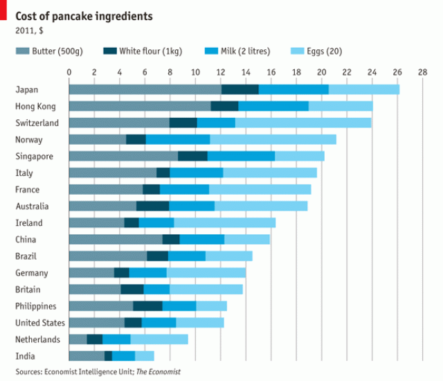
This first question comes from a 1940 classic book called How To Read A Book by Mortimer J. Adler. Adler maintains that you don’t save time on books by learning to speed-read. Instead, you save time by making an informed decision about what to and what not to read. And the best way to make this decision is to do an “inspectional read” which means skimming through titles, headings, tables of context, etc. Similarly, when you encounter a chart, map, or graph in text, skim over it by reading the title and subtitle, and any captions or annotations. Then determine what its about and, more specifically, what question it is trying to answer.

2.     What’s my guess about the answer to that question?

This might seem like an unnecessary step, but studies have shown that comprehension increases when a reader forms questions about a text before consuming it. A question primes your brain for an answer. The more our curiosity is piqued, the easier all learning becomes.

3.     What’s the quality of the data?

This might be the most important step and the least likely to be taken. At least determine the source of the data and whether the source appears to be reliable and credible. True, individuals will disagree on which sources are reliable and credible. Some of us, however, might be wary of data from institutions with clear political leanings or agendas. If no data source is noted, the viz is not worth your time.

For extra credit, look for information on what is and what is NOT included in the data. Consider, for example, the time period of the data and the demographics of people represented by the data. You are trying to determine if the data are equal to the task of the visualization. Can it really answer its question(s)? Or are there gaps in the data that weaken its ability to answer the questions fully or at all?

4.     What more can I learn from the structure of the viz

If you have gotten this far, you are engaged by the viz. Now consider what it all means. A visualization is, by nature, an abstraction of reality. It shows data collected in the real world using position, color, shape, and size to represent the data. Thus it’s important to understand what these visual cues mean in the particular viz you are consuming.

5.     What is the answer to the question and what questions am I left with?

Finally, consider what answers you see in the viz and how they compared to your expectations. And to prime yourself to consider future information on the same subject, ask yourself what else you’d like to know about it. 

See other data tips in this series for more information on how to effectively visualize and make good use of your organization's data.

Data Viz Vs. Infographic

2.png

Infographic and data visualization often are used interchangeably. And, indeed, the distinction is not hard and fast. They both focus on showing rather than telling. They explain something using more visual cues than words or numbers and so take advantage of our visual superpowers. (For more on these superpowers, see Tip #1.) The difference is that an infographic is more of a story, and a data visualization is more of a tool.

An infographic typically uses images to lead the viewer through a story. Some of those images might be visualizations of data. For example, the point of this infographic is to show the viewer the negative impact of homelessness in contrast to the positive impact of a program called Ability Housing. Infographics are usually meant to explain or show something to people who are not all that familiar with the topic.

A data visualization, unlike an infographic, uses visual cues (shape, color, size, etc.) primarily to represent data. Think bar chart, line graph, pie chart, and maps. And though the creator of the data visualization may have a story he/she wants to tell, the viewer can use the visualization to discern any number of stories.

For example, on the quadrants chart below, each circle represents an educational strategy. The strategies are plotted along two measures: how much importance educators place on the strategies and how often they put these strategies into practice. We can use this chart as a tool to decide what to do next. Clearly, most of the educators represented in the data already feel these strategies are important. But they use the tactics less than 50 percent of the time. So we need not waste time explaining the value of the strategies to them. Instead, we should figure out what is getting in the way of their implementing the strategies.

So if you are looking to tell a specific story particularly to an outside audience, consider an infographic. If you are looking for a tool to explore data, consider a data visualization.

quadrants.jpg

See other data tips in this series for more information on how to effectively visualize and make good use of your organization's data.

Data Viz Lineup

3.png

Eyes beat memory according to Tamara Munzner. Her idea (which she shares with others, including myself) is simple. It’s easier to compare two things you can see at the same time than to compare something you can see to something you can only remember.

When several small visualizations are placed side by side (called “small multiples”), you can see the power of eyes over memory. Take a few seconds to check out this great small multiples viz by Doug McCune. You can quickly scan the images to make easy comparisons.

In each chart, the X-axis shows time of day, and the Y-axis shows number of crimes. Daytime crimes are displayed with yellow bars in the top half of the chart. Night-time crimes with blue bars on the bottom.

It’s easy to see that driving under the influence and drunkenness occur more often during the night and trespassing and suicide occur more often during the day. It would be much harder to draw this conclusion flipping through pages or clicking through screens.

See other data tips in this series for more information on how to effectively visualize and make good use of your organization's data.

Flatten Your Data

60-SECOND DATA TIP #8 (1).png

Bells and whistles can be a problem when visualizing data. Edward Tufte, the grandfather of modern data viz, entreated us to remove any non-data ink. The idea is to focus on what matters — the story the data is telling us — without any unnecessary distractions.

Making visualizations look three-dimensional is almost always a distraction and a distortion. To make something look 3D, you have to use a technique called “foreshortening” which means that parts that are supposed to be perceived as closer in space are larger (see red slice of the pie in the image below), and parts that are supposed to be perceived as farther away are smaller (see green and blue slices). The angles represented on the 2D chart on the left, as you can see, are distorted on the 3D chart on the right, making it more difficult to judge the relative size of the slices.

Another way of creating the illusion of three dimensions is to obscure some objects with others to make it appear that one object is in front of another. But, of course, this is a problem for accurate assessment in a data viz. For example, in the 3D bar chart below, the green bars for "C" are barely visible whereas the flat image shows the green bars clearly.

Is it ever a good idea to make data visualizations look 3D? Yes, but rarely. The rule is simple. Only use 3D visualizations for 3D spatial data such as a diagram showing airflow over a spacecraft. Otherwise keep it flat.

See other data tips in this series for more information on how to effectively visualize and make good use of your organization's data.

pie_3d.png
bar_3d.png

How to Extract Your Head From The Sand

60-SECOND DATA TIP #8 (2).png

We think we know more than we actually do. In fact, we are wired that way. This illusion helps us to get along in the world. But it also gets us into trouble sometimes. Like when we are planning what our organization should do next.

Overtime, we have relied less on our own abilities to build houses, cure diseases, or fix toilets and more on others’ knowledge in these areas. We each specialize, gaining more in-depth knowledge in one area than any generalist could. Then we trade our knowledge for that of others. Seems like a good idea, but there are downsides.

We so effectively collaborate that, as Sloman and Fernbach argue in The Knowledge Illusion: Why We Never Think Alone, the lines between our understanding and that of others blurs together. We perceive the others’ knowledge as our own, even when that “knowledge” is actually baseless opinion. “This is how a community of knowledge can become dangerous,” according to Sloman and Fernbach.

Every organization has its orthodoxies, but not all of them are true. How can we distinguish the truth from our own and others' deeply-held but false beliefs?

The answer is: data. In other words, we can use the scientific method and put our assumptions to the test. If we cannot find evidence (aka data) that sufficiently refutes our assumptions, we can feel encouraged that we MIGHT be right, as long as new data doesn’t come along and undermine our beliefs.

Progress in organizations — and in all of human history — starts with the concession that we might be wrong. As Yuval Noah Harari suggests in Sapiens: A Brief History of Humankind, the scientific revolution was the point in history when “humankind admits its ignorance and (as a result) begins to acquire unprecedented power.” 

On a more modest scale, we can start asking questions like: what would we expect to see in the short and long run if our programs work how we expect them to? And then we can look for data that either supports or refutes our expectations. And if we bristle at spending our time with data when so much else needs to be done, we can make data more digestible by visualizing it. (See Data Tip #1 for more on the power of data visualization.)

See other data tips in this series for more information on how to effectively visualize and make good use of your organization's data.

Photo by Tyler Nix on Unsplash


Upcoming Data Viz Workshops

60-SECOND DATA TIP #8.png

This week's tip is short and sweet: bring your planning, fundraising, communications, and assessments to life by visualizing them. Check out my upcoming workshops below. Three are in the Chicago area and one is online.

Data visualization: Using Your Organization’s Secret Weapons To Boost Fundraising and Impact

Tuesday, April 17, 2018, 8:00 am to 9:30 am at the Evanston Community Foundation, One Rotary Center, 1560 Sherman Ave., Evanston, IL.

60-SECOND DATA TIP #8 (2).png

Data Visualization for Grantmakers

Thursday, April 19, 2018 9:00am to 10:30am at The Robert R. McCormick Foundation, 205 N. Michigan Avenue, 43rd Floor, Chicago, IL. This event is open to grantmaker members of Forefront. If you are interested and not a member, please contact nonprofitviz@gmail.com. 

60-SECOND DATA TIP #8.png

Using Data Visualization to Boost Your Organization's Fundraising

Friday, May 11, 2018, 9:00am to 12:00pm at the School of Social Service Administration, 969 E 60th Street, Chicago, IL.

60-SECOND DATA TIP #8 (3).png

Data Visualization Webinar: Using Your Organization’s Secret Weapons To Boost Fundraising and Impact

Thursday, May 24, 2018, 1:00 pm to 2:00 pm online.

The Power of Data Mirrors

60-SECOND DATA TIP #8 (1).png

Looking into a data mirror can be a powerful experience. In the 60-Second Data Tip series, we have talked quite a bit about nonprofit managers, fundraisers, board members, and funders looking at organization-wide or individual program data to understand what to do next. And last week, we spoke about sharing data charts, graphs, and maps with our clientele to better understand trends. However, data can be a tool not just for planning and evaluation at the organizational level, but for personal change.

You may ask, don’t I already know a lot about myself? Do I really need to consult a data chart for self discovery? Well, research evidence suggests that we often think we know more than we actually do. We are wired to rely on the knowledge of others and sometimes we mistake their knowledge for our own (stay tuned for a tip on this). Also, sometimes we simply are not paying much attention to ourselves.

So a data mirror can be revealing. For example, you may think you spent the whole day on our feet, but the data on your Fitbit may show you otherwise.

As discussed in Data Tip #1, nonprofits tend to have a lot of data that never gets used or used well. Instead, it collects virtual dust on your server. But what if you blew the dust off of some of that data, visualized a single client’s data (e.g. her level of participation in your programs over time) and shared it with her? The data could lead to a conversation about what promoted progress and what stumbling blocks led to downward trends. Regular data feedback can be motivating, as we know from Fitbits and video games and goal-setting apps. Sharing data with clientele could be a secret weapon you didn’t know you had.

See other data tips in this series for more information on how to effectively visualize and make good use of your organization's data.

Give Voice To Data Points

60-SECOND DATA TIP #8.png

We are, each of us, data points in an unlimited number of data stories. These stories can be told using charts, maps, and graphs. Depending on the topic, you might be a data point lost in a crowd of other points (in other words, you are in the norm) or you might be hanging out on the fringe (aka an outlier). Either way, you hold valuable information that the chart, map, or graph cannot tell on its own.

Let’s say that you’re a dot on a scatterplot. A scatter plot uses horizontal and vertical axes to plot data points. They show the relationship (or correlation) of one variable to another. A scatterplot might show the amount of time spent in a program—say an employment training program—on one axis and an intended program outcome—say current wages—on the other. Each point is a participant in the program.

Of course, you would hope to see that wages increase as duration in the program increases, at least to a certain point. But what if that’s not the case? That’s when it’s good to get the data points' points of view. Share the scatterplot with a few participants with different durations in the program and at different wage levels and ask: "Why do you think the data looks like this?"

They are going to share their personal experiences, their understanding of causes and effects in their own lives. And these stories will help you to understand general trends across all of the participants in the program. Perhaps one will tell you that he dropped out of the program several times when he gained new employment, which reduced his time in the program but also increased his wages. This insight, along with insights from other individuals (either collected informally or through a survey) can lead your organization to program reforms which, in turn, change trends in your data.

See other data tips in this series for more information on how to effectively visualize and make good use of your organization's data.

Images created by Ilaria Bernareggi and n.o.o.m. for Noun Project.

A Valentine's Day Post On (Data) Relationships

60-SECOND DATA TIP #8 (2).png

Data on any one thing isn’t that interesting. You might know the ages of all the participants in a program or the average grant amounts for a group of foundations. But that doesn’t really tell you anything until you look at that data in relationship to something else. That “something else” usually falls into these categories: time, other data, space, rank, or networks.

Time.  Is participation now greater or less than in the past? To see this, you need a line chart with some measure of time, such as each month of a year, along the horizontal (aka X) axis and number of participants along the vertical (aka Y) axis. Each point shows how many people participated in a given month. Connecting the dots gives you a slope, which instantly shows you whether participation is increasing, decreasing, or varying over time.

Other data. You might want to know how participation relates to other data you have on participants. For example, are the ages of participants related to their satisfaction with your program (as reported on a survey)? In this case, you could use a scatter plot with satisfaction scores along the vertical axis and age along the horizontal axes. Each dot shows the age and satisfaction of a single participant. If the dots suggest a rough increasing slope, then older participants are often more satisfied with your program than younger ones. You might then color dots representing females red and those representing males as blue to see if and how gender relates to the age and satisfaction of participants. 

Space. To show where participants live in relation to each other and to your organization, participant dots can be placed on a map. If you size the dots to show another factor, such as income, then you have a bubble map.

Rank. These types of charts show your data in relationship to a scale that indicates importance, prevalence, or some other metric. Perhaps the most common type of chart in this category is the tree diagram, which is often used to show reporting relationships among staff in an organizational chart. You might use it to show the educational institutions of participants in your program, starting with school districts at the top, individual schools in the middle, and classrooms at the bottom.

Networks.  In network visuals, the relationships among individuals, groups, things, concepts, etc., are shown using connecting lines. For example, you might visualize participants as dots and the connecting lines show what other participants they referred to your program. In this way, you can quickly distinguish frequent referrers from infrequent ones. 

See other data tips in this series for more information on how to effectively visualize and make good use of your organization's data.


Data Is Not The Answer

Copy of 60-SECOND DATA TIP #8 (2).png

Love might be the answer. But data is not. Data is more a suggestion than a solution. We get data-driven suggestions all of the time: movie suggestions from Netflix, book suggestions from Amazon, mate suggestions form Match.com.

Netflix data can take us only so far. Once we get their suggestions, we then apply knowledge that even Netflix doesn’t have: what mood we are in right now, whom we plan to watch the movie with, etc.  Netflix’s suggestions + our knowledge/wisdom can lead to a good decision.

The data we house in our organizations also can make suggestions worthy of our consideration. But we must apply knowledge and wisdom before moving forward. A key source of this information are staff members, at different levels of an organization, who can apply their experience and professional knowledge. Executives are more likely to apply broad knowledge from the field while those on the ground are more likely to apply first-hand knowledge gleaned from experiences with certain programs, clients, etc. Accessing this knowledge is as simple as showing a line chart to staff and asking: why do you think this happening?

Another source of invaluable wisdom is our clientele (service users, participants, visitors, patients, etc.) Unfortunately, many organizations do not tap this resource well or at all. Clientele knowledge will be the topic of a future data tip.

See other data tips in this series for more information on how to effectively visualize and make good use of your organization's data.

Show Order

Copy of 60-SECOND DATA TIP #8.png

We visualize data to take advantage of our visual superpowers. And when doing so, we should keep in mind how our mind works. We humans are great at detecting patterns, even when none exists (think conspiracy theories). From an evolutionary perspective, pattern recognition has helped us to understand what we see and make predictions that help us survive and reproduce.

Order is a particular type of pattern. It is the arrangement of people or things in relation to each other according to a particular sequence. So when there is an order to our data, we should show it. Our pattern-seeking minds will thank us for delivering up a real pattern and making it so easy for us to see.

For example, arrange bars on a bar charts in descending order so that viewers can easily pick out the top/bottom or the most/least. In this visualization from The Economist, we can easily see that Japan is the most expensive place to make pancakes (assuming you are buying all of your ingredients there.) It also gives you a sense of what is driving the difference in cost of pancake ingredients: butter in Japan, eggs in Switzerland.

pancakes.gif

See other data tips in this series for more information on how to effectively visualize and make good use of your organization's data.

Camel by Tatiana Belkina from the Noun Project

Choose the Right Viz for the Job

Copy of 60-SECOND DATA TIP #8.png

When you think of visualizing data, your mind probably goes to bar graphs or maybe pie charts. However, there are many more species of visualizations. Ever heard of a waterfall or a circular area chart? Your first decision when visualizing data is what type of chart or graph to choose and that depends on what you want to show and what type of data you have.

I highly recommend Andrew Abela’s simple decision tree called “Chart Suggestions—A Thought-Starter” (see image below).  It’s based on Gene Zelazny's classic work Saying It With Charts. The decision tree starts with the basic question: “What would you like to show?” And provides four options:

Comparison. You have two or more groups of things or people and you want to see which group is largest or smallest (or somewhere in between) on some measure. You also may want to see how these groups compare on the measure over time.

Distribution. You have a bunch of data points (e.g. the ages of participants in a program or test scores of students in a class) and you want to know how spread out or bunched up they are. Are most of the ages, test scores (whatever) near the average? Or is there a wide range? Are there some extreme outliers?

Composition. You want to understand who or what makes up a larger group such as how many of the participants in a program are in different age brackets or how many have been in the program for different lengths of time.

Relationship. You want to know if one thing is related to another, either at one point in time or over time. Do participants in a mental health program report less distress over time? Do those with lower incomes have higher heart rates?

Once you answer this basic question, the decision tree helps you to choose a specific chart based on the type of data you have. Abela’s chart chooser includes the types of charts you are most likely to select. But there are more rare species out there. To learn more about the wide array of ways to visualize data, check out the Data Visualization Catalogue.

See other data tips in this series for more information on how to effectively visualize and make good use of your organization's data.

chart-suggestion-infographic.jpg

Color Coordinate Your Data

Copy of 60-SECOND DATA TIP #8 (1).png

Color is a great tool for drawing attention to certain data points in a graph, chart, map, or diagram. But, WARNING, color also can confuse the viewer. Adopting a few rules of thumb will turn a rainbow of confusion into an elegant and clear picture:

1) Limit one meaning per color. If you are color coding a map and assigning blue to a certain income range, then do not use blue to mean anything else in that map or adjacent related visuals. Blue always means that specific income range.

2) Limited color palate. Limit your graph, chart, map, or diagram to a few complementary or monochromatic colors. Remember the color wheel? (See image above.) Choose complementary colors that are on opposite sides of the wheel: think orange and blue and yellow and purple. Or choose several tones of one color (a monochromatic color scheme). Looking for an effective ready-made color palate? Check out sites like color-hex.

3) Avoid reds with greens. Seven to ten percent of men are red-green colorblind. They can’t tell the difference between the two. So avoid using them both on a visualization.

4) Dial-up one data point and mute the rest. If you want to draw attention to one point, line, bar, or pie slice, give it a bright color and color the rest a muted shade or gray.

See other data tips in this series for more information on how to effectively visualize and make good use of your organization's data.


What Averages Obscure

Copy of 60-SECOND DATA TIP #8.png

Nonprofits (and everyone else) are addicted to averages. We like to talk about how participants do on average. We might describe how many visitors we have in an average week. But how much are we missing when we focus solely on averages? Short answer: it depends, but it could be a lot. If I only showed you the average sized guy in the picture, would you appreciate the full range of sizes?

To figure out what and how much we are missing, we need to calculate—or better yet show—how spread out our data points are. Understanding the spread gives us an idea of how well the average or the median represents the data. When the spread of values in the data set is large, the average obscures the real picture more than when the spread is small.

Spread measures include range, quartiles, absolute deviation, variance and standard deviation. For more on these measures, check this out. 

A great way to quickly grasp the spread of your data is to make a box plot. A box plot (aka. box and whisker diagram) shows the distribution of data including the minimum, first quartile, median, third quartile, and maximum. The box plots below show the affordability of neighborhoods in five cities. Each red circle represents a zip code area. The gray boxes show where 50 percent of the zip code areas fall on the affordability scale. And the median is where the dark gray meets the light gray. You can see that, in general (i.e according to the median), New York is more affordable than Los Angeles. However, New York has some zip code areas that are much less affordable than the median seems to suggest.

So when looking at your data, don’t just look at averages, also consider the spread.

boxplot2.jpg

See other data tips in this series for more information on how to effectively visualize and make good use of your organization's data.

Image created by Moxilla for Noun Project.

A Good Cause Is No Coincidence

1.png

We all know that correlation does not equal causation. Just because something occurs with something else, doesn’t mean that one caused the other. If you do a dance and then it rains, that’s not enough evidence that the dance caused it to rain. Even if it rains almost every time you dance, it could be that something else is causing both the rain and your dancing. Perhaps a drop in barometric pressure causes your joints to hurt and you dance to loosen them up while the same drop in pressure causes rain. It’s a silly example. But you get the point. (Check out this hilarious website which shows other spurious correlations, such as the one between cheese consumption and death-by-bedsheets.) 

Nonprofits (and everyone else) often make erroneous claims based on correlation. We might conclude, based on our data, that participation in our employment training leads to higher wages over time. Well, maybe. But perhaps employment in our city is on the rise and affecting everyone, not just participants in our program. Or maybe our program tends to attract participants who are quite motivated to find jobs and would do just as well without the program.

Correlation is necessary but not sufficient to prove causation. Indeed causation is a very high bar to reach. You must have three conditions: 1) correlation: two factors co-occur, 2) precedence: the supposed cause comes before the supposed effect in time, and 3) no plausible alternatives. This third condition is the trickiest. It involves ruling out other causes of the observed effect. So you can see why even carefully designed studies can rarely produce incontrovertible evidence of causation. (For more on establishing cause and effect, read this.) 

Short of hiring researchers to design and conduct rigorous (and usually expensive) studies of your work, you can at least consider plausible alternatives. When you observe something good or bad happening in your organization, consider possible causes both within and outside of your organization’s control. If possible, try altering just one factor, collect data over time, chart it, and see if a trend changes. Explore rather than assume.

See other data tips in this series for more information on how to effectively visualize and make good use of your organization's data.

Photo by Ariel Lustre on Unsplash

Simplify

Copy of 60-SECOND DATA TIP #8 (1).png

This data tip comes from the grandfather of modern data visualization: Edward Tufte. He originally recommended the elimination any non-data ink from data visualizations. Although today we might think more in terms of pixels than ink. The idea is to remove any distractors from the story that a data visualization--such as a bar chart or line graph--shows. Such distractors can include bells and whistle such as bars on a bar chart drawn as people or buildings (Tufte called this “chartjunk”). But there are more subtle distractors like graph lines and background color. The two images here show the same data, but the one on the right is stripped down to the essentials: no graph lines, no axis titles, only the visual information necessary to see the slope and to quantify it. So next time you visualize data, try simplifying so that your story shines through.

Note: 60-Second Data Tips will resume in January 2018. Happy New Year!

See other data tips in this series for more information on how to effectively visualize and make good use of your organization's data.

Point To The Story

Copy of 60-SECOND DATA TIP #8.png

Data can tell a story. But rarely is that story apparent when you look at a spreadsheet. (See Tip #1.) You can bring the story into focus by visualizing the data. You can show change over time using a line graph. You can compare and contrast groups using a bar chart. You can juxtapose a part of a group and the whole group using a pie chart. And there are plenty of other examples. But once you have visualized, the story can still be hidden, particularly to those unfamiliar with the data. That’s when it’s time to call out data points with color and annotations. In the visualization below, each line is a city in Hennepin County in Minnesota. The slope of the lines shows changes in housing prices overtime. The Minneapolis Star Tribune, which created the visualization, draws our attention to the city of St. Louis Park and allows us to easily compare this city's housing prices to that of other cities before and after the housing bubble peak. The annotation also gives us specific data on St. Louis Park that would be difficult to glean from the graph alone. The interactive version of this graph allows you to highlight different cities and look at median housing cost, relative cost, and relative change in cost.

See other data tips in this series for more information on how to effectively visualize and make good use of your organization's data.

Screen Shot 2017-12-13 at 10.37.27 AM.png

Consider Outliers

60-SECOND DATA TIP #8 (1).png

When you visualize your data (in a bar chart or line graph, for example), your eyes tend to focus on clumps of data. That makes sense. The clumps are where the action is. Groups of data — which appear as the longest bars or data that forms an approximate line on a graph — show us general patterns in the data. For example, they tell us that as one thing increases (like age), another thing also increases (like risk of disease). Or they might tell us that use of counseling services peaks in the months of January, February, and March. These are important stories, so certainly keep your eyes on the action. But also do not ignore small bars or the isolated points or smaller clumps of data points, aka “outliers”. They have important stories to tell too. First, their message might be: “Warning! Human error! The data is wrong and needs to be corrected." Second, if you have confirmed that the data is correct, then these outliers might alert you to distinct subpopulations that, for example, do particularly well or notably poorly in a program. This is an interesting finding, one not to be discounted. They should prompt you to ask: Who are these individuals? What about them sets them apart from the others? Did they have different program instructors? Did they have certain characteristics which would (dis)advantage them in the program? The answers to such questions often prove to be insights that help you to adjust your course and improve curriculum, your recruitment strategy, or other ways in which you do your work.

See other data tips in this series for more information on how to effectively visualize and make good use of your organization's data.

Pies are for eating

There are better ways to show your data.

60-SECOND DATA TIP #8.png

Pies are delicious but often inscrutable when applied to data. Humans are pretty good at deciphering some visual cues and pretty bad at others. For example, we do well when comparing lengths along a common scale. So looking at this image, we can confidently proclaim the E bar as the tallest. But we would be hard pressed to pick out which pie slice is largest. That’s because we don’t do so well with angles. So when comparing the quantities of several things, bar charts are almost always better than pie charts. The only exception is when you want to compare a part to a whole. In this case, a pie chart does a good job of showing that girls, for example, represent only a sliver of all the participants in a program or that 30 to 40 year olds are the majority of visitors to an event. But once you get beyond 2 (or maybe 3) slices, skip the pie and dust off the trusty bar chart.

Get the whole picture

tip7.jpg

In an ancient Indian parable, a group of blind men encounter an elephant for the first time. Each man feels a different part of the animal and reaches his own conclusions. One feels a tusk and proclaims it a spear. Another feels a leg and decides it’s a tree trunk. The message? Collect more evidence and take a wider view. This is a good message for nonprofits. Notice a 3-month downward trend in participation in one of your programs? Zoom out and see if the trend holds over longer periods of time. If not, is there a cyclical pattern? For example, when looking at the trend over the past 5 years, does participation increase during certain months and decrease in others? Also, zoom in and see if the trend holds for subgroups. Is there a downward trend for boys in your program but an upward trend for girls? Do those in certain age groups have differing trends? Zoom out and zoom in to clearly understand the whole story.

See other data tips in this series for more information on how to effectively visualize and make good use of your organization's data.

Photo by jinsu Park on Unsplash