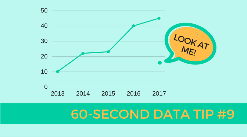
When you visualize your data (in a bar chart or line graph, for example), your eyes tend to focus on clumps of data. That makes sense. The clumps are where the action is. Groups of data — which appear as the longest bars or data that forms an approximate line on a graph — show us general patterns in the data. For example, they tell us that as one thing increases (like age), another thing also increases (like risk of disease). Or they might tell us that use of counseling services peaks in the months of January, February, and March. These are important stories, so certainly keep your eyes on the action. But also do not ignore small bars or the isolated points or smaller clumps of data points, aka “outliers”. They have important stories to tell too. First, their message might be: “Warning! Human error! The data is wrong and needs to be corrected." Second, if you have confirmed that the data is correct, then these outliers might alert you to distinct subpopulations that, for example, do particularly well or notably poorly in a program. This is an interesting finding, one not to be discounted. They should prompt you to ask: Who are these individuals? What about them sets them apart from the others? Did they have different program instructors? Did they have certain characteristics which would (dis)advantage them in the program? The answers to such questions often prove to be insights that help you to adjust your course and improve curriculum, your recruitment strategy, or other ways in which you do your work.
See other data tips in this series for more information on how to effectively visualize and make good use of your organization's data.