Ideas You Should Steal From This Viz (Installment 5)

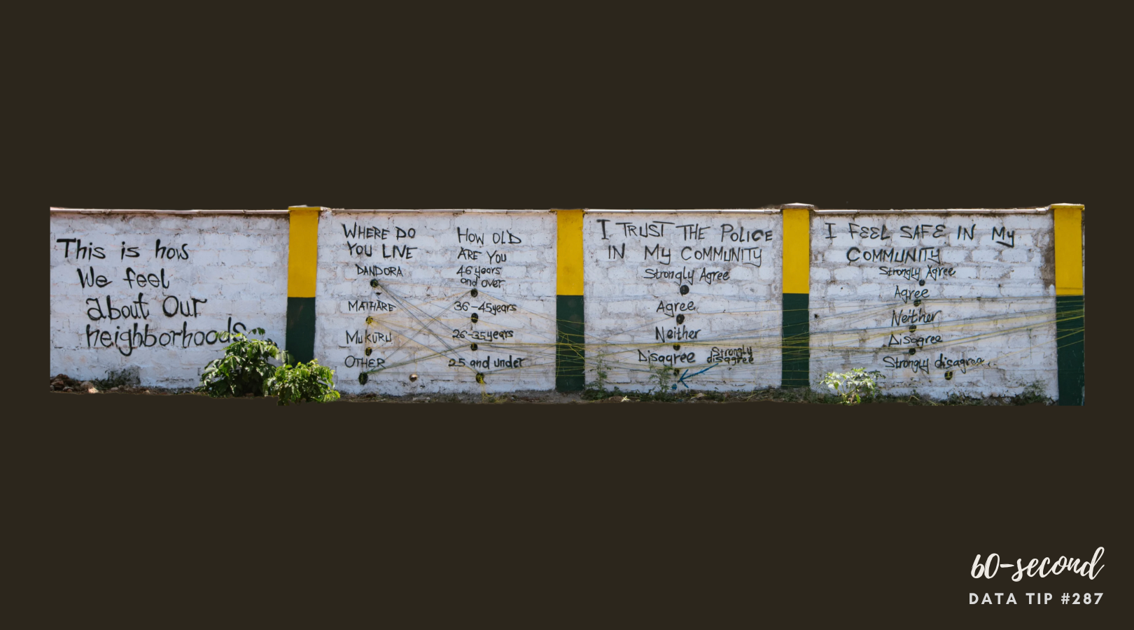
Today I offer up yet another steal-worthy viz that I came across in the Tableau Public Gallery. Take a look:

Source: Vignesh Suresh on Tableau Public

Source: Vignesh Suresh on Tableau Public

The goal is to highlight the mismatch between the percentage of websites using a language and the share of the world’s population speaking that language. As we can see, there’s a mismatch for all languages except Polish. Using partial shapes for each of the two metrics works so well. It’s easy to see where there is more or less of a mismatch.

Creating such a chart in Tableau involves some varsity-level skills including the trigonometric functions of sine and cosine. But if you are just as happy with diamonds as circles, you can easily steal the basic idea for this chart and create a much simpler chart in Tableau. The example below compares the percent of residents in a community in need of a particular service and the percent of program slots providing that service. Want to know how I did it? Check out these instructions which assume basic knowledge of Tableau.


To see past data tips, click HERE.


Let’s talk about YOUR data!

Got the feeling that you and your colleagues would use your data more effectively if you could see it better? Data Viz for Nonprofits (DVN) can help you get the ball rolling with an interactive data dashboard and beautiful charts, maps, and graphs for your next presentation, report, proposal, or webpage. Through a short-term consultation, we can help you to clarify the questions you want to answer and goals you want to track. DVN then visualizes your data to address those questions and track those goals.

Schedule A Free Consultation

Ideas You Should Steal From This Viz (Installment 4)

“Every artist gets asked the question: ‘Where do you get your ideas?’ The honest artist answers, ‘I steal them.’ . . . What a good artist understands is that nothing comes from nowhere. All creative work builds on what came before.” —Austin Kleon in Steal Like An Artist.

Today I offer up another steal-worthy interactive viz that I came across in the Tableau Public Gallery. Scroll down for ideas to steal from this viz.


Source: Ethan Lang on Tableau Public


Here’s what I suggest you steal from this viz:

  • Side-by-side comparisons. It’s simple to compare states to one another since they are arrayed alongside each other.

  • Good news/bad news colors. The red/blue color coding makes it easy to discern states with decreased rates of homelessness from those with increased rates both in the national map and in the individual state charts.

  • Easy look up. If you want to dig into one state’s data, you can select it on the map and get more detail on the charts in the upper left hand panel.

To see past data tips, click HERE.


Let’s talk about YOUR data!

Got the feeling that you and your colleagues would use your data more effectively if you could see it better? Data Viz for Nonprofits (DVN) can help you get the ball rolling with an interactive data dashboard and beautiful charts, maps, and graphs for your next presentation, report, proposal, or webpage. Through a short-term consultation, we can help you to clarify the questions you want to answer and goals you want to track. DVN then visualizes your data to address those questions and track those goals.

Schedule A Free Consultation

Ideas You Should Steal From This Viz (Installment 3)

“Every artist gets asked the question: ‘Where do you get your ideas?’ The honest artist answers, ‘I steal them.’ . . . What a good artist understands is that nothing comes from nowhere. All creative work builds on what came before.” —Austin Kleon in Steal Like An Artist.

Today I offer up another steal-worthy viz. Take a look:

Source: Nicole Mark on Tableau Public

Here’s what I suggest you steal from this viz:

  • Use a quote for the title. As noted in another data tip, titles are among the most important elements of a viz but often little effort goes into them. Nicole Mark, who created this viz, could easily have slapped on this title: “Number of People Who Fled Ukraine, February to March 2022.” Instead, Nicole humanized the crisis with a quote from Volodymyr Zelenskyy.

  • Show just the trajectory. To focus attention on the dramatic increase in the number of people fleeing Ukraine, the axes and gridlines have been removed.

  • Connect key information with color. The quote, the key statistic in the lower right corner, and the line on the chart are the only elements in red and thus appear more important than the other information and are visually related to each other.

To see past data tips, click HERE.


Let’s talk about YOUR data!

Got the feeling that you and your colleagues would use your data more effectively if you could see it better? Data Viz for Nonprofits (DVN) can help you get the ball rolling with an interactive data dashboard and beautiful charts, maps, and graphs for your next presentation, report, proposal, or webpage. Through a short-term consultation, we can help you to clarify the questions you want to answer and goals you want to track. DVN then visualizes your data to address those questions and track those goals.

Schedule A Free Consultation

Ideas You Should Steal From This Viz (Installment 2)

60-SECOND DATA TIP_3.png

“Every artist gets asked the question: ‘Where do you get your ideas?’ The honest artist answers, ‘I steal them.’ . . . What a good artist understands is that nothing comes from nowhere. All creative work builds on what came before.” —Austin Kleon in Steal Like An Artist.

Recently, I recommended that you steal ideas from this data viz . Today I offer up another steal-worthy interactive viz that I came across in the Tableau Public Gallery.

Source: Ellen Blackburn on Tableau Public

Here’s what I suggest you steal from this viz:

  • Vertical Timeline. The vertical timeline looks cool and works better than a horizontal one on a phone screen.

  • Self-Explanatory Chart. Each action by the Trump Administration is represented by a square. I would have stated this in the subtitle, but I think the chart is pretty self-explanatory once you begin interacting with it (give it a try). It’s easy to see when there were more or fewer actions and what proportion of actions are considered anti-LGBTQ+ and anti-trans.

  • Detail on Demand. When you scroll over the squares, you get a lot more detail on the particular actions. But none of this detail is visible until you start scrolling. So the details do not obscure the overall patterns and change over time.

  • Controlled color palette. Using just two colors for the squares and one color for the text lets the patterns shine through. Also, the off-white background looks like a piece of paper, making the viz seem more approachable.

To see past data tips, click HERE.


Let’s talk about YOUR data!

Got the feeling that you and your colleagues would use your data more effectively if you could see it better? Data Viz for Nonprofits (DVN) can help you get the ball rolling with an interactive data dashboard and beautiful charts, maps, and graphs for your next presentation, report, proposal, or webpage. Through a short-term consultation, we can help you to clarify the questions you want to answer and goals you want to track. DVN then visualizes your data to address those questions and track those goals.


Schedule A Free Consultation

Ideas You Should Steal From This Viz (Installment 1)

60-SECOND DATA TIP_3.png

“Every artist gets asked the question: ‘Where do you get your ideas?’ The honest artist answers, ‘I steal them.’ . . . What a good artist understands is that nothing comes from nowhere. All creative work builds on what came before.” —Austin Kleon in Steal Like An Artist.

Today’s tip is to steal ideas from other data visualizations. Here’s a viz I recently came across in the Tableau Public Gallery:

Source: Jacqui Moore on Tableau Public

Source: Jacqui Moore on Tableau Public

I’ve stacked the four squares below so that you can see it close up. And here’s what I suggest you steal from this viz:

  • Simple charts. The viz has only two types of charts: bar charts and line graphs. And they are so simple to read. Distracting elements (like axes and gridlines) are eliminated so that you can easily compare the world to North America, both now and over time.

  • Repetition of charts. The same charts are repeated for each of four categories, making comparison among categories quite easy.

  • Images. The simple images relating to mountains, terrestrial, freshwater, and marine help us to distinguish among the four categories and add visual appeal.

  • Controlled color palette. The viz focuses attention on the four categories by diverging from the monochromatic color scheme only in the images.

Untitled design (1).png

I look forward to sharing other steal-worthy data visualizations with you in future data tips! To see past data tips, click HERE.


Let’s talk about YOUR data!

Got the feeling that you and your colleagues would use your data more effectively if you could see it better? Data Viz for Nonprofits (DVN) can help you get the ball rolling with an interactive data dashboard and beautiful charts, maps, and graphs for your next presentation, report, proposal, or webpage. Through a short-term consultation, we can help you to clarify the questions you want to answer and goals you want to track. DVN then visualizes your data to address those questions and track those goals.


Schedule A Free Consultation