Managing Amid Uncertainty: What You Can Know and Show

60-SECOND DATA TIP_3 (1).png

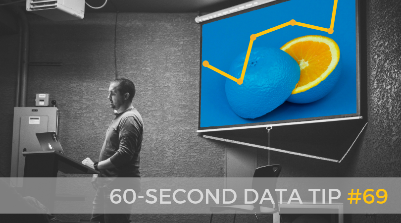
Does your organization feel like the guy in the picture above? Heretofore, you and your colleagues have been climbing a challenging mountain. The journey has been daunting at times but despite occasional setbacks, your trend has been upward. And just as you were ready to take on the next steep incline, you encounter a cliff — or at least what feels like a cliff. The path ahead is foggy and uncertain.

How to deal with the uncertainty that the pandemic had brought into most aspects of life, including our work? One response is to try to bring the present and possible future into focus through charts, maps, and graphs. “In many ways, data visualization has been instrumental to how we’re processing COVID-19,” writes Stephen Gossett at Built In. “The Washington Post’s animated-dots simulation became the paper’s most-viewed article ever.” But Gossett goes on to describe the dangers of visualizing uncertain data. As I wrote in an earlier data tip on “Low-CAL” data, data visualizations can make situations appear more certain than they actually are. We should look for the fine print that describes Context, Assumptions, and Limitations and be wary of visualizations that lack this information.

So what can you confidently know and show about your organization now?

  • Your past efficacy or impact. It’s a good time to dust off old charts. Or better yet, revive past data with new and improved visualizations that show your staff, board, and current and prospective supporters how well you have done in the past and thus how worthy of investment your organization is.

  • Your ability to adapt. For extra credit, show your stakeholders how well you have adapted to changes in the past, particularly unexpected ones. Show in charts how you resurged after a cut in public funding or how you built new programs to address unexpected needs in your community.

  • Your current efforts. Show how much money and person hours you have invested, how many people you have served, how many funds you have raised, or how you have redirected resources to new programs.

Even amid all of the uncertainty, there are some “known knowns” (in the words of former US Secretary of Defense, Donald Rumsfeld). While we are waiting for the “known unknowns” and the “unknown unknowns” to come into focus, we can move forward by showing what we do know.

 To see past data tips, including those about other chart types, click HERE.


Let’s talk about YOUR data!

Got the feeling that you and your colleagues would use your data more effectively if you could see it better? Data Viz for Nonprofits (DVN) can help you get the ball rolling with an interactive data dashboard and beautiful charts, maps, and graphs for your next presentation, report, proposal, or webpage. Through a short-term consultation, we can help you to clarify the questions you want to answer and goals you want to track. DVN then visualizes your data to address those questions and track those goals.


Top 3 Things You Should Know About Rankings (And How To Visualize Them)

60-SECOND DATA TIP_3.png
  1. We love lists, listicles, and rankings in particular, because they make assessment easier. We hate information overload. Ranked lists show us what information is most important and so ease decision-making.

  2. We are more likely to remember items at the top and bottom of the lists and forget the items in the middle. So shorter lists are easier to retain.

  3. People also BELIEVE shorter lists more than longer ones.

 3 Ways to Visualize Rankings

  1. Bar Charts (like the one above)

  2. Rank Charts (which are good for showing how ranking changes over time)

  3. Stacked Bar Charts (scroll down to see the mother of all stacked bar charts showing the top 100 colleges by diversity)

For more on the power of rankings, check out this podcast from  the Kellogg School Of Management At Northwestern University. And here is the full version of the viz shown above:

You can find the ARTICLE in which this viz appeared on the World Economic Forum website.I found this chart on Grafiti.

You can find the ARTICLE in which this viz appeared on the World Economic Forum website.

I found this chart on Grafiti.


Let’s talk about YOUR data!

Got the feeling that you and your colleagues would use your data more effectively if you could see it better? Data Viz for Nonprofits (DVN) can help you get the ball rolling with an interactive data dashboard and beautiful charts, maps, and graphs for your next presentation, report, proposal, or webpage. Through a short-term consultation, we can help you to clarify the questions you want to answer and goals you want to track. DVN then visualizes your data to address those questions and track those goals.

How To Squeeze MUCH More Information From Your Surveys (Repost)

60-SECOND DATA TIP #8 (5).png

Surveys are such a common data source for nonprofits. And I get so many questions about how to make better use of survey data, that I’m reposting this tip which originally appeared in June 2018.


Surveys provide answers to many nonprofit questions.  How do participants like this program? What are barriers to enrollment? What types of services do community members lack and need?

It’s easy enough to create a survey on Survey Monkey or the like. It's harder to get an adequate number of responses.  And even when you do, the respondents might not fairly represent the larger group you want to know about. But let’s say you get past this hurdle. There’s still a major hurdle ahead of you: extracting meaning from your data.

Surveys include different types of questions. Perhaps the most common one is the Likert scale question. You have seen them a million times. Respondents are asked to indicate how much they agree or disagree with a particular statement using a five to seven point scale.

Let’s say you want to know participants’ feelings about a program. Your Likert scale statements might be; “I feel that I can ask the instructor for help when I’m confused” or “I feel comfortable interacting with the other participants in the program.” Survey Monkey will give you each respondent’s rating of each statement and will also give you the average rating. What meaning can you extract from these numbers?

Many organizations will use just the averages to determine where they are doing well and where they need to worker harder or differently. But there is so much more information in those numbers than averages can tell you, including:

The extremes: Averages can’t tell you what were the lowest or highest ratings on any given statement.

What most respondents said: Averages also can’t tell you if the average is three because most people responded with a “3” or because half responded with a 5 and half responded with a 1.

What subgroups think and feel: Even though the overall average might be high, the average might be low for some subgroups within your group of respondents. Perhaps respondents from a certain neighborhood, for example, had very different opinions than the group overall.

You can extract and show this information using data visualization tools like Tableau that allow you to interact with your data. The viz below shows the range of responses to each survey statement and the proportion of responses for each rating. Moreover, the interactive version allows you to “drill down” into the data and see how the results change overtime. We could also construct the visualize to show us results for different subgroups.

If you are going to go to the trouble of conducting a survey, make sure to squeeze all of the information you can from the data you collect.

survey_large.png

Let’s talk about YOUR data!

Got the feeling that you and your colleagues would use your data more effectively if you could see it better? Data Viz for Nonprofits (DVN) can help you get the ball rolling with an interactive data dashboard and beautiful charts, maps, and graphs for your next presentation, report, proposal, or webpage. Through a short-term consultation, we can help you to clarify the questions you want to answer and goals you want to track. DVN then visualizes your data to address those questions and track those goals.

See other data tips in this series for more information on how to effectively visualize and make good use of your organization's data.

Embrace Redundancy

1.png

Redundancy gets a bad rap. It’s almost always mentioned as something to avoid. Graphic novelist Nate Powell cautions. “As a visual storyteller, a lot is learning what to include so you're not being redundant between images and text.”

But some research by Michelle Borkin and colleagues points in a different direction. They found that “redundancy was helpful in improving visualization recall and in improving viewers’ understanding of the data being presented. This was true whether it was data redundancy (like labeling your bar chart values, or dual-encoding data) or message redundancy (including the same message in a title, an annotation, a label, a pictogram, etc.)” (Quote from: “How to get people to remember your visualization” by Mike Cisneros and Lilach Manheim.)

Other psychological research also suggests that redundancy can be a friend to memory. (See this research, for example.) And it makes intuitive sense. Perhaps redundancy is good for the same reason you want it on the space shuttle: if one component doesn’t work, it’s good to have a back up. Perhaps it’s just the power of repetition. In either case, it’s a good way to make sure your primary message gets through.

Check out the example below. The main message is that there are a lot of vaccines in development. This is communicated by the title, the number of circles, and the data labels.

tons-new-vaccines-pipeline.png

Source: https://beta.grafiti.io/facts/1048338

And for more on how to capture attention with data visualizations, check out this data tip and this one and this one too!

Data Viz for Nonprofits helps organizations to effectively and beautifully present their data on websites, reports, slide decks, interactive data dashboards and more. Click HERE to learn more about our services and HERE to set up a meeting to discuss how we can meet your particular needs.

The Most Important Element of Any Chart

2.png

After you have chosen a chart type and labored to make it clear and engaging, you still haven’t done the most important part. You haven’t given it a title. And it turns out that “YOUR TITLE IS SUPER IMPORTANT. It’s the thing people look at for the longest, the thing they build the strongest association with, and the thing they’re most likely to remember” according to data visualization research described in “How to get people to remember your visualization” by Mike Cisneros and Lilach Manheim.

So don’t give the title short shrift. Consider what your viewers/readers might want to know. What would capture their attention? What would make them want to learn more? Below are some visualizations posted on Grafiti. The “before” images show their original titles. The “after” images show my new and improved titles. See what you think.

9.png
Copy of 60-SECOND DATA TIP_3 (1).png
11.png
12.png
13.png
14.png

And for more on how to capture the attention with data visualizations, check out this data tip and this one too.

Data Viz for Nonprofits help organizations to effectively and beautifully present their data on websites, reports, slide decks, interactive data dashboards and more. Click HERE to learn more about our services and HERE to set up a meeting to discuss how we can meet your particular needs.


Add This To Make Your Charts Memorable

Copy of 60-SECOND DATA TIP_3.png

Look at the two images below.  Which catches your attention? Which do you think you are more likely to remember?

Copy of 60-SECOND DATA TIP_3.png

Edward Tufte and other data viz gurus have warned us against “chartjunk” which is anything that is not necessary to comprehend the information represented on a chart, map, or graph. The idea is to get rid of distractions and focus attention on the data.

But some research by Michelle Borkin and colleagues points in a different direction.  In an experiment, they showed participants charts with and without various elements that might be construed as chartjunk like photos and drawings. They found that such images not only did not hinder memory or understanding of visualizations, they appeared to serve as “visual hooks into memory.”  Such visual hooks are important because what we perceived is based, in part, on what we expect to perceive due to memories of past experiences.

The idea of not loading up a chart with a lot of junk competing for attention is still a good one. But some images, if they are closely related to the data and connect with what folks already know, can help viewers to focus on and absorb information.

And for more on how to capture the attention with data visualizations, check out this data tip.

Data Viz for Nonprofits helps organizations to effectively and beautifully present their data on websites, reports, slide decks, interactive data dashboards and more. Click HERE to learn more about our services and HERE to set up a meeting to discuss how we can meet your particular needs.

 M. A. Borkin et al., "Beyond Memorability: Visualization Recognition and Recall," in IEEE Transactions on Visualization and Computer Graphics, vol. 22, no. 1, pp. 519-528, 31 Jan. 2016.

 P. Kok et al., “Associative Prediction of Visual Shape in the Hippocampus,” in Journal of Neuroscience 1 August 2018, 38 (31) 6888-6899.

 Photo by Nery Zarate on Unsplash

Data TMI? It's A Thing

Copy of 60-SECOND DATA TIP_3.png

TMI* is a problem in many realms. It has become a parenting truism to only answer the question asked when our kids ask about sex. “Don't tell the kid every single thing you know about a topic; keep it pretty simple and let them ask you for more detail if they need it,” says  Dr. Carol Queen, a sexologist.

I think the same principle applies to data dashboards. Those of us who create dashboards have a tendency to add too many charts, too many filters, too many measures, too many dimensions. The idea is to anticipate almost any question the user might have and make it answerable with the dashboard. But usually, that’s TMI. We overwhelm the user. It’s not clear why or how to use the dashboard and so it’s not used at all.

So listen to the sexologist. When designing dashboards, focus each one on just a few questions that your intended users have. Then beta test them with a few of those users. If they want more detail, they will ask for it.

Data Viz for Nonprofits help organizations to effectively and beautifully present their data on websites, reports, slide decks, interactive data dashboards and more. Click HERE to learn more about our services and HERE to set up a meeting to discuss how we can meet your particular needs.

* too much information

Details, Details (And When To Include Them)

Copy of 60-SECOND DATA TIP_3.png

What I remember most about the movie “Inside Out” is a scene about forgetting. And it has helped to shape my thoughts on presenting data.

In the 2015 Pixar film, memories are shining orbs sent through vacuum tubes to “Long Term,” a mammoth storage room with, nevertheless, limited capacity. So “Mind Workers” continuously cull the memory orbs, discarding the unnecessary ones – old phone numbers, piano lessons, names of past presidents – into the “Memory Dump.” I remembered this scene most recently when:

1) I heard Bryan Caplan interviewed on NPR. He’s an economist who wrote the thought-provoking book The Case Against Education. One argument Caplan makes against education is that we mostly forget it.  He cites studies that show little retention of both facts and generalized skills post college.

 2) My 12- and 14-year-old daughters’ shared with me YouTube channels like Oversimplified, In A Nutshell, and Crash Course. These funny, brief videos explain stuff I’ve forgotten (or perhaps never learned, who knows?) like the origins of the French Revolution and how the immune system works.

So here’s the question: Given that our brains are continuously purging information, particularly details, and retaining, at best, big picture stuff that can be contained in a 10-minute video, should we not bother with the details in the first place? My short answer is no. For me, it’s about who should spend time on the details and when.

If you are presenting data in any form, it’s incumbent upon you to know the details of the data -- what the trends are overall and by subgroup, who or what is not represented in the data, where the outliers are. And then the idea is to transfer aspects of this knowledge in the right form for the right people, paying as much attention to what you exclude as to what you include.

Some of the people will only need the biggest picture, but even they should to be tipped off to any exceptions to the rule hidden in the data. They also need to know where to go to learn more if and when they want to. Some of the people will need a more detailed rendering of the data, but don’t give them so many trees that they can’t see the forest. Indeed, they may retain the details more if you give them a general picture first which serves as a scaffolding on which they can attach details presented later.

And here’s hoping you retain the gist of this data tip!

Data Viz for Nonprofits help organizations to effectively and beautifully present their data on websites, reports, slide decks, interactive data dashboards and more. Click HERE to learn more about our services and HERE to set up a meeting to discuss how we can meet your particular needs.

How To Make Your Data Riveting

60-SECOND DATA TIP_3.png

Attention is like a bouncer at the entrance to our brains. For anything to get inside and make a difference in how we think and act, it first has to win our attention. And I don’t have to tell you (although here I go anyway) that we each have limited attention and lots of things are competing for it. So if you aim to influence others’ thoughts and actions with data, give some consideration to the nature of attention.

What wins people’s attention? 1) Stuff that stands out and 2) Stuff related to our desires or goals. The former wins our “exogenous” attention. The latter wins our “endogenous” attention.

Say you are at a crowded cocktail party. You are going to notice stuff that stands out like loud noises or bright lights. But you will also notice stuff that does not stand out but is of particular interest to you such as that woman standing in far corner whom you were hoping to see. You may also notice if one of your favorite songs is playing softly in the background.

We can make use of this understanding of attention when we visualize data by:

  • Making the most important aspects stand out.  Vary the size, color, and space around text and data points. For example, make the title much larger than the rest of the text or color all of the data points gray except for the ones you want to call attention to.

  • Pointing to aspects that may interest your intended viewers. Use titles, subtitles, data labels and captions to highlight and explain aspects of the data that may be particularly engaging for your intended audience.

Check out the before-and-after vizes below to see how I’ve applied these techniques to focus my audience’s attention.

BEFORE

Slide2.jpg

AFTER

Slide1.jpg

See other data tips in this series for more information on how to effectively visualize and make good use of your organization's data.

Wait, What? Numbers That Bewilder

60-SECOND DATA TIP_3 (1).png

Numbers can bewilder our hunter-gatherer brains. For more than 95 percent of human history, folks were not processing written numbers or words. But they were processing visual information in the form of color, shape, and size. It’s not surprising that our brains, evolved over many thousands of years, are better at understanding data in visual form than in word and number form. So when numbers confuse, try “translating” them to the visual.

Here’s a great example of a number that makes me scratch my head: “54% more students with monitors improved attendance than students without monitors.” The statement relates to a fictional program that (like some non-fictional programs) pairs students with monitors to boost their attendance. At first blush, to me, that sounds pretty impressive. It sounds like this: if 10% of the students without monitors improved their attendance, then 64% (10% + 54%) with monitors improved their attendance. Or, put another way, six times as many kids with monitors improved their attendance as kids without monitors.

But my brain just made a wrong turn. That 54% is showing what statisticians call “relative difference.” And the problem with this type of stat is that indicators with low values have a tendency to produce large relative differences even when the “absolute difference” is small.

Okay, still bewildered? No worries, I give you now a picture for your primitive brain. Let’s say, in our fictional program, there are 10 students per class. In one class, all of the kids got paired with monitors. In the other class, none of the kids did. The picture below shows how many kids in each class improved their attendance.

out of 10 students who got Little Bit support, improved their attendance. (3).png

So the difference (aka “absolute difference”) is 1.4 (4.0-2.6) which means that 1.4 more kids in the class with monitors improved their attendance. How did that measly 1.4 become 54%? Well, relative difference is calculated as the absolute difference divided by the “standard” which, in this case, is the class without monitors. So 4.0 minus 2.6 divided by 2.6 or .54, which when expressed as a percentage is 54%.

If relative difference requires varsity level processing for many of us, then percentages are junior varsity. So if I were visualizing the difference between the two groups, I would stay away from both and use an icon chart, like the one above. I might make it even more concrete by showing 25 person icons in each group since the typical elementary school classroom has 25 students. I would then use color to show that 6.5 students out of 25 without monitors had improved attendance and 10 students out of 25 with monitors had improved attendance. So, if you bring the program to a typical classroom, you might expect it to improve the attendance of an additional 3 to 4 kids.

Bottom line? Numbers can be like road signs pointing us in the wrong direction. To move folks in the right direction, make your message concrete and visible.

See other data tips in this series for more information on how to effectively visualize and make good use of your organization's data.


Avoid This Danger When Choosing Metrics

60-SECOND DATA TIP_3.png

I’m all about making data clear and easy-to-digest. But there is a danger in it. The clarity may cause you accept what the data seems to tell you. You may not linger. You may not reflect.

Writer Margaret J. Wheatley warns us that “without reflection, we go blindly on our way, creating more unintended consequences, and failing to achieve anything useful.”

Economist Charles Goodhart recognized this danger in the metrics we create to measure our progress. At first, a certain metric may seem like a good indicator of progress. If we want kids in an after-school track program to increase their endurance, we might measure how far they run at the beginning of the program and then again at the end.  Makes sense, right? We might then try to motivate students by offering them free running shorts if they increase their miles by a certain amount. But, that’s when students might start gaming the system. They can increase their miles not only by training hard and running farther over time but also by running very short distances at the start. This is the kind of unintended consequence that Goodhart warned us about. His law states: “When a measure becomes a target, it ceases to be a good measure.” 

The solution? First, reflection. Consider the potential unintended consequences of each of your metrics, particularly those tied to incentives. Second, use multiple metrics to provide a more balanced understanding of progress.  In our running example, in addition to the change in miles participants run, you might also measure resting heart rates at the beginning and end of the program, knowing that a lower resting heart rate generally indicates a higher level of cardiovascular fitness.

See other data tips in this series for more information on how to effectively visualize and make good use of your organization's data. 

How To Continuously Update Your Outdated Annual Report

60-SECOND DATA TIP_3.png

What were you doing on this date last year? If you don’t remember, and if it seems like a long time ago, then reconsider your annual report. Showing your donors, board members, and other stakeholders what you were doing a year ago (or even more, depending on how long it takes to produce your annual report) is not always the best strategy. What if you could describe to them – not only in words but also numbers – what is happening right now? Programs like Tableau make this possible. You can create an online multi-page report, complete with photos, illustrations, and interactive charts. But the numbers on those charts will show what is happening now rather than a year ago. And, of course, you also can show trends over time. Even the free version of Tableau (called Tableau Public) allows you to connect charts to real-time data. The Tableau Foundation has its own “living” rather than “annual” report. To take a look, click here and scroll down!

See other data tips in this series for more information on how to effectively visualize and make good use of your organization's data. 

The Ideal Text to Image Ratio

60-SECOND DATA TIP_3.png

“Okay, I get it. I should be showing and telling because we all process visual information (color, size, length) much faster than information encoded in words and numbers. But what is the best ratio of show to tell?”

A participant in one of my data viz workshops posed this question to me, in a more polite way. And here is my answer. Like so many answers, it begins with “it depends.” There is no exact formula for the best ratio of text to images (including data visualizations or other types of images like photos.) I think it depends on the medium — report, presentation, webpage — and the audience — general, already engaged, expert.

At one end of the spectrum, where you are sharing information with highly engaged experts, particularly in print form, I think you should include more text so that you ensure a precise and careful communication that includes a lot of specifics. In this case, the split might be 30/70 in favor of text.

At the other end of the spectrum are communications to a general audience that is not necessarily familiar with your subject matter. Then I would go for at least a 50/50 split. Also, the images should be easy to understand, and the overall amount of information, whether in text or images, should be limited to the key points.

In the middle of the spectrum, you might have a somewhat informed audience or a diverse audience including experts and novices. Here I would offer a smorgasbord with plenty of sign posts. I know I’m mixing my metaphors, but stick with me. The idea is to make your report or webpage accessible to the casual reader, who is going to peruse the titles, subtitles, pull quotes, images, and charts. These elements of the smorgasbord, together, should tell a general story without the aid of the text. Charts, in particular, should have sufficient titles and labels so that someone can consume them without reading the surrounding text. And some of these elements — titles, subtitles, and pull quotes— also act as sign posts, directing the reader to the content of greatest interest. Indeed, if done well, the sign posts can turn a casual reader into an engaged one.

See other data tips in this series for more information on how to effectively visualize and make good use of your organization's data. 

Data Viz Don'ts

60-SECOND DATA TIP_3.png

This week’s 60-second tip is to head on over to Sarah Leo’s article on Medium the next time you have 8 minutes to spare and read about mistakes she and others at The Economist have made when visualizing data. It’s called “Mistakes, we’ve made a few: learning from our errors in data visualization.”

First, it will make you feel better about your own mistakes. Even the pros get it wrong sometimes.

Second, it will test your data viz prowess. If you have been digesting my bite-sized morsels of data viz wisdom on a regular basis, then use this article as a little quiz. Take a look at Leo’s “before” and “after” vizes and figure out why the “after” version is better.

Third, it may give you some new ideas on how to visualize your own data!

See other data tips in this series for more information on how to effectively visualize and make good use of your organization's data. 

Error by Roselin Christina.S from the Noun Project

3 PowerPoint Laws to Always Obey

60-SECOND DATA TIP_3 (1).png

Charts, graphs, and maps often make their debut in PowerPoint presentations (or the like.) This is a problem. A bad PowerPoint can kill even a great data visualization.

We already know PowerPoints are a problem. We have napped through many of them in our careers. And we even know, when we are on the creating end, that they shouldn’t be text heavy. But we don’t know what else do besides typing in a few bullet points and pasting in some bad clip art.

Since I’m committed to giving you something useful in 60-second portions, this week I give you my top three PowerPoint laws (yes laws – you might not take mere recommendations as seriously, and this is important!)

Law #1: Slides are for seeing. Think about the last subtitled movie you saw. Did you miss a lot of the action while reading? Research shows we are quite good at simultaneously processing pictures and spoken words. But our brains go on overdrive when processing pictures plus written text – like during subtitled movies. And our brains can completely shut down when processing written text plus spoken words, which is what we ask audiences to do during our Powerpoints.* So move those bullet points to your script or speaking notes and use a well-designed data visualization or a great free photo from websites like Unsplash.

Law #2: Portion control. The hard truth is that our audience members are going to walk away from our presentation retaining just a few ideas whether we like it or not. If we shower them with ten, twenty, thirty ideas, we don’t control which ones they retain. So choose just a few and weed out the rest. Then feature only one idea per slide. And go easy on the charts, maps, and graphs. They are more difficult to process than photos or illustrations, so give your viewers a cognitive break between charts.

Law #3: Obey visual hierarchy. Remember what Antoine de Saint-Exupery said: “Perfection is achieved, not when there is nothing more to add, but when there is nothing left to take away.” Simplify your slides with one compelling image or one chart, map, or graph (which, itself, has been stripped down to what is necessary). Make sure there is plenty of empty space around the image or chart to give it prominence. Then enlarge only the most important elements while reducing the size of the rest. Similarly, use color sparingly to draw attention to the most important aspects of the slide. And for much more on visual hierarchy, check out this great article on Canva.

See other data tips in this series for more information on how to effectively visualize and make good use of your organization's data. 

* For more on this, check out Moreno and Mayer’s studies on multimedia learning.

Photos by NeONBRAND and Cody Davis on Unsplash

Bar Chart Hack #5: Fine Tuning

60-SECOND DATA TIP_3.png

Welcome back to the 60-Second Data Tip series, “How to Hack a Bar Chart.” This week we look at some graphical fine-tuning that can transform a traditional bar chart into something that’s more engaging and more informative.

First I’ll show. Then I’ll tell.

Take a look at example A below. Then take a look at example B.

large_small_data (version 1).jpg

Example A

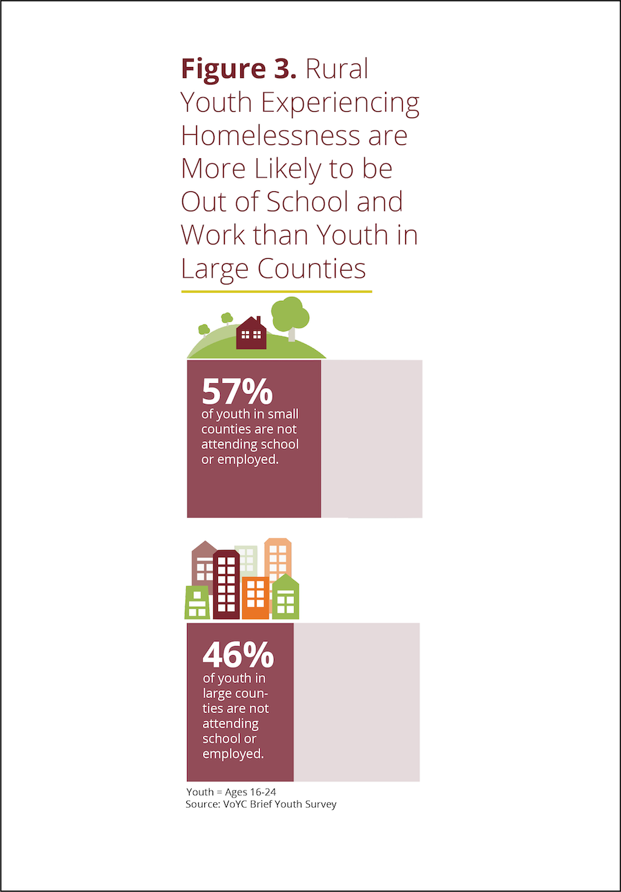
voices.png

Example B


Both are bar charts showing the same data. But B wins, hands down. Why?

Chart A truncates the Y-axis making the difference between large and small counties look bigger than it actually is. Chart B, by contrast, fills in the whole bar and darkens the portion not attending school or employed, thus giving us a sense of the size of both groups (those who are in and out of of school and work) in large and small counties.

Chart B points us to the conclusion it wants us to draw with the title and annotations.

Chart B doesn’t have unnecessary and distracting visual elements such as gridlines and axes labels.

Chart B provides images to further emphasize the contrast between large and small counties.

See other data tips in this series for more information on how to effectively visualize and make good use of your organization's data. 

How To Make Data Beautiful

Copy of 60-SECOND DATA TIP.png

Data people meet designer people. Designer people meet data people. You can learn a lot from each other. Today we will focus on what graphic designers know and data analysts should learn.

A couple of tips ago, we talked about how beauty can actually help a viewer more effectively process a visualization of data. If you missed that one, click here. Now we will consider how to make data more beautiful. Luckily, we need not start from scratch. Graphic designers already know a lot about what makes anything that we look at more attractive and engaging. They have written many books and blogs on the subject. But for the purposes of a 60-second data tip, below are some composition basics to consider from Dan Scott. (Also check out his website.) Data presented in a pleasing composition is more likely to engage your viewer.

If you want it in an even smaller nutshell than the list below, here you go: “Perfection is achieved, not when there is nothing more to add, but when there is nothing left to take away.” Sage advice from French writer and poet Antoine de Saint-Exupery.

danscottimage.jpg

See other data tips in this series for more information on how to effectively visualize and make good use of your organization's data.

Truth and Beauty

Copy of 60-SECOND DATA TIP.png

Real data people care about truth, not beauty. More accurately, they care about evidence that might suggest a truth. So they don’t really embrace truth, just the pursuit of it. However, they don’t have any time for pursuing beauty. Indeed, they may see beauty as deception. A glossy chart or graph is the province of advertisers or advocates seeking to influence rather than to fully inform. As far as the look of displays of information, they advocate for clarity. They may embrace Tufte’s rule of reducing the "data-ink ratio" by removing unnecessary gridlines, labels, and what he calls “chartjunk” (i.e. non-informative elements) to let the data shine through. (For more on Tufte, see Data Tip #11.)

I’m here to argue — both to “real” data people and the rest of us — that we should not discount beauty when visualizing data. Indeed, it might be worth our while to pursue it as we pursue truth. The reason? Well, because we like pretty things. If that sounds like a flimsy explanation,  stick with me a bit longer.

Research evidence suggests that visually attractive things make us happy. (See “The Beauty-Happiness Connection” in The Atlantic for more on this.) And a positive mood, in turn, helps to expand our working memory, which allows us to process more information. So rather than being deceptive window dressing, beauty can actually more deeply engage the viewer in the pursuit of truth.

How can we make data more beautiful? Stay tuned. This is the topic of next week’s data tip.

See other data tips in this series for more information on how to effectively visualize and make good use of your organization's data.

Guinea Pig It

Copy of 60-SECOND DATA TIP.png

Data Viz UX, Episode 5

Today we tackle the fifth and final step in the data viz user experience design process: the beta test. Let’s say you have dutifully followed steps 1-4 by profiling your users, choosing the right data and type of viz, and then refining that viz. Now you have a carefully designed visualization. But does it work on real, live people? Time to find some humans (preferably those similar to your intended users), show them the visualization, and do the following:

  • Ask them what they think the viz is about and what question(s) it is trying to answer.

  • Then ask them to try to answer several specific questions using the viz. These questions should focus on the key information you want users to easily extract from the viz.

  • Take notes. What was difficult for them to figure out? Did they miss any critical aspects of the viz? Did they come to any incorrect conclusions or interesting conclusions you didn’t expect?

Use your notes to revise! Make some aspects of the viz more prominent using color, fade other aspects to the background, add a better title or more captions, remove confusing or distracting elements, even add new data to make clearer comparisons.

See other data tips in this series for more information on how to effectively visualize and make good use of your organization's data.

Photo by Karlijn Prot on Unsplash

Turn A Good Viz Into A Great One

Copy of 60-SECOND DATA TIP (1).png

Data Viz UX, Episode 4

Four weeks ago, I promised to show you how to apply some UX (User Experience) tips to keep your viewers awake, engaged, and wielding data from the data visualizations (aka data viz) you create. So far, I’ve covered the first three steps: knowing your users, choosing the right data, and choosing the right type of visualization (chart, map, graph). The next leg of the journey is to turn a good viz into a great one.

There are lots of suggestions out there about what makes a visualization easy to read and engaging. I’ve culled them down to a list of ten. Each of my “10 Data Viz Suggestments” appears in a previous tip. Please follow the links below to learn more.

  1. Encode Thoughtfully

  2. Consider Your Axes

  3. Highlight What’s Important

  4. Show Order

  5. Clarify With Color

  6. Simplify

  7. Flatten Your Data

  8. Compare Side-By-Side

  9. Zoom In

  10. Stick With A Table (Sometimes)

Stay tuned for the last step in the UX process: testing the viz.

See other data tips in this series for more information on how to effectively visualize and make good use of your organization's data.